Green logos can be such powerful tools when crafted well! Thanks to their color they are associated with safety, health, nature, growth, and prosperity. And, they also are becoming increasingly popular as more businesses aim to project an image of environmentally friendly and sustainable companies. So consequently, creating an effective green logo requires thoughtful design choices that reflect the values and mission of a brand.
In today’s article, we will go through 21 successful examples of green logos projecting a memorable brand image, and we’ll also share tips on how to create such designs.So, let’s begin!
1. Starbucks

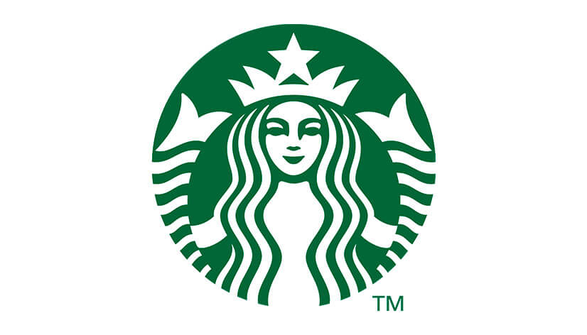
The Starbucks logo, with its iconic mermaid, is a masterclass in brand identity. Its circular shape and the use of green evoke high quality and prosperity, as well as growth and sustainability, aligning with the company’s values and mission. The mermaid’s inviting, symmetrical design makes the logo welcoming and easily recognizable worldwide.
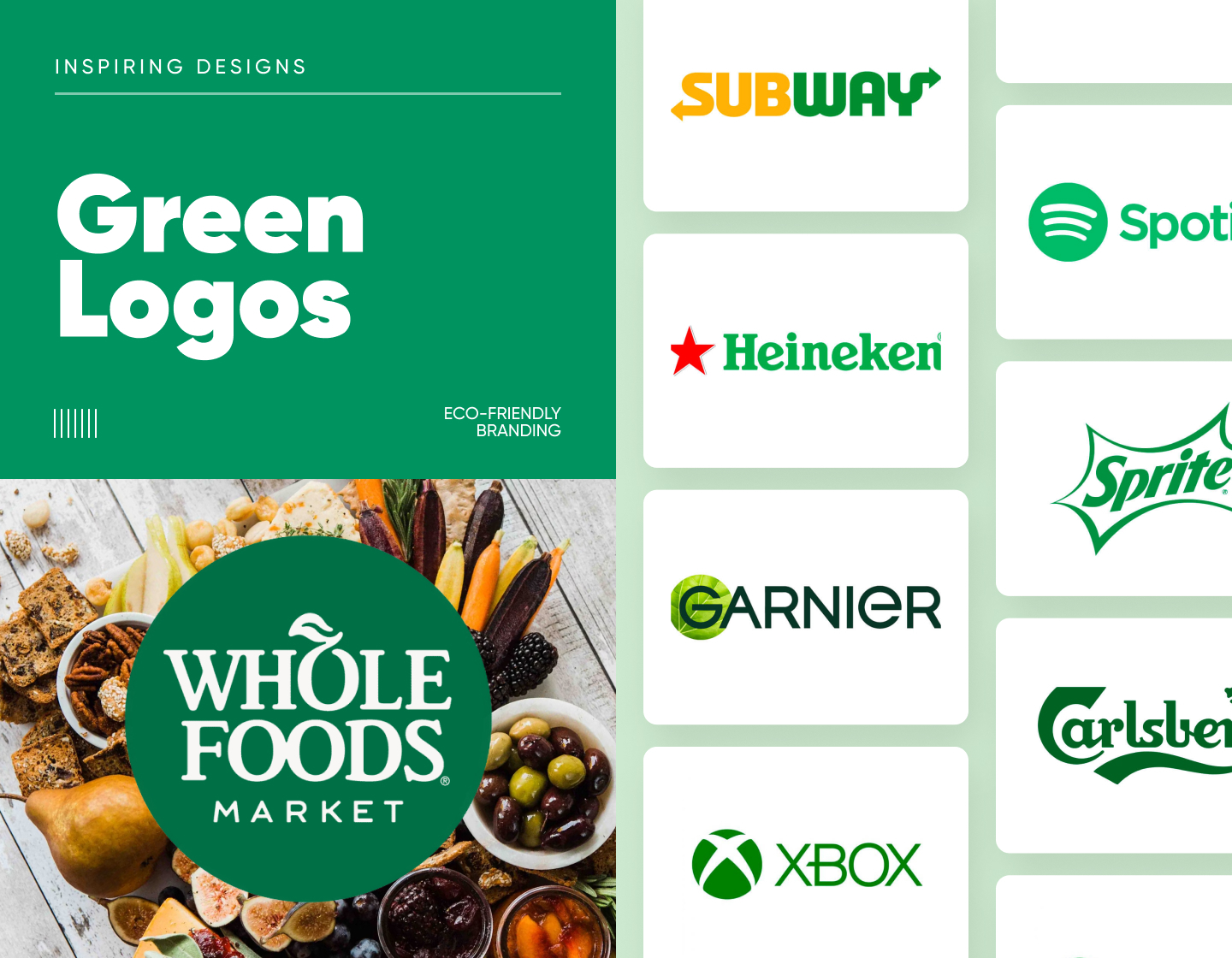
2. Whole Foods Market

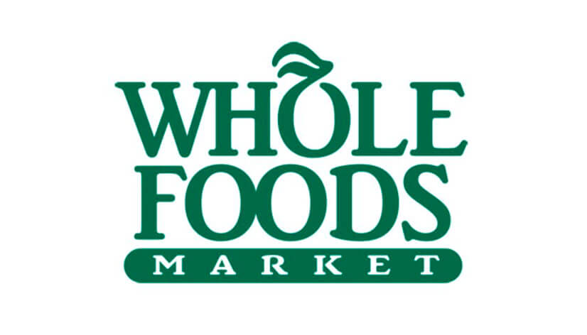
This design’s green color symbolizes natural products, fitting for an organic grocery store. The conventional, bold typography exudes straightforwardness and reliability, with a catchy leaves accent on the first “O” shaped to resemble a fruit. As a result, the supermarket’s logo nicely resonates with the chain’s mission to provide healthy, organic products.
3. Spotify
Spotify’s logo features a bold, simple waveform that represents sound and music. Its bright green color strongly stands out, exuding freshness and vibrancy, and also capturing the essence of a dynamically growing and prosperous digital music service.
4. Land Rover
The Land Rover emblem combines green with a classic oval design, reflecting the brand’s heritage and reliability. In addition, the logo’s strong, uppercase typography and the symbol’s elliptical shape emphasize endurance and adventure, thus associating with the experience of driving a Land Rover.
5. Subway
Subway’s logo uses a combination of dark yellow and green to highlight its commitment to freshness. On the other hand, the arrows in the “S” and “Y” reflect the chain service’s speed and efficiency, thus appealing to those looking for quick and healthy food options.
6. Heineken
Heineken’s signature red star against the green logotype creates a striking contrast and symbolizes the company’s rich history and high-quality products. The logo’s classic serif typeface conveys tradition and hints at the brand’s excellence in brewing.
7. Sprite

The Sprite logo’s lively, deep green hue and bold, italicized typography reflect the refreshing and energetic effect of its drink. The badge-like six-pointed framing with concave sides adds to the design’s exclusivity and dynamism. As a result, the overall straightforwardness of the concept makes it easily recognizable and visually effective.
8. John Deere
The streamlined, leaping deer in the John Deere emblem references the founder’s name and symbolizes his business’ prosperity, traditions, and also innovation. At the same time, the distinctive green color represents growth and the company’s agricultural roots, creating a strong, enduring brand image.
9. Monster Energy
Monster Energy’s logo is highly recognizable with its striking green M claw mark, which looks like being left by a monster. The stimulating drink’s symbol radiates a sense of power, strength, and energy, thus appealing directly to its bold, adventurous consumer base.
10. Android
There probably aren’t many people who don’t recognize Android’s playful green robot, for it is unique and memorable. The simplistic icon adds to the brand’s approachability, while also symbolizing the company’s innovation and user-friendly technology in the mobile operating system market.
11. NVIDIA
NVIDIA’s eye-catching logo icon uses green to signify growth and innovation. Its abstract representation of the all-seeing eye symbolizes the company’s vision and prosperity in the tech industry. In addition, the plain yet modern typeface makes the brand seem approachable, straightforward, and professional.
12. Xbox
The Xbox logo’s vibrant green sphere with a stretched-out X on it abstractly illustrates a streamlined portal to the gaming world. With the neat, plain lettering also in mind, the overall design symbolizes energy, youthfulness, and innovation in the entertainment industry.
13. Fiverr
Fiverr’s chosen hue of green looks progressive and represents the ease of communication and the dynamic exchange of services on its platform. Also, the use of sleek and soft lowercase lettering and the design’s simplicity embody approachability and creativity.
14. Garnier
The Garnier logo has smartly used the green color within its leaf emblem for over 15 years now, thus reflecting the brand’s focus on natural ingredients. The design’s modern, memorable logotype accentuates its icon, thus highlighting its commitment to high-quality beauty products and promoting sustainability as a way of life.
15. Carlsberg

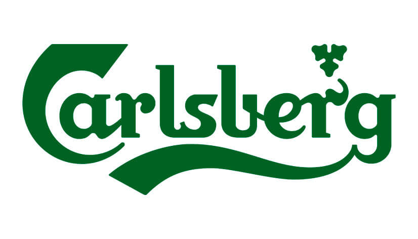
Carlsberg’s logo has so much personality! It is composed of a wordmark and a little emblem above one of the letters. The design uses deep green customized handwriting typography, thus associating with traditions, growth, and success. As a result, the logo appeals to all beer enthusiasts looking for heritage and quality.
16. Tic Tac
The Tic Tac symbol is easily recognized with its clever design. Featuring a deep green leaf as a background, it reflects the minty, fresh nature of its dragees. The overall concept is catchy and inviting, thus appealing to a broad and diverse audience.
17. Publix Green Logo
The Publix logo’s rich green color conveys freshness and quality, which, of course, are important values for a grocery store. Meanwhile, the simple, clear typography with rounded letters ensures easy recognition and works for a friendly and approachable brand image.
18. The Body Shop
With its earthy green emblem and a simple, clean design The Body Shop looks appealing to consumers. By using this color and pendant-like frame, resembling feathers, the logo emphasizes natural ingredients and sustainable production. In addition, the plain, all-uppercase text looks minimalistic and adds to the brand’s professionalism and stability.
19. WhatsApp
The WhatsApp’s speech bubble icon signifies the application’s essence and its reliable and accessible communication. By using the color green the design embodies the app’s purpose of safely connecting people worldwide. Moreover, the wordmark’s simple style adds reliability and credibility to the company’s image.
20. Girl Scouts of the USA
The shamrock shape and green color in the Girl Scouts logo represent the organization’s commitment to growth, nature, progress, and life itself. Further, the three diagonally aligned female face silhouettes symbolize the unity and the empowerment of young women. In general, the result is a powerful and confident-looking design.
21. Sierra Club Logo
The muted, dark olive-green logo of the Sierra Club reflects its mission to stay in harmony with nature by protecting and enjoying it. The icon, depicting a tree-filled scenery, promotes outdoor adventure, while the solid, uppercase lettering emphasizes the organization’s mission of environmental conservation.
Tips for creating impressive green logos
- When thinking up your concept pick the shades of green that best align with your brand’s values and communicate its message. That is to say that depending on its hue, green can be associated with nature, harmony, prosperity, safety, health, and so on.
- Think about adding a complementary color with which you can emphasize the design’s effect, add dynamics and energy through contrast, or simply complete the concept and make it memorable.
- Avoid cluttering your design with complex or too many details. Keep it simple, focusing on a few key elements that distinctly convey your message. That way your logo will be easier to recognize and remember.
- Choose fonts that are clean and easy to read, for they communicate quickly the logo’s message and are legible in various sizes. You can also consider custom typography that aligns best with your values.
- Ensure that your green logo is versatile and adaptable to different sizes and formats. Also, don’t forget to test it on various backgrounds to ensure it always maintains its impact.
Final Words
Taking advantage of green logos in your branding strategy is an effective way to present your company’s image as eco-aware, nature-committed, prosperous, loyal, and fresh. A well-designed emblem will not only strengthen the brand’s identity but will also attract eco-friendly customers. And, as people become more environmentally conscious, the true fame of green designs is probably yet to come.
So, we hope you have found your inspiration here and are feeling ready to begin with your next fresh-colored design!
If you liked this article, you may also inspire yourself with our other colorful logo collections: