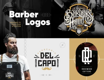
Today, we’ll go through the different types of logos, backed up with plenty of logos examples to get your creative juices going at full speed. Let’s begin!
Logo design is an essential part of brand identity. It requires special attention, creative thinking, and a deep understanding of the symbolic meaning of shapes and colors. Unlike most types of graphic design which are highly influenced by current trends, the design of a logo usually goes unchanged for years.
Logo design generally falls into two main categories – logotypes and logomarks, which make plenty of subcategories – nuances, variations, and mixtures of these two types. When designing a logo, designers should put more than just creativity.
Types of logos – a quick cheat sheet:
1. Pictorial Logo: An artistic graphic icon or symbol that represents a real-world object, usually in accordance with the brand’s name/essence.
2. Abstract Logo: An artistic graphic icon or symbol that represents a metaphorical abstract object, not necessarily related to the actual brand’s name.
3. Illustrative Logo: A more complex type of pictorial logo that consists of a stylized illustration rather than a simple symbol.
4. Mascot Logo: A pictorial type of logo that illustrates a fictional character or a real person representing the brand.
5. Badge & Emblem Logo: A complex type of logo with a strictly outlined shape, consisting of letters and, sometimes, imagery included inside.
6. Letterform Logo: The logo is designed around one letter, usually the first of the company’s brand name.
7. Monogram Logo: Two or more letters, usually the company initials, are overlapping to form one symbol.
8. Lettermarks Logo: Two or more letters, usually the company initials, are arranged side by side.
9. Wordmarks Logo: The full word of the brand name is written.
10. Combinated Logo: A type of logo that puts a logotype and a logomark together.
A logo design should be functional – well readable on big and small marketing mediums; symbolic – representing the essence of the brand, evoking just the right emotions, conveying just the right message; and memorable – easy to grasp and easy to remember. Ready to get into more detail for each type?
Pictorial Logo Design
A very popular type of logo design Is the pictorial design. It consists of a stylized shape, symbol, or icon that represents a real-life object, usually tightly related to the company’s name and/or activity. The pictorial logo is scarce of details, so it looks good on all kinds of mediums, at any scale. It is very often used in combination with a wordmark logo before it establishes in customers’ minds.
Abstract Logo Design
An abstract logo design is a type of pictorial design that carries a metaphorical meaning. It consists of a stylized and abstract shape, symbol, or icon that may or may not represent a real-life object. In both cases, this pictorial mark is used as a metaphor for communicating a specific message about the company’s activity, values, etc. For example, MasterCard’s overlapping circles are just a metaphor for cooperation and unity, and the colors mean growth and energy. P’tit lit’s cloud logo is a metaphor for sleeping well, and Canterbury’s three kiwis represent the homeland of the company.
Illustrative Logo Design
The illustrative logo design is a more complex type of pictorial design with a little bit more detail and an artistic look than just a simple symbol. The illustrative logo design usually looks exactly like an illustration. Due to the details, however, it may not be well readable on small-sized mediums, so companies with such a logo may develop a simpler version for this purpose.
Mascot Logo Design
A mascot logo design is a type of illustrative logo design. It depicts a character that represents the company. This could be a fictional character, i.e. mascot, or a real person. Companies with this type of logo usually have an alternative for small-sized mediums just for the same reason, as the illustrative logo design. Mascot logo design may not be well readable in small sizes, since it contains a lot of detail.
Badge & Emblem Logo Design
The badge or emblem logo design is a popular type of logo that literally looks like a badge. It is very popular among sports teams but not only. The badge and emblem logo design has a strictly outlined shape, and text that is fitted inside. An emblem logo design may have a heraldic look among sports teams or a very modern look among brands for the mass audience.

Letterform Logo Design
A letterform logo design is a variant of a logotype that uses just one letter of the brand’s name, usually – the first. A brand logo may be entirely built around this one letter and used everywhere, or it could be just a variant of the logo to be used on mobile device app icons and other small-sized mediums. A letterform logo design is usually well readable at small and large scales but still depends on the complexity of details.
Monogram Logo Design
You can easily describe the monogram logo design as a logotype design with a twist. In a monogram logo design, you have two or more letters overlapping each other to create an interesting and unique symbol. The monogram logo design looks for a more artistic approach and creativity rather than readability. That’s why it may be accompanied by the full brand name on some mediums before establishing in the customers’ minds.
Lettermarks Logo Design
The lettermarks logo design is usually built around the company’s name initials. This type of logo is perfectly suitable for brand names made of multiple words. Unlike monogram logo design which may also contain the brand name initials, in the lettermarks logo design, the initials are arranged side by side as separate letters. Of course, the font and design of the letter marks still depend on the essence of the brand. Sophisticated and elegant serif fonts are suitable for fashion brands, e.g. Zara, while bold and heavy sans serif fonts convey stability and trust, e.g. Dell.
Wordmarks Logo Design
A wordmark logo design is exactly what it sounds like – a logo made of the word/s of the brand name. This type of logo design is preferred and advised for starting businesses which are yet to be established in the customers’ minds. While some companies start off with a wordmark and a symbol, they may later lose the wordmark because the symbol has become just as recognizable, other examples of wordmarks logos remain pretty timeless.
Combinated Logo Design
The combinated logo design is a very popular type of design that consists of a logotype and a logomark. Usually, companies start off with a combinated logo design of their brand name (wordmark) and their symbol (pictorial mark) before people can actually learn to associate the specific symbol with the specific brand. Later on, some companies may lose the lettering and use the symbol only, while others keep the consistency of the combinated logo design, especially when the text is an artistic part of the pictorial mark and vice versa.
Well, that’s it!
The diversity of brand logos types is really big. However, all need to follow certain rules and principles in order to serve their main purpose – represent the brand in the best possible way and get stuck in the customer’s mind, so they instantly associate it with this particular brand every time they see it.
We hope this content was useful to you, and that we managed to shed some light on the subject of different types of logos. If you are just making your first steps in the graphic design industry, you will probably find our blog pretty useful. We post regular tips and freebies for graphic designers, to make your life easier and your work better. Enjoy!


