Typography is so much more than just words on a screen – it’s the voice, the vibe, and sometimes even the wow factor of a website. You may like bold headlines that stop you in your tracks or intricate typefaces that whisper elegance but they are all examples of how typography has the power to transform a website design from “meh” to mesmerizing.
If you’re hunting for inspiration to make your next project shine, you’re in the right place. We’ve rounded up 28 amazing typography website examples that push creative boundaries, break the rules (but in all the right ways), and show off how letterforms can be art. From clean and minimal to wild and experimental, this list will certainly fuel your creative fire. So grab your coffee, settle in, and prepare to be amazed by how these sites turn text into showstoppers. Ready to dive in? Let’s explore!
1. PACT Media – Stylish Modern Typography Website Example

PACT Media gives us a website example that stylishly balances serif and sans-serif typography to achieve an engaging, modern design. The overall design has a welcoming tone while staying professional, with bold headings that emphasize important information and smaller text sizes for body content that’s easy to follow. In addition, the website’s contrasting colors add to its accessibility, ensuring that the digital text is readable for all.
What we like:
- Clean web design that improves readability
- Balanced font sizing for user-friendly navigation
- A thoughtful visual hierarchy that directs the viewer’s attention
2. Bathyscaphe – Creative Typography Example of a Bar & Restaurant Website
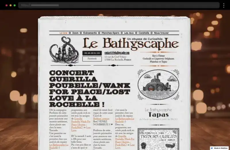
Bathyscaphe’s website has one of the best typography examples inspiring with typefaces that feel both experimental and functional. The font choices play on contrasting weights, combining light sans serif fonts for smaller text with prevailing bold serif fonts to convey a dynamic aesthetic. This is a great example of typography in web design that uses color contrast and line-height to improve readability and still maintain creativity.
What we like:
- Unique font combinations that add both depth and visual interest
- Beautiful use of contrast to create effect and hierarchy
See also → 20 Stunning Vintage Website Design Examples
3. AJ Design – Modern Website Example with Amazing Typography
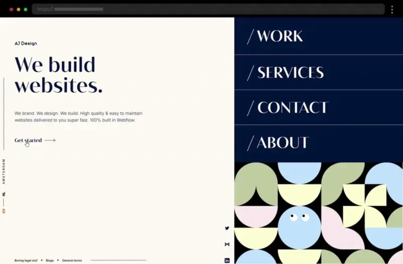
AJ Design’s portfolio blends two types of sans-serif fonts with creative use of line height and font size to create an effortlessly sleek design. The minimalistic typography in the web designer’s site ensures that every word feels intentional, while the emphasis on whitespace and color contrast draws the eye to the brand identity and design elements.
What we like:
- A beautiful combination of sans serif fonts with modern styling
- Subtle, interactive design elements that add visual interest
4. Wholeness Collective Therapy Group – Elegant Typography Website Example
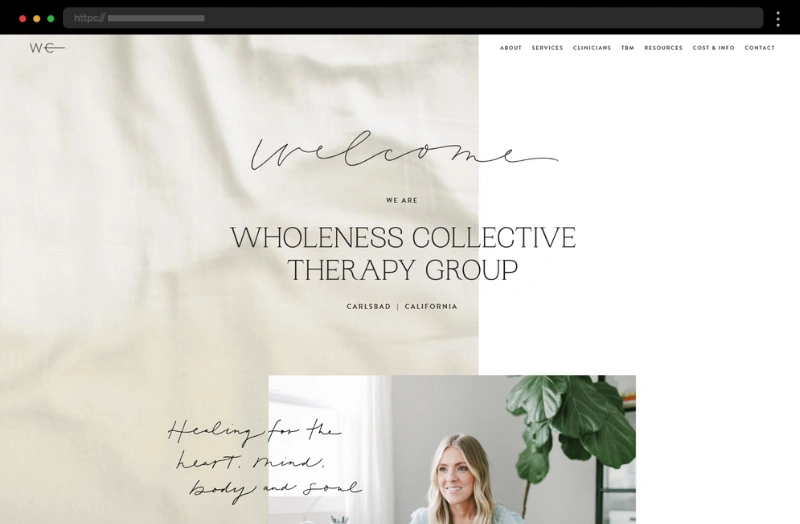
This website example takes a soothing, even therapeutic approach to typography in web design. The web designer has used soft serif typefaces to evoke warmth and trust, while sans serif fonts in the small-sized text provide a clean and accessible feel. The muted palette and generous spacing further enhance the relaxing tone of the site, making it one of the best typography website examples that aligns seamlessly with the brand identity.
What we like:
- Soft typefaces that set a calming tone
- Thoughtful use of script typography for accents
- A harmonious color palette that complements the typography
5. Readymag – Huge Typeface Website Example
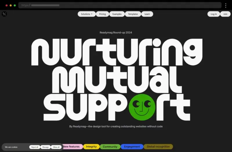
This interactive showcase of typography plays is a graphic designer’s dream. Combining a bold sans-serif font with many bright colors creates a dynamic and engaging design that certainly makes a strong impression. In addition, the alternating fonts create a compelling balance between readability and artistic flair, drawing the reader’s eye to each section.
What we like:
- A creative use of a typeface that instantly attracts attention
- A bright typography color palette that keeps the focus
6. Hello Machine – Top Website Example with Elegant Typography
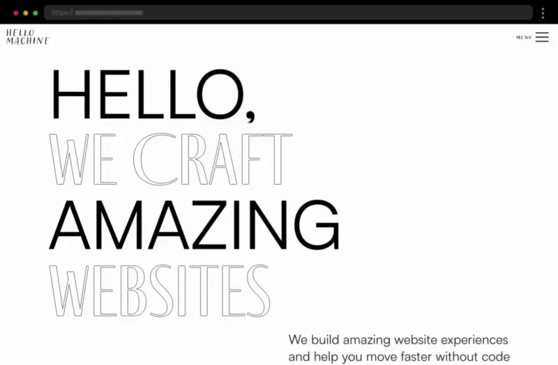
Hello Machine captivates with a bold choice of experimental font styles, creating an energetic but elegant vibe. The design employs various types of sans-serif typefaces that are smartly used to draw the reader’s attention to key elements, giving the site a modern yet sophisticated feel. With also a light, creamy background that amplifies the typography, the site designer ensures every word and line makes a statement.
What we like:
- Elegant web design featuring bold headings and high-impact typography
- Creative typography plays with letter spacing for a unique aesthetic
7. Hourly App – Bold and Animated Typography Website Example
The Hourly App’s typography leans on modern sans serif fonts to create a clean, tech-forward aesthetic. The font styles are streamlined and functional, pairing huge headings with smaller text while the added animations help for a professional yet accessible feel. The site designer ensures the typography remains consistent across the landing page, reinforcing the app’s sleek brand identity.
What we like:
- Clear sans serif fonts that maximize readability
- Strong hierarchy guiding the user journey
- Creative web design plays, such as subtle animations that add motion to the text
8. Angela Milosevic – Art Director Website Example with Eclectic Typography
Angela Milosevic’s website is a great example of good visual hierarchy, using contrasting fonts to create a seamless blend of daring typography and elegant simplicity. Moreover, the thoughtful combination of different typefaces adds balance and style to the web design. With playful handwritten typography accents sprinkled throughout, the design also feels personal and creative, reflecting her role as an art director.
What we like:
- Handwritten typography for a unique and personalized touch
- All capitalized serif fonts help establish a clear hierarchy
9. MadSavvy Creative – Website Example with Playful Typography
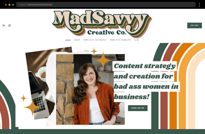
MadSavvy Creative stands out with bold and playful typography. The fonts used throughout the site are modern and versatile, while oversized headings build a powerful hierarchy. In addition, the alternating font weights add texture giving the site an edgy yet professional vibe that aligns with its creative agency branding.
What we like:
- Oversized headings for a striking first impression
- Contrasting fonts and font weights
- A sleek, modern web design with typography as the focal point
10. Sea Harvest – Creative Typography of a Food Market Website
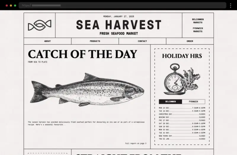
Sea Harvest blends a nautical theme with bold serif fonts that evoke a sense of heritage and tradition. The typography is timeless, reflecting also the brand’s strong connection to the sea. Key elements like ample line height and font size make the digital text feel approachable, while the overall design leans on a combination of serif fonts for headings and sans serif fonts for body text to create balance.
What we like:
- Stunning serif typeface in the headings for an old-world charm
- Clean sans serif that enhances readability
- A cohesive brand identity tied seamlessly to the site’s visuals
11. Divina Lingua – Storytelling Website Example with Traditional Typography
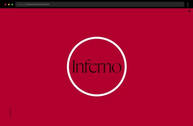
Divina Lingua is a typography-forward website that feels elegant and intellectual while telling the story of Dante’s Inferno. The site uses mainly serif fonts while certain words and text are highlighted with a sans serif font to ensure clarity and accessibility. The text hierarchy is carefully crafted, with well-spaced lines and contrasts, thus guiding the reader effortlessly through the content.
What we like:
- Elegant font that reinforces the website’s message
- A polished design with well-balanced typography and visuals
12. Red Collar Font – Interactive Typography Website Example
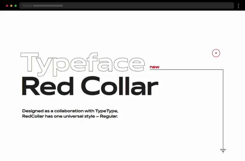
Further on our list of examples is the Red Collar Font – an amazing typography-forward website that showcases a typeface named Red Collar. The web design is highly animated and interactive, engaging users from the beginning while achieving an avant-garde aesthetic. Building a beautiful image of the one font it uses, this site will certainly make you want to use the typeface at once.
What we like:
- Animations and interactions that push creative boundaries
- The use of typography to provide a both dynamic and artistic experience
13. Lyst Denim – Colorful Website with Cool Typography
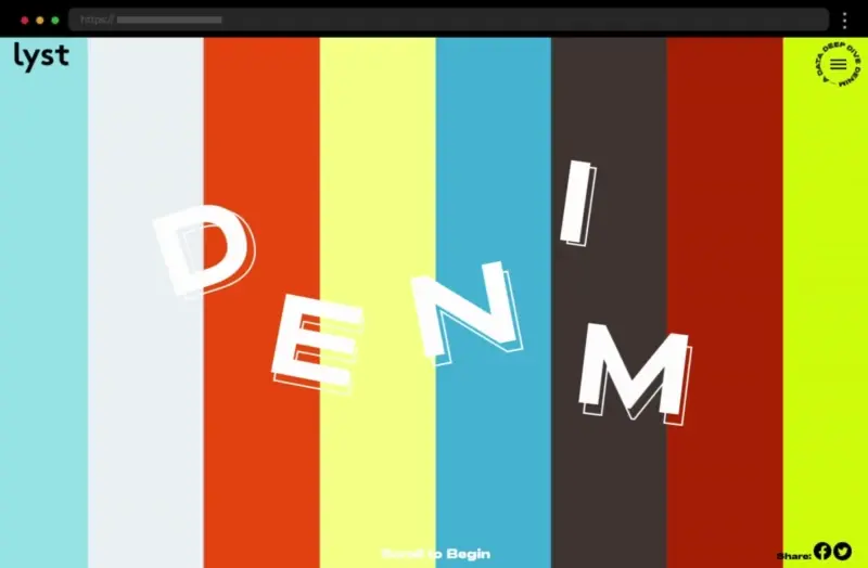
Further, Lyst’s colorful website example uses typography to reflect its trendy and fashion-forward brand identity. The sans serif fonts throughout the site are sleek and modern, paired with bold headings, outlined texts, and colorful accents so they can draw attention to important elements. The design elements ensure the typography is not only stylish but also supports readability for both large and small screens.
What we like:
- Minimalist, modern fonts that align with a fashion-forward brand
- Creative use of font weight and size to highlight statistics and headlines
- A polished web design with plenty of whitespace for balance
14. Fat Choy NYC – Illustrated Website with a Playful Typeface
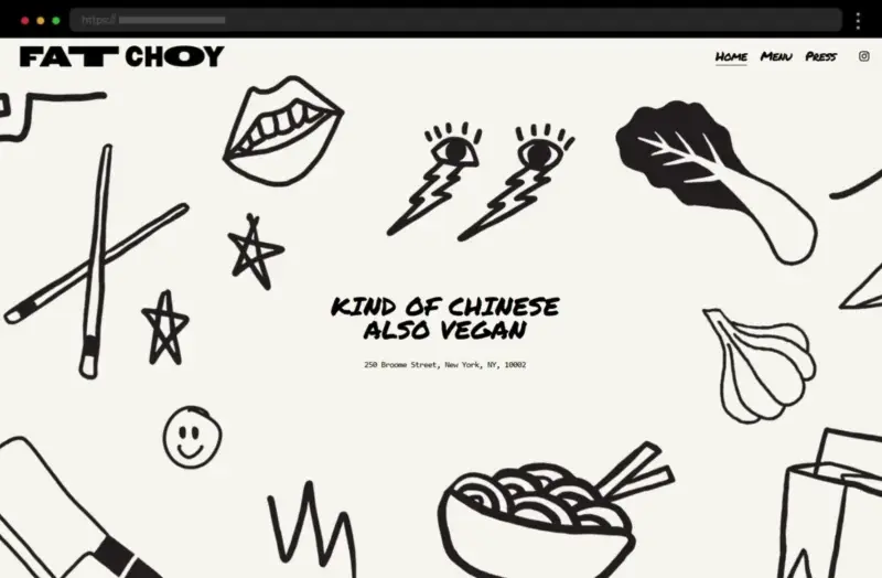
This website is a feast for both the eyes and your inner foodie. With a bold and playful typeface leading the charge, Fat Choy NYC pairs quirky font choices with vibrant design elements so it can reflect its casual, plant-based New York vibes. The sans serif fonts are modern and approachable, while the line height and spacing maximize readability.
What we like:
- Clever use of typography that mirrors the playful personality of the brand
- A strong visual hierarchy that guides the reader’s attention
15. Allta – Inspiring Typography Website Example
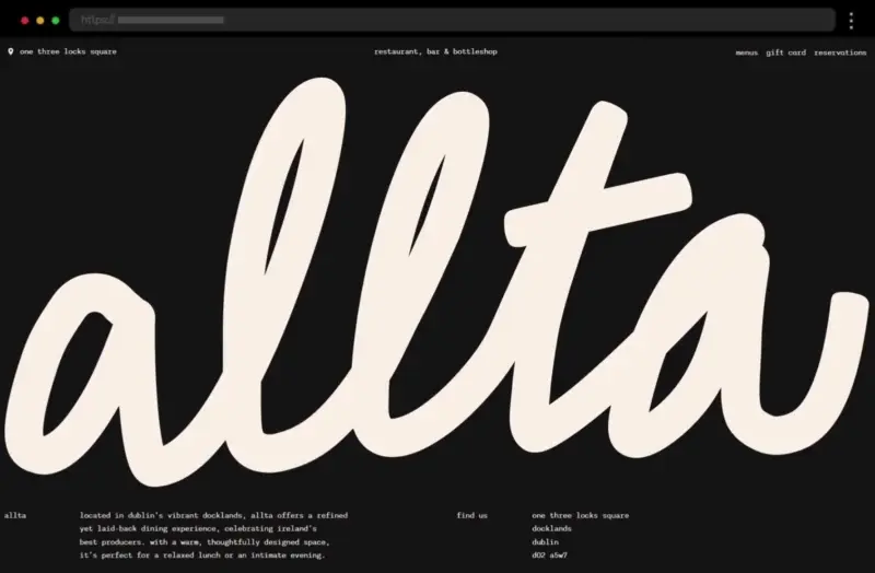
Allta’s typography exudes warmth and charm, thanks to its stunning use of a large, handwritten lettering on its landing page accompanied by a straightforward sans-serif font for all the other text. The website beautifully uses typography in its overall design, achieving a rustic, artisanal aesthetic. As a result, Allta’s website is eye-catching and certainly enhances the brand’s image, making it feel cozy and authentic.
What we like:
- Gorgeous fonts that establish a welcoming tone
- Subtle design elements that complement the typography without overpowering it
16. Ansley and Jonathan – Typography of a Wedding Website Example
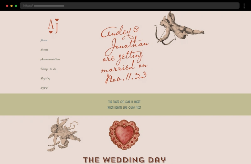
Ansley and Jonathan’s site uses beautiful typography to tell a heartfelt story. Sans-serif fonts dominate the headings while the serif one exudes an elegant and timeless vibe that perfectly matches the theme of love and celebration. As a result, the web design is approachable, user-friendly, and perfectly mirrors the romantic mood of the event it presents.
What we like:
- The fonts effortlessly add to the site’s romantic aesthetic
- Excellent use of white space to draw attention to both typography and visuals
17. Charlie Lemaignan – Typography Designer Website Example
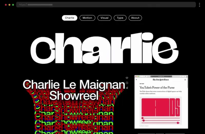
This is the website of a graphic designer who specializes in motion and typography and so, naturally, it showcases typefaces to perfection. Utilizing a black background is a smart choice as it helps the many various types of colorful lettering stand out and thus create a striking yet understated web design. As a result, it’s a fantastic example of how to craft a great typography portfolio website.
What we like:
- Different fonts that showcase the designer’s portfolio
- A clean, minimalist design that keeps the focus on typography
18. Monograph Communications – Stylish Typography Website Example
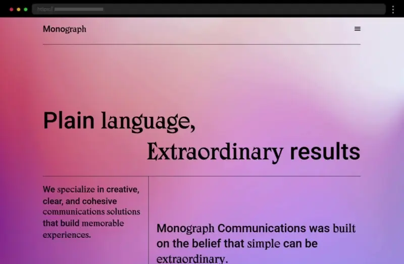
Monograph Communications takes an all-text approach to its web design, combining a clean sans-serif font with a more creative serif one all displayed on a visually appealing gradient backdrop. The overall site design emphasizes clarity and sophistication, with carefully measured line length and line height ensuring that body text is easy to read. Thus, this is a great example of typography inspiration for a creative agency aiming for an elegant brand identity.
What we like:
- Thoughtful line length that improves readability
- An interesting combination of typefaces for added texture
- A gradient background that enhances the typography’s visual impact
19. Henry Northington – Typography Example for an Artistic Creator Website

Further on our list of examples is Henry Northington’s portfolio website which employs a creative, old-school pixelated typography showcasing his artistic flair. The overall web design feels confident and modern, with typefaces that shift between large headings and lighter text bodies to establish a strong visual hierarchy. In addition, the black background enhances the contrast, making the fonts truly stand out.
What we like:
- A creative font that exudes both creativity and confidence
- A black background for striking contrast and readability
20. Bibenda – Restaurant Website Example with Artisanal Typography
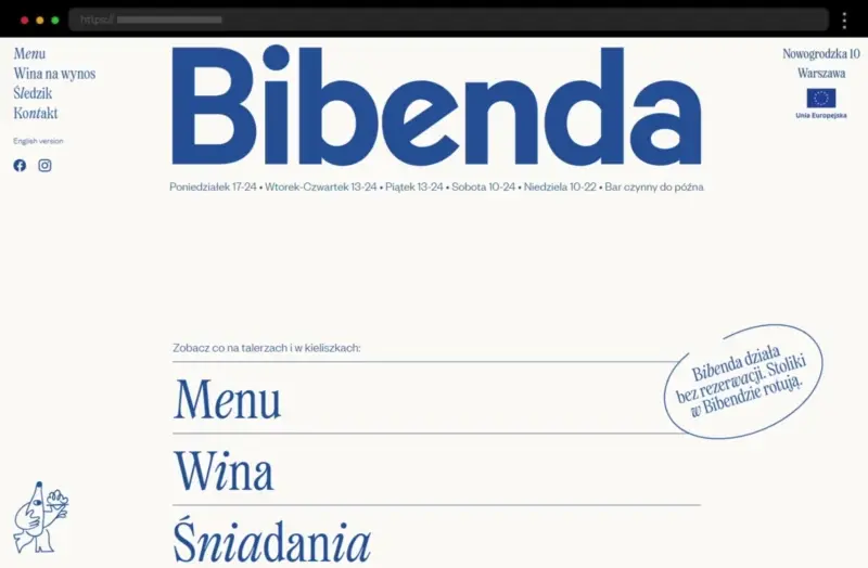
Bibenda’s typography captures the charm and warmth of its food-inspired brand identity with serif fonts that exude elegance and personality. The site design smartly uses font size and headings to guide the viewer’s attention while the general text remains clean and approachable, thanks to carefully chosen sans serif fonts.
What we like:
- Stunning fonts that feel both artisanal and inviting
- Playful typography accents that reflect the restaurant’s vibrant image
21. Osean Dive – Modern Typography Website Example
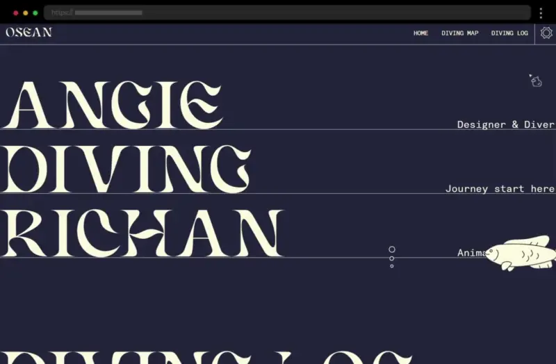
Further, Osean Dive excels at typography in web design with a sleek and modern approach. The design is refreshingly simple, combining a sans serif font with clean lines and generous spacing with a creative, wavy one that mirrors the site’s nautical theme. This web design plays on a minimalist aesthetic, with the site focusing on readability and accessibility but without sacrificing visual interest.
What we like:
- A creative combination of fonts
- Great typography choices for both mobile and desktop layouts
- Use of whitespace to create a calming, immersive experience
22. Kathe Kollwitz Memorial – Historical Website Typography Example
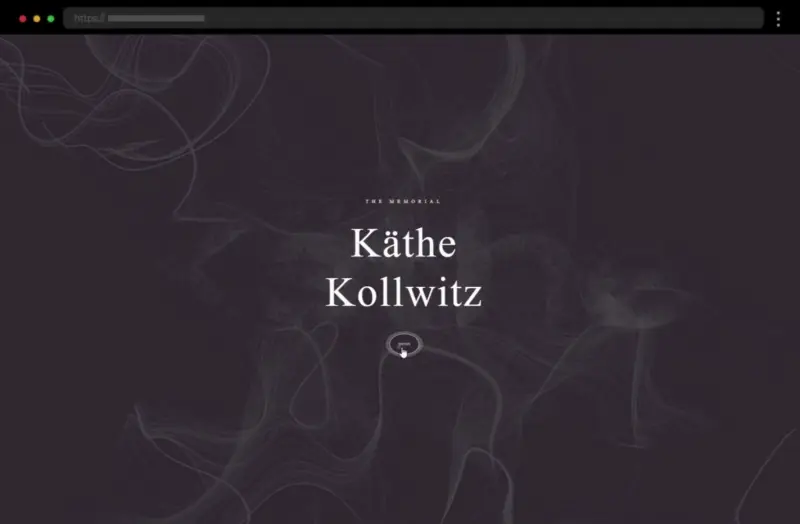
Kathe Kollwitz Memorial showcases a nostalgic, heartfelt, elegant design that smartly uses fonts to evoke tradition and timelessness. The typography plays a crucial role in communicating easily the German artist’s story, with large headings creating a strong visual hierarchy. In addition, the subtle use of color in the text and overall design creates a coherent experience and enhances readability while maintaining an inviting tone.
What we like:
- Beautiful typography that conveys warmth and heritage
- Excellent readability thanks to balanced line height and font size
23. Sullivan NYC – Cool Website Example with Modern Typography
Sullivan NYC’s website is a fantastic example of typography in design that captures bold sophistication. The combination of serifs and sans serifs establishes a refined but contemporary tone. The content hierarchy is further enhanced by the contrasting palette, emphasizing the typeface as the main design feature.
What we like:
- Bold lettering for an authoritative but creative feel
- A sleek, modern design that highlights the typography
24. The New Yorker – Great Media Website Example with Signature Typeface
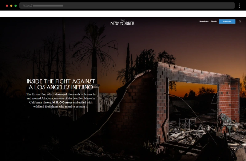
Further, we have The New Yorker – a legendary typography-forward publication that’s synonymous with its signature serif typeface. Embracing its traditional font, the website establishes an unmistakable brand identity that blends timelessness with modern website design.
What we like:
- An iconic font that reinforces the publication’s prestige
- Smart text settings that support lengthy editorial content
25. BOBA Ice Cream – Creative Website Typography Example
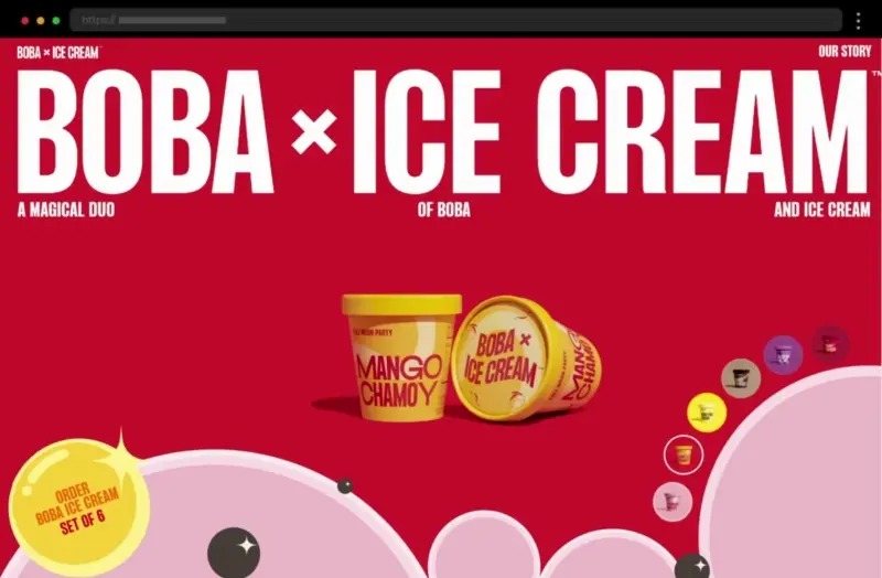
BOBA Ice Cream’s website is a playful and vibrant showcase of cool typography paired with colorful visuals. The design utilizes sans serif fonts in different colors that exude an approachable and fun tone that undoubtedly mirrors the brand’s cheerful personality. The creative use of a vibrant color palette complements the fonts, making the overall website design feel lighthearted and unique.
What we like:
- Playful typeface style for an energetic and creative vibe
- Vibrant colors that enhance the typography’s fun and approachable tone
26. Dana Barkay – Typography on a Visual Designer Website
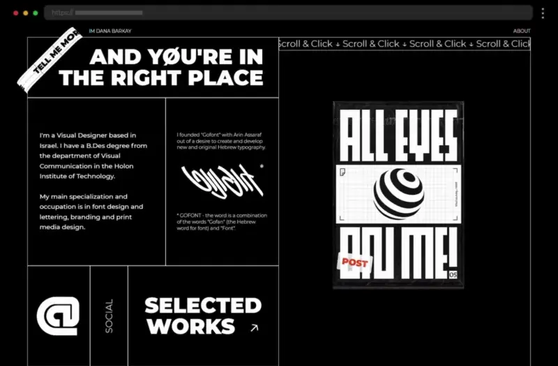
Dana Barkay’s site is a great example of typography in web design where artistic expression meets functionality. Combining various sans-serif fonts with animations, the design is engaging and wears Dana’s personal touch. The smartly utilized white typography contrasting with the black background sparks interest while adding depth and texture.
What we like:
- Contrast between the background and the body text colors
- Thoughtful spacing and line length that improve readability
27. I Love Typography Fonts – Typography eCommerce Website Example
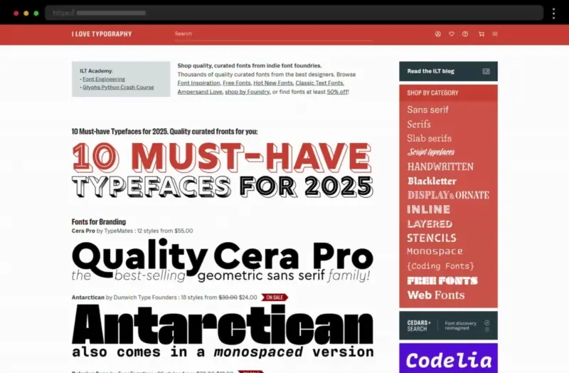
I Love Typography’s site is a true inspiration, featuring a stunning variety of typefaces crafted by indie designers and also offered for sale. In general, the design focuses on showcasing different fonts in action serving as a wonderful example of how to celebrate type as both a functional and artistic medium.
What we like:
- A curated display of both unique and high-quality typefaces
- Interactive elements that highlight the beauty of each typeface
28. Bruno Tomé – Whimsical Website Example with Quirky Typography
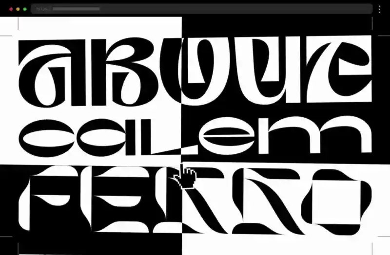
This developer portfolio is a great example of creative typography inspiration. Bruno Tomé’s site uses contrasting fonts and weights to achieve a sleek and contemporary feel. The huge animated lettering engages visitors and invites them to interact further with the design. Although the texts’ readability suffers from the highly creative design, the black-and-white color scheme helps the typography pop and grab the visitors’ attention.
What we like:
- A black-and-white color scheme for impactful color contrast
- Huge, interactive lettering that grabs the attention
Best Practices for Crafting Impactful Typography Websites
1. Make your design legible by choosing fonts that are easy to read on various devices and screen sizes. Sans serif fonts work well for body text, while serif fonts can add elegance to headings.
2. Further, establish a hierarchy by using font weight, size, and spacing to differentiate headings, subheadings, and general text.
3. Limit font styles and stick to two or three typefaces so you can maintain a cohesive design.
4. Ensure enough contrast between text and background to improve accessibility, for example, black backgrounds with light text or light backgrounds with dark fonts are classic choices.
5. Also, the typeface and styles you choose should reflect your brand’s personality.
6. You can also experiment with animations, overlapping text, and creative spacing that can add flair without sacrificing functionality.
Final words
Typography is more than just text and words – it’s a fundamental design element that shapes the look, feel, and usability of a website. Exploring these typography website examples, you’ve seen how diverse font styles, visual hierarchy, and creative plays can enhance brands’ web identity and also provide a compelling user experience. So, we hope you found inspiring examples that resonate with you and are ready to design with your readers in mind.
Next steps:
-
Browse these 30 Creative Minimalist Website Examples, or
-
Head back to our WordPress Website Examples Hub.