Creating your own creative email signature is a great way to both brand and personalize your emails. An email with a signature at the bottom looks way more professional than an email that ends with.
“Cheers,
John Doe”
In this article, we want to help you understand the general best practices, how to create, and what not to do when creating your own creative email signature. Hopefully, by the end of the article, you will have your own professional email signature.
Article Overview:
1. Definition of an email signature
2. Best practices when creating an email signature.
3. Great examples of creative email signatures.
4. Examples of bad email signatures.
5. How you can quickly and easily create your own email signature.
1. What is an Email Signature?
Email signature refers to the block of content at the end of an email message. This block usually includes information about the sender: Name, business contacts, website, and other relevant links.
2. Best Practices For Making Email Signatures
An email signature should contain a few elements that are almost mandatory
- Your photo
- Email contact
- Phone contact
- The name of your company
- Your position
- The address of your company
- A link to relevant social media
Adding your picture to your email signature is a great way to put a face behind the name. Make sure your picture isn’t too big as we don’t want to divert the attention of the reader from the actual body of the email.
Your email and your phone are mandatory. They will give the reader the means to contact you should any further inquiries be needed. It is recommended that you include your work phone number or if you don’t have one you can always use services to get a number that is different from your personal phone number.
The name of your company and your position are pretty self-explanatory. That information helps the user keep track of the conversation and it also provides guidance on whether or not they should include you in an email chain.
Finally, you can add your social media links. Don’t go overboard with email icons. Place only what’s relevant. For example, Linkedin has been established as the social media for business and professional communications.
If you are an artist for example it is a good idea to include your Pinterest or Instagram account. If you are a web developer or programmer then your Github account should be included.
3. Really Good Examples of Email Signatures
Let’s take a look at a couple of email signatures that strike a great balance between creativity and simplicity.
As you can see all of these email signatures follow the best practices. They all differ a little on their own but as a whole, they follow the same format. The most important thing to remember for all of these is that they don’t take the user away from the email.
When you are sending an email all of the focus should be on the content of the email. The email signature is just a quality of life feature.
With that in mind let’s take a look at some problematic email signatures and see why maybe they are not the best.
4. Examples of Problems in Email Signature Design
Now we want to start by saying that none of these email signatures are particularly bad. Most of them just try to do more than what an email signature should. In a sense, they are a bit too creative for email signatures.
The problem: It’s too big for an email signature.
From a design perspective, this is a very pretty email signature. In fact, it’s a little bit too pretty. We feel like the attention of the user would be totally diverted from the body of the email which is something you don’t want to do.
The problem: It’s a bit too technical for most email clients
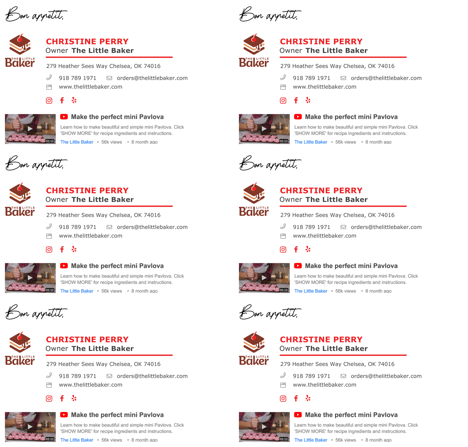
This is an email signature that really pushes what’s possible in terms of email tech. The bottom part is a gif of a Youtube video along with the title and some information about the video.
The data for views and the upload date is updated automatically. While we think this is a great idea we are not sure how well most email clients will be able to support it.
The problem: CTA’s should be in the email not the signature
If we exclude the bottom section this is a great email signature. The only problem is that the bottom part tries to drive conversions in a way that may take away from the email body.
In our opinion, the great design of the CTA should be reserved for an email that is focused on it.
The problem: Too many images.
Here we see another great design of an email signature but again it takes away from what an email signature should be. The main focus of this email signature is to showcase the product. We think that the email signature should be about the person sending the product, not so much about the product itself.
5. How you can quickly and easily create your own email signature
After we’ve gone through the best practices and given you some examples of how creative email signatures look, we feel the best way to finish this article is to give you a tool that you can use right now to create your own.
Hubspot has created a great and easy-to-use email signature creation tool that anyone can use to get a professional-looking signature in minutes.
All you need to do is go to the Email Signature Generator page and play around with it a little. The tool gives you options for what text and images to include. You just have to enter some information and upload a few images and you’re good to go.
Conclusion
Everyone should have their own email signature. It only takes a few minutes to create one but it will serve you for as long as you desire. Remember that an email signature is about you, the person sending the email keeps it that way and keeps it simple.
In the meantime, why not take a look at the related articles to get some more inspiration or grab a couple of freebies:





![When to Send Emails? [Complete Guide to Success]](https://reallygooddesigns.com/wp-content/uploads/2025/02/when_to_send_emails-193x150.webp)


