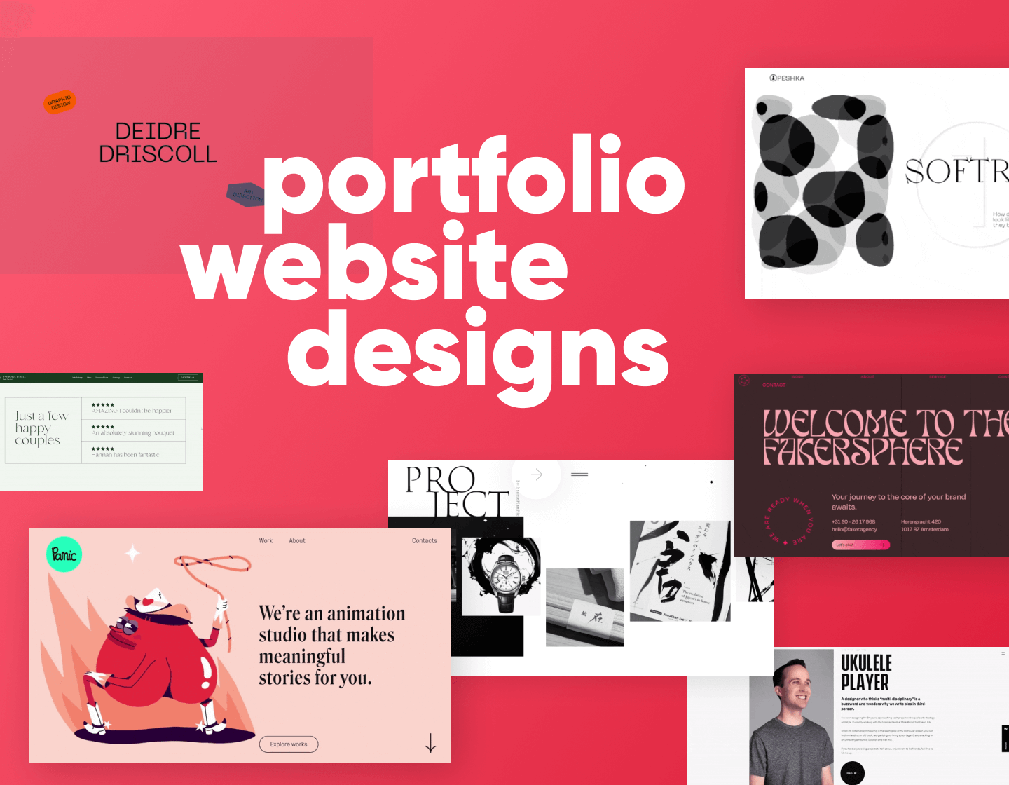
Your professional portfolio gives you the opportunity to tell the world who you are, what you do, and how you do it. And more importantly, what makes you the right problem-solver for future clients and employers. In this article, we will talk about the anatomy of a good portfolio website, we will explore some really good inspirational portfolios and we will learn what makes them good.
Table of Content
- Superb Portfolio introduction examples
- Amazing showcase section examples
- Great examples of an about section
- Portfolios with successful case studies
- Portfolios with outstanding testimonials and social proof
- Great contact forms in portfolio websites
- More portfolio ideas
1. The Introduction to Your Portfolio Website
An About Me page is always a good way to tell people about yourself, your experience, and what makes you the perfect solution to their problem. However, keeping this information strictly on a separate page means people should search for it in a menu. This is why you can take advantage of a brief introduction like these websites do:
1.1. Start with a Brief Introduction
Introduce yourself right away in the hero section of your Homepage in a bold catchy title. A brief introduction stating your field of expertise will immediately help users know who you are.
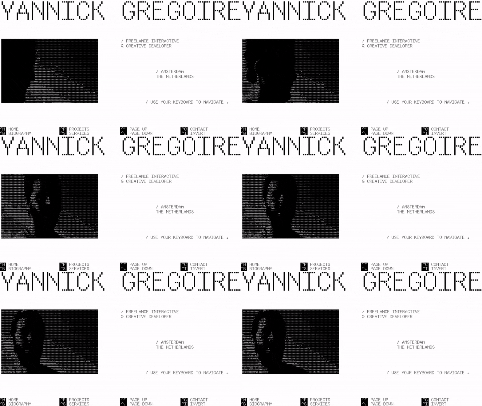
Here’s the brief introduction by Yannic Gregoire, a freelance interactive and creative developer. Right off the bat, you learn his name, he is a freelancer who offers web development services, and he’s based in Amsterdam. All without scrolling or having to see the About page.
1.2. Avoid Abstract Language
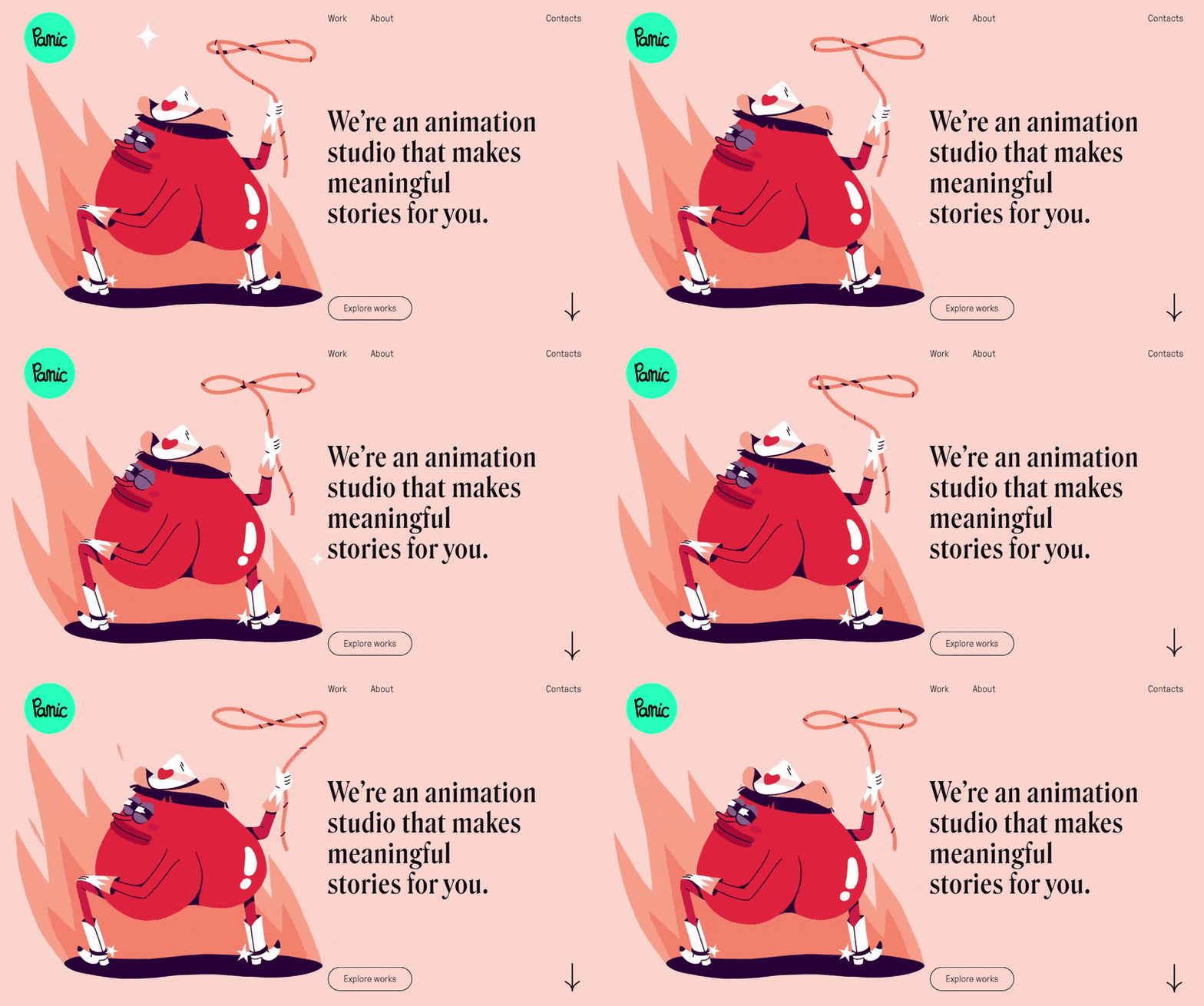
It’s also important to be specific. For example, when it comes to digital services, a title explaining that you “create digital experiences” doesn’t mean much to the average user. They wouldn’t know if you design the layout, create animations, or write the code. Using technical terminology in the introduction is also not a good practice. The following example by Panic Studio lets you know they will create meaningful animations for you with precise language and a funny sample animation of a twerking cowboy heart.
2. A Showcase of Your Work
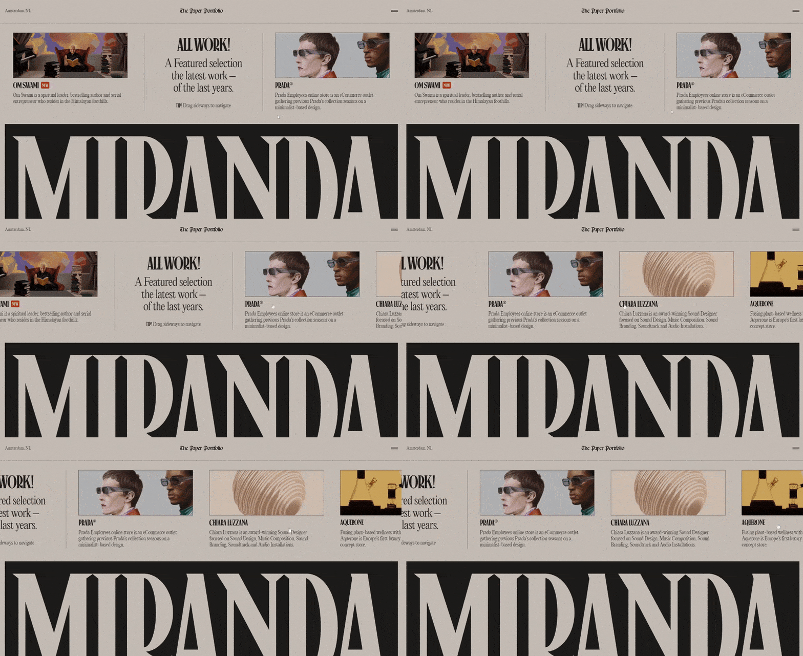
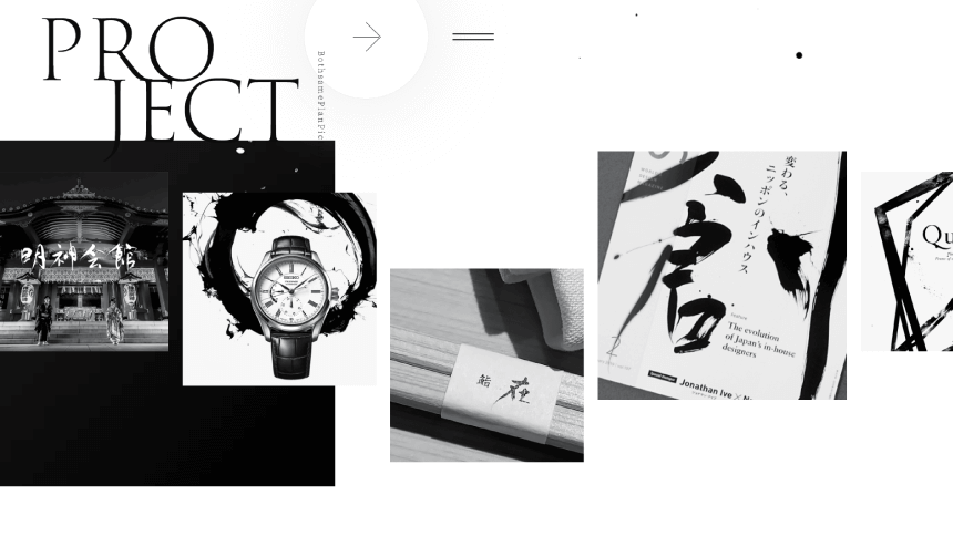
Unfortunately, it only takes a few seconds to lose a visitor’s attention, so make sure you use those precious seconds efficiently. To do so, create an appealing visual presentation of your best work that will make them click for more details. You can use slideshows, videos, or a gallery. The portfolio below uses a horizontal slider to showcase the best projects.
2.1. Show only the work you enjoy doing
Showcase mostly the type of projects that represent the work you want to do. If, for example, you’ve been working on a project that drained your creativity and caused you a serious burnout (in short, you kinda hated it), you better not include it in your portfolio. Chances are, you will be requested to do more of that sort of work… a lot.
2.2. And don’t forget your personal projects
Projects you did for clients always have more weight, as they prove you’re someone people can work with and get results. However, your personal projects show your passion, personality, and creativity way better. These projects aren’t managed by clients and you don’t get paid for the process. They allow your future clients to see your creativity in its most honest form.
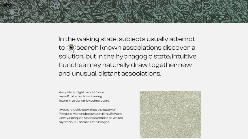
Roger Haus, for example, has featured the project that best represents his surrealist work. The artist explains his search for excellence and clean lines, associations, and the inspiration behind it.
2.3. Grab Attention with Cover Photos
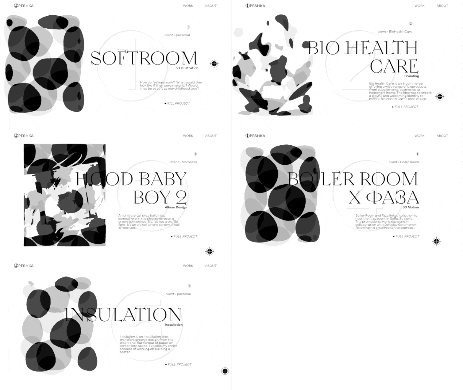
When showcasing your curated projects, pay special attention to the preview images you’ll place on your homepage. If you’re showcasing UI projects, showing one of the best parts of the UI in detail will gain much more interest than an abstract crop image. If it’s an animation, why not show part of it on hover?
3. Your About Page is Not Entirely About You
The About page serves users to get to know you and, most importantly, learn who will solve their problem. This includes your professional experience, education, expertise, tools of the trade, what you’ve learned to do, how you approach a project, etc. In a way, this page is a great opportunity to convince the visitor you are the right person to do the job or your future employer to hire you.
3.1. Include your CV
Attach your CV as an additional document in PDF for future clients or employers to download and print.
3.2. Get Personal
Another important detail is to make your About page personal. Make sure to include your name, and photo and speak directly to the visitor in the first person. Feature a cool fact, show them your accomplishments, and give your audience something memorable.
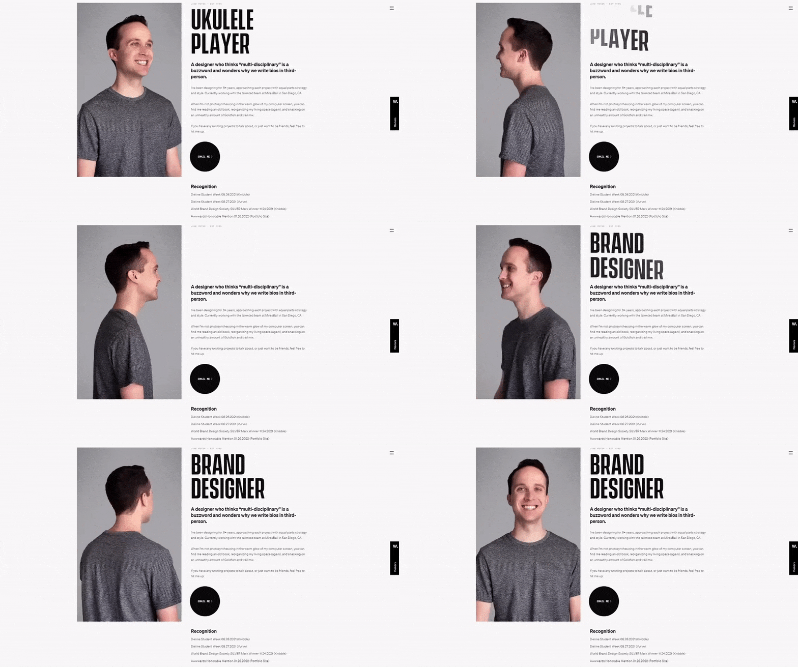
For example, freelance brand designer Luke Meyer lets you know all the specific details about his work, alongside the fact he’s an awkward dancer who collects typefaces, quotes movies, and plays the ukelele.
3.3. And be Humble
Let people decide if you’re really the best. Your work, client testimonials, realized projects, awards, and other social proof will communicate that for you. People trust results, so avoid unrealistic bombastic titles such as “leading company” or “top service”. On the other hand, your audience will definitely appreciate a quote by an actual client, stating that you’re “their design power animal”, so leave that to the testimonial section.
4. Curated Case Studies And the Stories Behind Them
Your case studies page is the foundation of your entire portfolio. It not only showcases your skills and accomplishments as a professional but also gives your future clients a precious peek into how you think and work. Your best option is to include a small number of curated latest projects. There’s no rule of how many projects you may include, but it’s usually between 3 to 6. This way you can focus on quality and give a detailed history of each.
Each case study has its own story that shows the entire creative process from start to finish. You can give your audience insight by giving answers to some of the following questions:
- What is the purpose of the project?
- What is your role?
- How did you accomplish your objectives?
- How long did it take you to complete the project?
- What is the outcome? (overview of the final product)
4.1. Always share your process
Your work process shows your true value. Especially in design, there are many misconceptions that it’s fairly easy and quick to design a logo or a layout. This is your opportunity to show your future clients that there’s no “design logo” or “draw character”button, by sharing your process from concept sketches to the final product. It gives a peek at how you think and how you solve a problem.
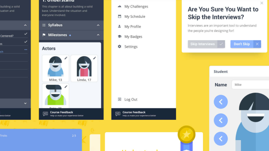
For example, the following case study is for an online platform for challenge-based learning. The designer’s role was to create an entire product design from research to conception, visualization, and testing. The case study is very in-depth and includes an intro, competitive analysis, interviews, and surveys, building empathy, information architecture, wireframing, prototyping, visual design, A/B testing, outcome, and conclusion.
5. Testimonials and Social Proof
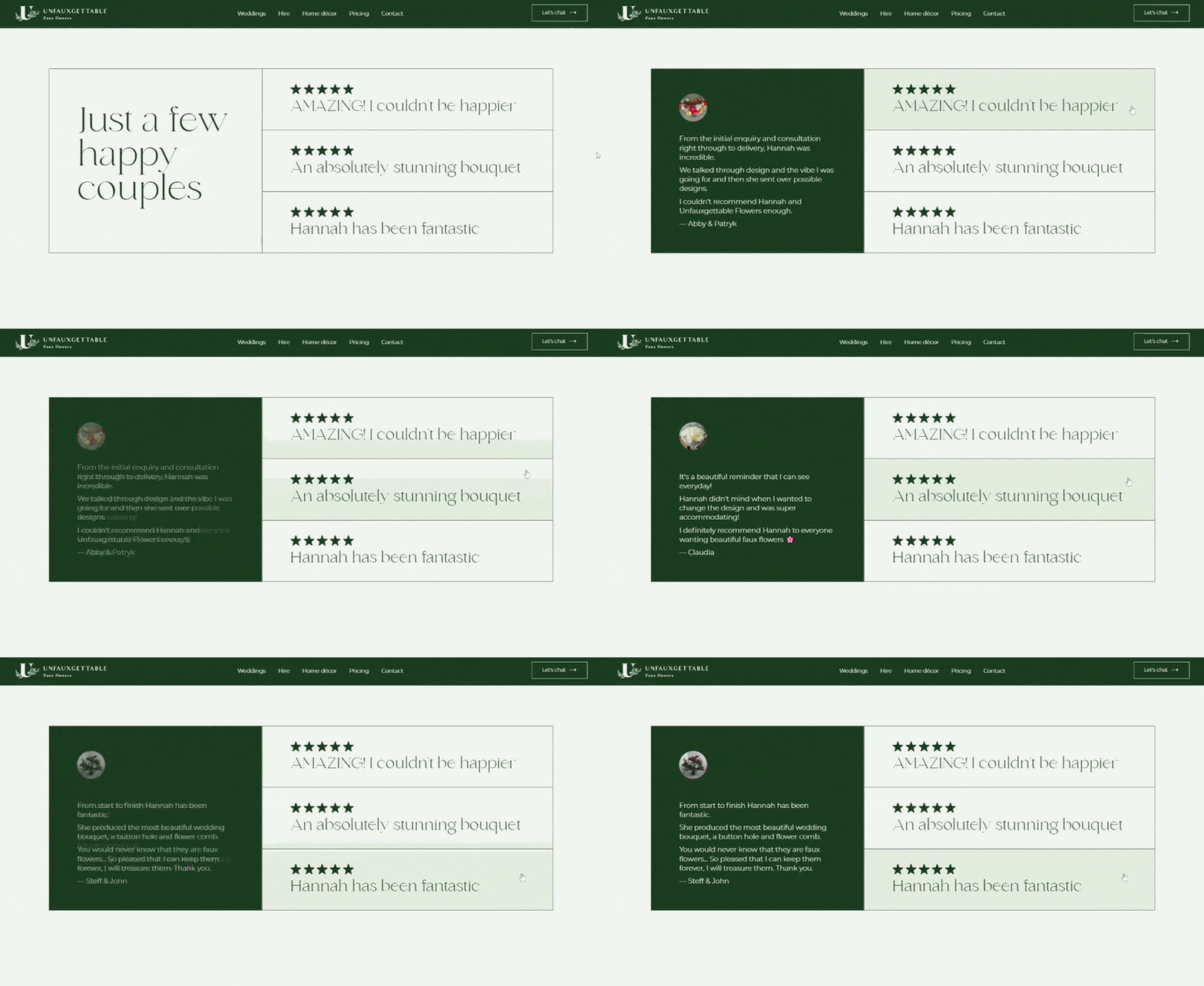
This is a review of your work and service written directly by the client. In fact, 70% of people trust reviews and recommendations from strangers. Aside from giving social proof, testimonials also back up your claims by breaking down exactly what you offer, and how it works. So, don’t hesitate to reach out to your previous clients and ask them for a testimonial you can include in your portfolio. After all, they enjoyed working with you and will gladly share their experience with other potential clients.
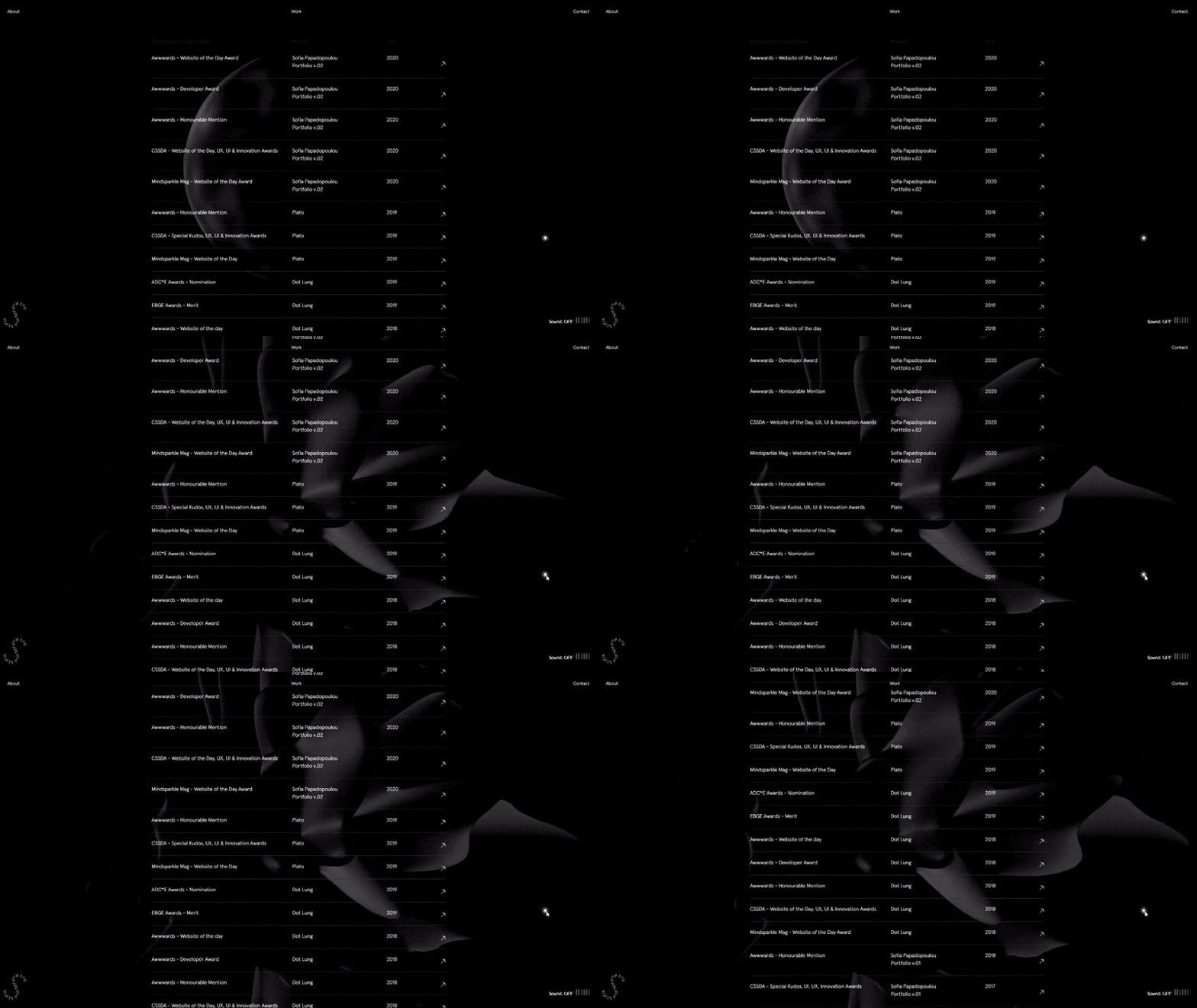
Interestingly enough, however, most portfolio websites skip the testimonial part and prefer to list awards and accomplishments instead. Not as effective, but it can still be persuasive.
6. Contacts
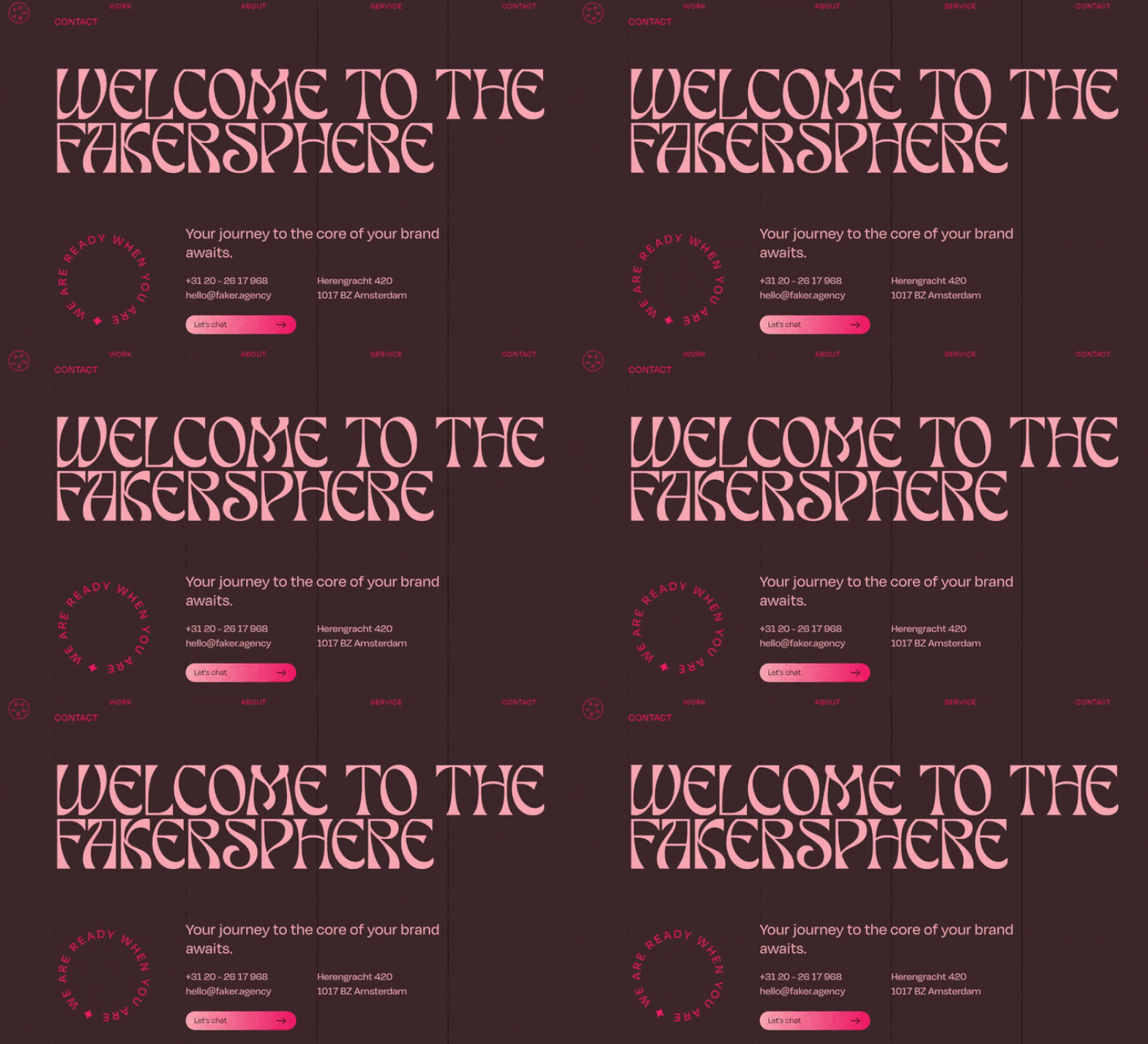
The Contact page is one of the most visited pages, so you need to make it easy to find at all times, functional, and contain the right information. Depending on your business, you will usually include phone numbers, working hours, response time, email address, social handles, and location.
Keep your Contact copy short by including only the essentials that will help your visitors contact you. Anything off-topic could distract them from the action you want them to take.
7. Other Portfolio Design Ideas
7.1. Clean Design
Make sure your design won’t stand in the way of your message. To do so, get rid of all the unnecessary elements that serve no other purpose, rather than decoration. Also try using more white space, simpler fonts, and good color contrast as a foundation for your design.
7.2. Easy Navigation
Your visitors should be able to navigate through your portfolio quickly and easily. If you choose to have a single-page website, make the structure intuitive so your visitors will know what follows (for example introduction, projects, about, contact). It’s even better if you include a navigation menu with anchor links so users could scroll to the specific sections they need.
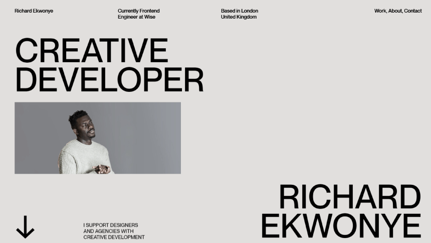
Richard Ekwonye’s portfolio website has both: the homepage can easily serve as a single-page website with all the essential info from introduction to contact. It’s well-structured and systemized. On the other hand, if you’d like to view the developer’s work in detail, read some personal info, or jump to contacts directly, the sticky navigation menu is easily accessible.
Final Words
There isn’t a blueprint for how you need to craft a winning portfolio website design, however, we hope that these successful examples inspired you with the creation of your own web portfolio.
In the meantime, why not take a look at the related articles to get some more inspiration or grab a couple of freebies:


