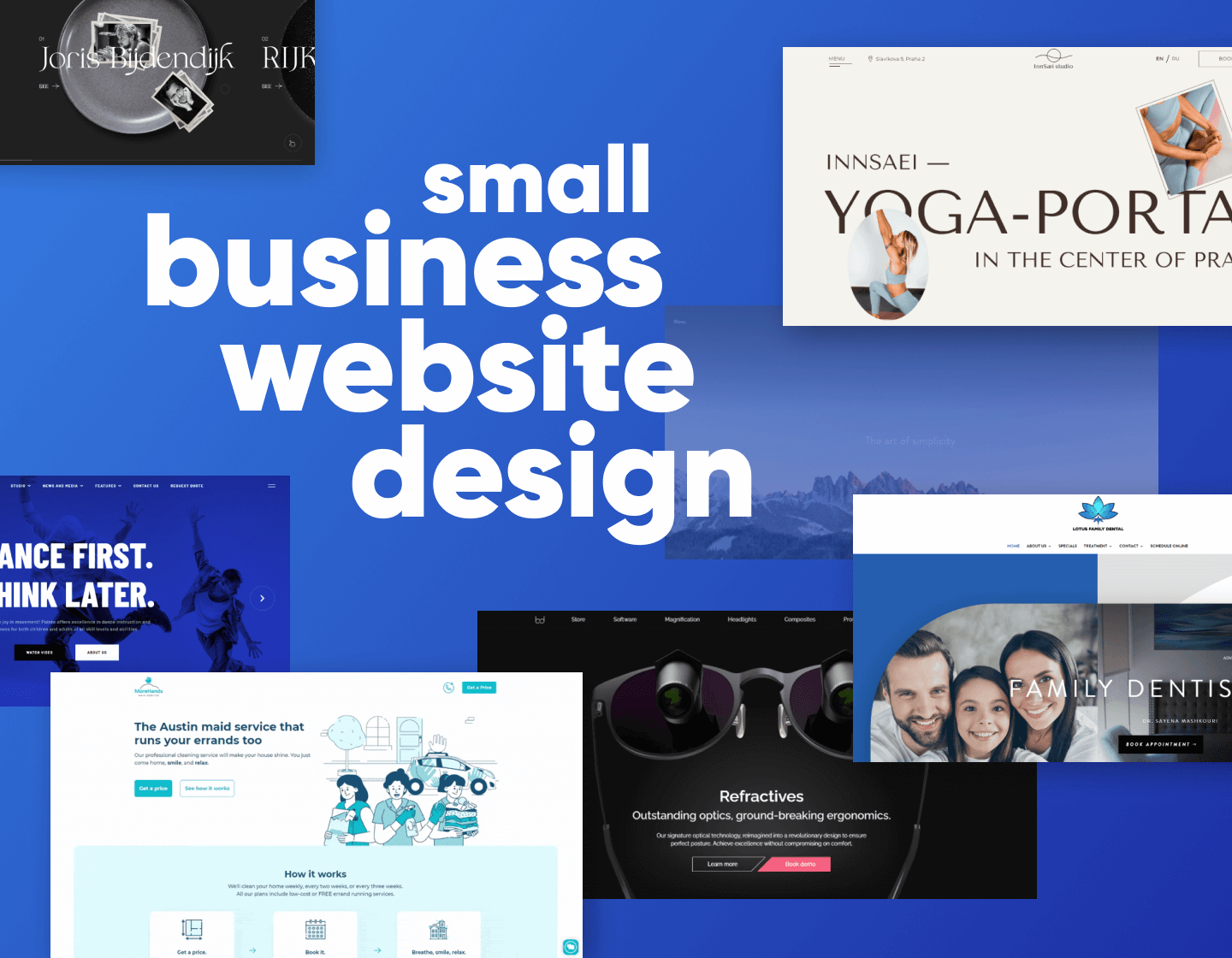
If you own a small business, your website plays a huge role in your success. Of course, not everyone is a web designer or has the budget to hire a digital studio for the creation of a top-notch business website. However, here’s the good news: you don’t need to. In fact, all it takes is to create a clean website with easy navigation; contacts that are accessible at all times; and of course tasteful visuals and well-written copy. This is why today we searched the web to find real-life small business website design examples that don’t go over the top with the visuals but stay focused, clean, and easy to navigate.
Small Business Website Design Examples:
- Law and Finance
- Sports, Gyms, Yoga Studios
- Medical Services
- Real Estate and Construction Companies
- Travel Agencies and Hotel Businesses
- Food and Restaurant Businesses
- Cleaning Services
- Other Examples
Hopefully, these 40 examples will inspire you to continue on your design journey with more ideas and excitement. Now let’s dive right into these small business websites.
Law and Finance Business Website Design Examples
We’ll start with local law firms and accounting services. What’s important about these websites is to feature phone contacts easy to access at all times, case studies for different services, and social proof. Since these websites are data-heavy and feature a lot of legal information, they must follow a more minimalistic design approach to keep the design clean.
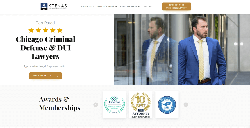
1. Ktenas Law: Chicago Criminal Defense and DUI Lawyers Business Website
This law firm starts right off with the social proof through a bold statement of aggressive legal representation above a series of awards and memberships. In addition, it uses a simple layout and is very easy to navigate through and find the service you’re looking for.
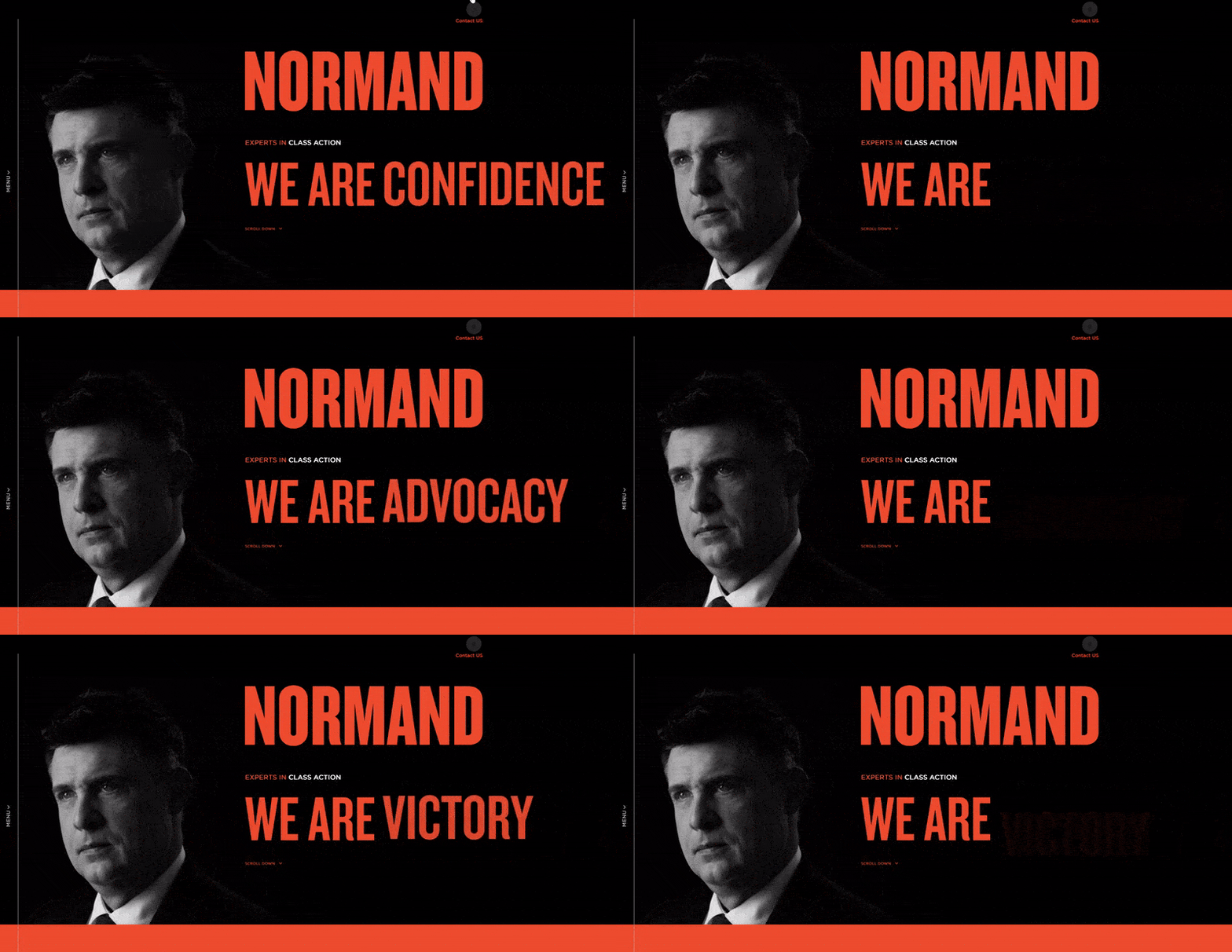
2. Normand: Class Action Services Business Website
Here we have a more professionally made website with micro-interactions and UI animations, however, this is not what makes it effective. The professionalism comes from the color scheme, clean design, well-organized content, and featuring detailed case studies that help the user take a glimpse at the class action expert’s work process.
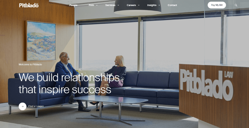
3. Pitblado: Banking and Finance Lawyer Services Business Website
This website’s homepage uses a simple layout with a hero image and listed values, services, and events. Very simple and effective with the minimum amount of micro animations.
4. Controva: Accounting Firm Business Website
Here we have a professionally-looking accounting website with a simple preloader that shows the firm’s logo. The homepage design itself is in macro style with big images and fonts, with a minimum copy. This makes the homepage very easy and fast to read before deciding which page to view next.
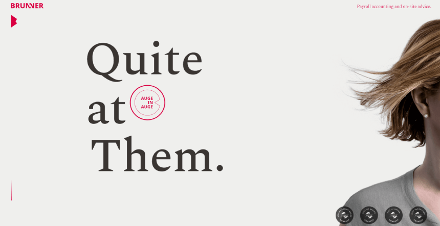
5. Brunner: Accounting Consultation Business Website
Another shorter page with big fonts and less copy. However, this homepage mixes horizontal and vertical scroll, enriching it with a smooth animation.
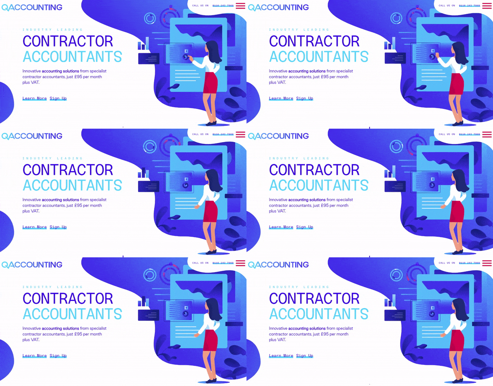
6. Qaccounting: Contractor Accountants Solutions Website
Here we have a small website with a very professionally made dynamic design, rich in animations. What’s more valuable about this design, however, is the brand-related illustrations in the firm’s signature color scheme. With that being said, even without the animations, the website has a memorable attractive design. It’s also well-structured with a lot of white space, making it easy to scan and find the section you’re looking for.
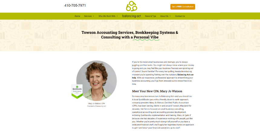
7. Towson: Accounting Services Bookkeeping Systems and Consulting
If you’re not into animations and giant hero images, you can also go with a tasteful old-school design just like in this case. Here we have a professional accountant page with a very simple design, focusing on the copy. In addition, the page is short, well-organized, and features a contact form at the bottom.
Sports Business Websites: Dance Groups, Gyms
Another popular field for small businesses is owning a gym, a sports club, a dance academy, or promoting your skills as a coach. These websites require more visuals, such as images and video materials with a sneak peek at the lessons, programs, and equipment. featuring free sample programs is also always a big plus.
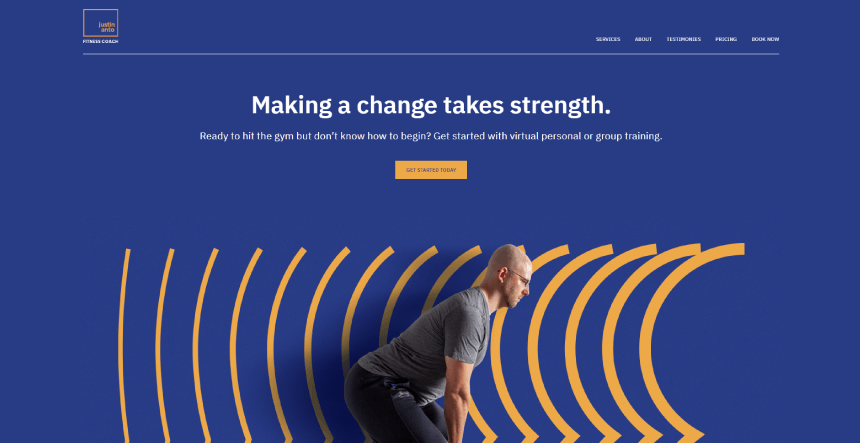
8. Justin Anto Fitness Gym Coach Website
This small website has everything users could be interested in, right on the homepage. It offers a professional design, classic sports color scheme in dark blue and orange, and separated sections for introduction, program, prices, and a contact form.
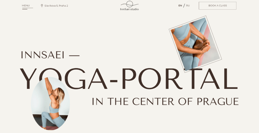
9. InnSaei Yoga Studio Business Website
When it comes to yoga, the design usually offers an atmosphere with images communicating serenity, a clean color scheme, and a lot of white space. In addition, this yoga website features nice animations on scroll, programs, and schedules.
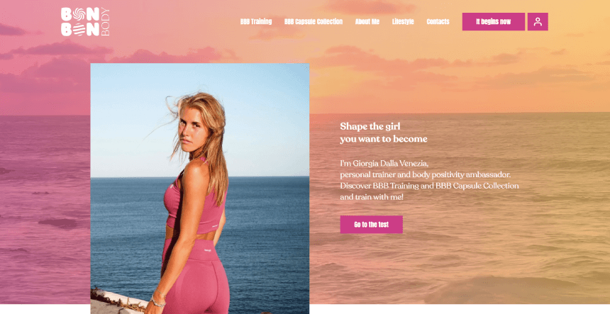
10. Bon Bon Body Lifestyle Coach Website
This website focuses the entire design, brand, and presentation on the personal coach, their values, and philosophy. It looks way more personal and builds trust.
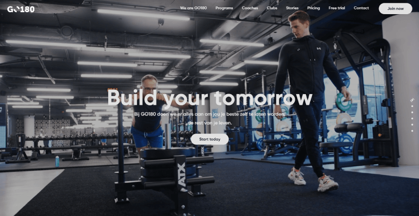
11. Go 180: Healthy Lifestyle Fitness Coaches Website
The next example is anything but a small website. Its entire homepage serves as an introduction to Go 180’s concept to get users in the zone. It uses strong slogans such as “At GO180 we do everything we can to help you become your best self for the rest of your life”.
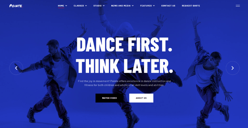
12. Pointe: Dance Studio and Instructors Website
And last, a dance academy dynamic website that communicates movement with colors and images. The homepage serves as an introduction to the academy, programs, and the teachers.
Small Medical Services Business Websites
When it comes to the medical field, it’s essential to present yourself with a professional-looking website. Most medical websites keep the design clean, with simple minimal color schemes and appointment scheduling options accessible at all times.
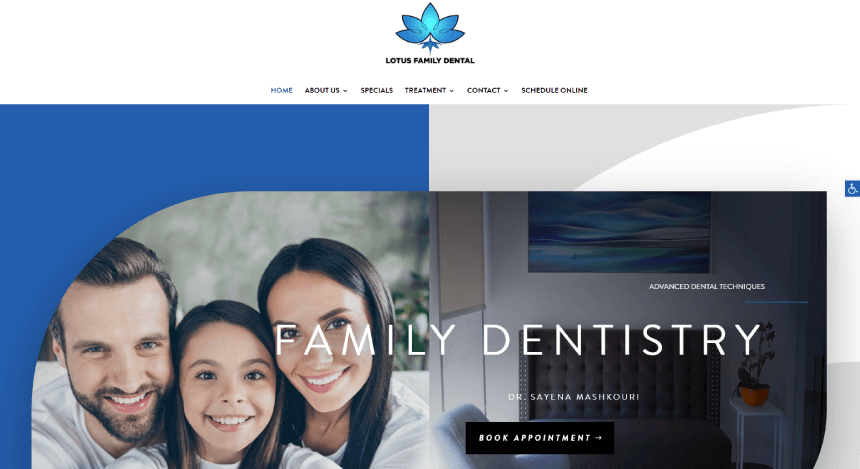
13. Lotus Family Dental: Dental Services Website
Family Dentistry has a clean modern design with animation on scroll. It features real Google reviews from customers and a well-made easy-to-locate fill form to book an appointment at the bottom.
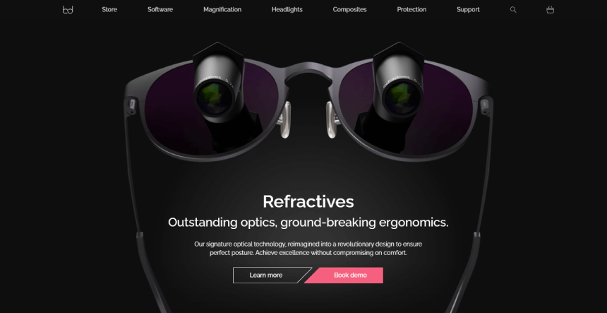
14. Bryant Dental: Dentistry Technology Business Website
Bryant Dental was created by dentists to solve problems they themselves had faced, by using technology to overcome these problems in unprecedented ways. With a very high-tech professional website, it gives a memorable experience for every user.
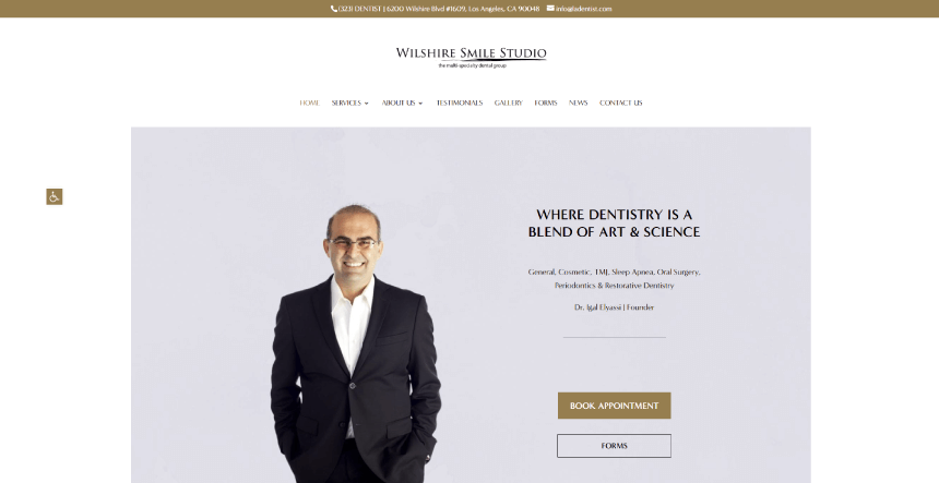
15. Wilshire Small Studio: Dental Local Services Website Design
The last example shows you don’t need to go overboard with animations and visuals in order to have a professional website to be proud of. This is the professional website of a dental studio with a personal touch, great structure, and simplicity that feels like a breath of fresh air.
Real Estate and Architecture Agencies Websites
This is where you can ditch the clean design and get more creative with the visuals. Real Estate and Architecture websites do need to look professional, but they also have to convey an atmosphere that will attract their future clients. They communicate lifestyle rather than just sell houses and apartments, this is why they focus on the final product and what the client’s life could be if they choose the particular services.
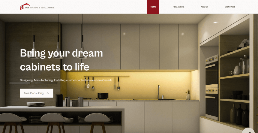
16. DSP Kitchens and Installations Business Website
Here we have a small business website example for kitchen installations. In fact, it does things right by focusing on images and aesthetics rather than the copy. After all, pictures of the final result speak louder than any written promise.
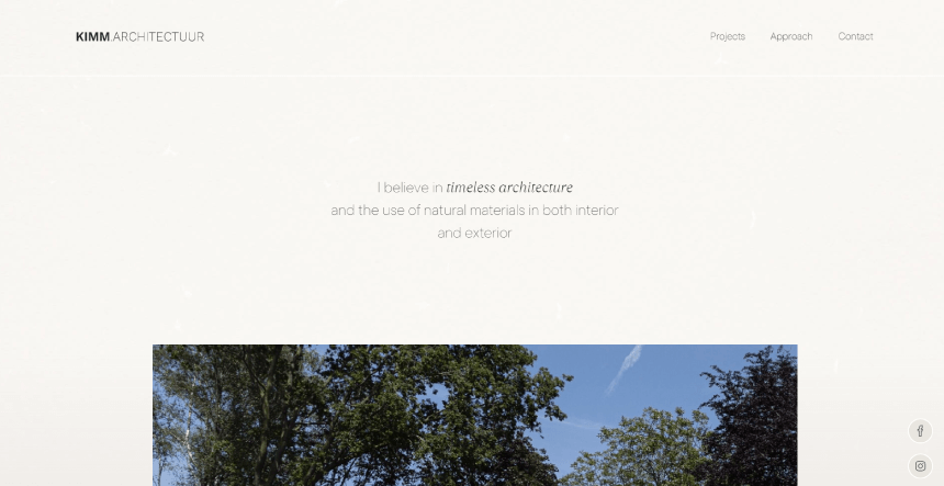
17. Kimm Architectuur: Construction Company Website
The next website belongs to an architecture design studio. It has a simple natural design and the promise of building structures you can call home.
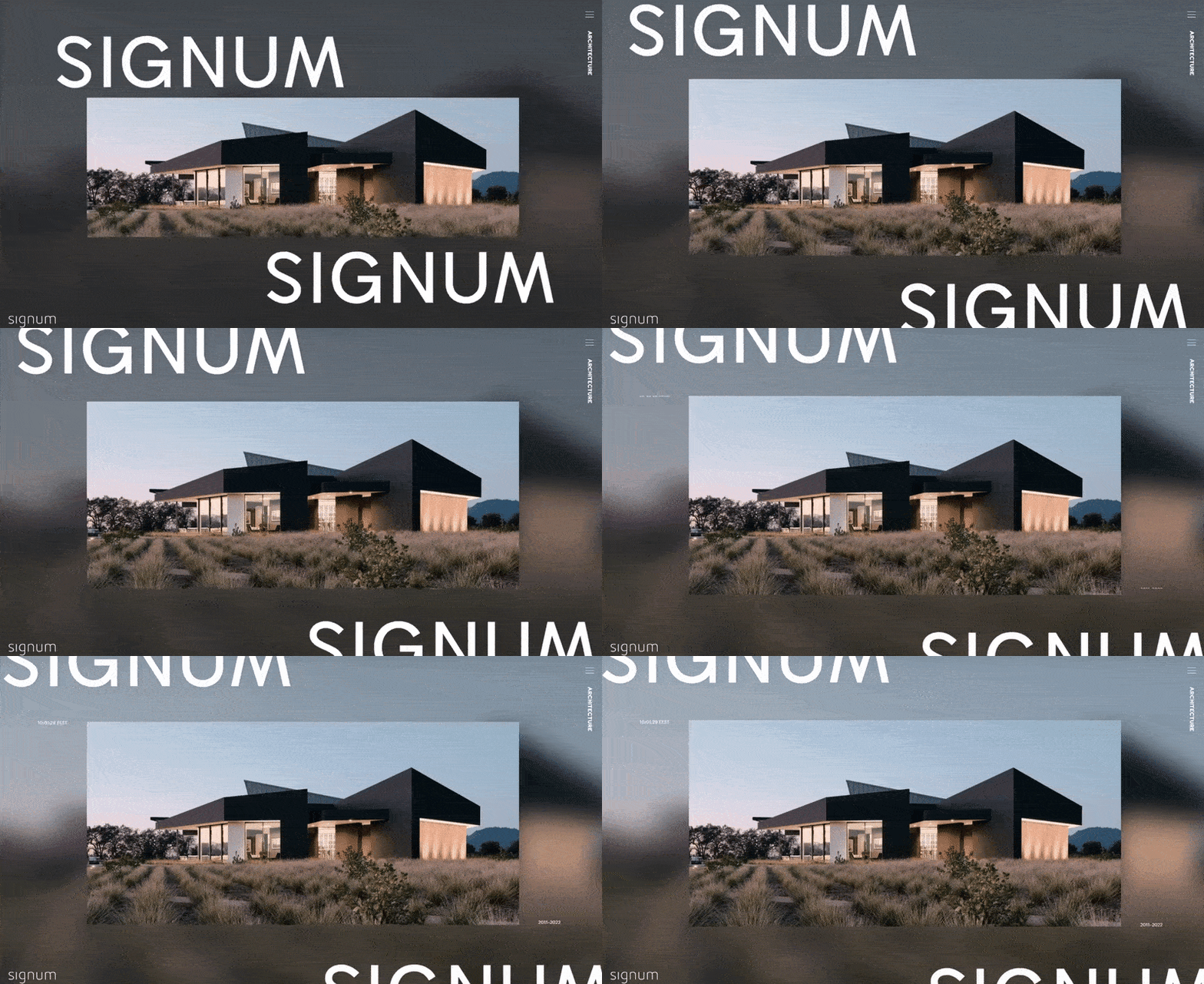
18. Signum: Construction Architecture Studio Website
Gimmicks can be very important for any brand. In this case, the architecture design studio uses a blueprint style design.
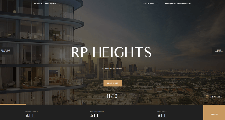
19. Richland Dubai Real Estate: Real Estate Business Website Design
This Dubai-based real estate agency makes a great presentation on its homepage. There is no scrolling, just a full-screen slider with all the perks you can get and a CTA button to redirect you on the respective page.
Travel Agencies and Hotel Business Websites
Similar to architecture studios and real estate agencies, travel agencies and hotels also need to sell experience. Most travel agencies and accommodation websites use visuals to communicate style, vibe, feeling, and even a dream.
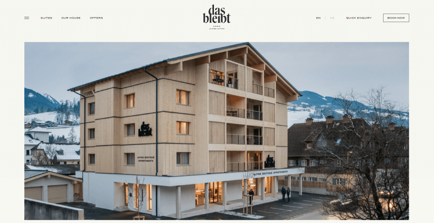
20. Das Bleibt: Mountain Hotel Housing Business Website
This website serves not only as a presentation for the hotel and its cozy rooms and restaurant but also for the experience it promises. It shows different activities for the customers during each season.
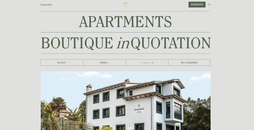
21. Fuente Real: Nature Beach House Accommodation Rental Hotel Website
Fuente Real’s website has a more artsy design approach, ideal to communicate the aesthetics of such a boutique art hotel. The animations are also minimal and tasteful, only present in the parallax effect of the background hand-drawn elements.
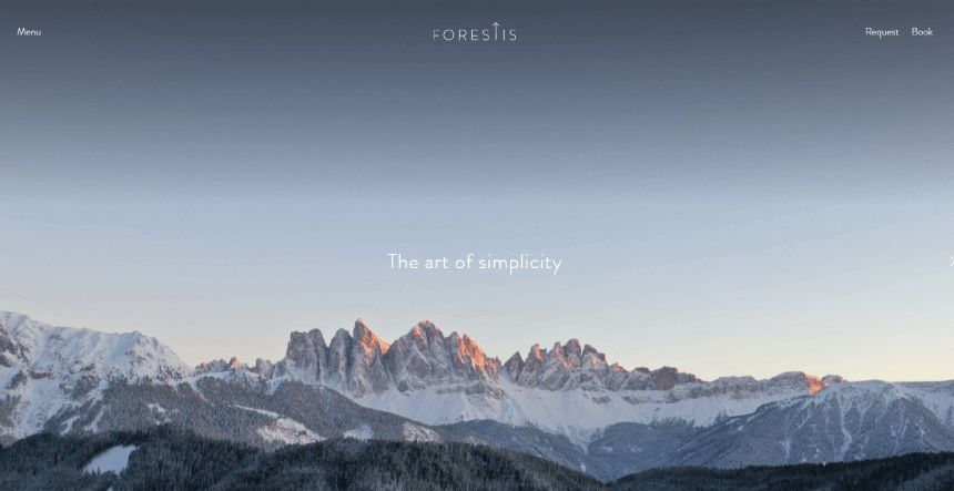
22. Forestis: Forest Nature Accommodation Resort Hotels
As a resort that focuses on the art of simplicity, it capitalizes on that idea with a beautiful minimalist website.
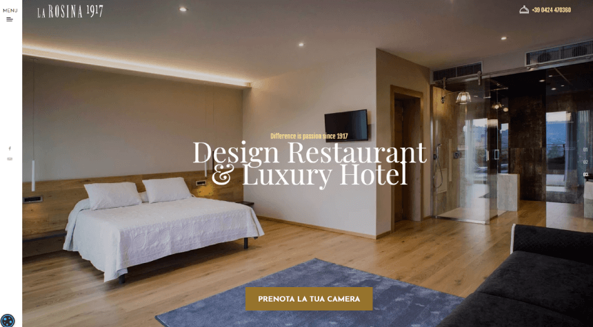
23. La Rosina: Luxury Hotel and Design Restaurant Website
Next, we have a website that belongs to a luxury hotel and restaurant with professional artsy design. It has an expandable sidebar sticky menu you can access at all times and navigate through the website easily.
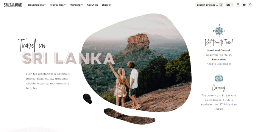
24. Salt in Our Hair: Travel Agency Destinations Website
In contrast to the formal professional minimalistic designs in the previous examples, here we have a more casual hand-drawn scrapbook design that gives the feel of an adventurer’s journal.
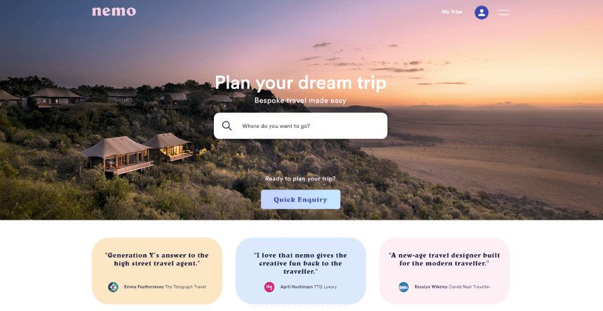
25. Nemo Travel: Booking Travel and Accommodation Services Website
Short and simple design in card layout that uses destination tags for easy navigation.
Food and Restaurants Business Websites
No matter if you own a small local restaurant or sell food and beverages, your goal is to make users ‘ mouths water. The easiest way to do that is through high-quality photos of your food. Another proven approach is to focus on the experience itself and present your restaurant as the place for friends to gather and have a good time.
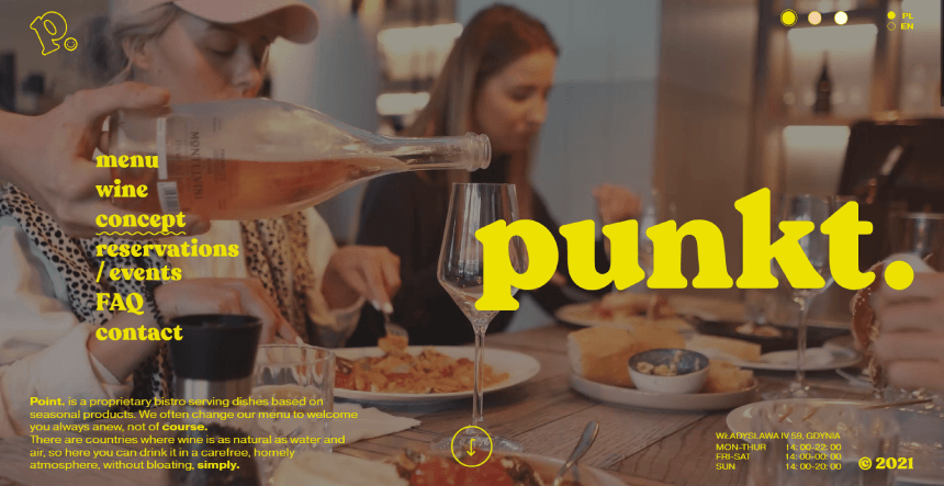
26. Punkt: Seasonal Food and Wine Bistro Website
Background videos are always great for restaurant websites to get users in the mood for a dinner out. It instantly communicates the aesthetics of the restaurant, the food it offers, and how perfect it is to socialize there with your loved ones.
27. Flesh & Buns: Japanese Cuisine Restaurant Website
When it comes to Japanese cuisine, the designers here went deep with the Tokyo aesthetics, with dark red colors, manga sketches, and glowing neon signs.
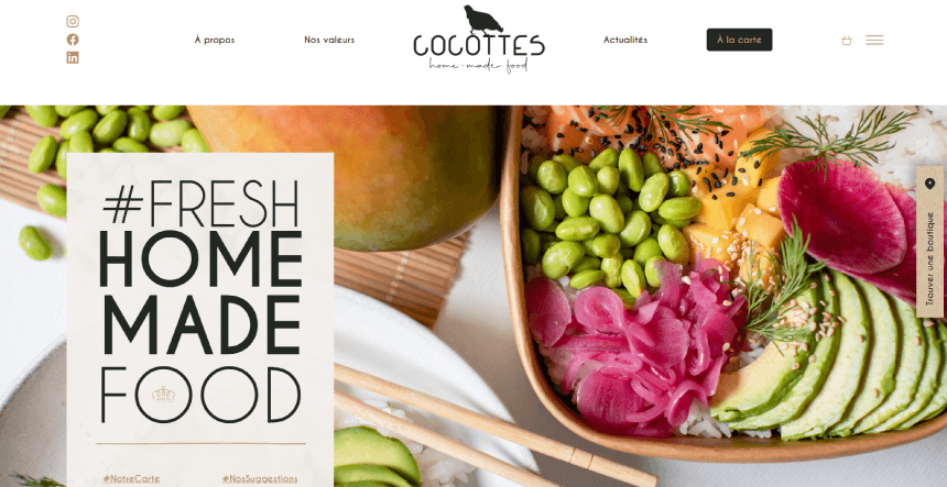
28. Cocottes: Food Restaurant Bakery and Catering Website
A clean website with natural colors and great presentation. As this business promotes an eco-responsible approach and fresh local seasonal ingredients, this translates well with the color scheme and the layout of the website.
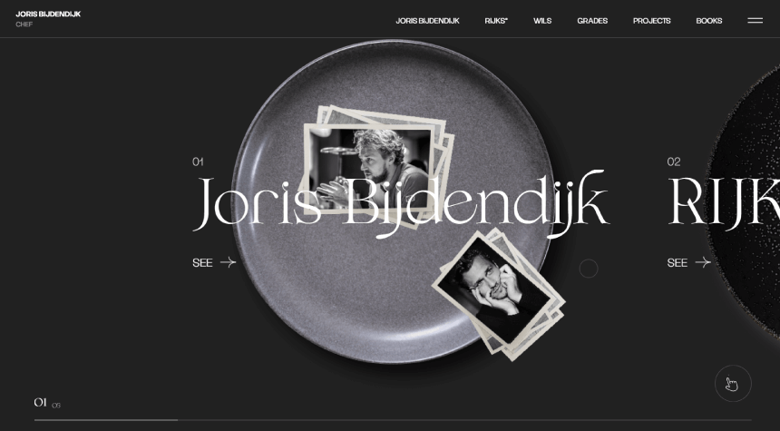
29. Chef Joris Bijdendijk Personal Website
The personal website of a chef with horizontal scrolling. Its entire homepage serves as menu navigation.
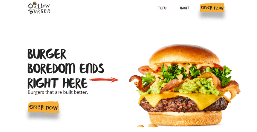
30. Outlaw Burger: Bistro and BBQ Website
Another way to design your website is through product photography. In this case, you can see the tasty burgers all over the page as design elements.
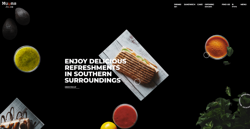
31. Muums Juice: Organic Food Website
Similar to the previous example, this website also uses product photos as design elements, animated on scroll.
Cleaning Services Websites
Good cleaning services websites should be attractive and tidy as the places they promise to clean. Also, they usually keep their content well-organized and feature detailed quotes and social proof to build trust with future clients.
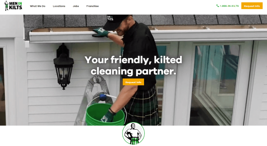
32. Men in Kilts: Interior and Exterior Cleaning and Pressure Washing Website
The most important part of your design is your message. Then, how about a legendary gimmick such as a cleaning crew in kilts. Quite memorable.
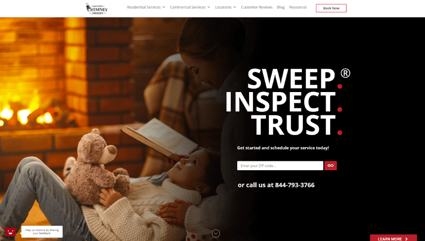
33. Midtown Chimney Sweeps: Residential Sweeping Dryer Vent Cleaning Chimney Repair Website
Residential cleaning services website with cozy hero image and simple layout.
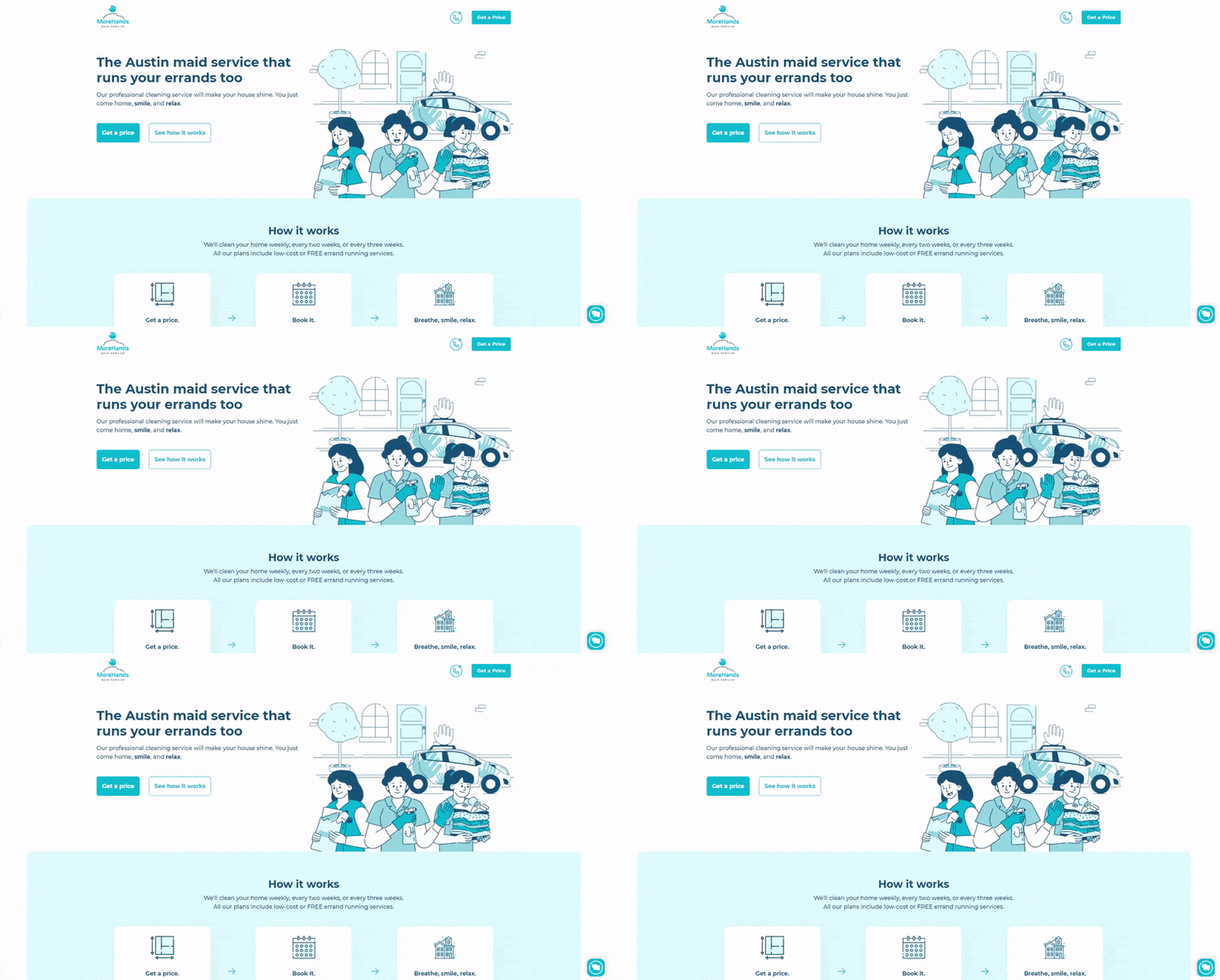
34. More Hands: Maid Services Small Business Website
In contrast to the previous examples, this cleaning services business features simple cartoon animations rather than photography.
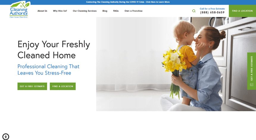
35. Cleaning Authority: Cleaning and Sanitizing Services Website
The last example shows a data-heavy website with easy navigation and a very clean design.
Other Small Business Website Design Examples
In our last section, we featured other small business website design examples to show what different services focus on when planning their presentation. We included websites for logistics services, equipment rental, flower shops, and more.
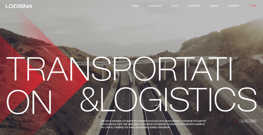
36. LODISNA: Transport and Logistics Business Website
We continue with a more complex logistics and transport website design that offers a very interactive experience with scroll animations and high-tech visuals.
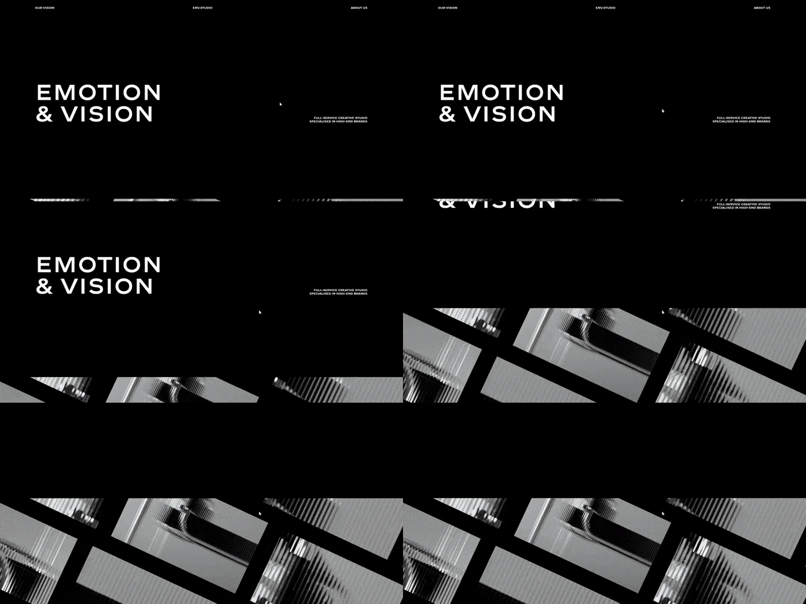
37. ENV Studio: Digital Creative Studio Portfolio Website
Creative studios offer design and web development services. This means they are obliged to show off their skills on their website. In this case, ENV Studio shows professional design, smooth animations, and a more complex layout.
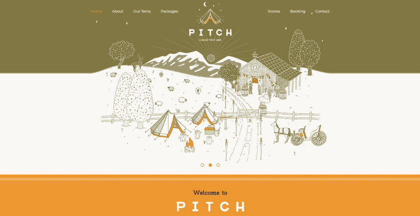
38. Pitch: Bell Tent Hire Camp Equipment for Parties Business Website
Pitch offers camp equipment for festivals with a lovely atmospheric website with fitting illustrations.
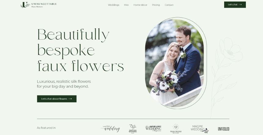
39. Unfauxgettable: Luxury Realistic Silk Flowers Seller Business Website
Unfauxgettable arranges and sells faux flowers for events. In fact, they mostly target wedding events, the website focuses on wedding aesthetics in terms of colors, fonts and images.
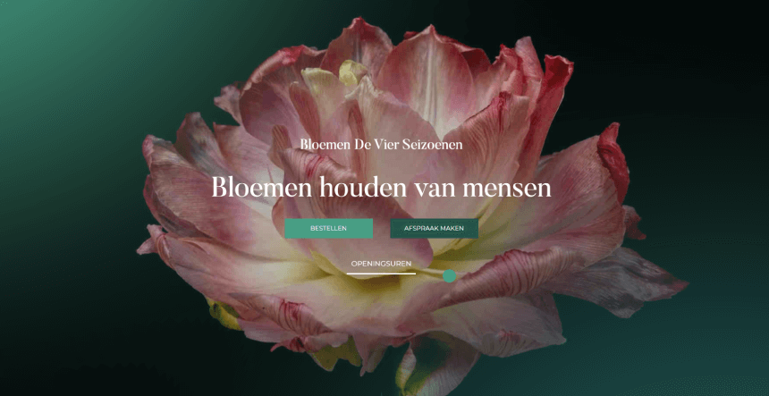
40. Bloemen De Vier Seizoenen: Bouquets for Events Small Business Website
The last small business website design example offers an interactive experience with beautiful animations and layouts.
Final Words
Although sometimes a challenge for small and local businesses, designing a website is always fun and exciting. We hope you have already come up with a huge list of ideas that will help you focus on what makes you special.
In the meantime, you can also grab more freebies, get more inspiration, or dive into some really good design tips and insights:


