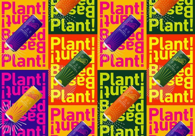
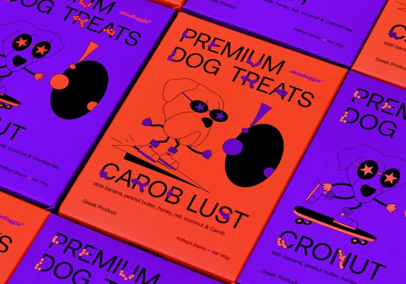
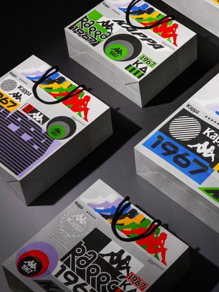
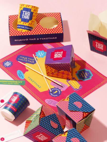
The world of graphic design is a wild race for attention. While everyone wants to stand out from the crowd, some styles still pop in popularity more than others. In this post, we’ll go through the most modern graphic design trends that leave their mark in all fields of graphic design – web design, ad design, branding, product design and packaging, and more.
We’ve outlined 12 extremely modern, popular, and current trends that are making history in graphic design, as we speak.
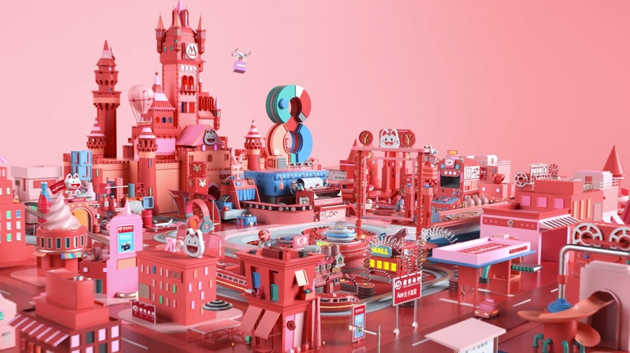
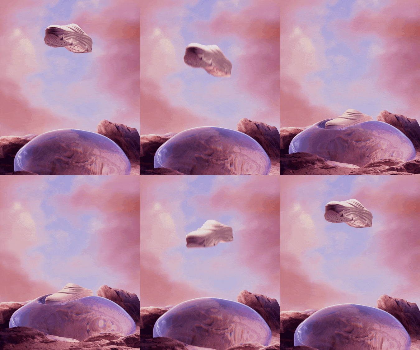
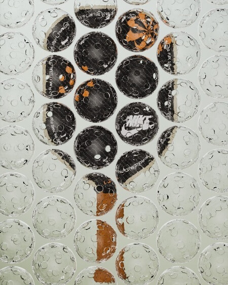
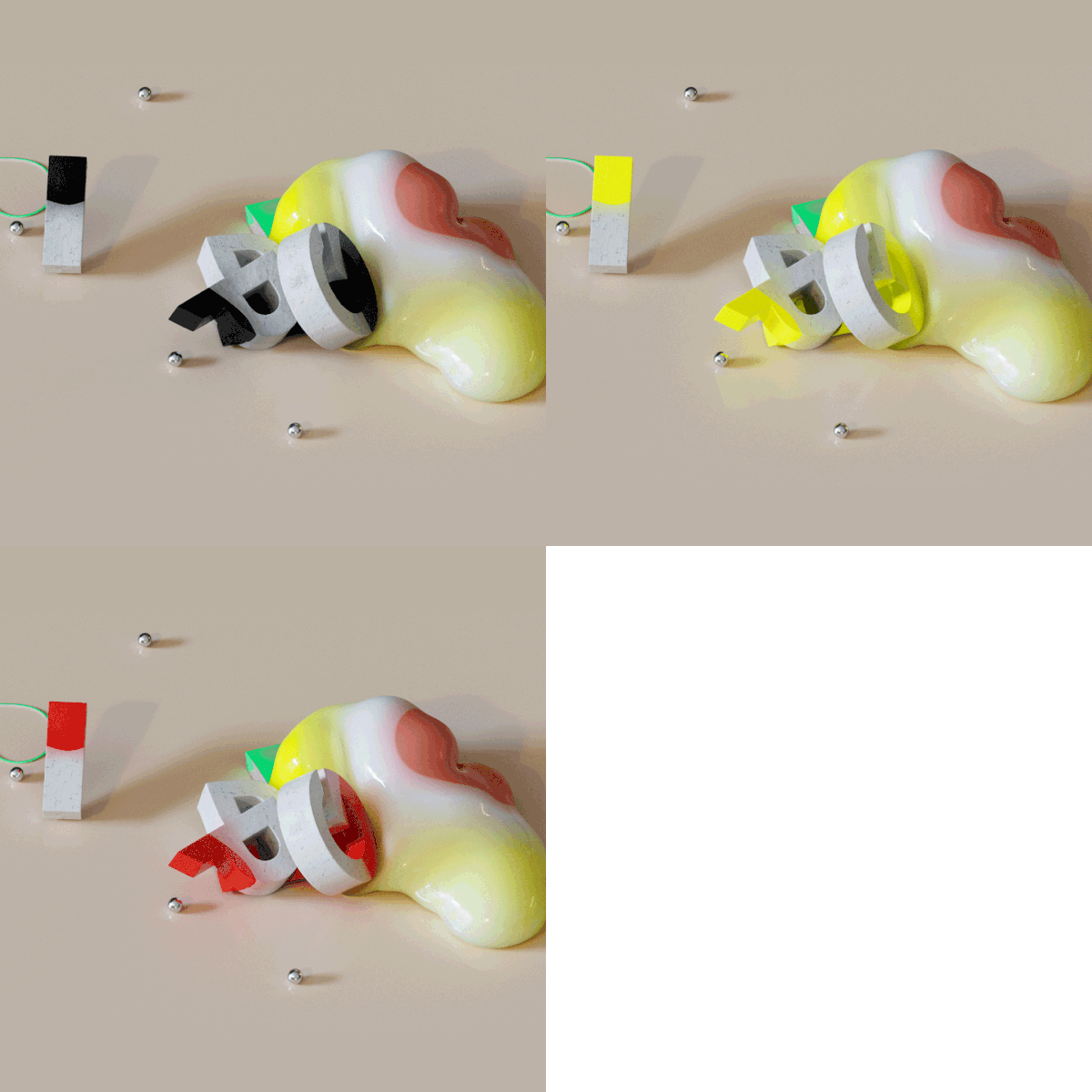
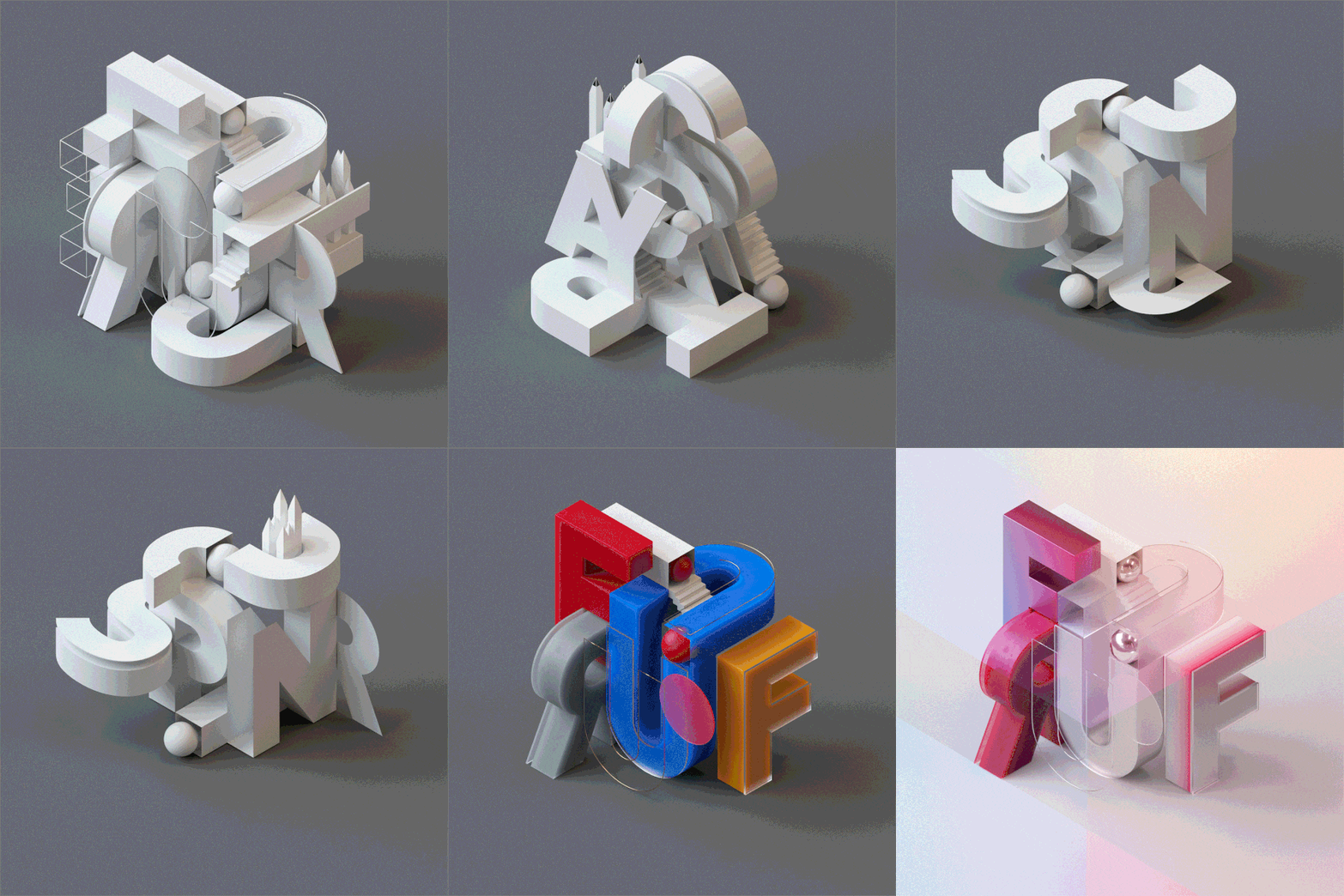
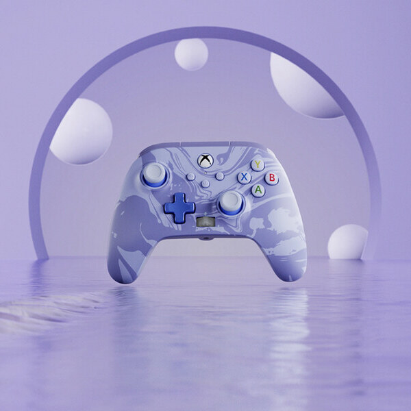
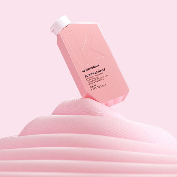
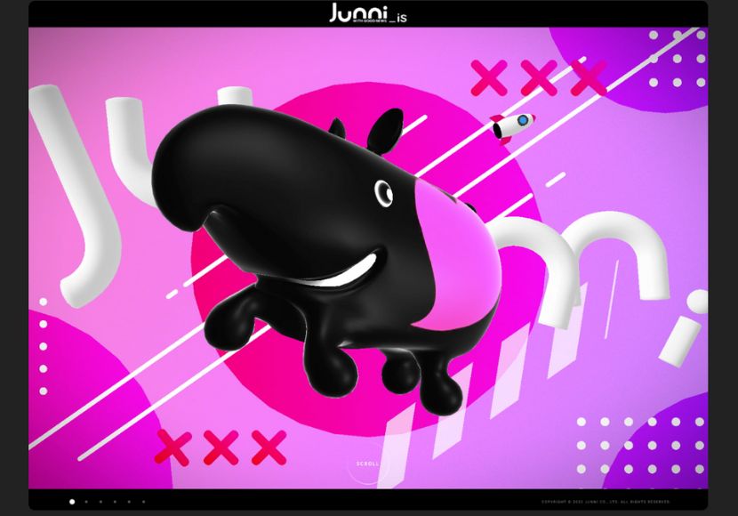
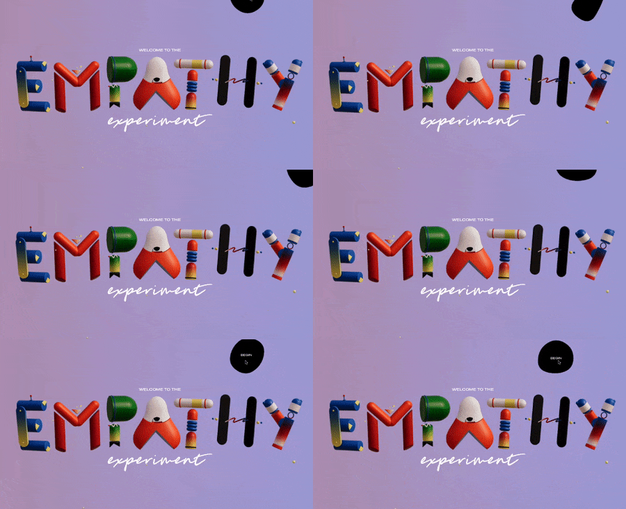
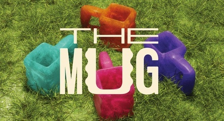
1. 3D Graphic Design
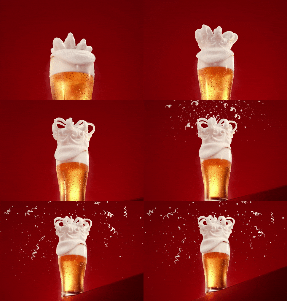
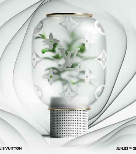
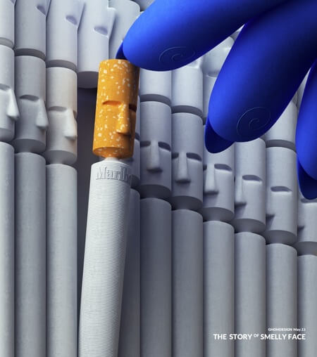
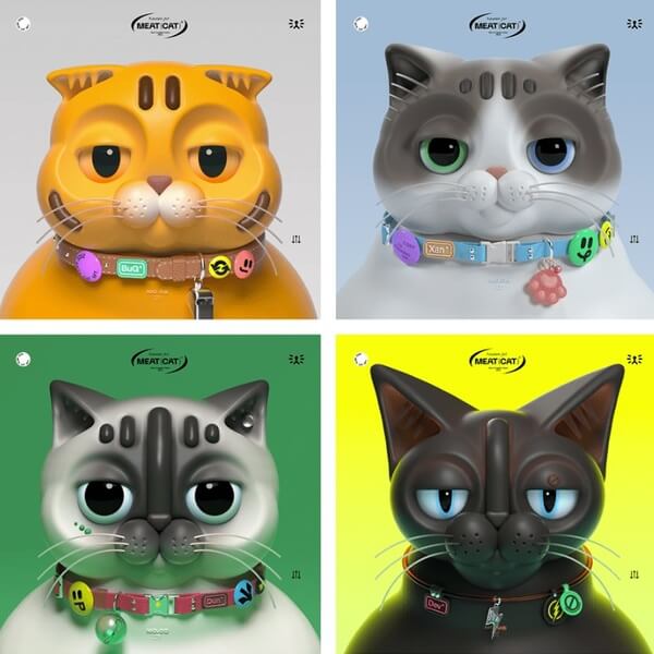
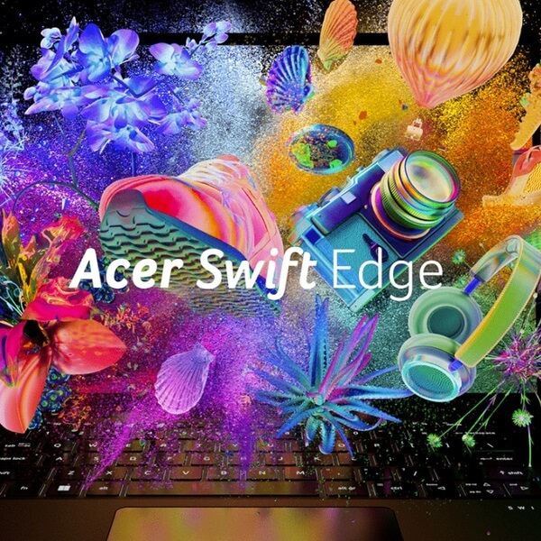
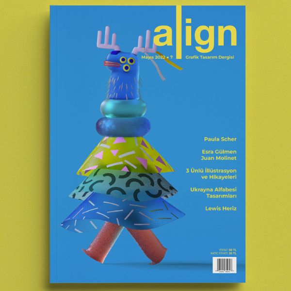
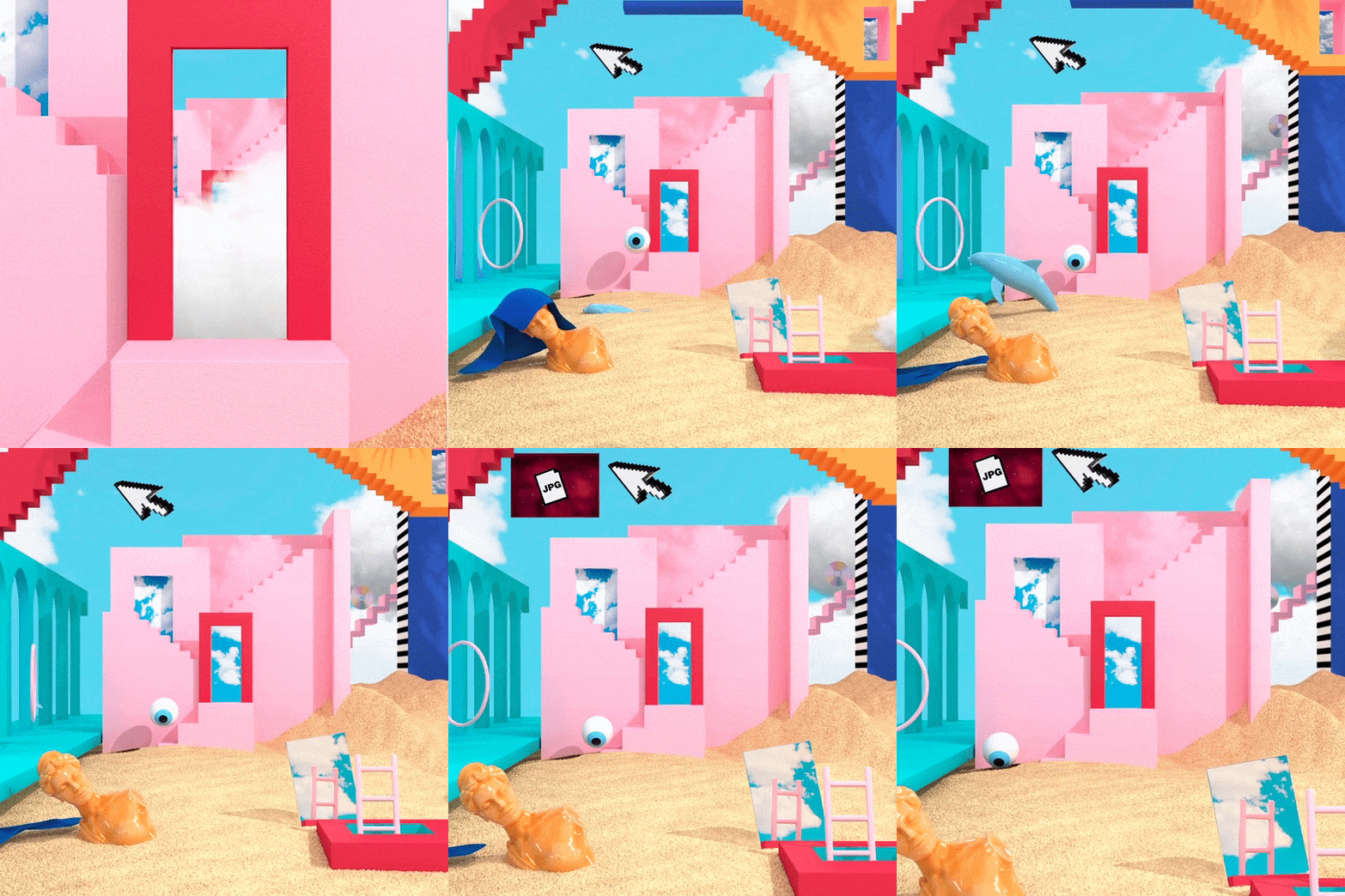
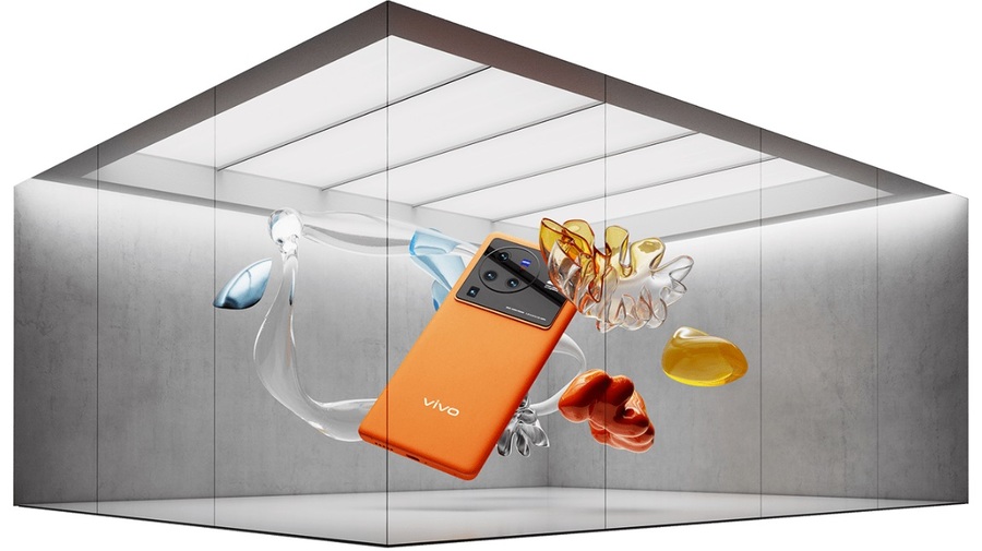
It’s only natural that the latest advancements in technology are influencing the way designers make art. While 3D graphic design is a style that carries a futuristic vibe, designers will keep on using it to make the viewer immerse in an alternative digital reality. For sure, using a 3D technique is among the most engaging graphic design trends, so this style will undoubtedly keep on evolving in the years to come.
Example by multiple owners
Example by multiple owners
Example by Dillon Hutchins
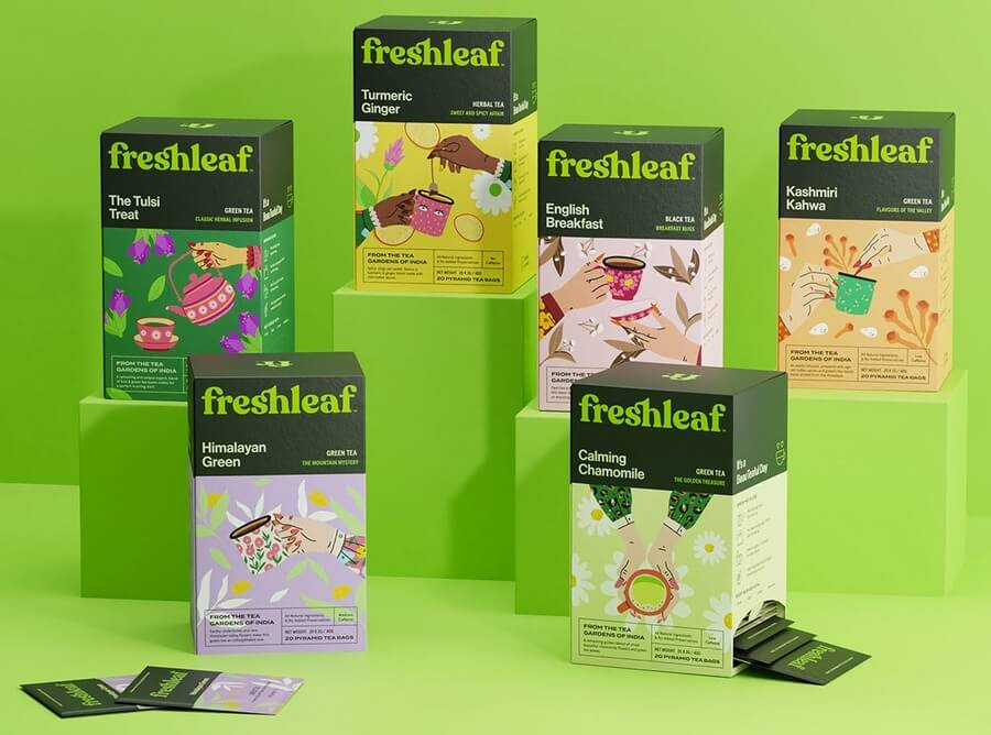
Example by Simone Nucci
Example by Simone Nucci
Example by multiple owners
Example by Bark & Bite
Example by Donerzozo
Example by PULSE Ltd.
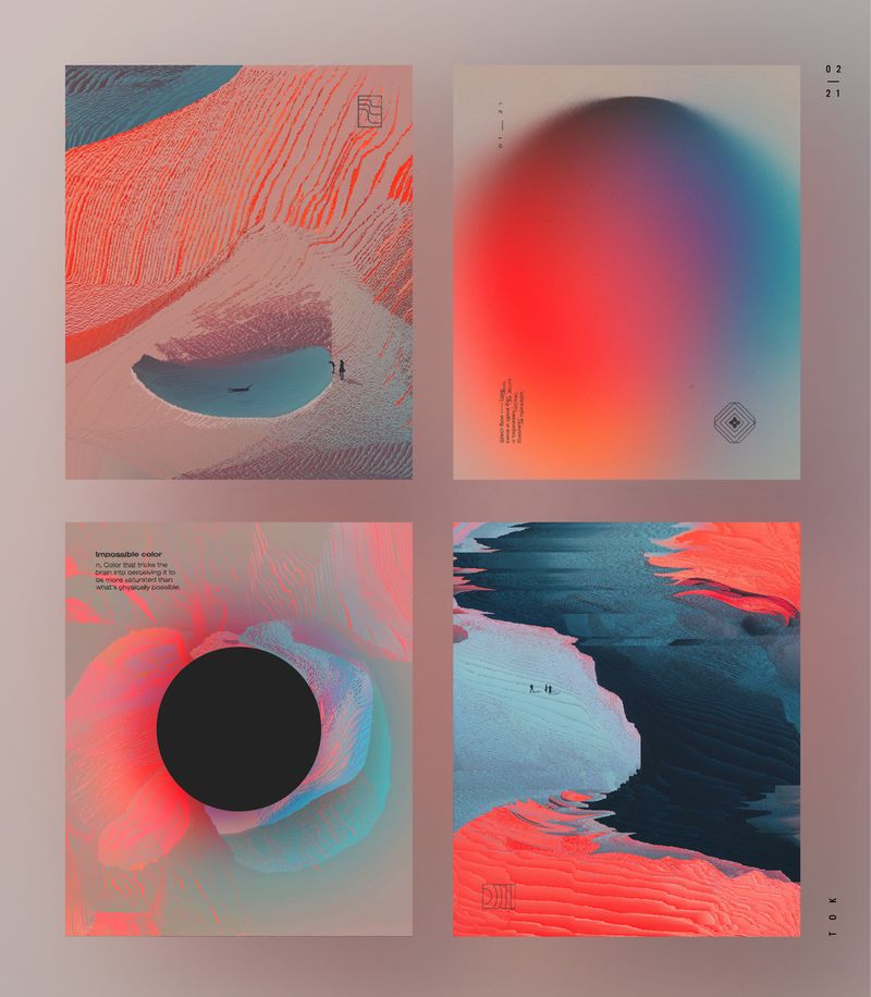
Example by oğuzhan topcu
Example by Noelia Lozano STUDIO
Example by Microsoft
Example by MNFST studio
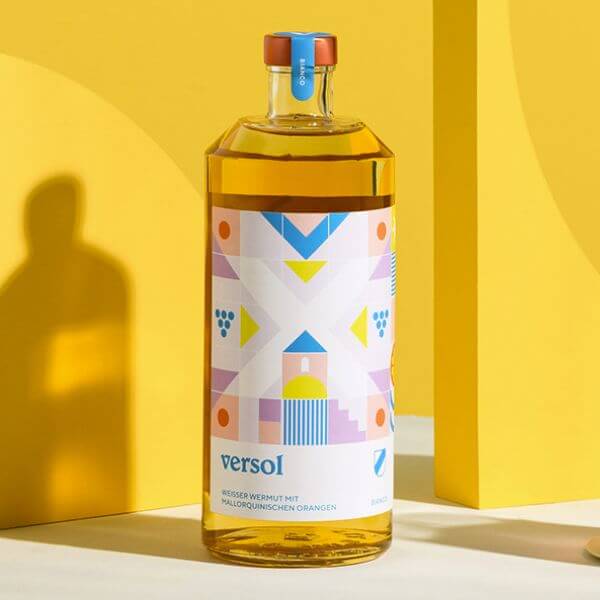
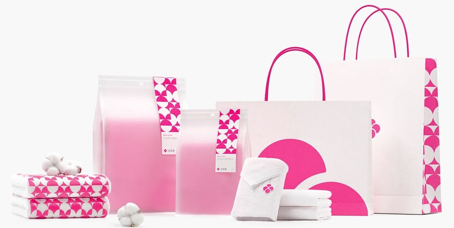
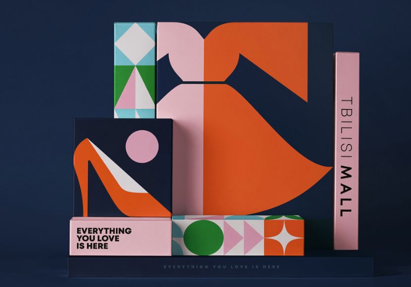
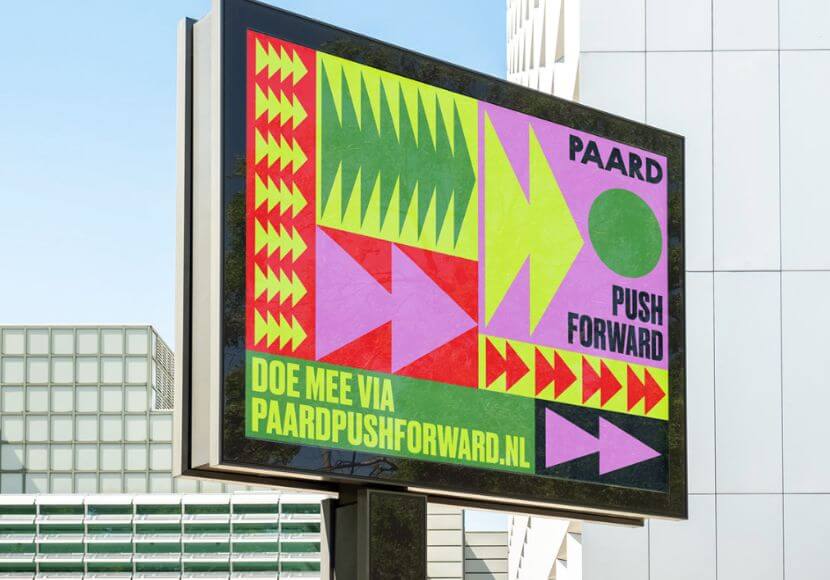
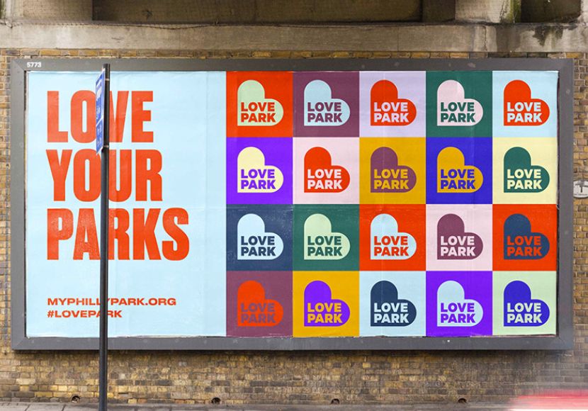
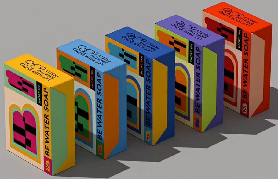
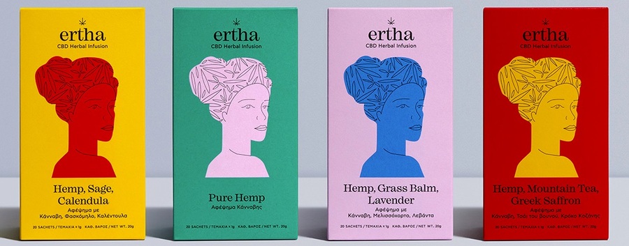
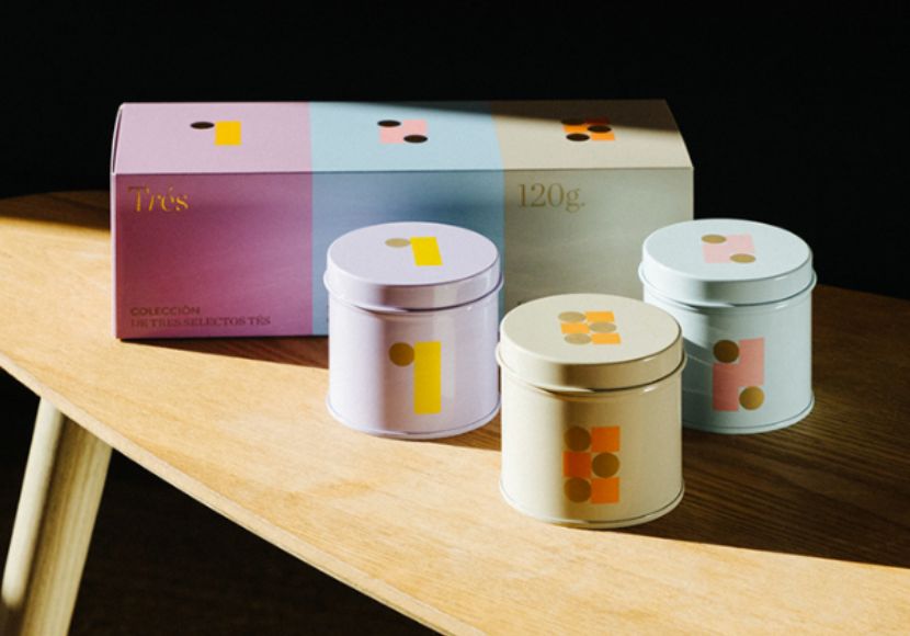
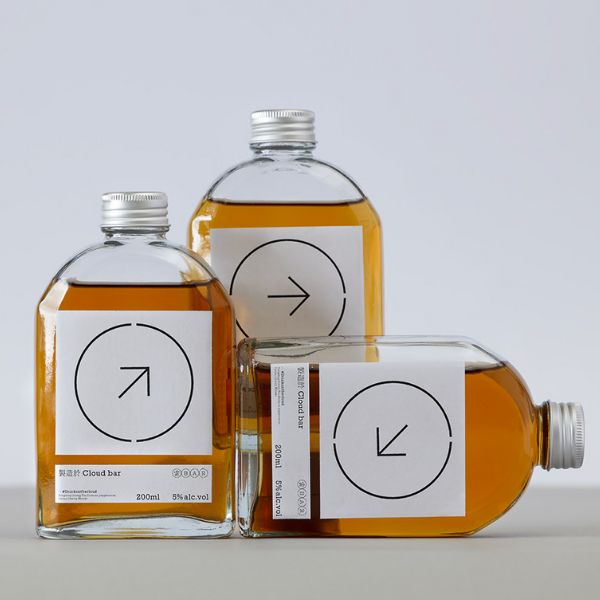
2. Basic Geometry in Graphic Design
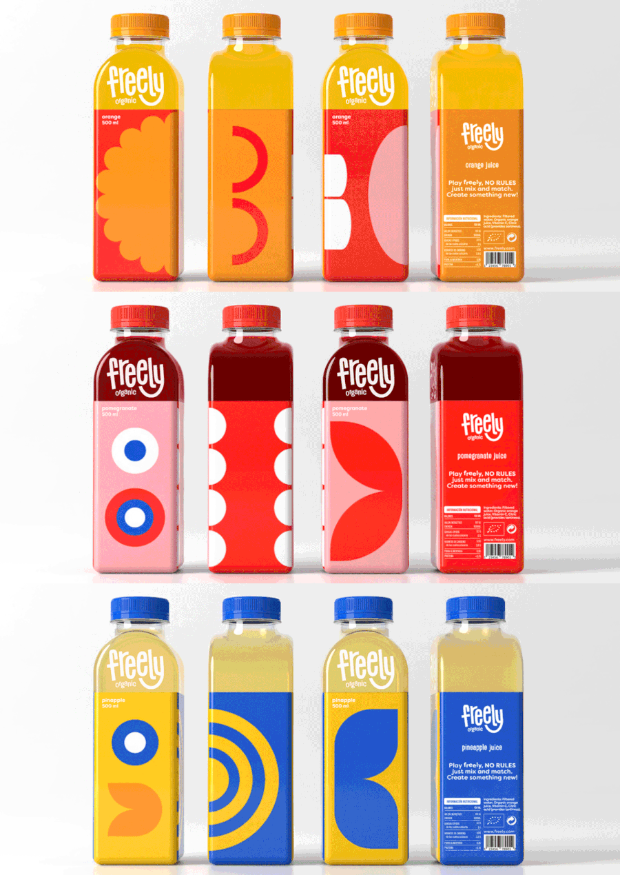
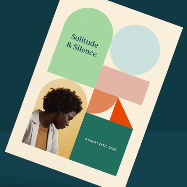
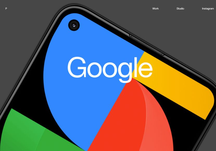
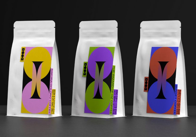
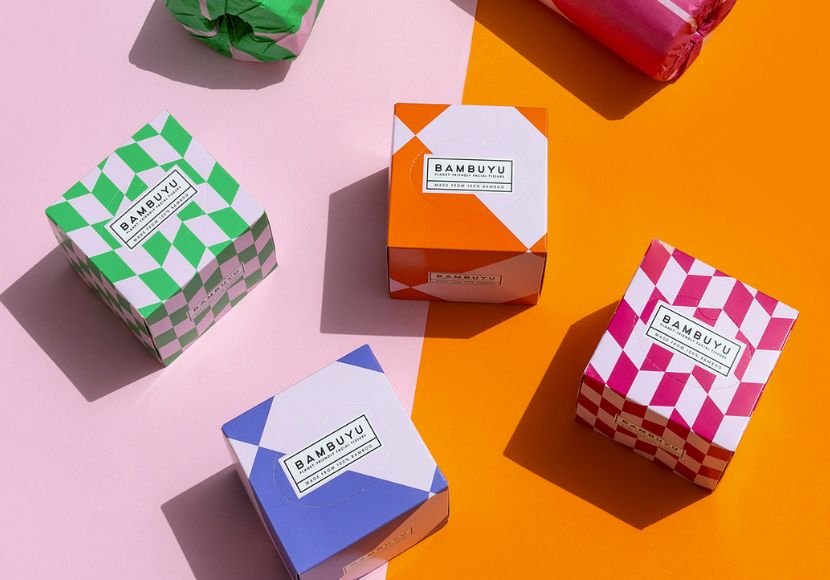
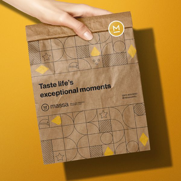
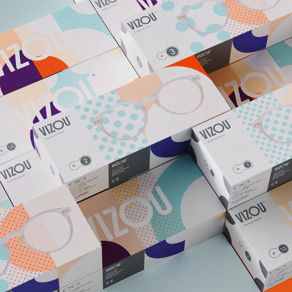
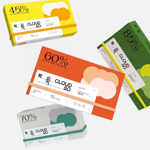
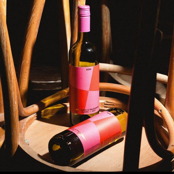
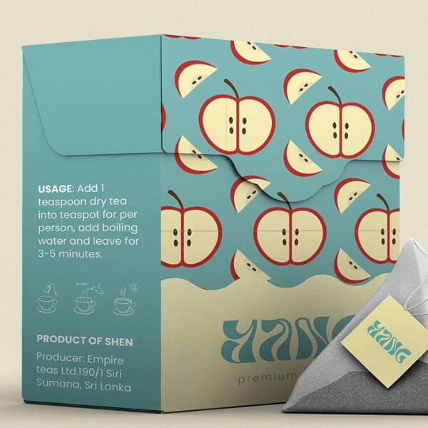
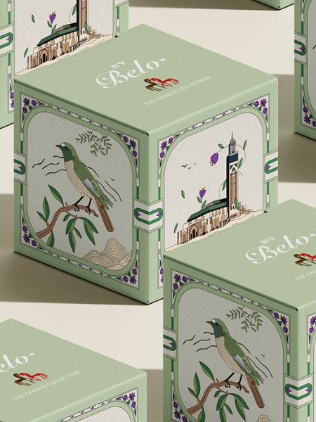
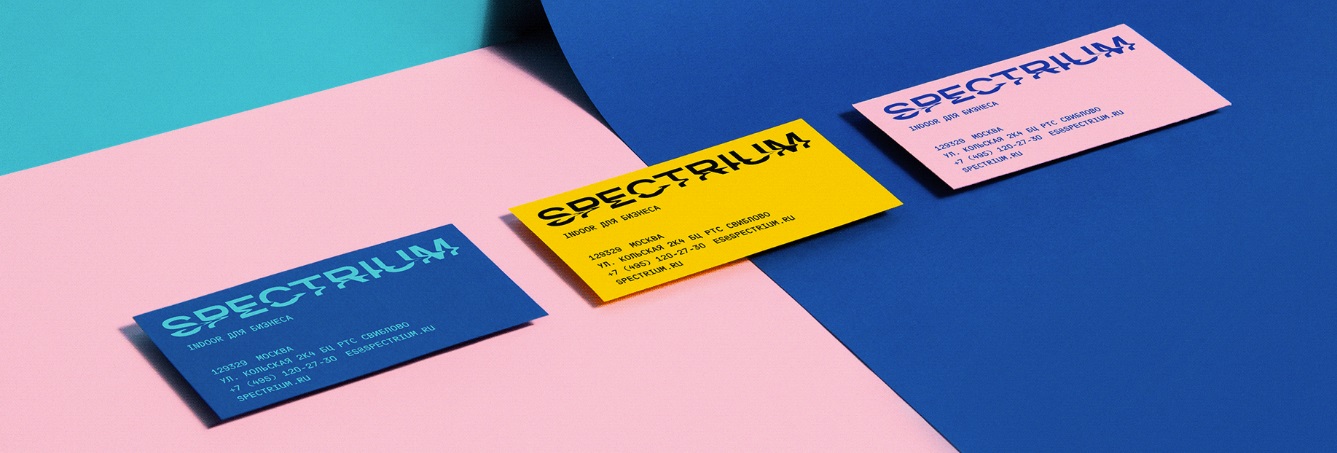
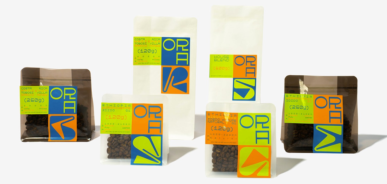
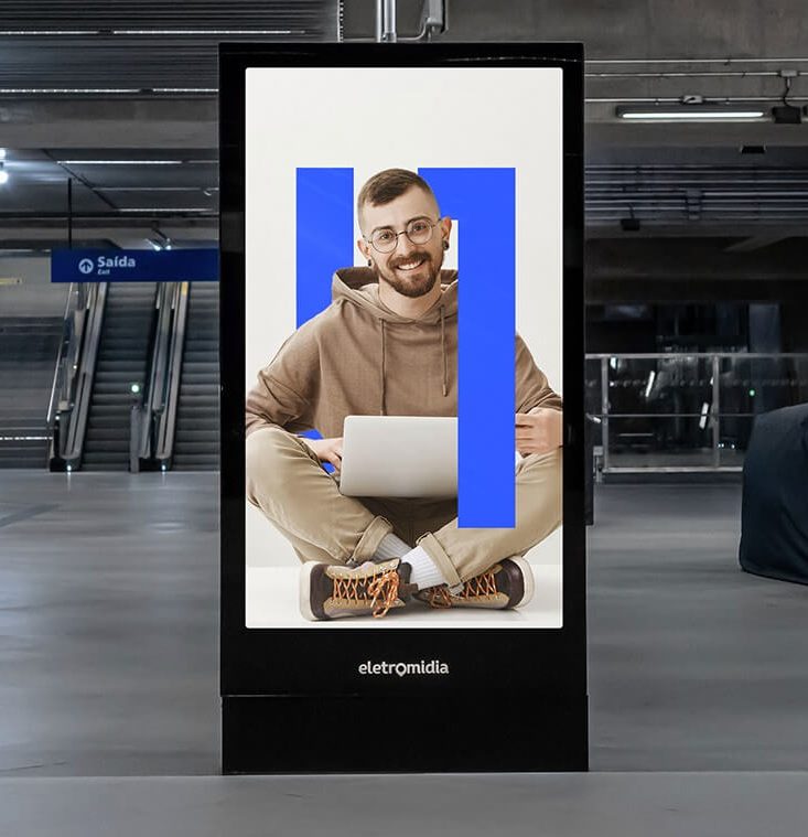
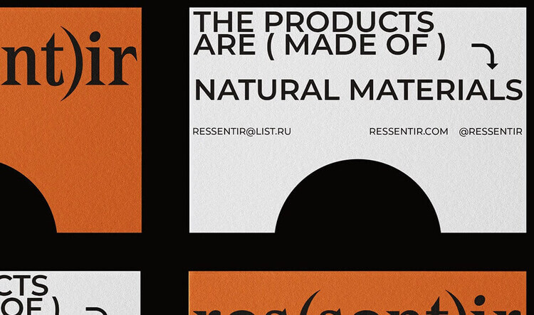
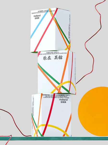
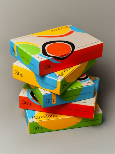
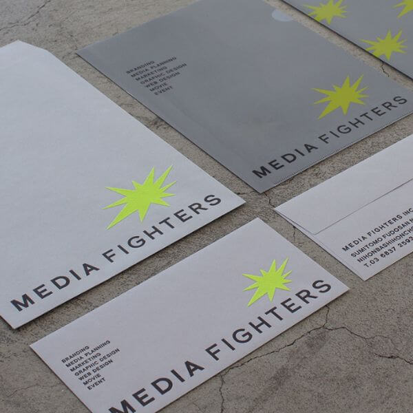
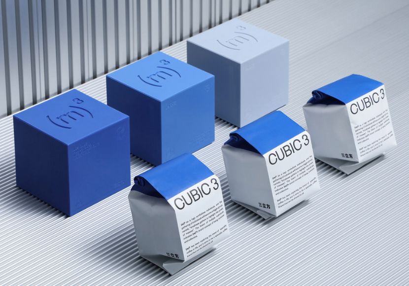
Going back to the roots of all – the basic shapes that form everything we know, looks incredibly modern and attractive right now. Simplifying the design to basic geometric shapes like circles, rectangles, and lines, and using color blocking is a huge hit in the world of graphic design.
Example by multiple owners
Example by Polina Zagumenova
Example by Kelsen Findlay
Example by Antinomy Studio
Example by multiple owners
Example by Ostecx Créative
Example by PG Brand Reforming
Example by Studio Chapeaux
Example by Mateus Sato
Example by multiple owners
Example by multiple owners
Example by ROUND 3 DESIGN
Example by Requena Office
Example by Studio Chapeaux
Example by RONG Design
Example by multiple owners
Example by Studio Lennarts & De Bruijn
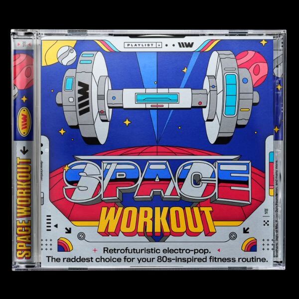
3. Retro Illustrations & Fonts
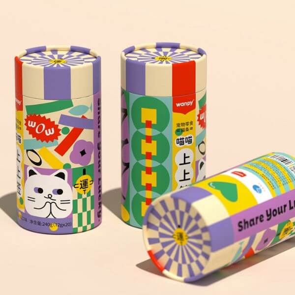
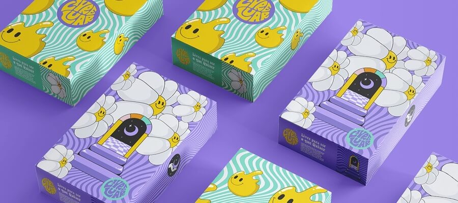
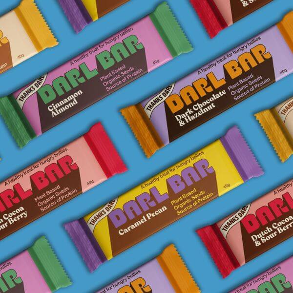
Inspiration that comes from the 70s & 80s to enrich the modern design with bold colors and classic illustrations with black thin outlining. Typefaces are rounded, thick, artistic, and often accompanied by long shadows or presented in a simple flat style.
Example by Juão
Example by Jo Cutri Studio
Example by NOUR
Example by advanced team
Example by Antonay
Example by Gulshan Mirzayeva
Example by Requena Office
Example by Fuman Studio
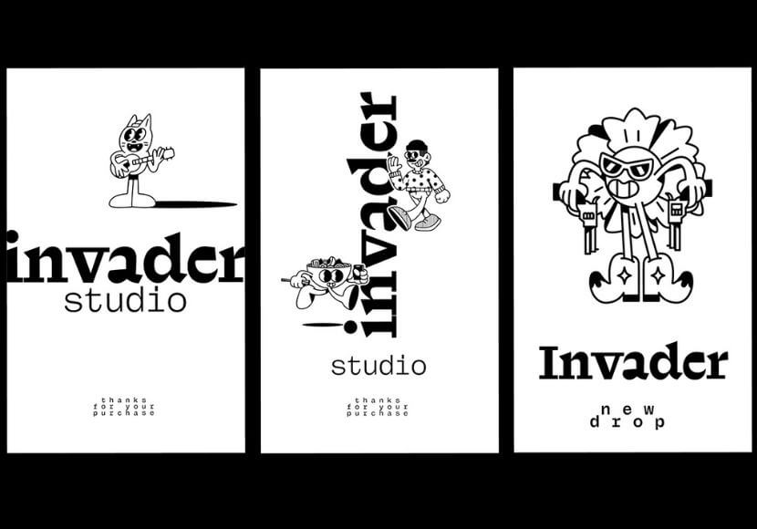
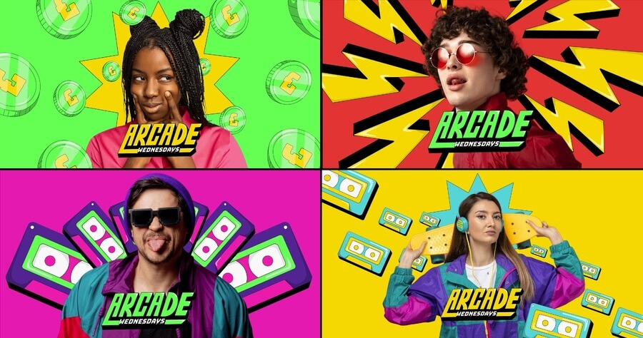
And some designs are even inspired by retro video games, presenting characters, details, and illustrations, all drawn in energizing electric colors that radiate joy and nostalgia.
Example by Mailchimp
Example by multiple owners
Example by Juão
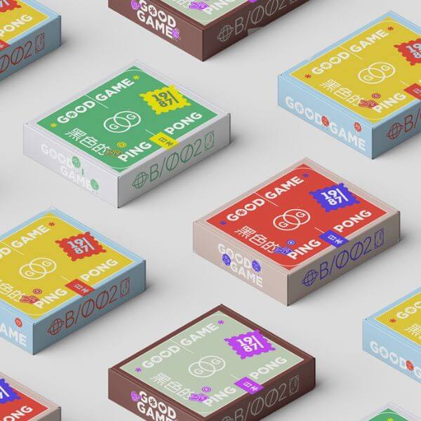
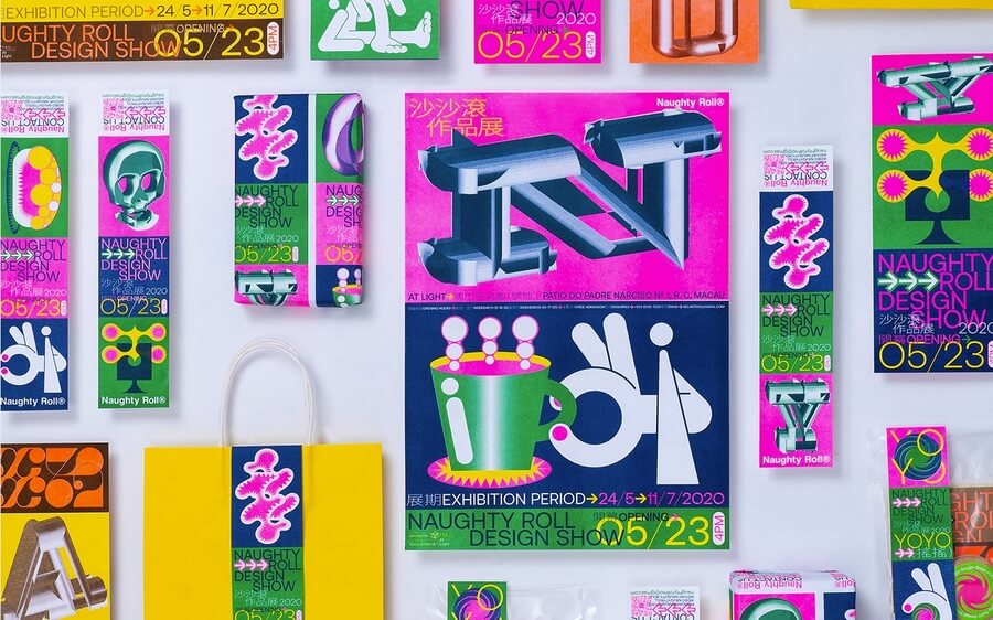
4. Pop Art Color Palette
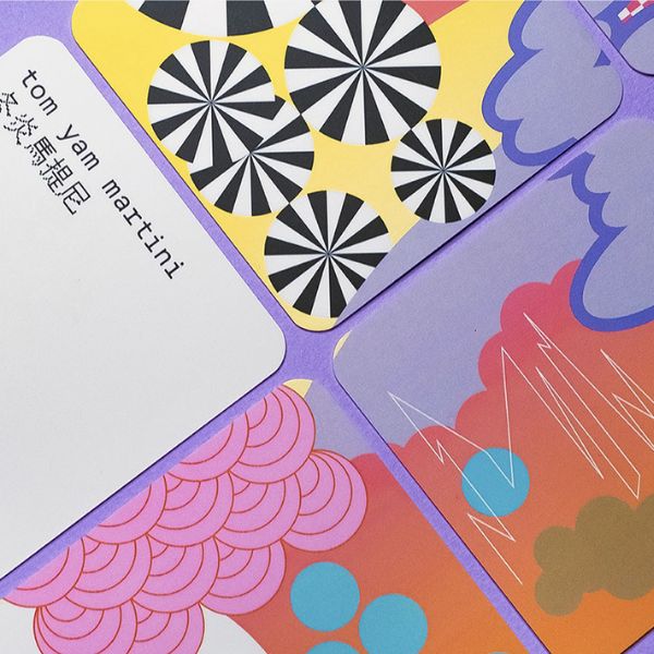
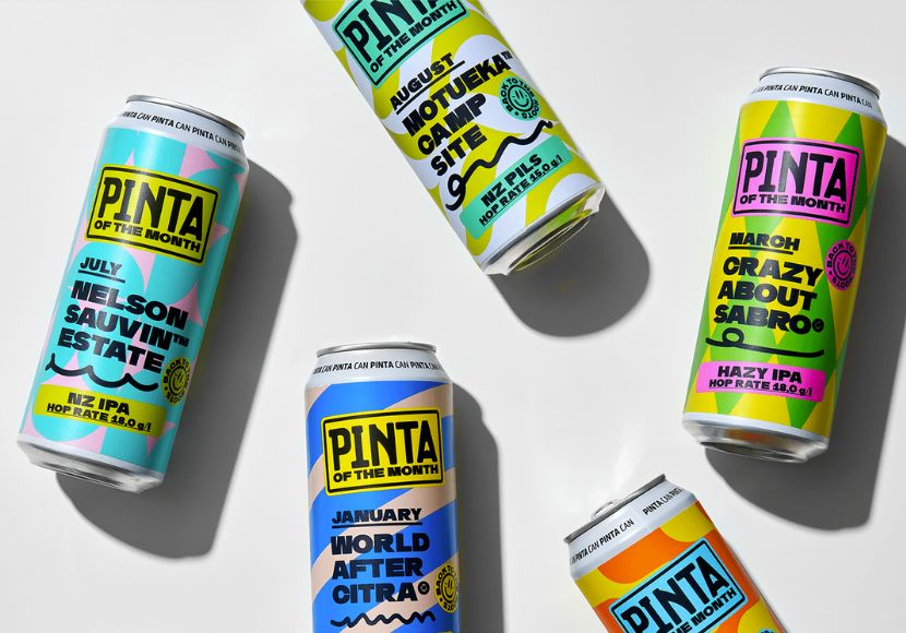
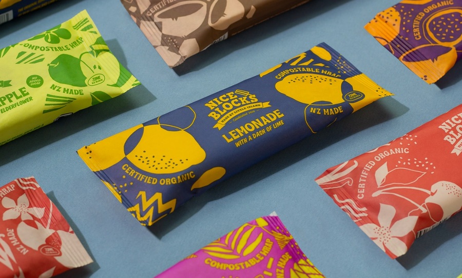
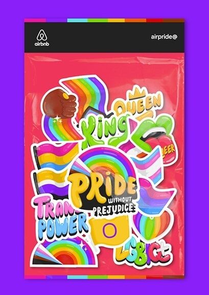
The pop art movement that created a wave of revolutionary designs against the status quo, and proved to the world that everything and anything can be art, is still very current today. The essence of pop art is formed by bright colors and everyday objects. In modern days, a design created with a pop-art color palette radiates joy, optimism, and a really good mood.
Example by indego macau
Example by CHANCE ®
Example by CROM STUDIO
Example by Asahi Nagata
Example by Han Gao
Example by Directa Bureau
Example by multiple owners
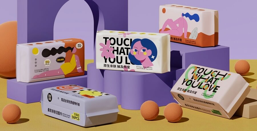
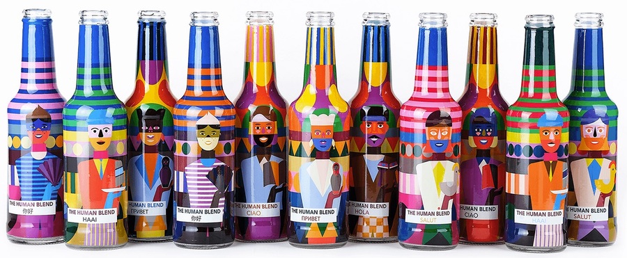
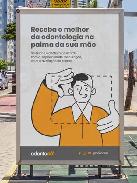
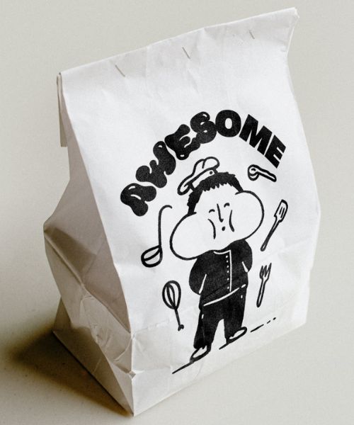
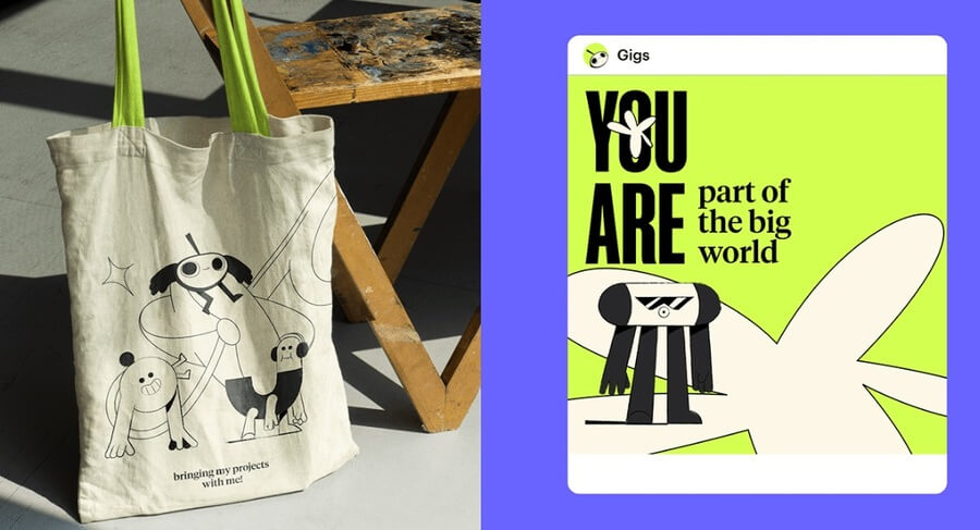
5. Over-simplified & Stylized Characters
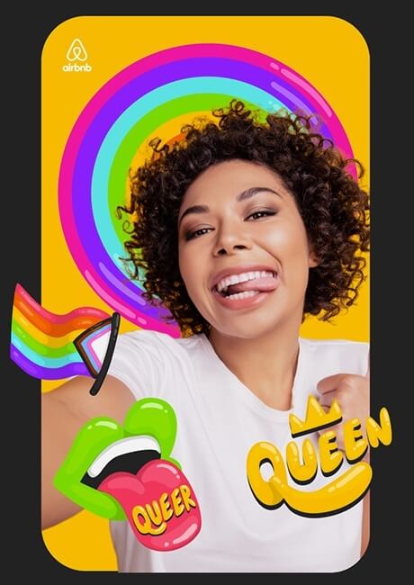
Character design also finds its place in graphic design, making the viewer relate to what’s being communicated even more easily. In the latest years, we’ve been seeing a wild use of over-simplified characters, often presented with distorted proportions, small heads and huge limbs, missing or really simplified facial features. Shadows, volumes, and gradients are also left-out, keeping the character design completely flat.
Example by COOOT
Example by nju: comunicazione
Example by AG Design Agency
Example by Ana Duje
Example by Mateus Ritter
Example by Alice Des
Example by Gamal Assy
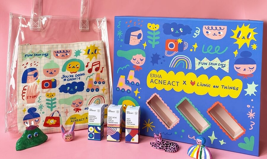
Example by Martcellia Liunic
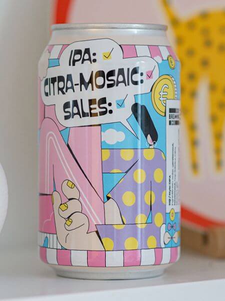
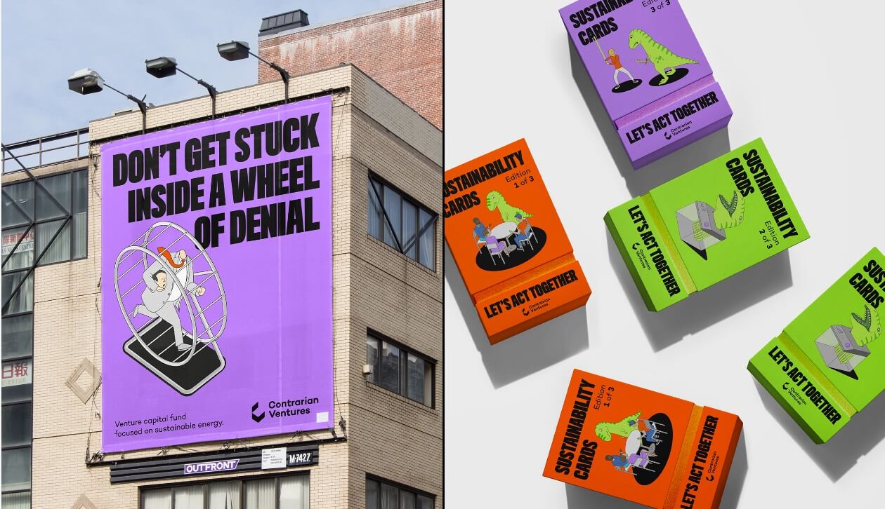
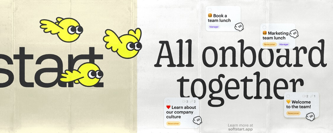
6. Cartoon Illustrations in Graphic Design
Cartoon illustrations make a design feel fun and easy-going better than anything else. They instantly raise associations with the carefree childhood years, and even more – they nail the attention just as fast as a cartoon nails the attention of a child. It’s just programmed in our brains. Using cartoon illustrations and cartoon fonts has been a stable trend in the graphic design field for brands who want to be accepted as easy-going and casual.
Example by Juão
Example by Fuman Studio
Example by Pánico Estudio
Example by multiple owners
Example by multiple owners
Example by multiple owners
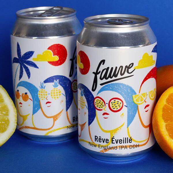
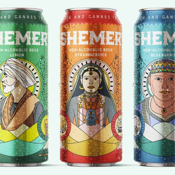
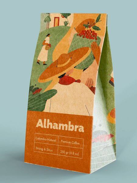
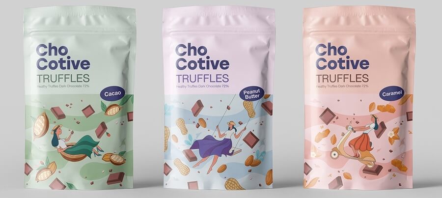
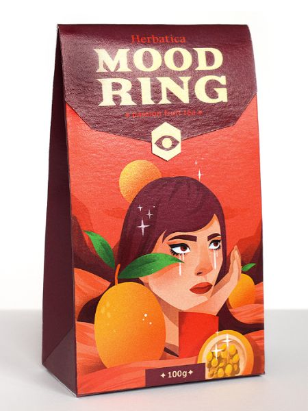
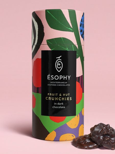
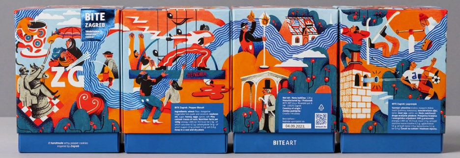
7. Artistic Illustrations in Graphic Design
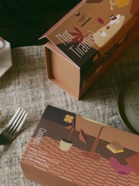
Since graphic design is art itself, meant to communicate ideas and concepts through appealing visual representations of text and images, then we can certainly say that illustrations make graphic design even more artistic and admiring to look at. Beautiful illustrations have always been among graphic design trends in their huge variety of artistic techniques. Luckily for all, classic detailed hand-drawn illustrations are currently on the rise in graphic design.
Example by Widarto Impact
Example by Luísa Zardo
Example by Gamal Assy
Example by Sentian Dazi
Example by Gulshan Mirzayeva
Example by Gamal Assy
Example by Slaykei
Example by George Probonas
Example by multiple owners
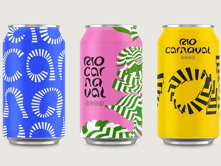
8. Typography-Focused Designs
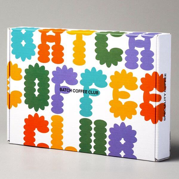
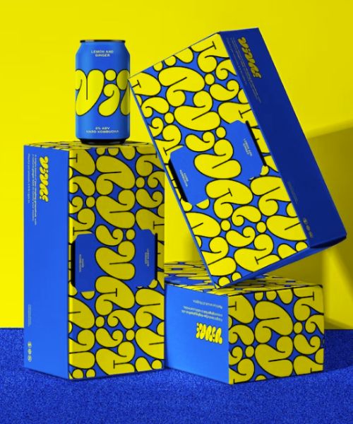
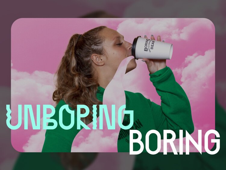
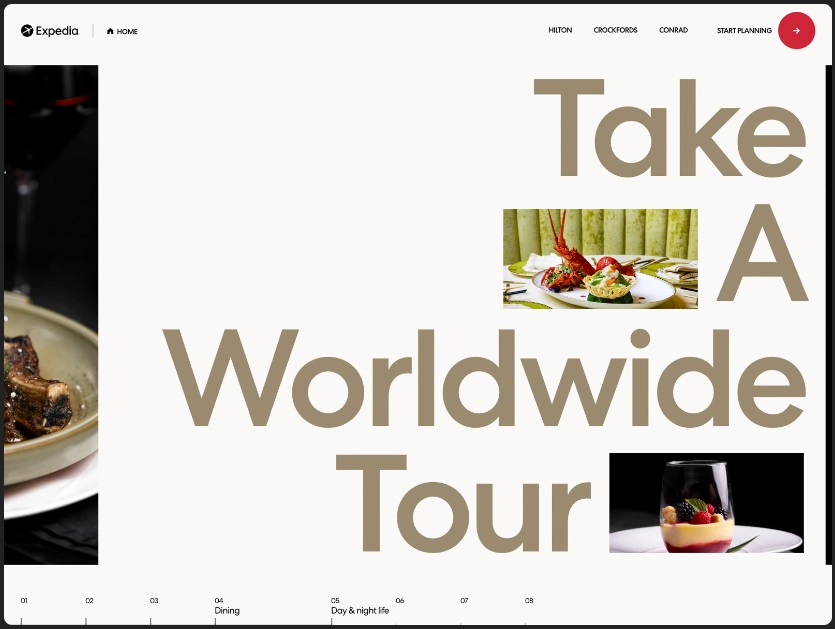
Typography not only plays a major role in graphic design but it provides such a big field of creativity that the whole artwork can be built around it. When it comes to creative typography in graphic design, designers can really put a huge portion of their imagination, playing with colors, shapes, and forms.
Example by Media Monks
Example by Nguyen Vien
Example by multiple owners
Example by Picsart
Example by Dotorg Agency
Example by indego macau
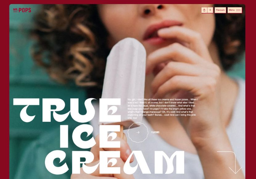
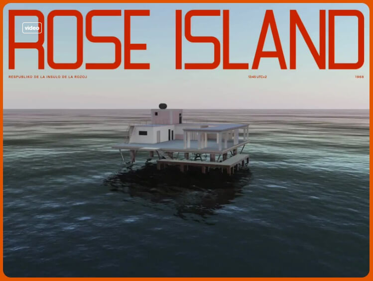
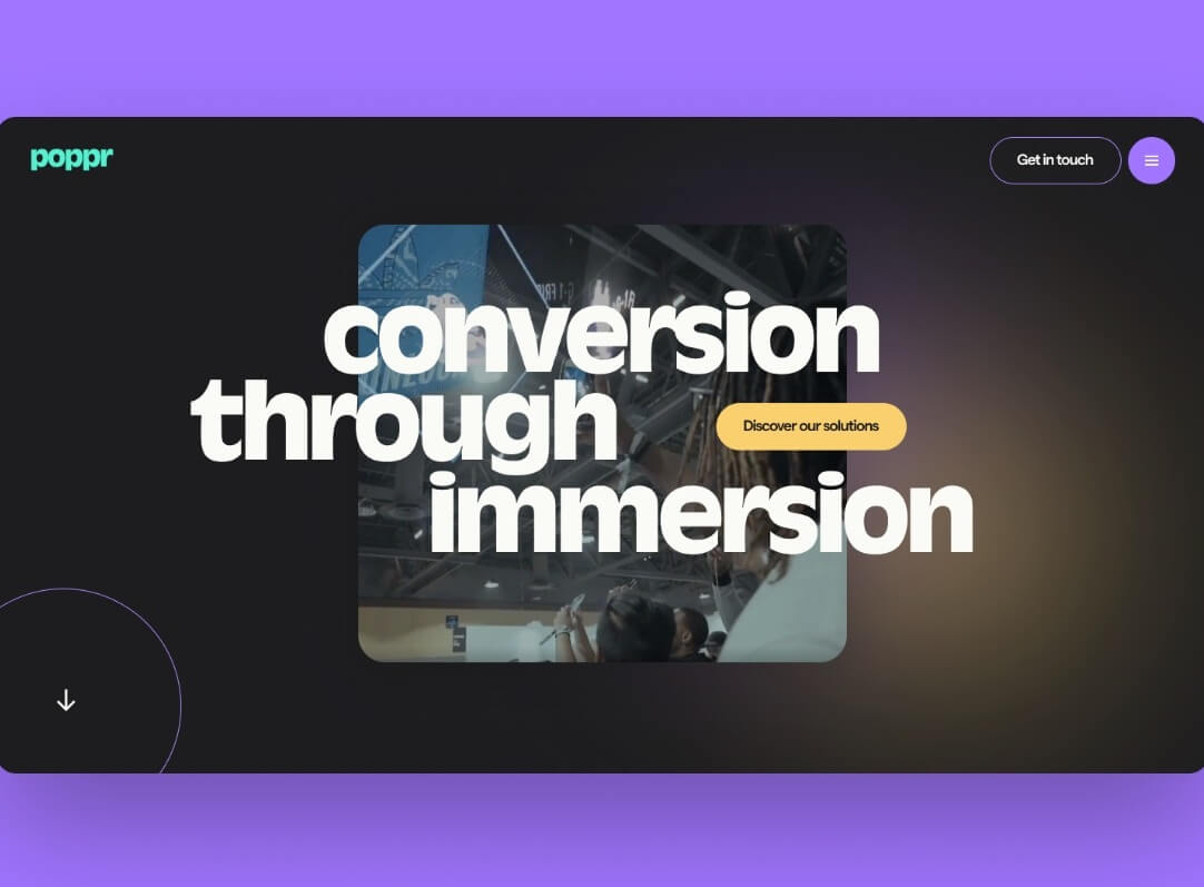
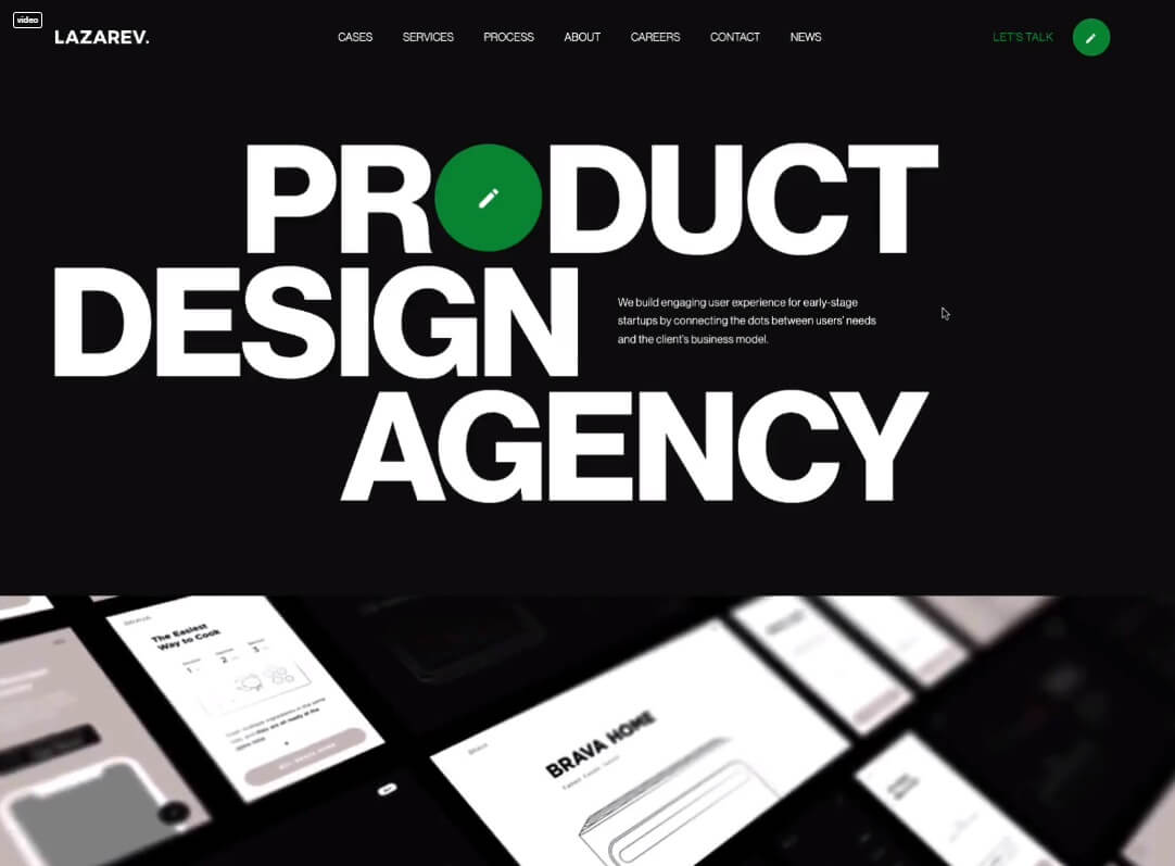
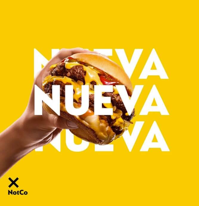
Oversize typography is an absolute hit currently. Designers can even go full width in order to make a super screaming statement. It’s often combined with extra small body text to make the size difference even more notable.
Example by También
Example by Synchronized Studio
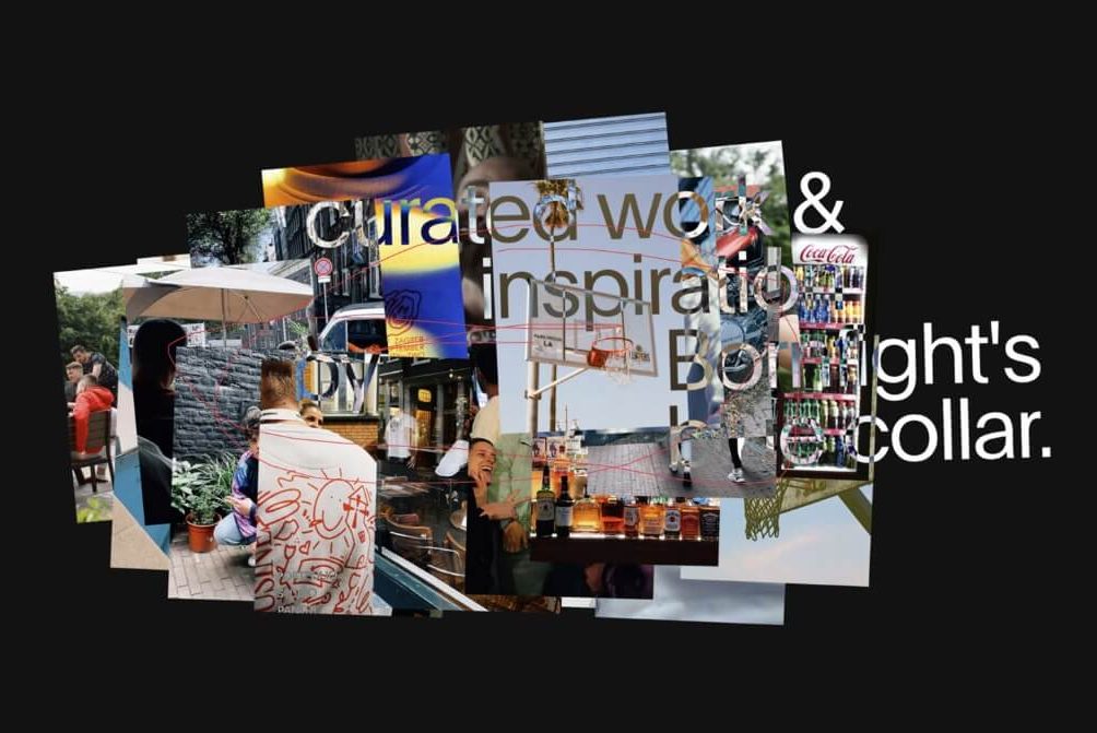
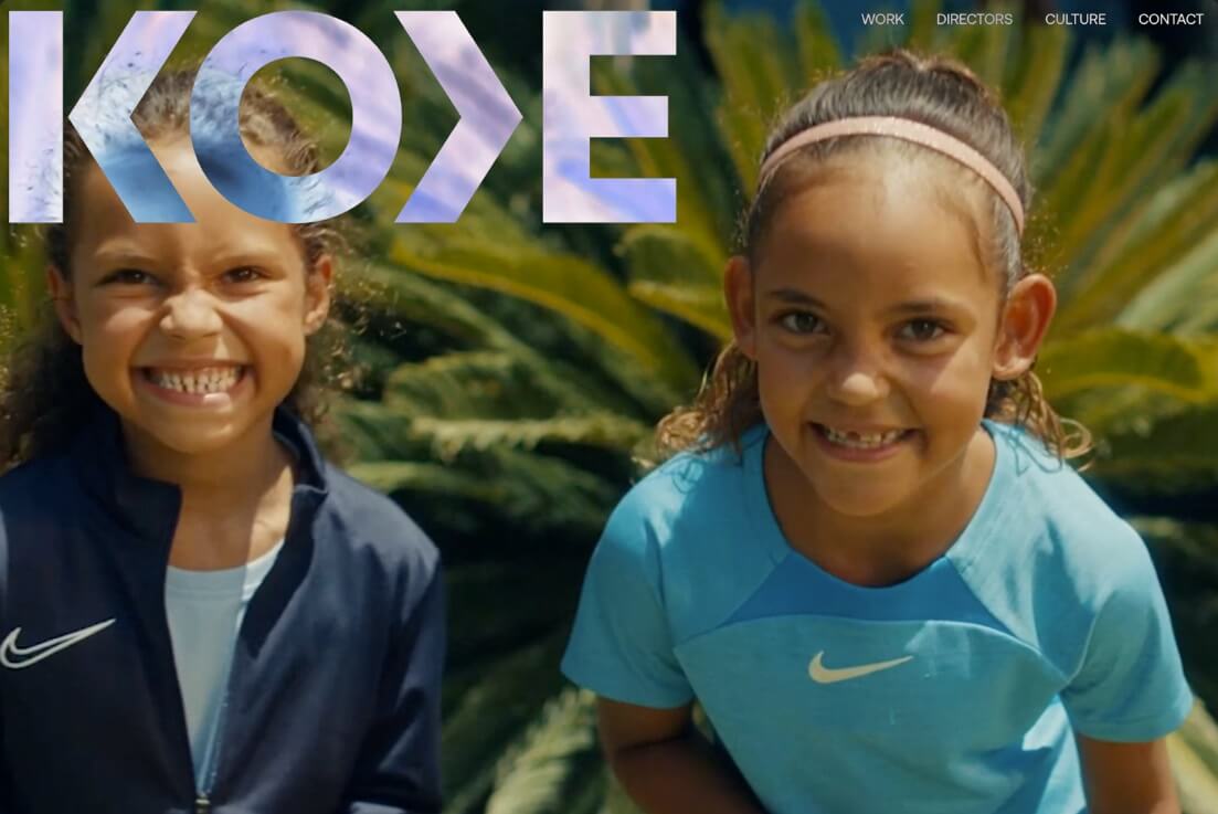
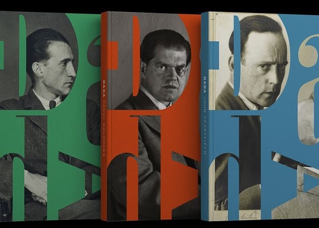
Mask effects and negative space effects can really make text look more interesting and rebellious. And while it’s very trendy to mix text with images, using masks and negative spaces can make the design look super modern, yet keep the words readable.
Example by BORNFIGHT STUDIO
Example by Malvah.Studio
Example by oğuzhan topcu
Example by Rōnin Amsterdam
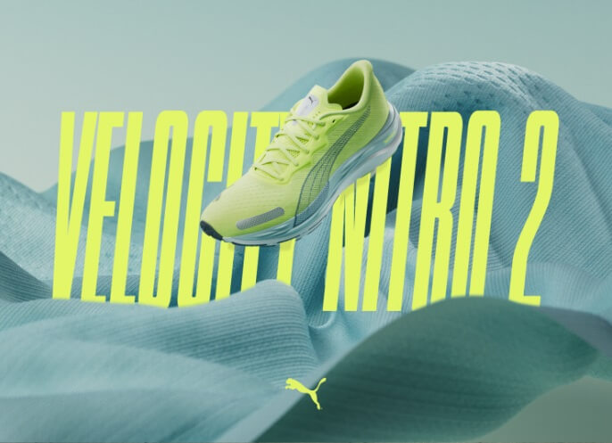
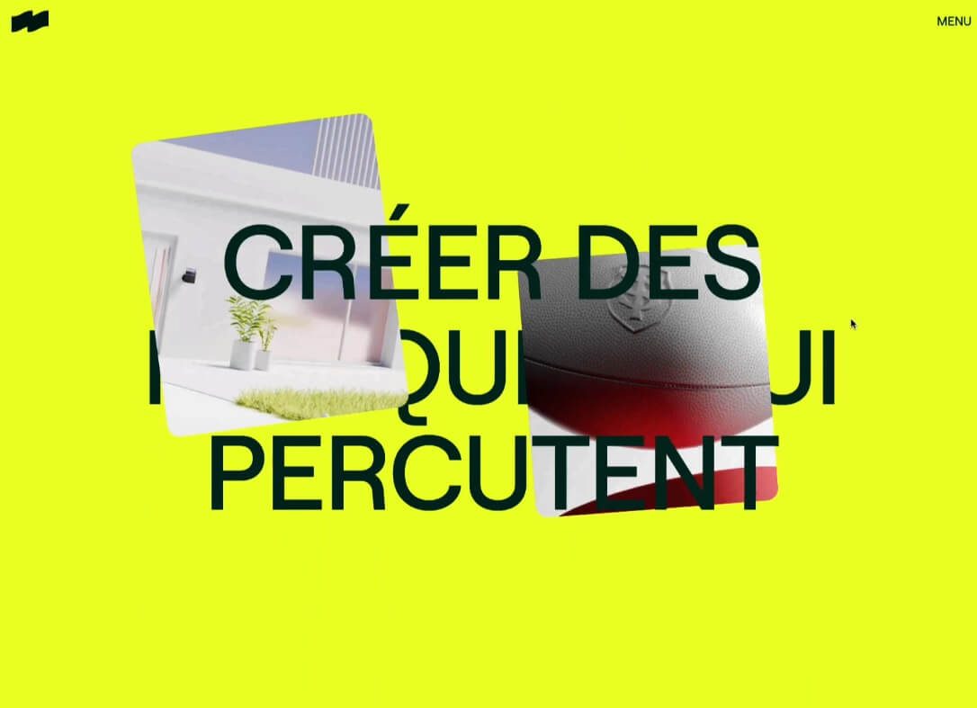
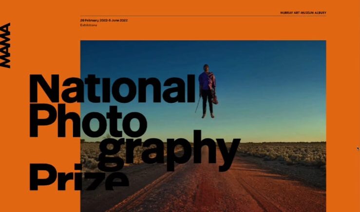
Among the current hits is making the text a fully interactive part of the design. Positioning text in different layers in the design, so it interacts with other objects, also creates the feeling of depth.
Example by PUMA Velocity 2 Experience
Example by Vendredi Society
Example by Plau Design
Example by Jean Rosa
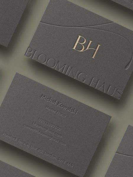
An interesting design whim is to keep line spacing and margins to a minimum. Usually, designers use sans serif fonts for this technique, so the strokes of letters don’t overlap with each other.
Example by NIGHTJAR
Example by Ulia Efimova
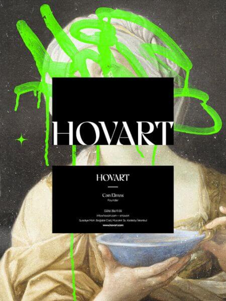
Example by Can Elmas
Example by Hardy Branding
9. Artistic Stains, Spots, Strokes
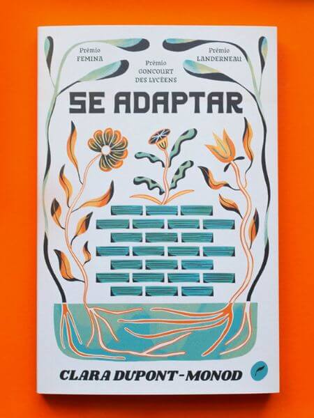
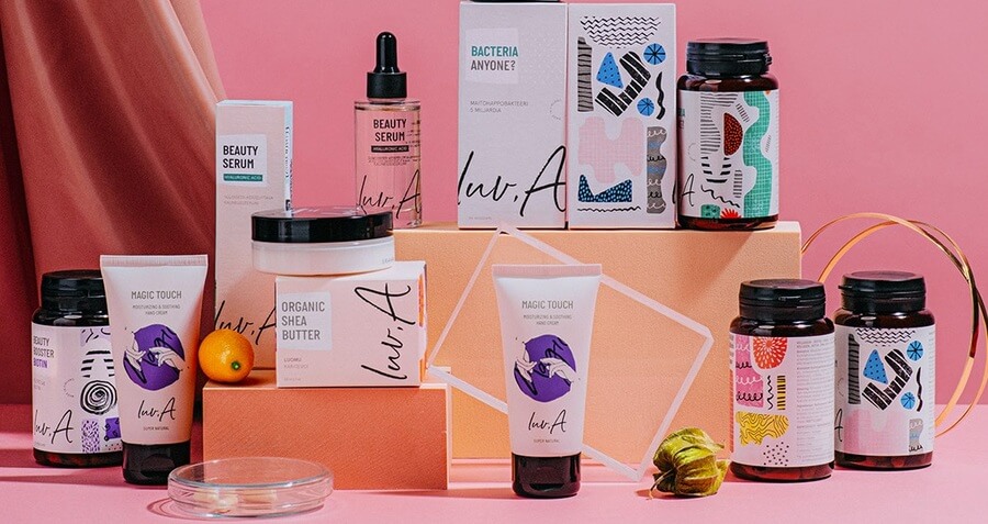
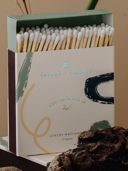
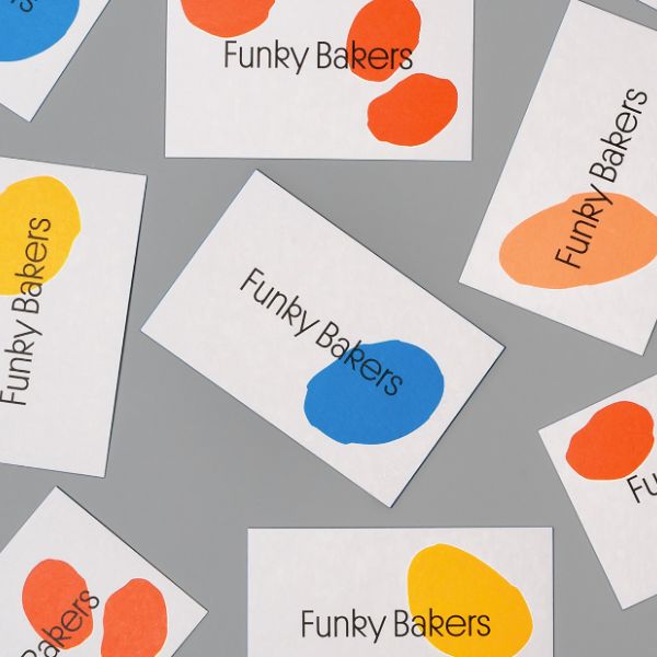
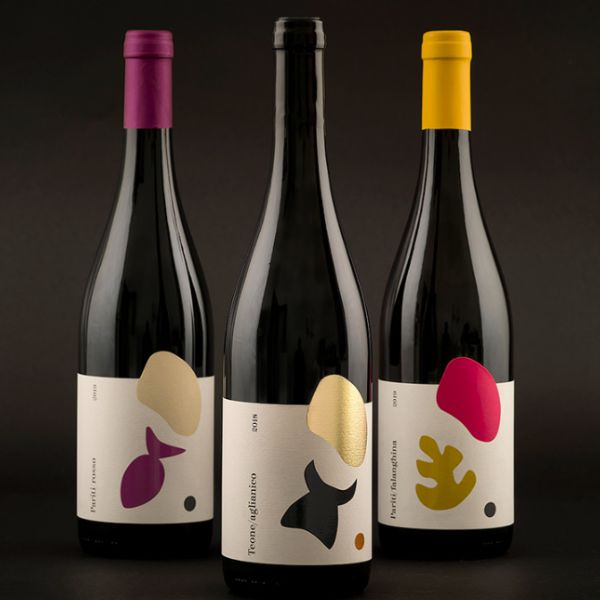
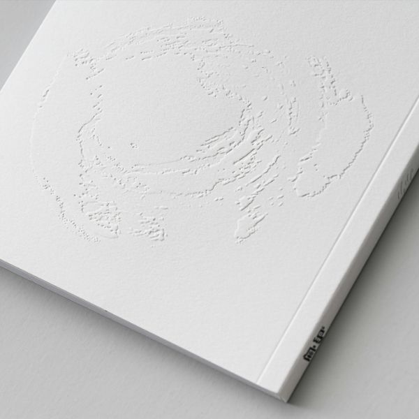
Imperfect design elements that literally look like careless stains and spots left here and there, actually make the design more abstract, unique, and even exclusive. You will often see lines, swirls, and strokes just casually drawn wherever there was an empty space, and still call it super cool and modern. Well, designers actually put plenty of thought to make the final look harmonious and eye-pleasing.
Artistic stains by geometrieva
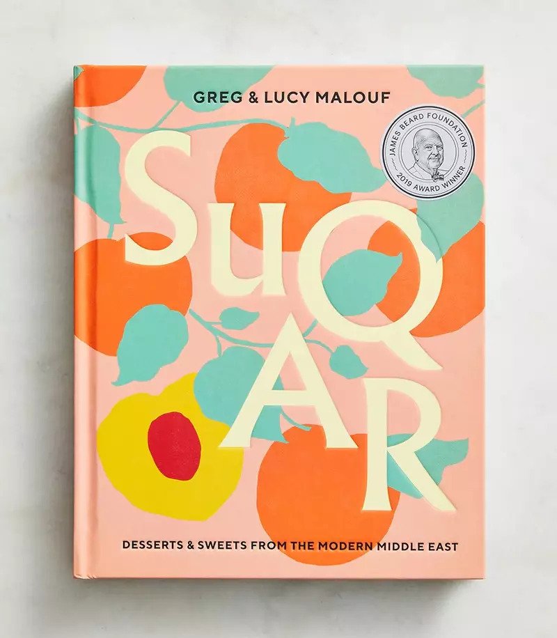
Artistic stains on the SUGAR book cover
Example by Toni Hukkanen
Example by Cansu Merdamert
Example by multiple owners
Example by Dong _11
Example by Requena Office
Example by Requena Office
Example by nju: comunicazione
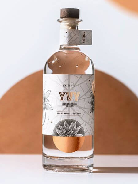
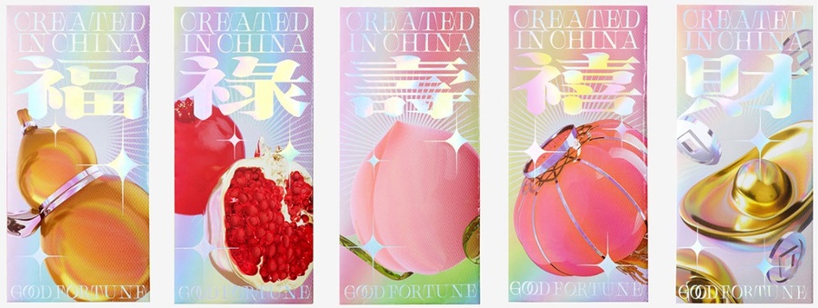
10. Metallic Effect in Design
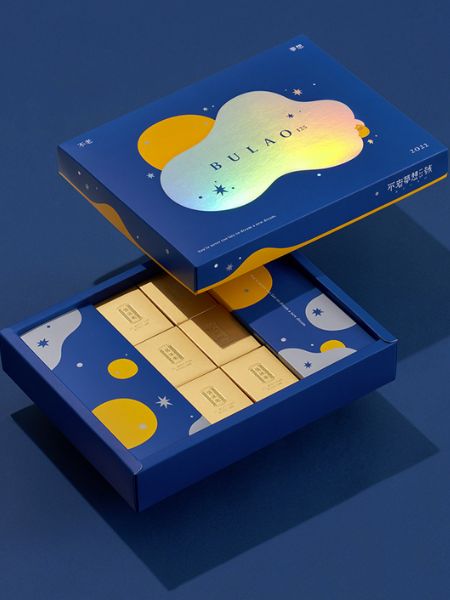
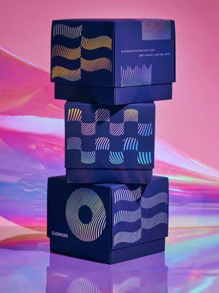
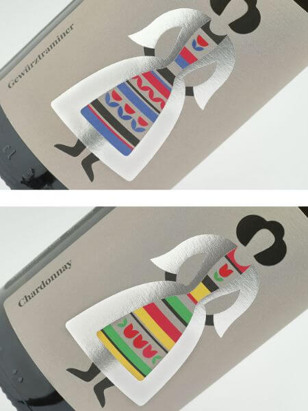
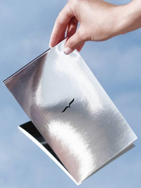
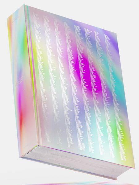
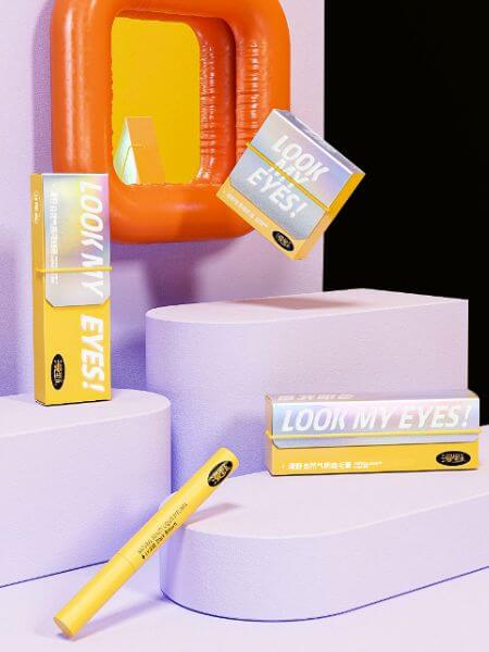
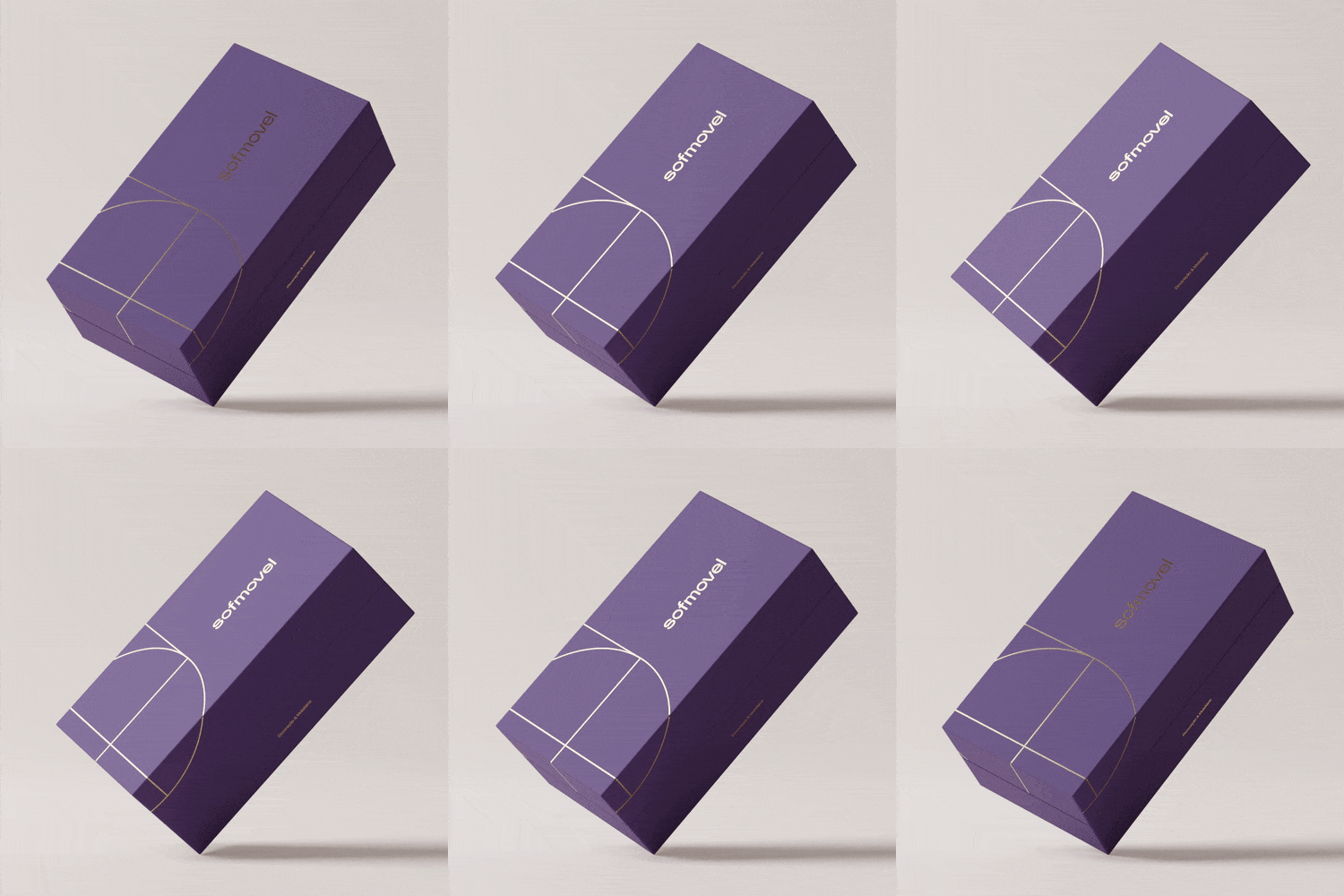
There is something futuristic about using metallic effects. It is futuristic, it is dreamy, and creates a sense of exquisiteness. The smooth surface that reflects lights can effortlessly be used to create a festive feeling, as well. Designers often combine the metallic effect with a holographic effect that makes the art feel even more magical. Just think how you feel when you see a rainbow. You simply stop and admire!
Example by Best Studio
Example by nju: comunicazione
Example by multiple owners
Example by multiple owners
Example by COOOT
Example by Estúdio Bogotá
Example by Dong _11
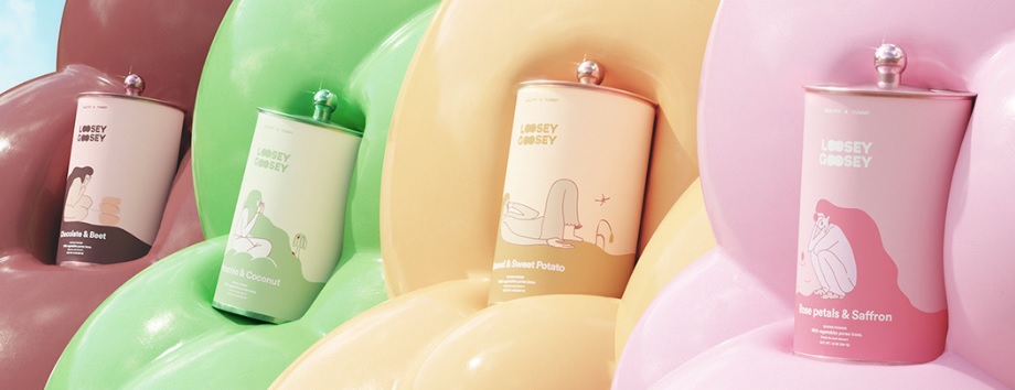
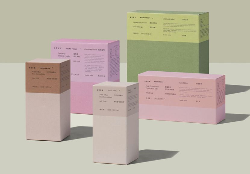
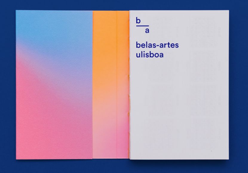
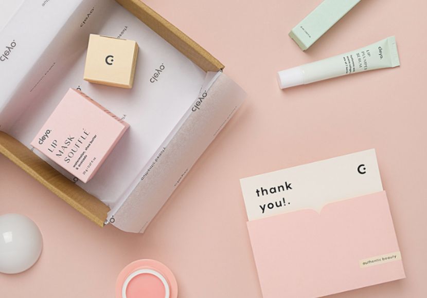
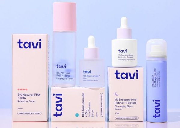
11. Soft Pastel Color Palette
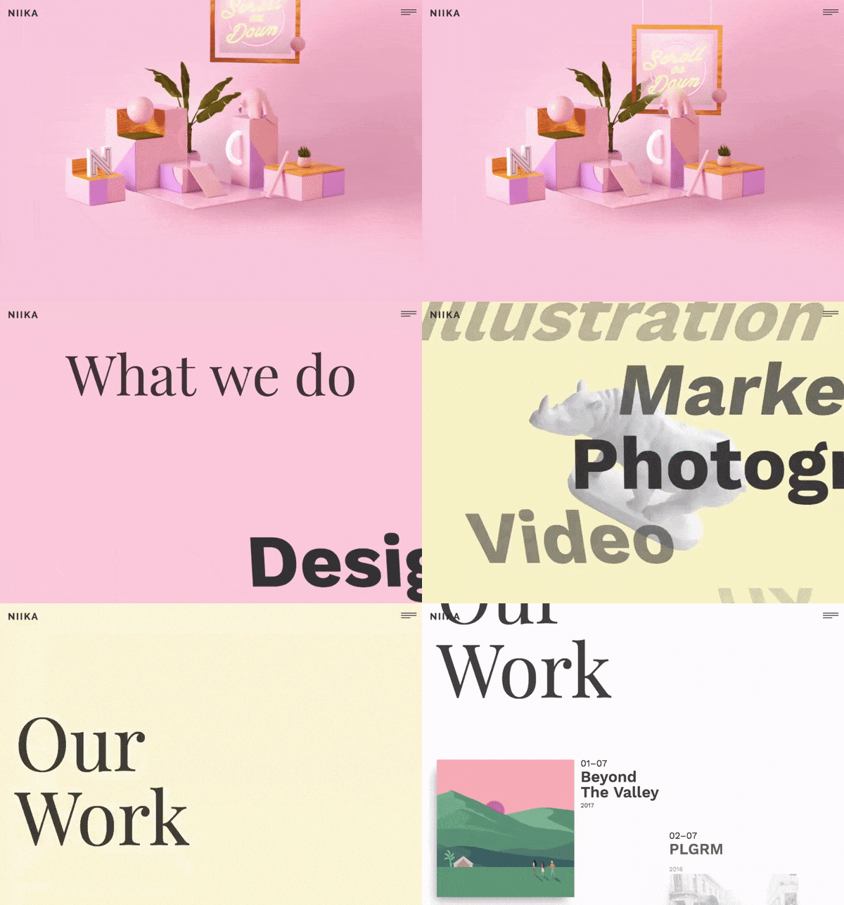
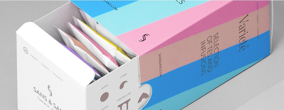
Beautiful and romantic pastel colors create preferred and very trendy color palettes among designers. What we call pastel, is actually a pale tint of color, with less saturation and a significant amount of white. Pastel colors create a relaxing and romantic atmosphere and are often chosen for the branding of cosmetics.
Example by multiple owners
Example by Han Gao
Example by Tomás Gouveia
Example by Requena Office
Example by multiple owners
Example by multiple owners
Example by Niika
Example by Requena Office
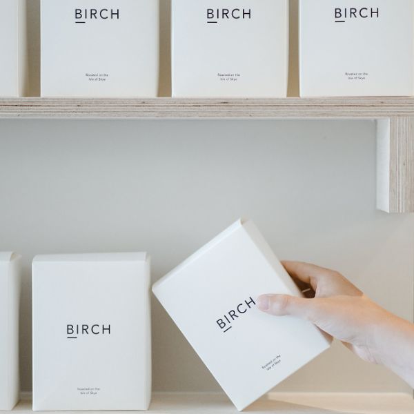
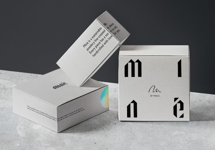
12. The “No design” Graphic Design
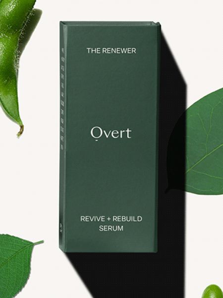
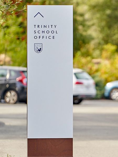
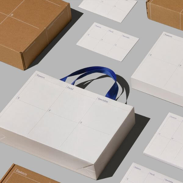
Super clear and minimalist designs that look like there is no design at all, actually take plenty of thought and time to create. Choosing the right font, the right sizing, the right color, so in the end, it all looks flawless and clean, really makes this type of design a challenge. However, many brands prefer it because it conveys purity, honesty, and even sophistication.
Example by erva® design
Example by Connie Huang
Example by Daria Po
Example by InPlace Design
Example by Mayuko Kanazawa
Example by Han Gao
Example by Y_Y_A_N_G raphic Design
Example by Sanna Mac
Example by low key Design
Example by Pánico Estudio
Example by multiple owners
To wrap it up,
Some graphic design trends come and go. But in the latest years, we are witnessing some incredibly stable ones, as graphic designers still want to maintain the diversity of styles in the field. Moreover, each style provokes a different array of feelings and associations, so designers can really strengthen the brand-customer relationship by just choosing the right one or even mix styles, as seen. For example, we see a lot of metallic effects on artistic stains or minimalist designs made in pastel colors. Well, only time will tell where all these graphic design trends are heading.
We hope you enjoyed our review of the current graphic design trends. If you are fully into graphic design, you will find plenty of useful articles on the subject – design collections for your inspiration or free downloadables to boost your future projects. Enjoy!


