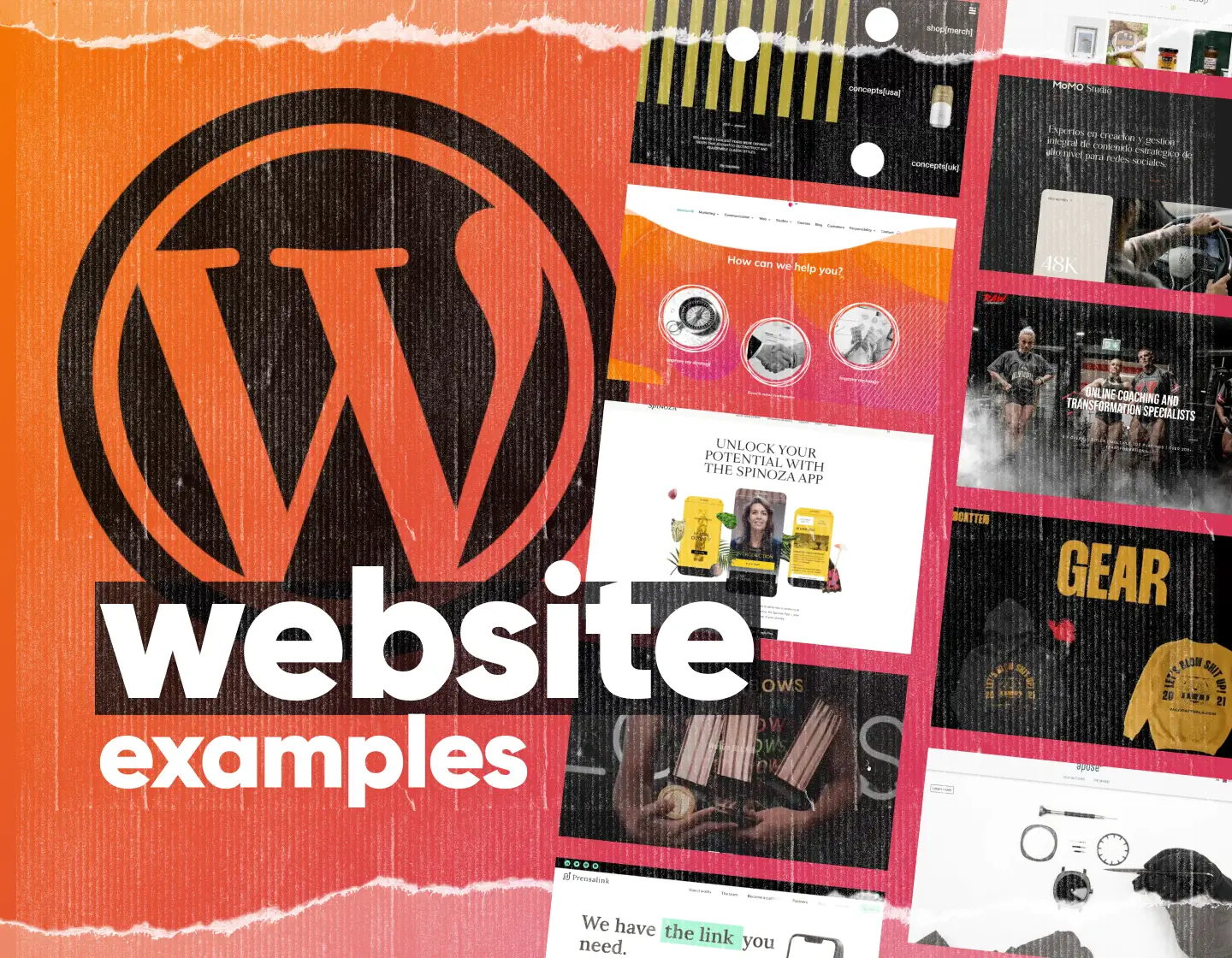
Looking for WordPress design ideas that actually work? We’ve curated 100+ real WordPress website examples grouped by style, industry, and design features. Bookmark your favorites, study the patterns, and if you want a pixel-perfect build, our partner agency htmlBurger can bring any design to life — get a free design audit below.
First impressions count. Your homepage is the gateway to your brand — and in WordPress, it can set the tone for your entire site. A well-designed homepage hooks visitors, guides them naturally toward your offer, and makes your brand memorable. Explore our handpicked WordPress homepage examples that combine stunning visuals, intuitive layouts, and smart UX patterns.
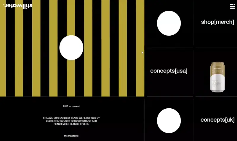
Stillwater’s homepage uses an unorthodox carousel to pull users deeper into the site. The minimal style is paired with flashy aesthetics, while WooCommerce powers its online store.
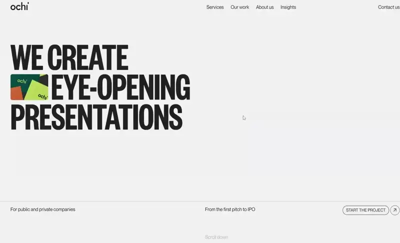
Ochi delivers an engaging homepage with bold typography, parallax effects, and witty branding. Animations and oversized sections create a modern and memorable WordPress experience.
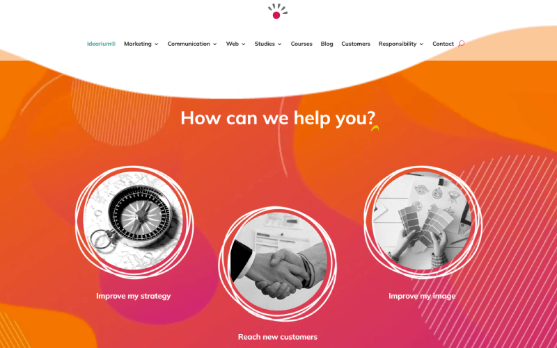
Idearium’s homepage blends smooth animations, organic shapes, and artistic strokes. The result is a trendy, visually dynamic WordPress site with video content and interactive design.
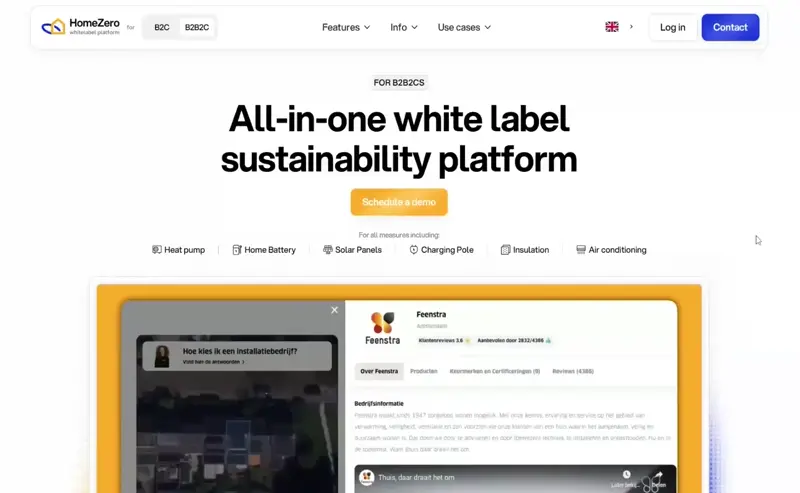
HomeZero opens with a demo video, quickly showing its product in action. Scrolling reveals a clean, friendly design supported by client testimonials and proof of service quality.
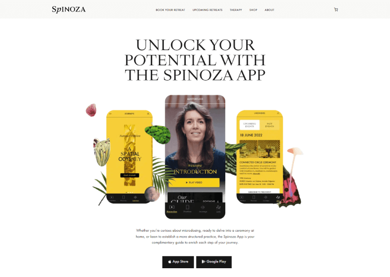
Spinoza’s homepage follows a StoryBrand approach, combining warm colors, subtle animations, and clear messaging to create a welcoming and user-friendly experience.
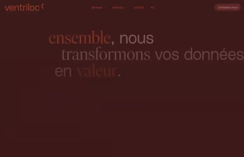
Ventriloc keeps users scrolling with stylish animations and retro-inspired colors. The design mixes trendy typography and effects to present services in a memorable way.
This Düsseldorf building project uses WordPress to showcase its identity as a fully sustainable development, with a sleek, future-oriented homepage design.
Just BLCK’s homepage relies on oversized typography, parallax effects, and color-block layouts. The focus stays on portfolio projects and a strong studio brand story.
Fabbrica’s dark-mode design suits its Parisian Italian restaurant perfectly. Playful touches like hover effects and a custom “Italian hand” meme preloader give the site personality and warmth.
One-page websites are all about focus and flow. Instead of sending users across multiple pages, everything lives in a single, scrollable journey. In this collection of WordPress one-page website examples, you’ll see how brands use animation, storytelling, and strong visuals to keep users engaged while delivering information in a clean, modern format.
A powerful storytelling site with bold colors and cinematic flow. Designed to spotlight a social issue while promoting the film.
A vibrant, WordPress-built one-pager with bold colors, sleek animations, and dark high-quality imagery that creates a luxurious feel.
Playful animations and bursts of color keep this one-page site lively. Short, focused text makes the design easy to digest.
Minimal black, gray, and white design with cinematic animations. The opening sequence feels like watching a movie.
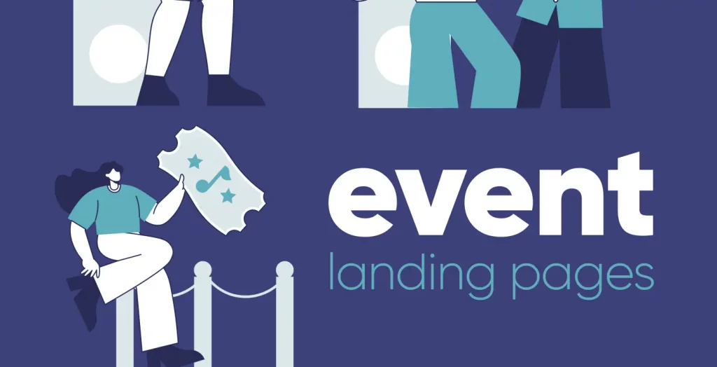
Landing pages are built for one purpose: conversion. Whether it’s promoting a product, service, or event, the best landing pages guide visitors with sharp copy, bold visuals, and clear CTAs. In this collection, you’ll find examples that balance design and strategy to turn clicks into action.
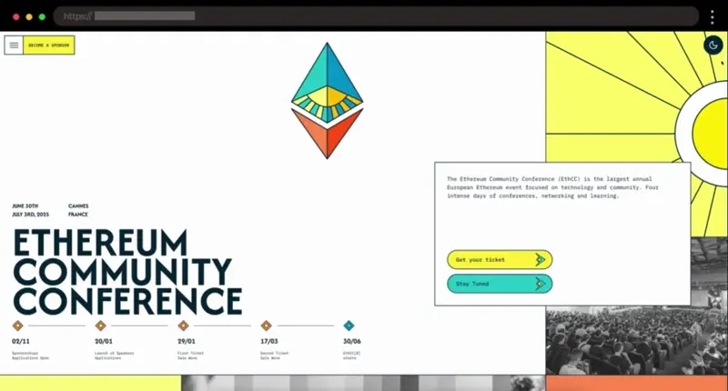
A fresh, multi-color event page with clean fonts and intuitive navigation. Quick access to tickets, sponsors, and FAQs makes it a model landing page for blockchain conferences.
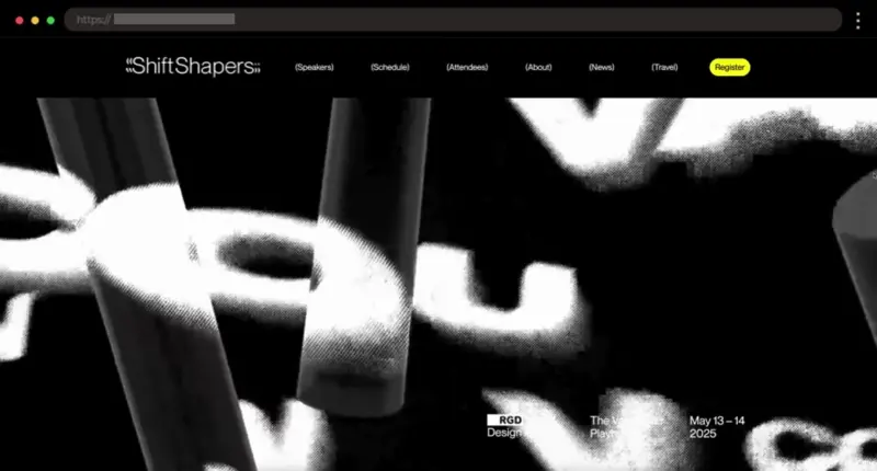
Bold black-and-yellow visuals, playful animations, and a clean layout give this design conference page an energetic, modern feel. A standout example of creative event branding.
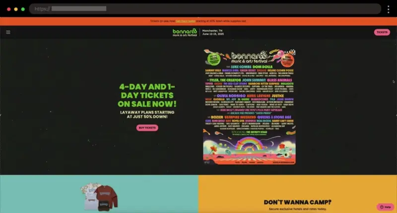
High-energy design with vibrant graphics and clear ticketing links. This festival page captures the excitement of Bonnaroo while keeping navigation simple and user-friendly.
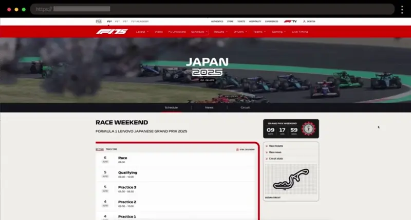
Dynamic visuals, bold typography, and a detailed circuit map create a thrilling experience for racing fans. A top landing page example for sports and live events.
The header is the first thing visitors see — and it can make or break their decision to stay. Great homepage headers combine striking visuals, smart typography, and clear calls-to-action to instantly capture attention. In this collection, you’ll find header design examples that set the tone, tell a story, and drive users deeper into the site.
Minimalist sticky header with a sleek hamburger menu revealing a full-screen animated navigation, balancing simplicity and modern flair.
Minimal black header with a hamburger menu that slides open dynamically, combining branding and creativity in one smooth motion.
Elegant full-width header with smooth hover effects and subtle sticky/fade transitions that guide users through the site effortlessly.
A 3D sleek, minimalist sticky header with left-aligned logo and right-hand navigation, keeping key pages accessible as you scroll.
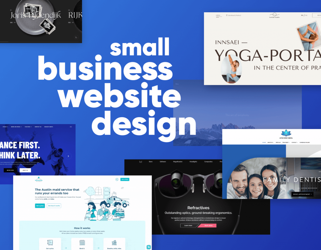
Small business websites need to build trust fast while showcasing products or services clearly. The best examples balance friendly design with strong calls-to-action, ensuring visitors quickly understand what the brand does and how to work with them. In this collection, you’ll find small business websites that combine clarity, personality, and smart design to win over customers.
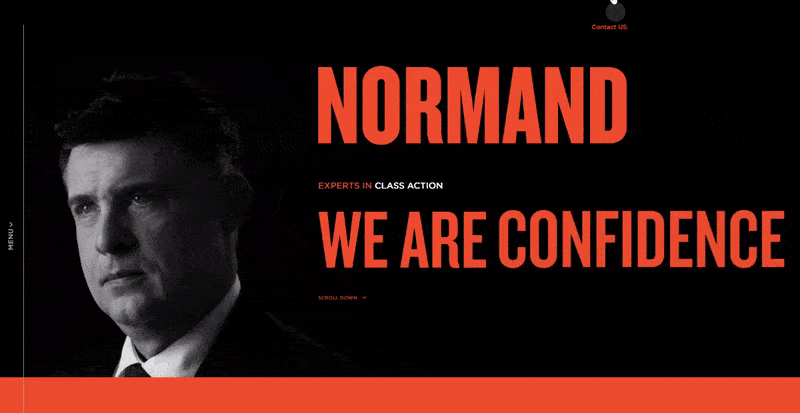
A polished law firm website with a professional color scheme, organized content, and detailed case studies that showcase expertise in class action services.
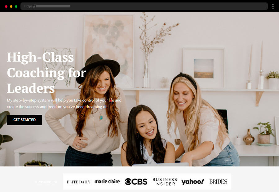
A personal, trust-building coach website centered on values and philosophy, with branding and design that highlight authenticity and connection.
Clean, modern design with scroll animations, real Google reviews, and a simple appointment form for seamless booking.
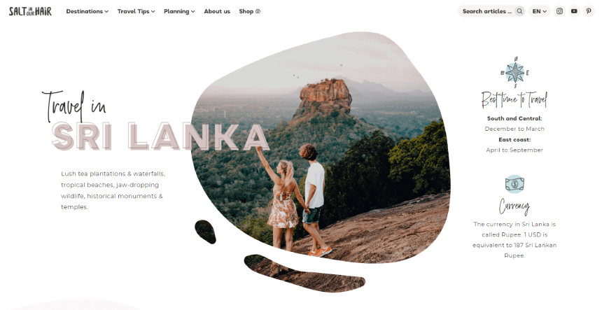
A playful, scrapbook-style design with hand-drawn elements that create the feel of an adventurer’s journal while showcasing travel destinations.
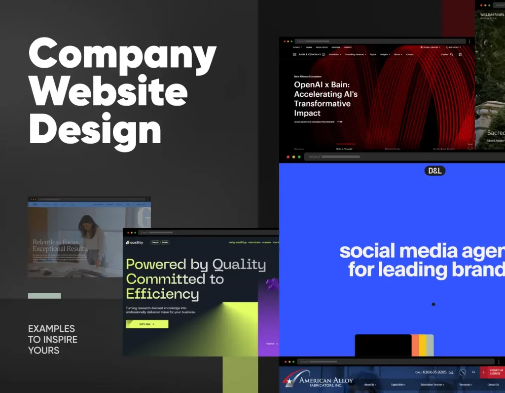
Company websites are all about credibility and clarity. They need to communicate what the business does, why it matters, and how it stands out—all within seconds. The best examples pair professional design with authentic storytelling, making it easy for visitors to trust the brand and take action. In this collection, you’ll find company websites that perfectly balance strategy, design, and brand personality to leave a lasting impression.
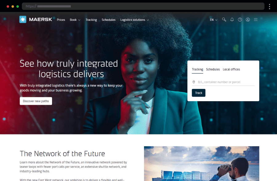
Maersk’s modern logistics website showcases global shipping expertise with strong visuals, intuitive navigation, and clear CTAs that highlight services and innovation.
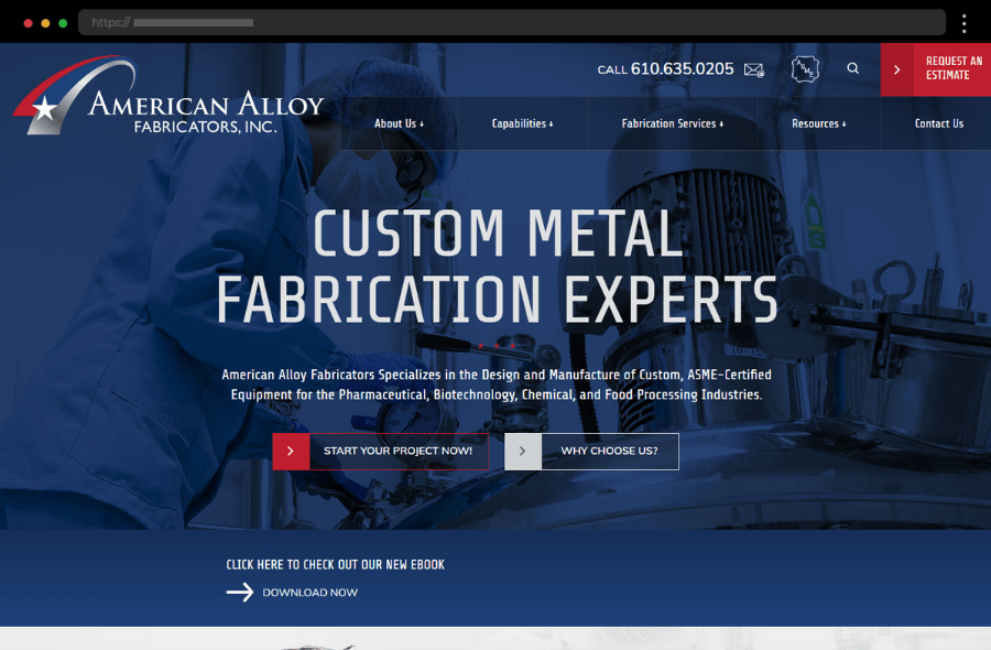
American Alloy Fabricators’ professional website highlights precision metalwork and industry expertise through clean design, clear navigation, and trust-building visuals.
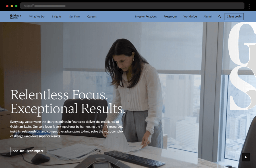
Goldman Sachs’ sleek corporate website uses bold typography and elegant visuals to present financial expertise with authority and intuitive user flow.
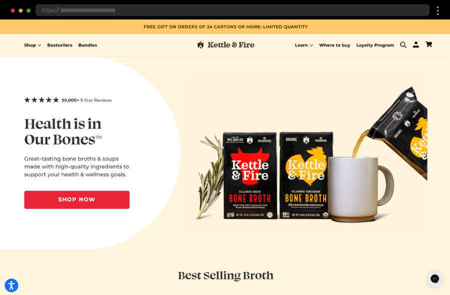
Kettle & Fire’s vibrant food company website blends appetizing visuals, warm colors, and informative content to engage health-conscious customers and boost trust.
A great ecommerce homepage sets the tone for the entire shopping experience. It grabs attention with strong visuals, communicates the brand’s identity, and guides visitors toward products with clear navigation and calls to action. In this collection, you’ll find examples that balance design and usability to create homepages that inspire clicks and conversions.
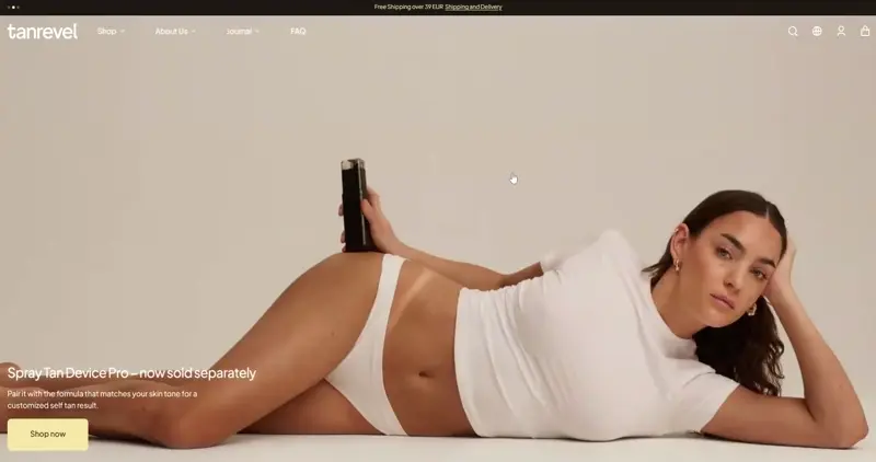
Tanrevel balances structure and style with a dynamic grid. Clean layouts and smart sectioning keep the homepage informative yet easy to browse.
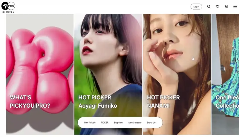
PICKYOU PRO stands out with motion typography and a crisp grid layout. The minimalist white design highlights its unique concept of selling items from influencers.
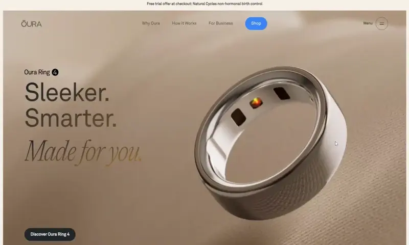
Oura’s homepage feels sleek and premium with oversized product imagery and smooth lazy scrolling. The grid layout and modern design showcase the ring’s high-tech features.
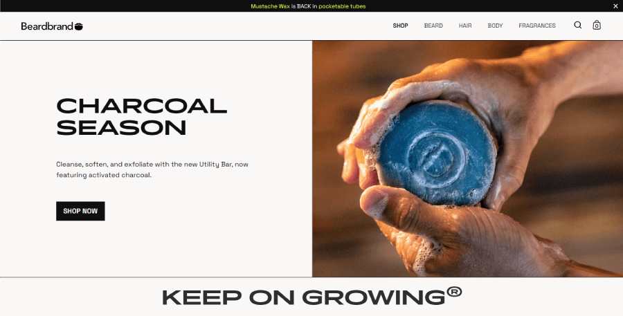
Beardbrand keeps it sharp and minimal with a clean hero, featured products, and blog highlights. Smart structure makes the simple layout feel full and polished.
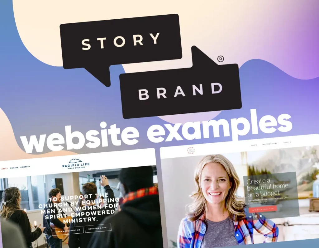
StoryBrand websites follow a proven messaging framework: clarify the brand story, highlight the customer as the hero, and guide them toward action. In this selection, you’ll see how businesses use clean layouts, sharp copy, and purposeful CTAs to simplify their message and connect deeply with their audience.
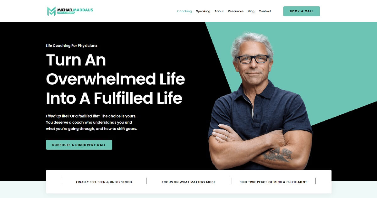
A well-structured coaching site that balances empathy and authority, with a clear Guide section tailored for physicians and surgeons.
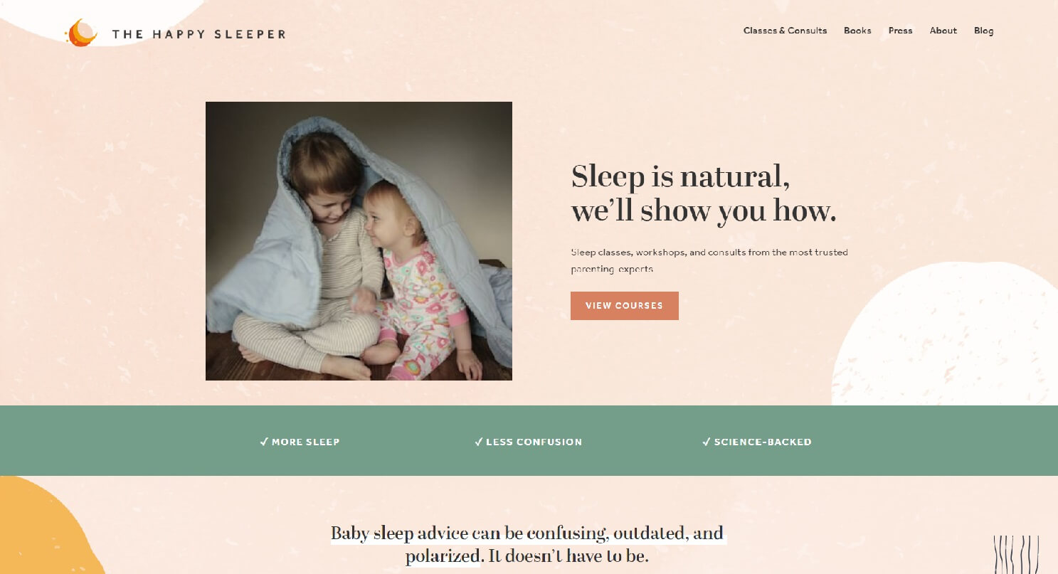
Empathy-driven copy aimed at moms, using problem-focused messaging and trust-building words like “science-backed” and “experts.”
A StoryBrand site with a simple 3-step process, client success stories, and a clear problem-solution framework.
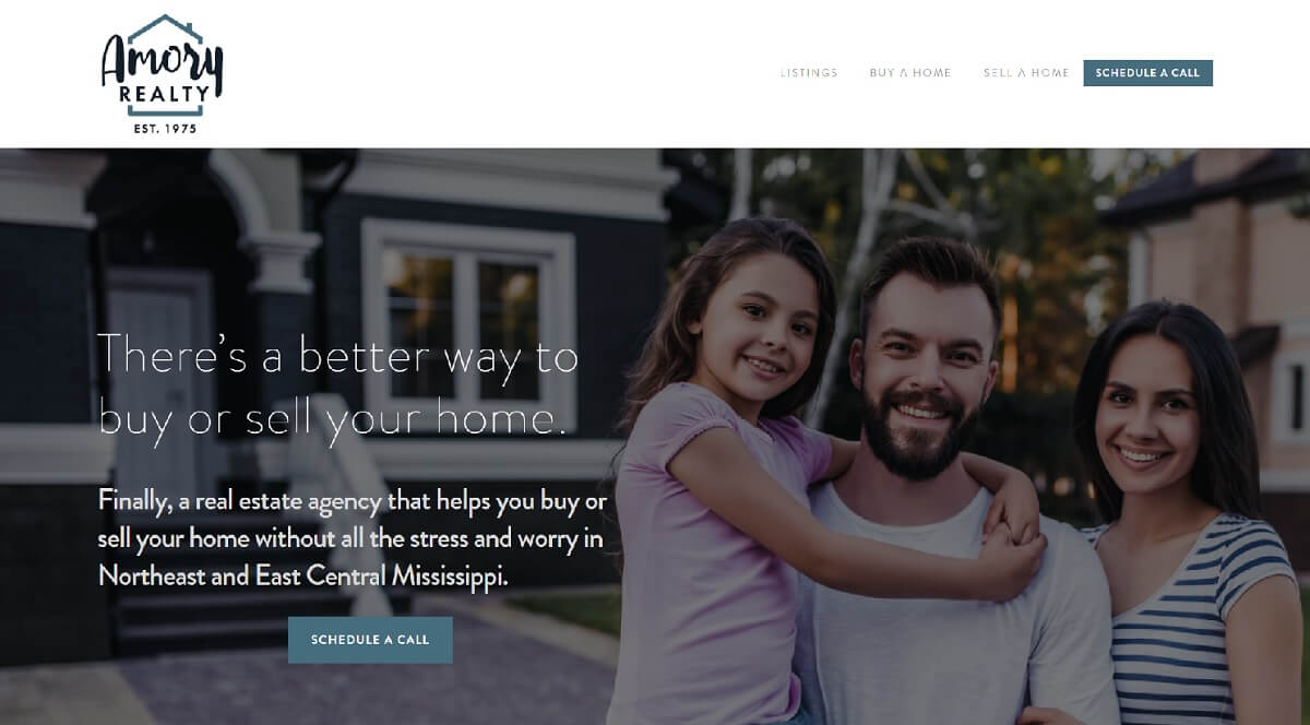
Direct messaging that addresses client concerns immediately, backed by a personal story that builds trust and empathy.
A blog is more than just content — it’s a platform to engage, inform, and convert. From magazine-style grids to minimalist layouts, WordPress blogs can be highly effective at keeping readers hooked. Check out these inspiring WordPress blog designs and discover layouts that maximize readability, storytelling, and engagement.
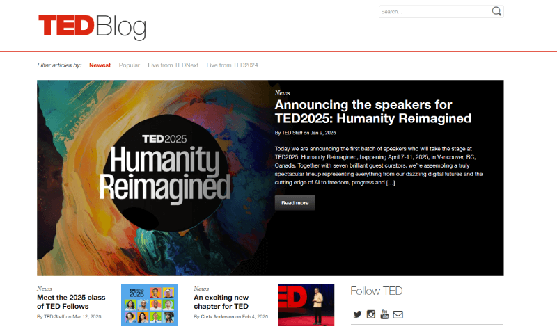
The TED WordPress blog combines inspiring stories, events, and talks with plugins like TranslatePress and SearchWP for accessibility and better user experience.
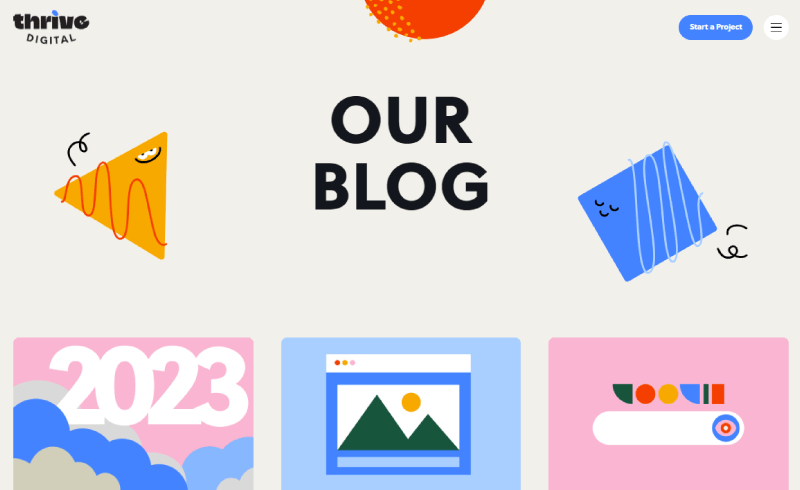
Thrive Digital’s colorful WordPress blog design uses a classic 3-column grid with consistent flat illustrations in bright, solid colors for a bold, cohesive look.
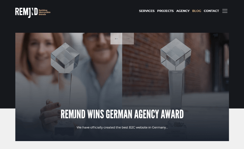
REMJND’s creative WordPress blog layout features an asymmetrical 3-column grid, infinite scroll feel, and fade-in animations that boost engagement.
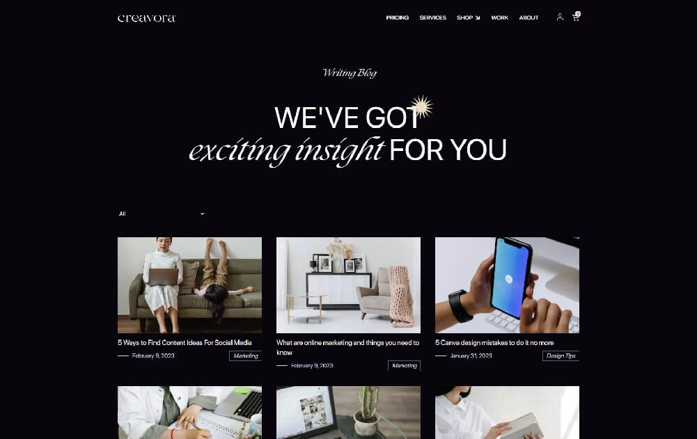
Creavora’s elegant WordPress blog example balances a simple 3-column grid with pastel-toned imagery against a dark background, plus a call-to-action for freebies.
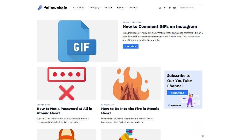
Followchain uses a modern WordPress blog layout with a full-width featured post followed by a 2-column grid, unified by consistent imagery and fonts.
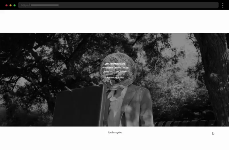
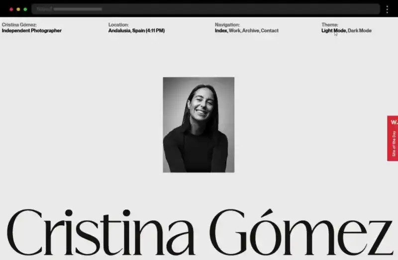
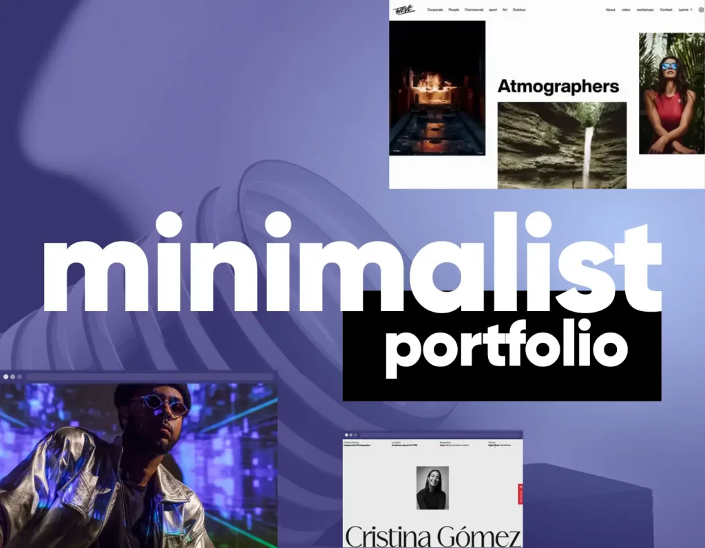
Showcasing your work effectively can make or break a creative career. WordPress portfolios let you display projects, highlight skills, and attract clients with style. Browse our curated selection of portfolio websites, featuring everything from interactive galleries to minimalist personal branding designs.
Creative portfolios are more than showcases — they’re statements of style and personality. In this collection, you’ll discover portfolios that break the mold with bold layouts, unexpected interactions, and imaginative storytelling, proving that great design can inspire just as much as it impresses.
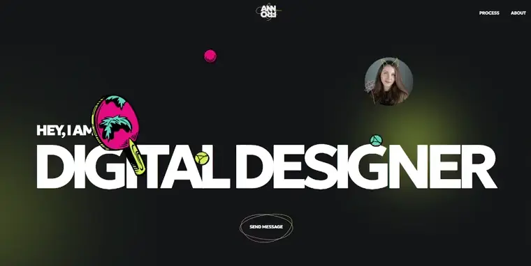
Minimalist and functional, this digital designer’s site uses a black palette with pops of color, crisp animations, and high-res images to highlight her clean interface design skills.
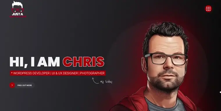
A bold black-and-red theme with playful illustrations and a hero self-portrait makes Chris’s portfolio lively and personal, with smooth scrolling and a full-screen menu for easy navigation.
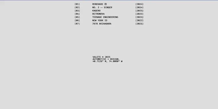
Kevin’s black-and-white site puts full-screen automotive photography front and center, using a minimalist design and smooth transitions to keep the focus on his striking visuals.
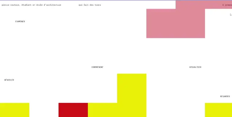
Pierre’s portfolio blends minimalism with creativity, featuring colorful geometric blocks that transform into project previews on hover for an engaging browsing experience.
Minimalist portfolios strip away the unnecessary, letting your work speak for itself. Clean layouts, plenty of whitespace, and subtle typography create a polished, modern feel. In this collection, you’ll find examples where less truly becomes more.
An object photography website with a smooth, easy-to-navigate layout. Airy and fresh, the focus in this minimalist portfolio website is entirely on the images.
Asymmetric grids and large visuals highlight interiors with clarity. Brief text and simple project pages balance minimalism with functionality.
Dramatic noise effect and seamless scrolling create a modern browsing flow. High-quality visuals pair with concise content for maximum impact.
A black-and-white palette with subtle hover animations adds elegance. Smooth scrolling and balanced layouts enhance the viewing experience.
Soft tones and refined transitions combine minimalism with artistry. A creative grid and sleek animations make it visually engaging.
A photography portfolio needs to showcase images at their best. These WordPress examples use full-screen galleries, creative grids, and minimal text so the visuals take center stage. Perfect inspiration for photographers who want impact with simplicity.
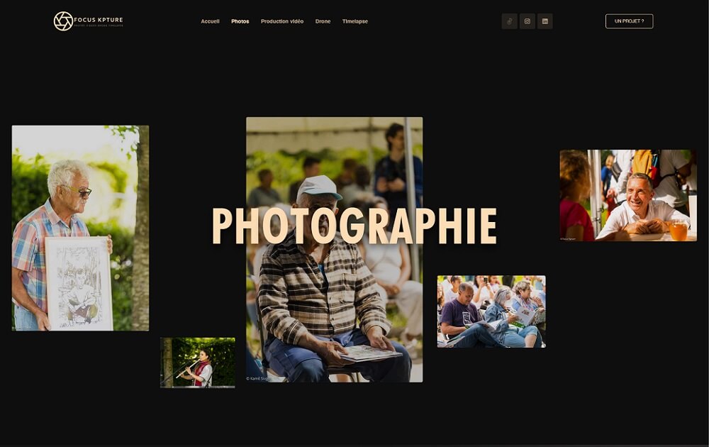
Focus Kpture’s WordPress photography website uses scattered hero images, parallax effects, and a dark background that makes the artwork stand out.
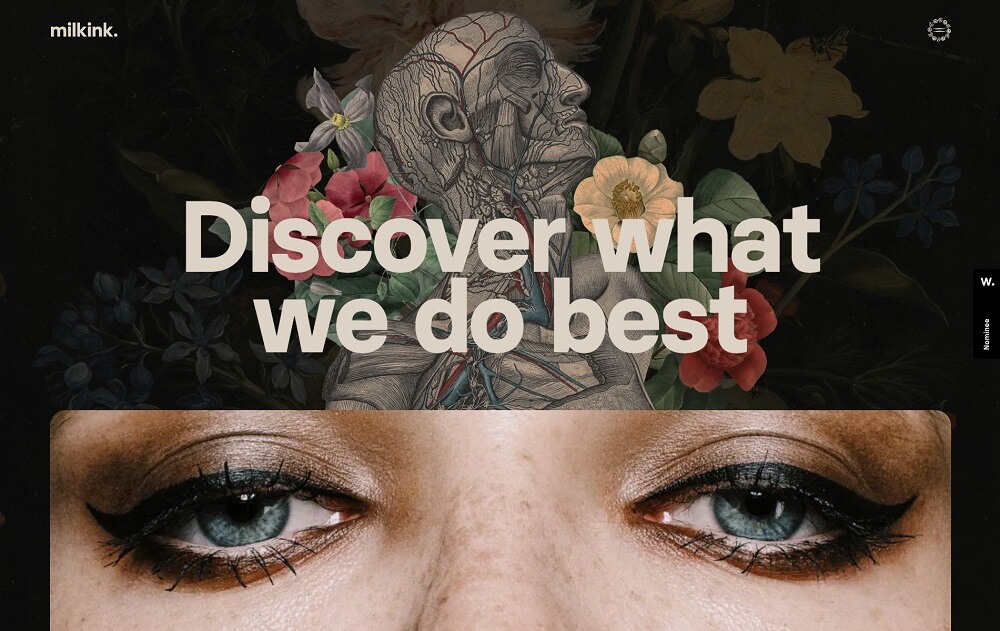
Milk Ink’s creative WordPress photography site features a dark floral theme, surreal illustrations, and a project-focused layout that feels mysterious and artistic.
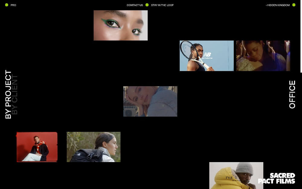
Sacred Pact’s WordPress portfolio website example combines scattered images, custom cursors, and hover effects for an interactive and visually dynamic showcase.
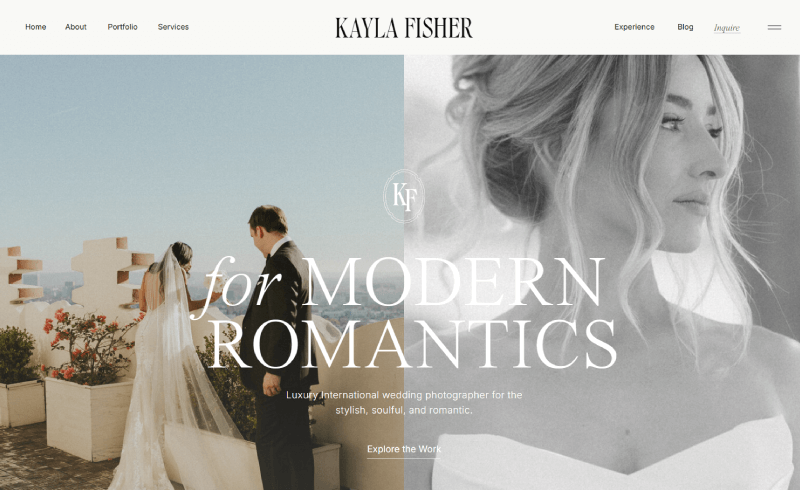
Kayla Fisher’s WordPress photographer portfolio highlights energetic wedding photos with oversized typography and smooth lazy scrolling for a polished look.
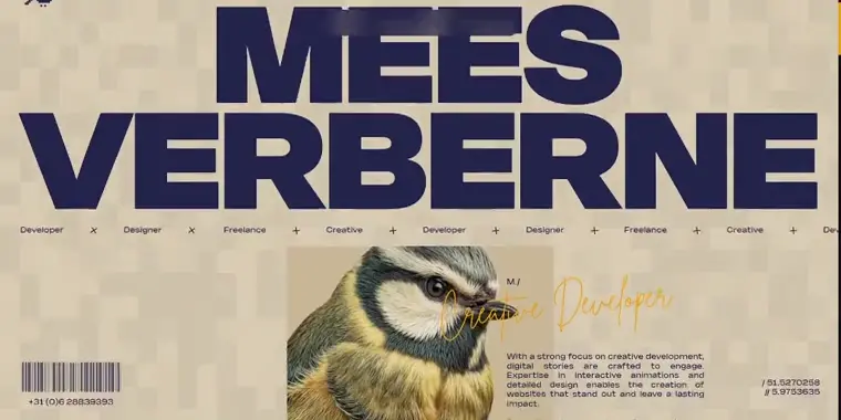
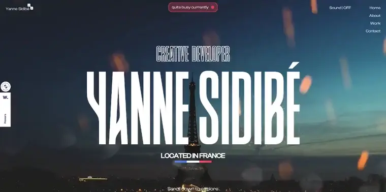
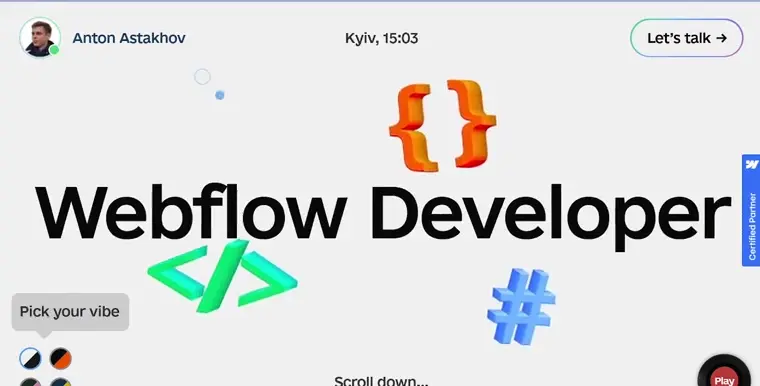
Developer portfolios are all about clarity and credibility. These examples show how coders and engineers present their skills with clean layouts, interactive elements, and project showcases that highlight both technical expertise and personality.
A playful site with a pixelated interactive background, smooth scrolling animations, and a quirky bird logo that reflects personality and skill.
Bold colors and fireworks animations set the stage for a sleek portfolio. Smooth scrolling highlights projects, testimonials, and technical expertise.
A one-page site with switchable color themes, music controls, and clear project highlights. Creative design meets functional Webflow execution.
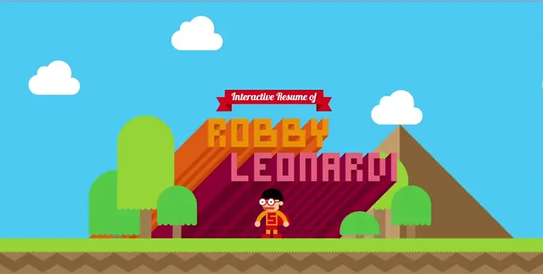
An interactive, game-like journey through design and coding skills. Playful storytelling and animations make it a standout portfolio experience.
A marketing portfolio has to do more than look good — it has to sell. These WordPress examples use bold visuals, sharp copy, and smart CTAs to highlight campaigns, case studies, and results that impress potential clients.
A clean, client-focused portfolio that builds trust by showcasing recognizable brand collaborations front and center, with work highlights over long case studies.
A polished portfolio featuring sharp visuals, big-name clients like IBM and Nikon, and award recognition. Clean project pages focus on results over buzzwords.
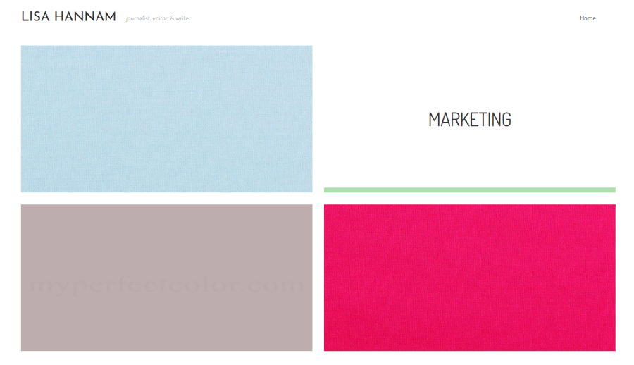
A content-driven marketing portfolio divided into clear sections for journalism, social, and marketing projects, laid out in a digital magazine style.
A bold one-pager that flows like a visual pitch. Sleek design and illustrated project visuals tell the brand’s story without overexplaining.
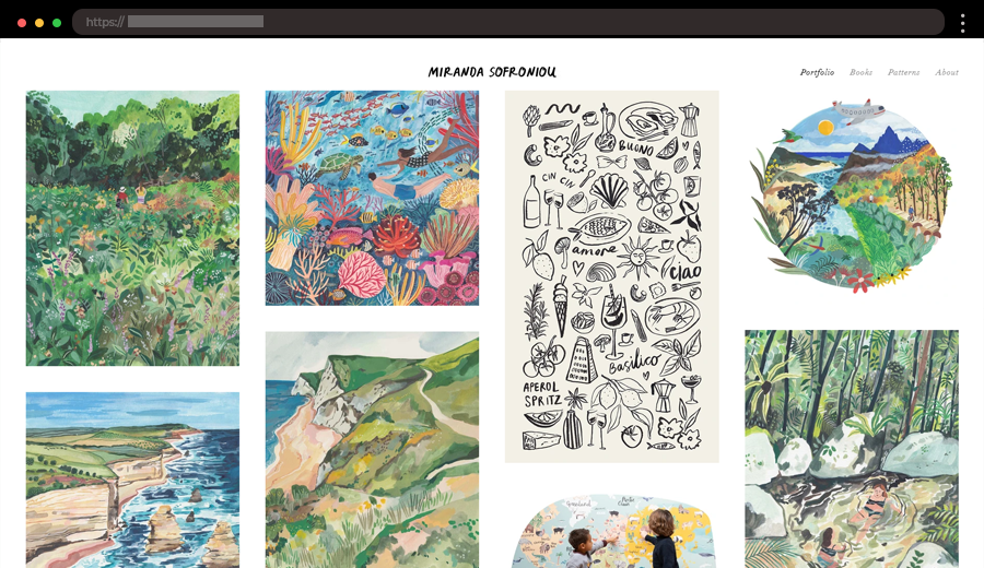
An art portfolio should feel like a gallery. These examples use creative layouts, experimental typography, and bold visuals to spotlight each artist’s unique voice while keeping the browsing experience smooth and immersive.
A warm, feminine art portfolio using orange-red tones, high-quality imagery, and clean typography. Includes a shop for stationery goods and a blog about the creative process.
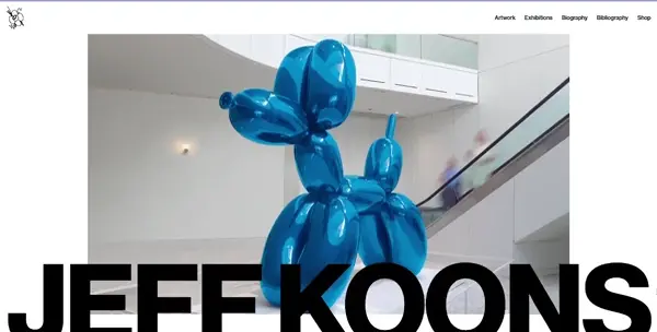
A polished, minimal site that highlights Jeff Koons’ iconic sculptures with crisp visuals, a clean layout, and a shop page for purchasing artwork.
A soft, pastel-toned art portfolio that feels like a storybook. Features a mobile-friendly gallery grid and clean layout that lets her illustrations shine.
A bold black-and-yellow design showcasing detailed 3D character work. Uses vertical scrolling, dedicated project pages, and clear About and Contact sections.
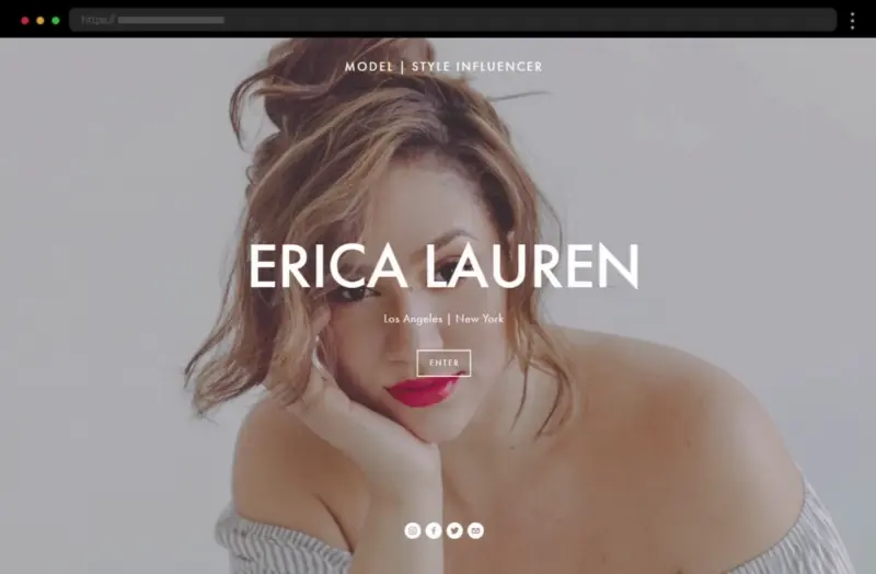
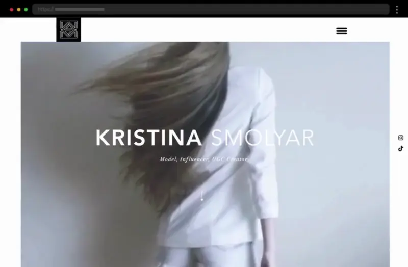
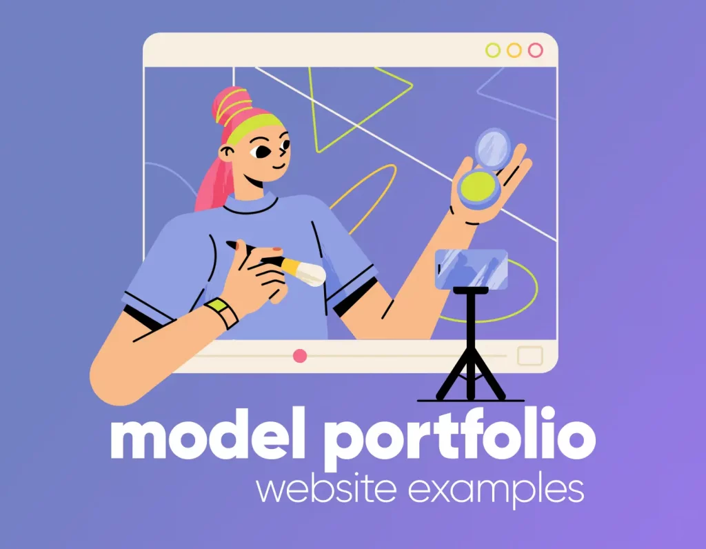
Model portfolios focus on striking visuals and clean layouts that let photography shine. These WordPress examples feature fullscreen images, stylish galleries, and simple navigation to put talent front and center.
An inclusive portfolio blending storytelling and professionalism. High-quality visuals highlight Erica Lauren’s confidence and unique qualities.
A refined, minimal portfolio with high-resolution photos, subtle typography, and a personal bio that adds depth to her professional brand.
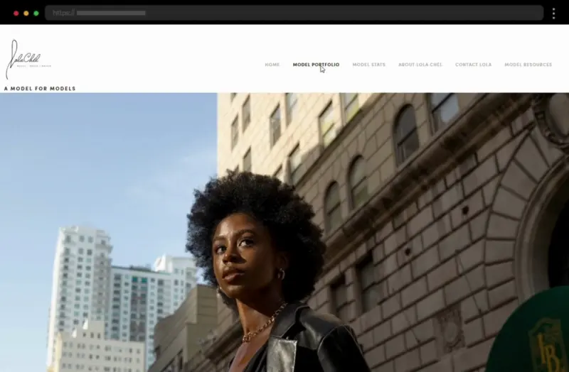
A creative and engaging site with a bold aesthetic. Strong personal branding and an elegant layout showcase Lola Chel’s distinctive style.
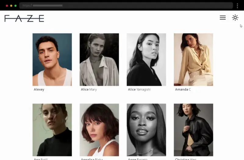
A polished, minimalistic agency portfolio featuring high-quality talent images, smooth navigation, and easy access to individual model profiles.
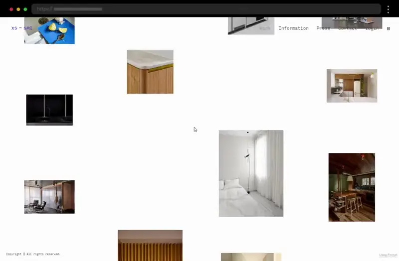
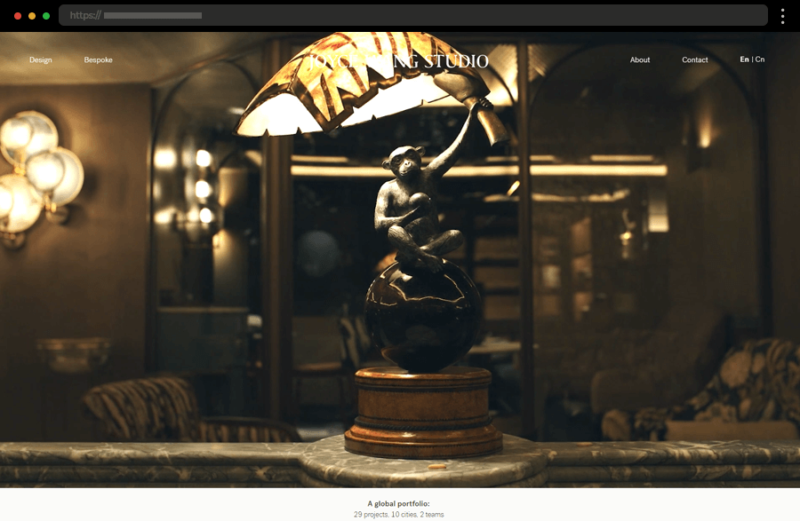
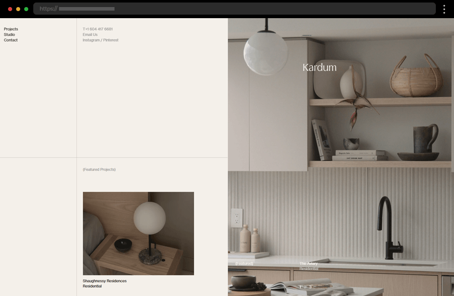
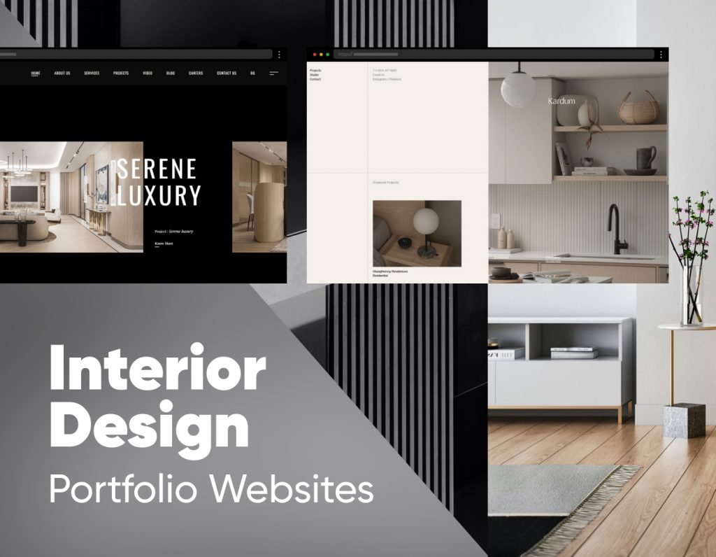
Interior design portfolios thrive on aesthetics. These WordPress examples use elegant typography, large imagery, and balanced layouts to convey sophistication while showcasing projects in a way that feels both stylish and inviting.
Captivating videos and a three-column grid gallery highlight Joyce Wang Studio’s projects, with dedicated pages that showcase each design in detail.
A sleek, presentation-style layout with featured works and discreet navigation creates a polished, modern portfolio experience.
A black-background slideshow sets a luxurious tone. The extensive homepage covers projects, details, and services in a professional, client-focused style.
A refined portfolio with a white background, clean typography, and minimal text that keeps the focus on creative project visuals.
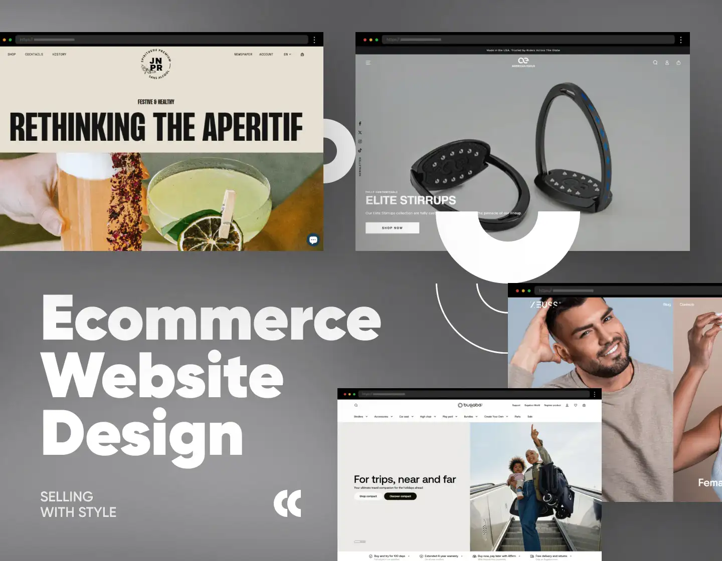
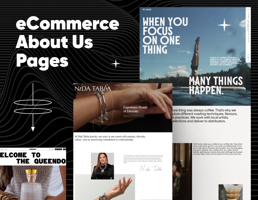
A successful online store requires more than products — it needs design that converts. WordPress eCommerce examples demonstrate effective layouts, persuasive product pages, and seamless checkout flows that keep customers engaged. Check out these inspiring eCommerce websites built to sell.
Modern ecommerce websites are sleek, user-focused, and built to convert. They combine clean layouts, intuitive navigation, and bold visuals to create a shopping experience that feels effortless. In this collection, you’ll find examples that push design trends forward while keeping the customer journey smooth from browsing to checkout.
This playful WordPress eCommerce website example uses a warm yellow palette, animated emojis, and a sticky navigation bar. Its online store lives under the “Prodavnica” tab.
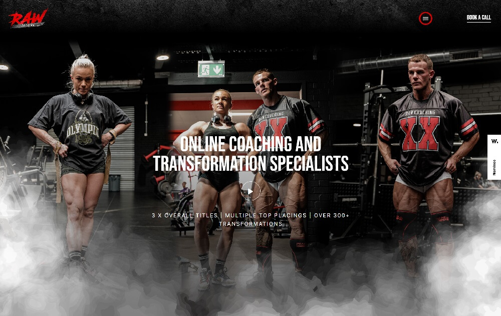
Raw Coaching’s dramatic fitness WordPress website design features a black background, smoky effects, and bold red accents. A “Shop” section completes the eCommerce experience.
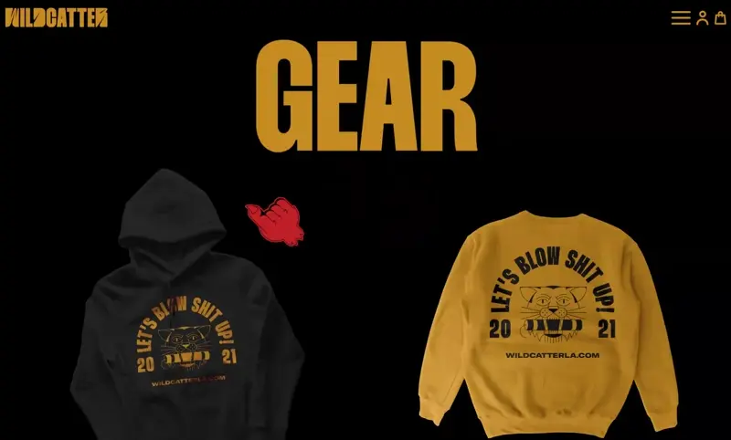
Wildcatter is a bold custom WordPress site with wild animations, a beast-hand cursor, and engaging hover effects — perfect for its edgy brand identity.
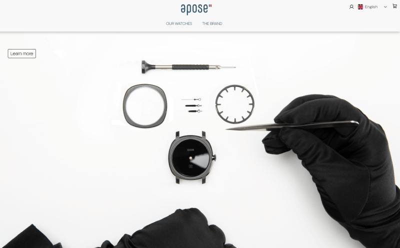
Apose showcases luxury watches with a sleek minimalist WordPress design. Sharp lines, elegant typography, and a black-and-white palette create a high-end feel.
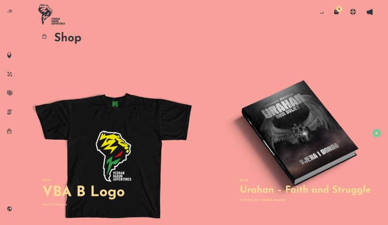
This adventure brand uses pastel section blocks, scrolling logo effects, and structured layouts. It’s a colorful WordPress adventure eCommerce website example with a functional shop.
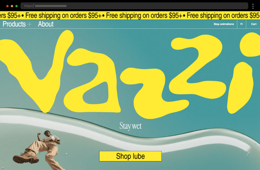
Vazzi grabs attention with bold visuals. Unique fonts, curated product pages, and high-quality images create a sense of exclusivity, while smooth navigation makes browsing effortless.
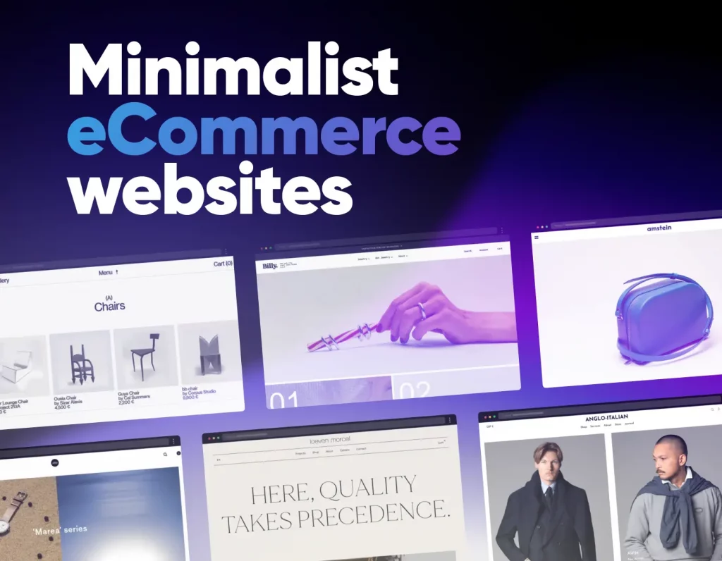
Minimalist ecommerce sites prove that less really is more. Stripped-down layouts, plenty of white space, and carefully chosen product photography keep the focus entirely on what’s being sold. In this collection, you’ll see examples that balance simplicity with style, delivering an elegant shopping experience that’s distraction-free.
A sleek, minimalist site with a monochrome palette and high-quality imagery that puts product craftsmanship at the forefront.
Sleek black-and-white design with bold hero sliders and spacious product pages that highlight precision and detail.
A clean layout with quirky, artistic product imagery and clear CTAs creates a seamless shopping experience.
Minimalist grid design with emotive hero images and strong brand storytelling for a streamlined journey.
Food and beverage ecommerce sites need to spark appetite and trust at the same time. Strong visuals, appetizing photography, and clear product storytelling are key to making customers click “buy.” In this collection, you’ll find examples that blend delicious design with user-friendly functionality to make online shopping irresistible.
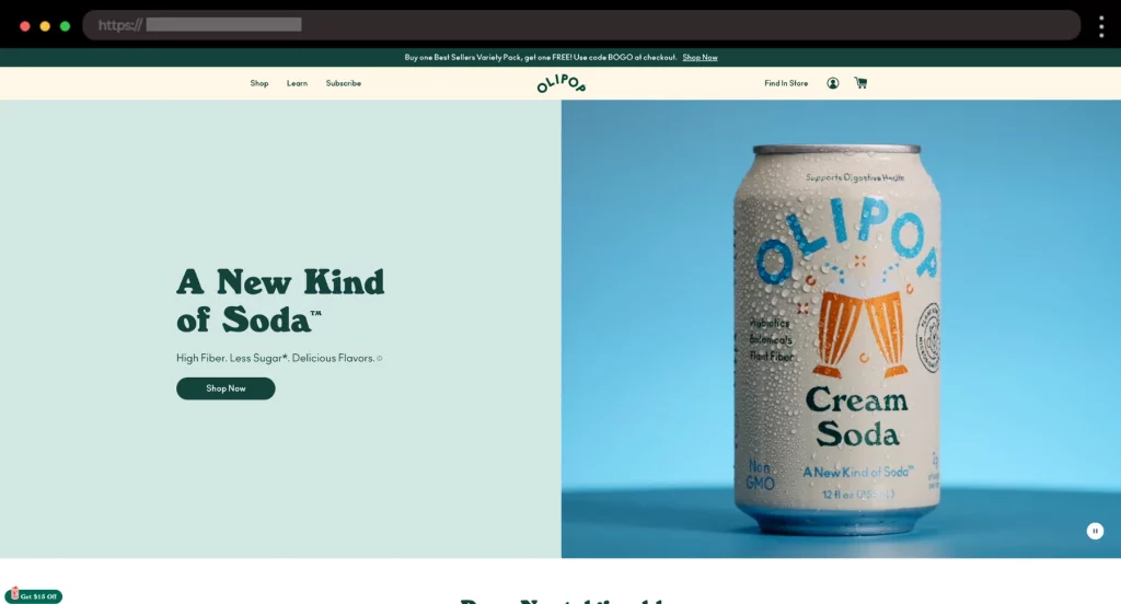
Olipop grabs attention with bold retro fonts, bright colors, and playful scroll effects. Lifestyle photography and fun storytelling make this soda brand feel vibrant and unforgettable.
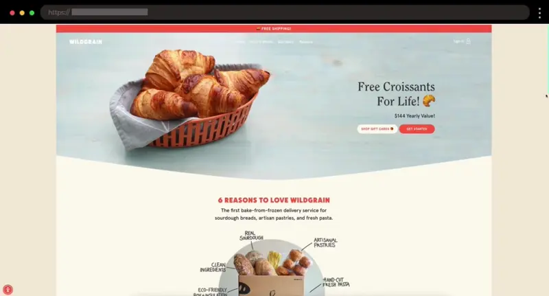
Wildgrain’s site feels warm and handmade, with rustic textures and inviting photography. Organic colors and honest copy highlight the artisanal nature of its breads, pastas, and pastries.
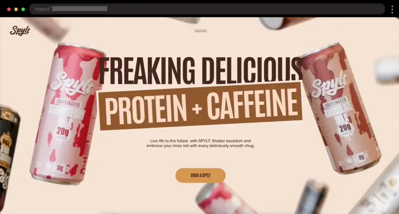
Spylt’s bold typography, slick scroll effects, and confident messaging give the site attitude. Clean product pages emphasize benefits clearly, making this shake brand stand out.
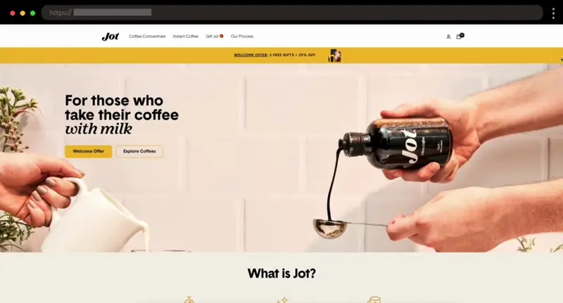
Jot keeps it sharp with warm tones, bold type, and striking product images. Smooth navigation and testimonial videos build trust while letting the coffee take center stage.
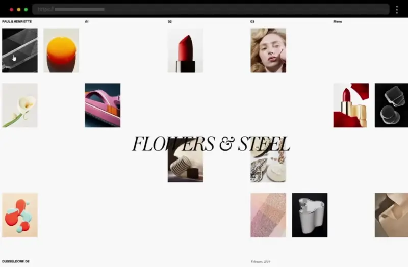
Fashion ecommerce websites are all about showcasing products in style. From bold lookbooks to seamless product galleries, they make browsing feel like stepping into a curated boutique. In this collection, you’ll find examples that mix striking visuals with smooth shopping flows to turn inspiration into sales.
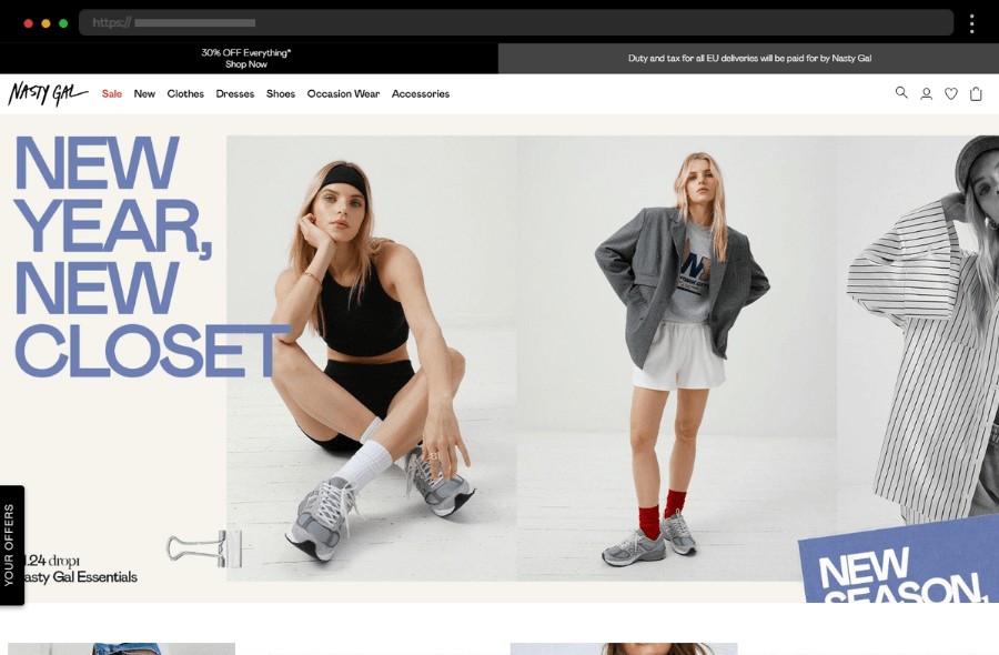
Nasty Gal stands out with bold, edgy visuals and vibrant imagery. A “shop by occasion” feature, fast loading, and smooth navigation make exploring fashion fun and effortless.
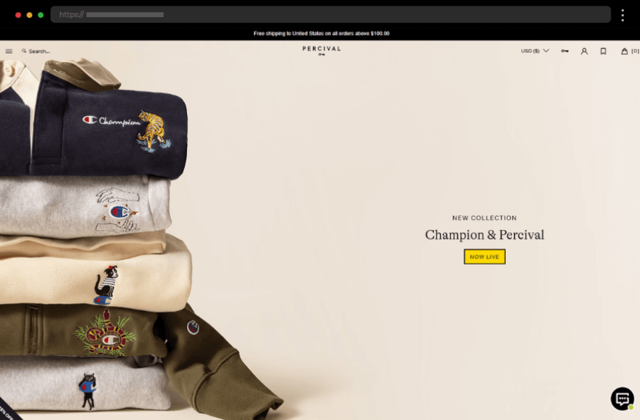
Percival’s clean, minimal design highlights striking clothing visuals. Quirky copy and a stylish palette reinforce brand identity, while clear navigation invites easy browsing.
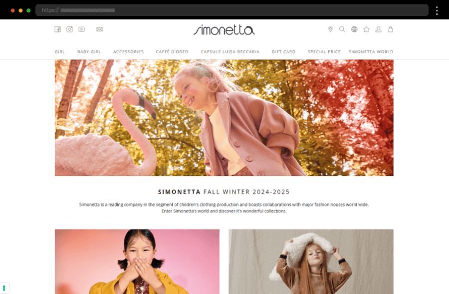
Simonetta blends playful elegance with bright colors and high-quality images. Simple navigation and accessible product pages make shopping luxury kidswear seamless for parents.
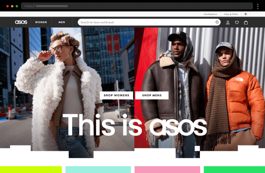
ASOS delivers a sleek design with efficient filters and diverse products. Its clean layout, fast-loading pages, and intuitive navigation create a smooth shopping experience.
Mobile-first ecommerce design ensures shopping is fast, intuitive, and enjoyable on any device. These sites prioritize speed, thumb-friendly navigation, and responsive layouts without sacrificing aesthetics. In this collection, you’ll discover examples that make purchasing on the go as seamless as it gets.
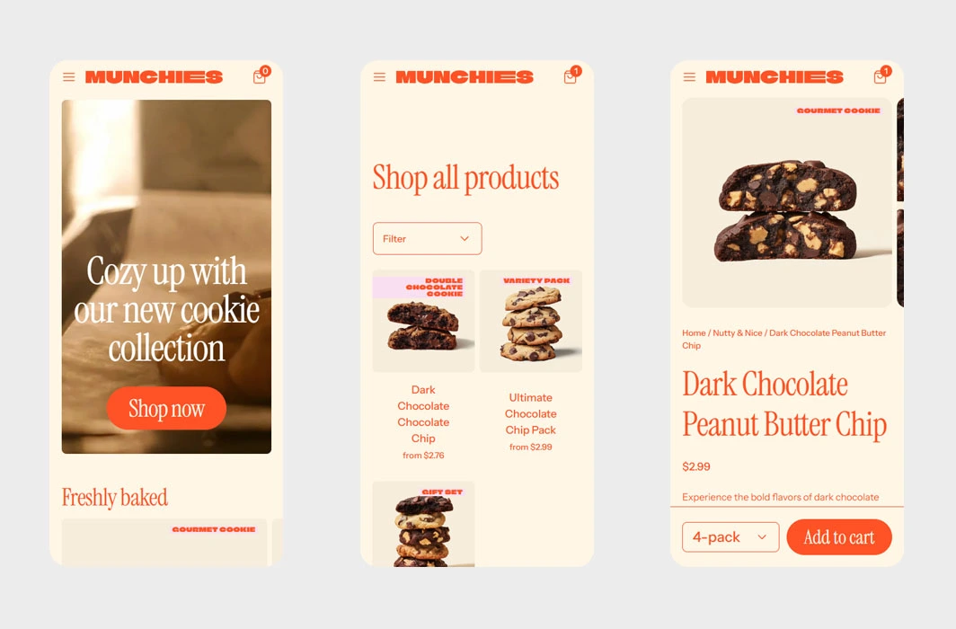
Munchies pops with bright colors and playful cookie imagery. The simple layout and quick checkout make mobile shopping fun and effortless.
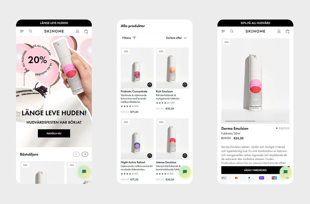
Skinome pairs modern design with science-backed skincare. Informative product pages and seamless navigation make mobile shopping smooth and educational.
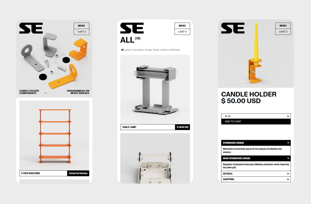
Standard Equipment keeps things practical with a clean, mobile-friendly design. Clear product categories and detailed specs make finding and ordering tools fast.
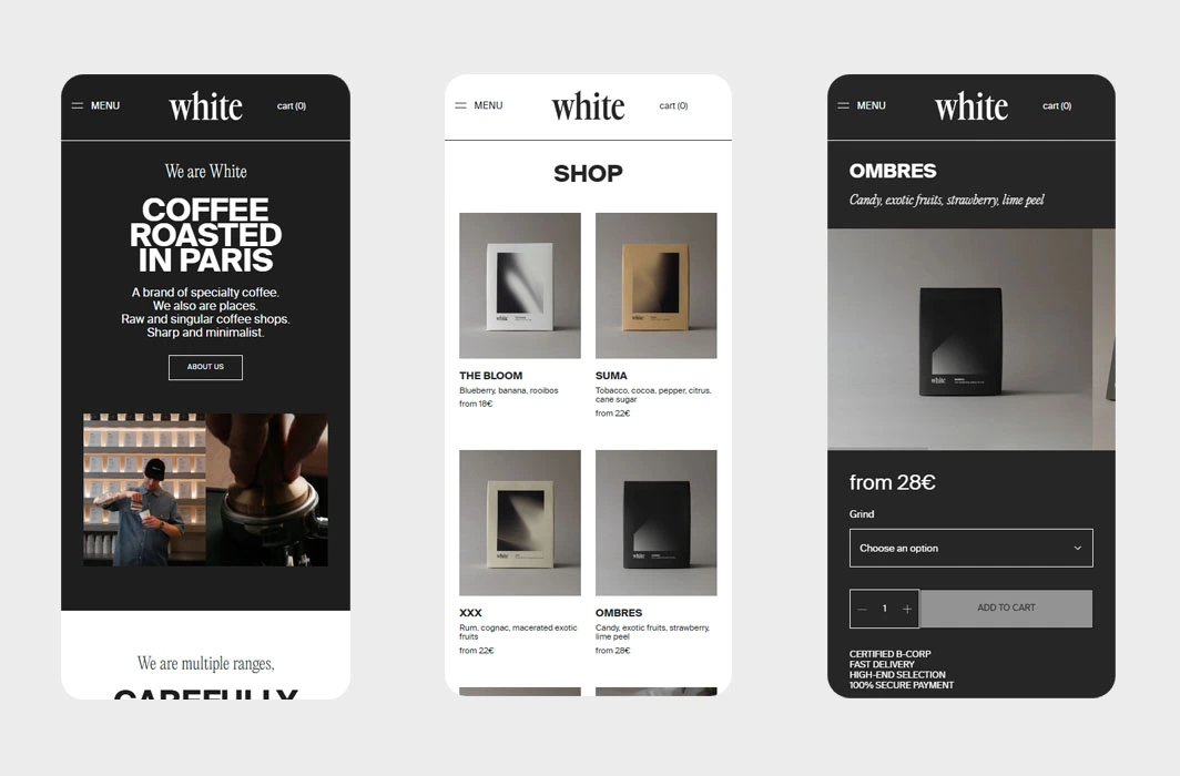
White Coffee blends elegance with simplicity. Flavor profiles and brewing tips enrich the shopping experience, while secure mobile checkout keeps things easy.
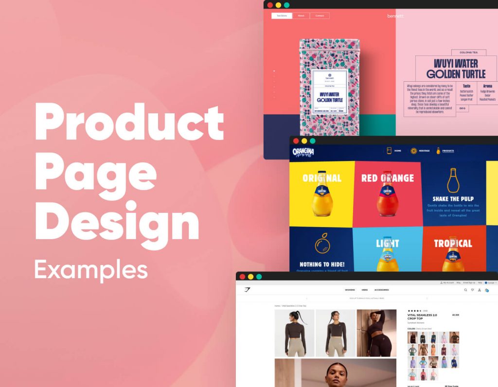
Product pages are where storytelling meets conversion. The best ones don’t just display a product — they sell the experience around it. From bold visuals and interactive 3D models to clever animations and seamless layouts, these designs prove how creative presentation can elevate even the simplest item. Whether it’s fashion, tech, or lifestyle, each example here shows how great product page design can inspire trust, spark curiosity, and turn visitors into buyers.
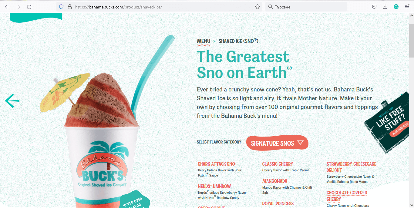
Bahama Buck’s product page uses vibrant 3D visuals and hover effects to showcase flavors, combined with detailed ingredient and nutrition info for a fun and informative experience.
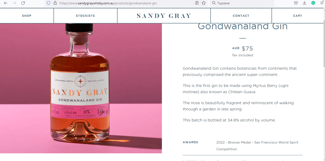
Sandy Gray’s product page highlights premium whisky with one striking image per product, sophisticated copy, and color-coordinated visuals to convey quality and craftsmanship.
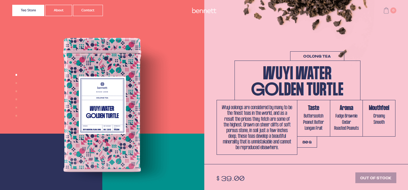
Bennett Tea’s product page features a smooth slideshow with pastel colors and fluid animations, showcasing each tea blend with artistic, Memphis-inspired design.
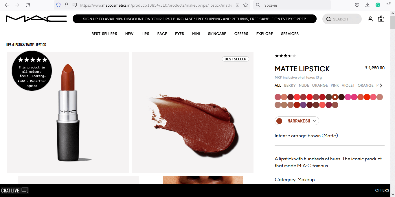
MAC Cosmetics’ product page combines a grid layout with zoom-on-hover images, star ratings, and a virtual “Try It On” feature for an engaging shopping experience.
Some niches require specialized functionality and design finesse. From education to real estate, agencies to restaurants, WordPress can handle it all. Explore our industry-specific WordPress website examples to see how tailored layouts, content, and UX make a difference.
Real estate websites are built to inspire trust and make browsing properties simple. They use clean layouts, powerful imagery, and clear calls to action so visitors can easily explore listings and connect with agents. In this collection, you’ll see examples that blend professionalism with usability to turn interest into inquiries.
S&P Real Estate’s luxury WordPress real estate website uses a clean black-and-white grid layout to showcase high-end property listings with elegance.
This WordPress architecture portfolio focuses on minimalist layouts, sharp typography, and stunning imagery that reflect architectural precision and emotion.
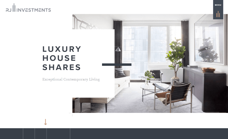
RJ Investments’ WordPress real estate site highlights luxury rental homes with an asymmetrical layout and overlapping elements for a modern feel.
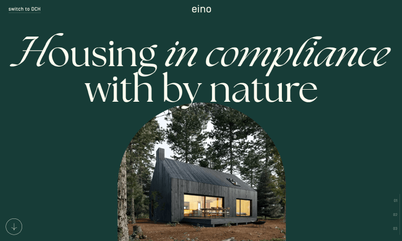
Evo’s immersive WordPress housing website uses green tones and even bird sounds to reinforce its nature-inspired, eco-friendly presentation.
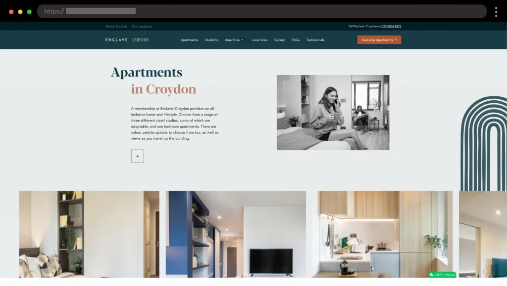
Enclave presents a clean design blended with personality. You will see bold headlines, clean fonts, and color choices that induce trust.
Creative agency websites are designed to impress from the very first click. Bold visuals, clever interactions, and strong branding communicate originality and expertise. In this collection, you’ll find examples that prove how design itself can be the strongest portfolio piece.
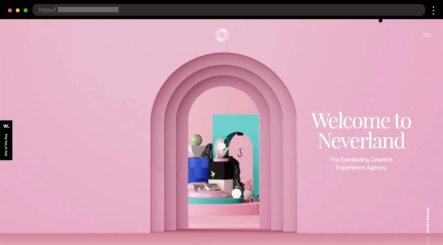
Neverland’s site feels like a whimsical journey, with playful animations, pastel accents, and bold typography. The dreamy design captures the agency’s creative spirit while keeping visitors engaged.
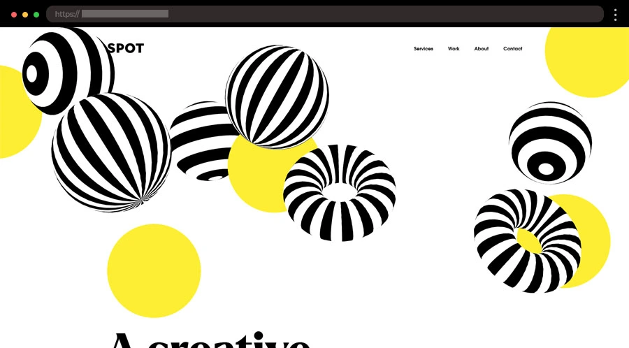
Spot Creates brings its energy online with bright colors, quirky layouts, and bold fonts. Interactive hover effects make the site feel dynamic and fun, perfectly mirroring the agency’s creative vibe.
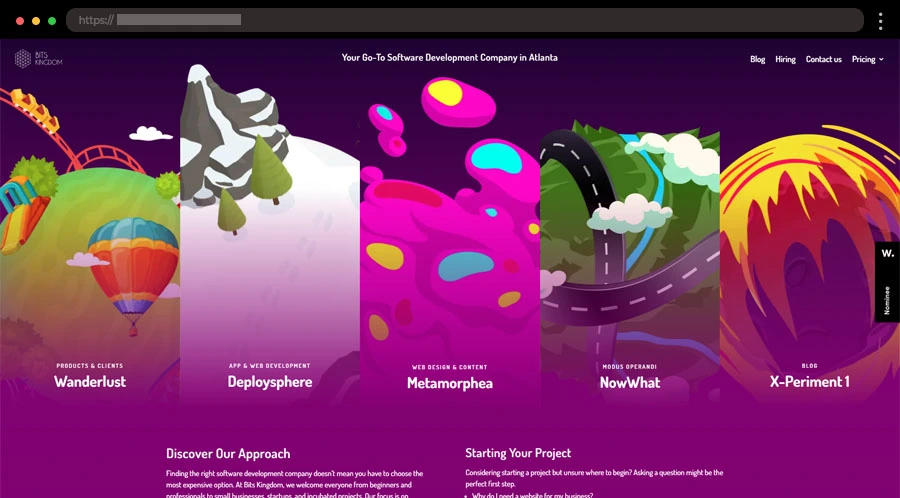
Bits Kingdom blends sleek visuals with a futuristic vibe. The site is clean, mobile-friendly, and easy to navigate, with strong CTAs that highlight their digital innovation and UX/UI expertise.
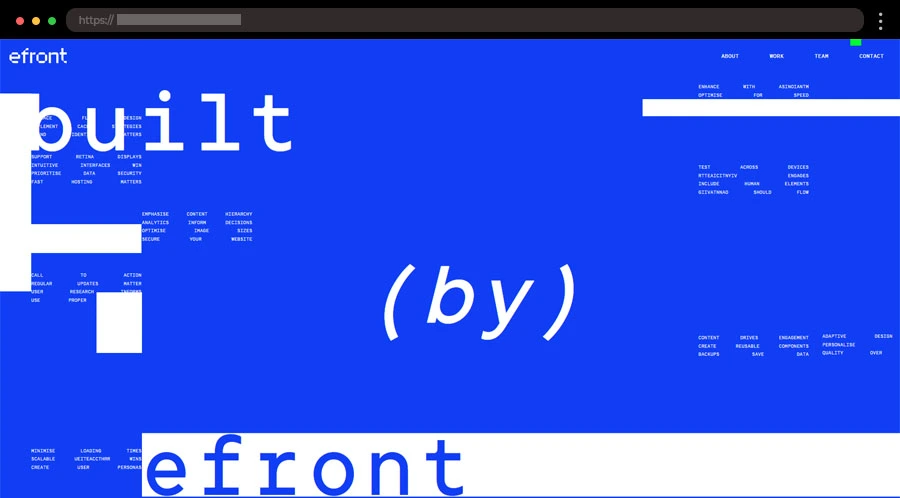
Efront Digital turns their site into a retro video game. Pixel fonts, bold colors, and interactive scrolling create a nostalgic yet immersive way to showcase their marketing and development services.
Digital design agency sites showcase precision, innovation, and aesthetic flair. They often combine sleek layouts, interactive elements, and polished case studies to demonstrate expertise. In this collection, you’ll see examples that show how agencies use their own websites as proof of design mastery.
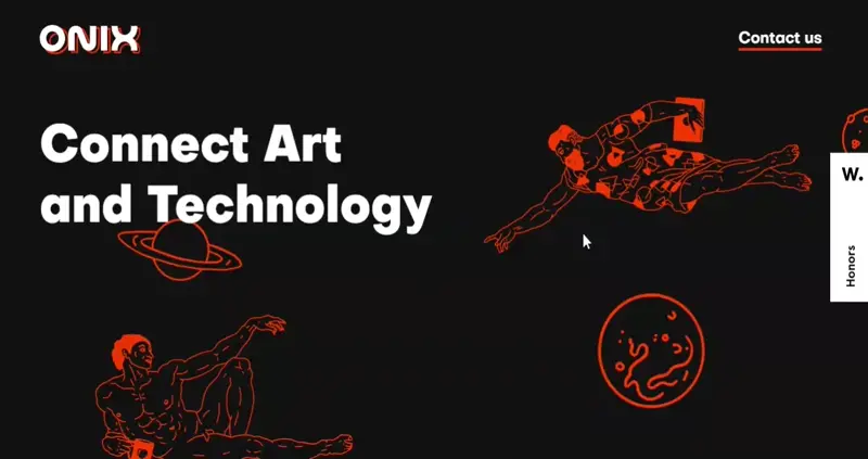
Onix pairs bold messaging with animated artwork that unfolds as you scroll. Interactive team portraits add a playful surprise, making the site both stylish and engaging.
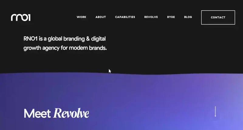
RNO1 stands out with a bold black-and-purple theme and wave animations that feel futuristic. The sleek design reflects their work with top brands like Microsoft and Airbnb.
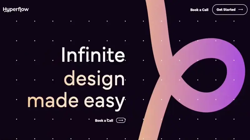
Hyperflow’s dark-mode site uses a pink gradient ribbon and smooth parallax effects. It positions the agency as a fast, affordable option for startups and businesses.
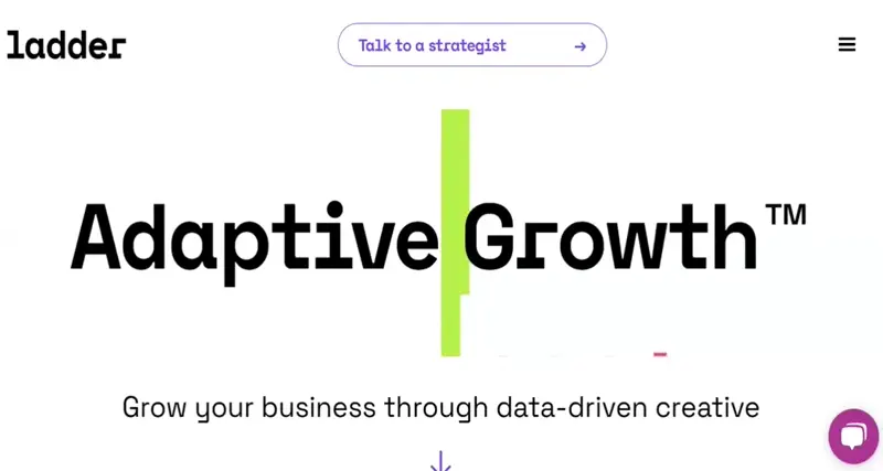
Ladder’s homepage is direct and client-focused, showcasing logos, results, and social proof. A quick demo video reinforces their expertise as a full-funnel strategy team.
Digital marketing agency websites are all about clarity and persuasion. With sharp messaging, dynamic visuals, and well-structured service sections, they show clients exactly how they can deliver results. In this collection, you’ll discover examples that balance creativity with conversion-focused strategy.
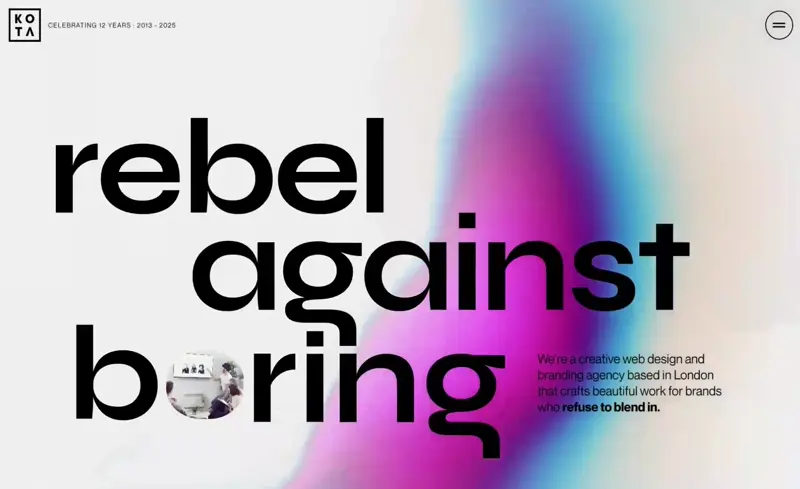
KOTA’s site shines with a pink-and-turquoise gradient, bold slogans, and interactive graphics. Their portfolio is immersive, showcasing briefs, processes, and results through video and motion.
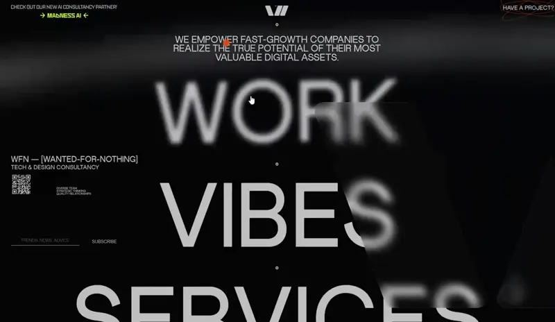
Wanted For Nothing uses a minimalist black design with bold text, hover effects, and motion typography. Playful touches like an orange scribble CTA and animated sections keep the site dynamic.
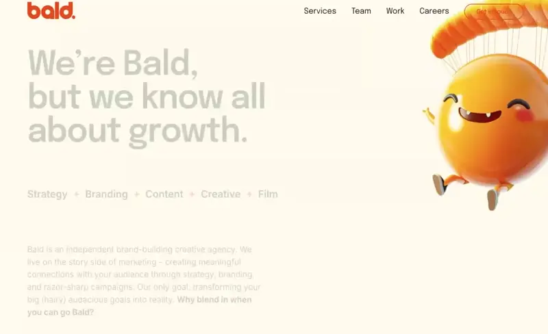
Bald’s website combines witty copy with smooth animations and a modern, laid-back design. Minimal content, curated case studies, and a playful tone make it both smart and fun.
Stink Studios impresses with a creative preload animation, bold tagline, and sleek video showcase. The casual “Ideas for the Internet” message feels fresh and approachable.
Space Oddity Dubai uses storytelling, smooth scrolling, and striking visuals to create a single-page experience.
Education websites make learning approachable and accessible. From schools to online courses, these sites use intuitive navigation, structured content, and engaging visuals to build trust and encourage enrollment. In this collection, you’ll find examples that combine professionalism with user-friendly design.
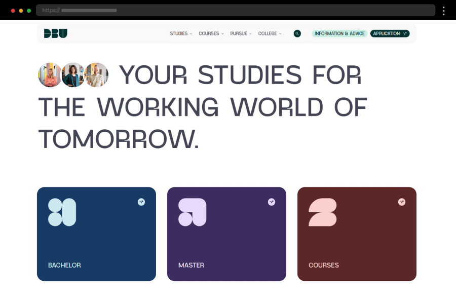
DBU’s site feels professional and modern with colorful visuals, clear text, and smooth navigation. Calls to action for programs and applications stand out, making it easy for students to explore courses and campus life.
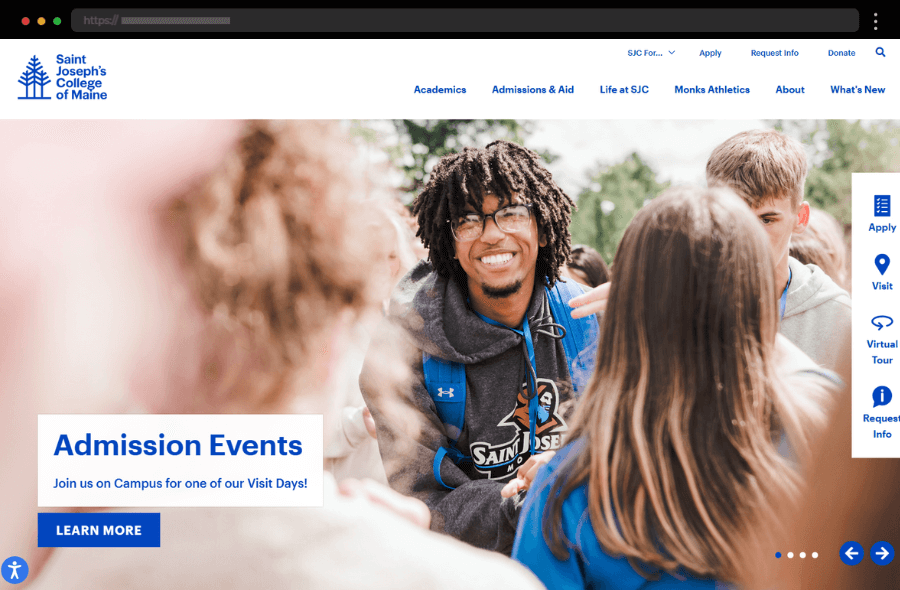
Saint Joseph’s College welcomes visitors with a modern design that highlights academics and student life. Clear calls to action and intuitive navigation make it easy for prospective students to find what they need.
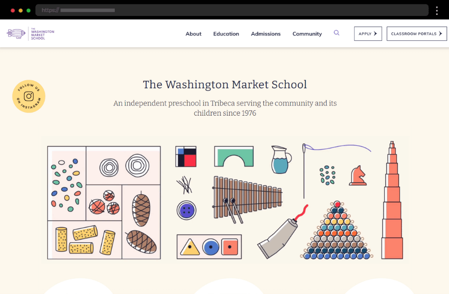
Washington Market School’s site uses soft colors and child-friendly images to create a warm, welcoming feel. Simple navigation and engaging photos make exploring programs and enrollment options effortless.
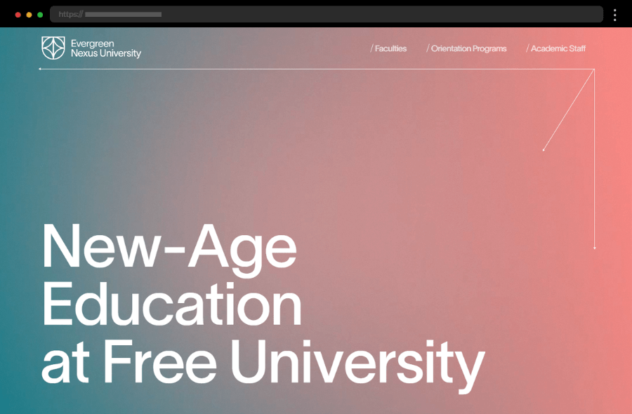
Evergreen Nexus University combines a clean layout with vibrant colors for a lively first impression. Intuitive navigation and quick links to faculty, programs, and orientation make the site easy to explore.
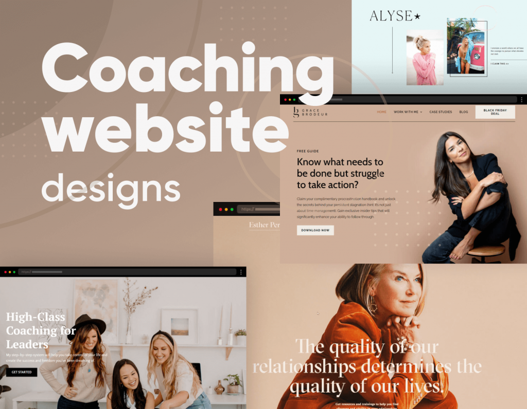
Coaching websites are built to inspire confidence and connection. They often feature personal storytelling, clean layouts, and clear calls to action to encourage sign-ups or consultations. In this collection, you’ll find examples that balance professionalism with approachability, helping coaches showcase their expertise while making it easy for clients to take the next step.
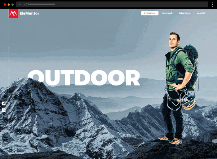
Elementor.at uses striking visuals and parallax effects to showcase swimming, fitness, and outdoor coaching. Course galleries bring each program to life, making it easy to see what the experience looks like.
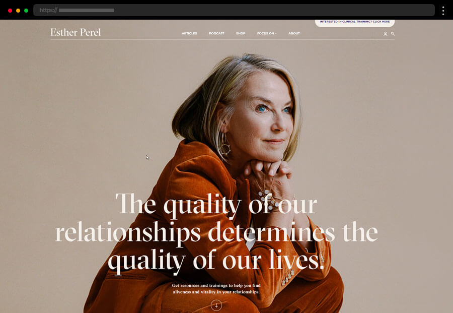
Esther Perel’s clean, minimalist site organizes podcasts, books, courses, and training into a user-friendly layout. It highlights her expertise while making resources easy to access.
Nora DeKeyser’s one-page site makes a strong first impression with media mentions, services, and testimonials. Simple but effective, it builds instant trust and credibility.
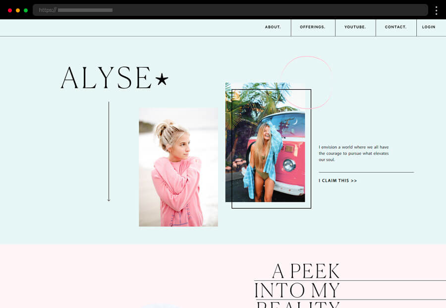
Alyse Parker’s site feels fresh and modern, designed for a social media–savvy audience. Minimalist design and soft tones make her self-paced wellness programs approachable and engaging.
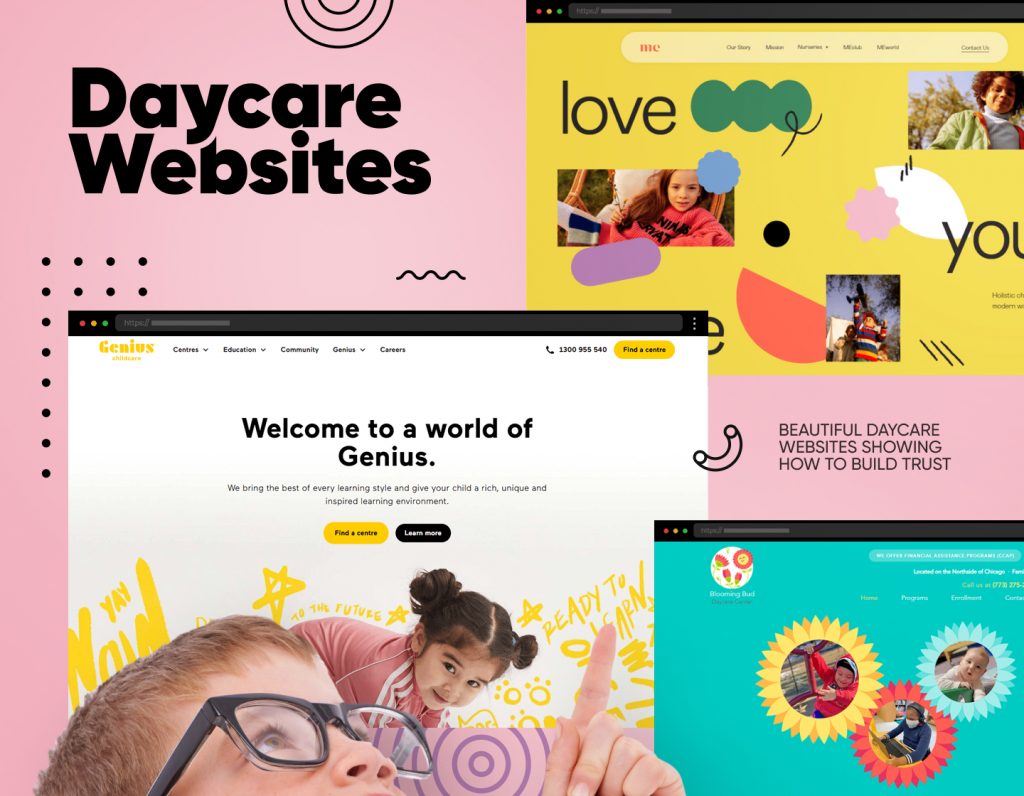
Daycare websites should instantly feel warm, welcoming, and trustworthy. Parents want to see a safe, nurturing environment where their children will thrive. The best examples combine cheerful colors, friendly imagery, and clear information about programs, staff, and enrollment. In this collection, you’ll find daycare websites that beautifully balance care, professionalism, and playfulness to build trust and connect with families.
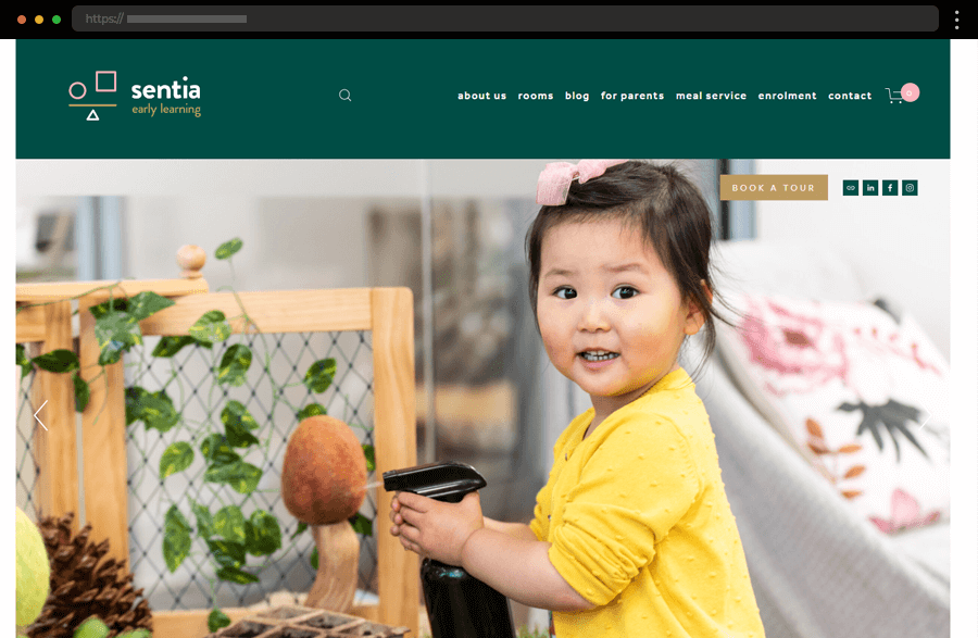
Sentia’s modern, well-structured website builds trust fast through detailed info, warm visuals, and parent testimonials, all wrapped in a clean, professional layout.
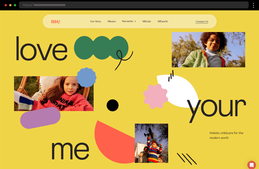
MePlace’s bright, colorful design feels joyful and welcoming, using minimalist structure, photos, and testimonials to showcase its caring philosophy.
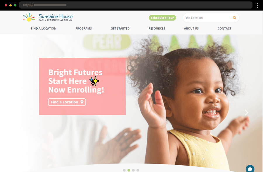
Sunshine House’s vibrant, informative site offers intuitive navigation, helpful CTAs, and a resourceful blog that strengthens parent engagement and trust.
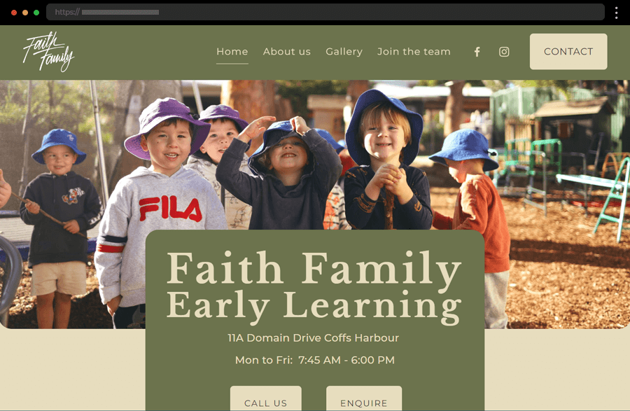
Faith Family’s earthy, nature-inspired design blends warmth with clarity, using strong visuals and quick links to highlight its nurturing childcare approach.
Tech websites need to communicate innovation while staying clear and functional. They often feature bold typography, interactive visuals, and product storytelling that simplify complex ideas. In this collection, you’ll see examples that merge sleek aesthetics with usability to showcase cutting-edge technology.
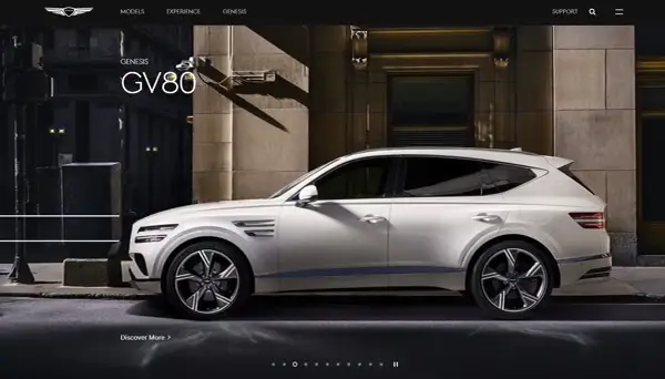
Genesis blends luxury and interactivity with cinematic car showcases, sleek visuals, and smooth navigation. Interactive previews highlight features while elegant design choices create a premium, modern feel.
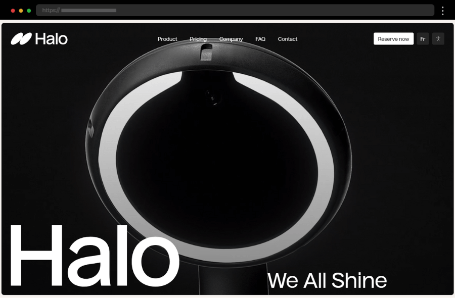
Halo Dental uses soft tones, clean fonts, and professional visuals to build trust. Clear CTAs, transparent info, and a mobile-friendly layout make booking and browsing effortless.
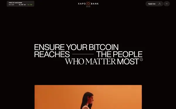
Xapo Bank’s minimalist design uses whitespace, bold typography, and subtle animations to simplify complex services. The clean layout and smart copy create clarity while driving engagement.
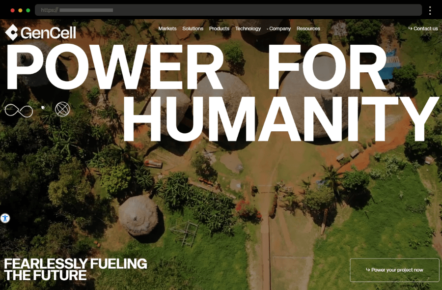
GenCell Energy combines futuristic vibes, video demos, and rounded design elements to explain complex tech simply. Strategic CTAs and graphics balance professionalism with accessibility.
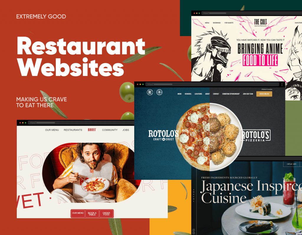
Food and restaurant websites should feel as appetizing as the menu itself. They rely on rich imagery, tasteful layouts, and clear booking or ordering systems to entice visitors. In this collection, you’ll find examples that use design to spark appetite and drive reservations or sales.
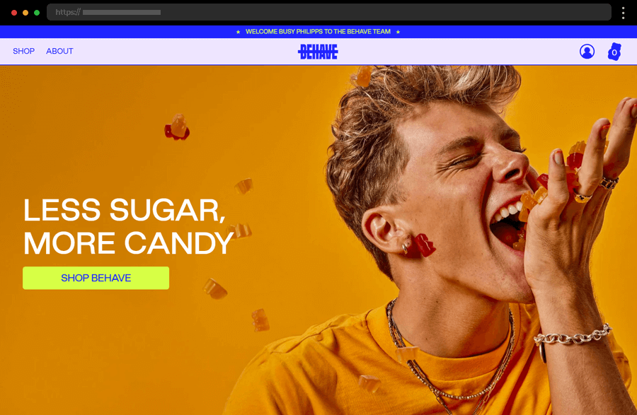
BEHAVE delights with bold colors, fun animations, and a playful tone that mirrors its healthy candy vibe. Clear info and easy navigation make browsing feel as sweet as the treats themselves.
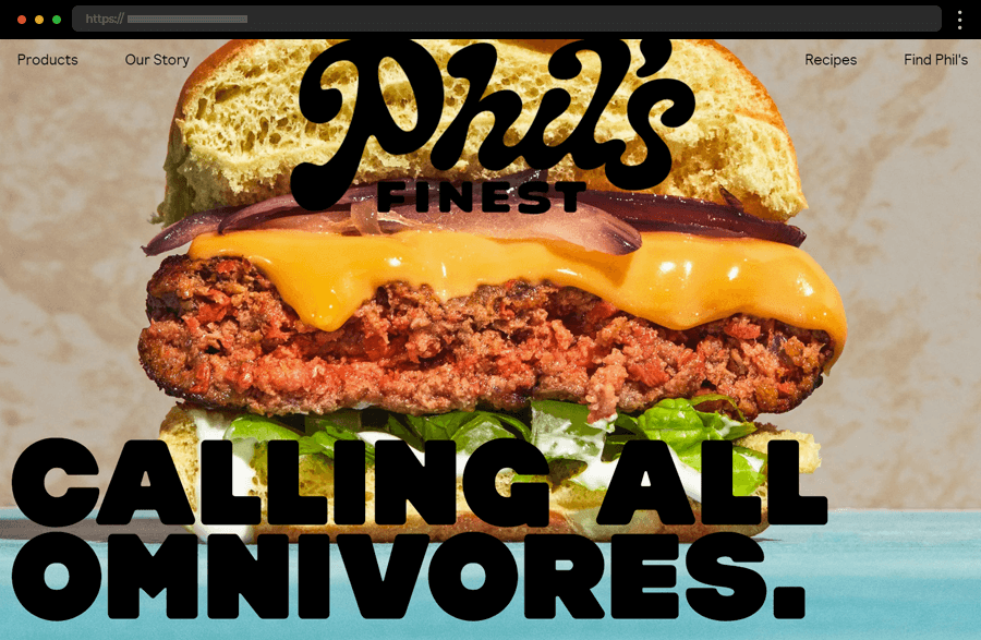
Phil’s Finest bursts with color and energy. Whimsical typography, enticing visuals, and clever copy make exploring the site a joy, perfectly reflecting the brand’s fun, fresh personality.
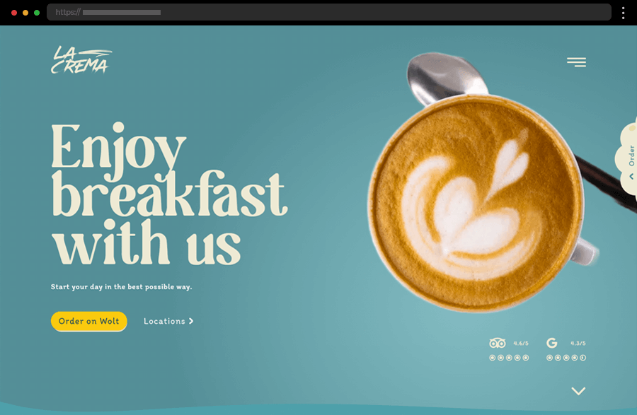
La Crema’s website feels calm and refined with soft tones, beautiful photography, and clear CTAs. Its smooth navigation and elegant layout create a truly inviting online café experience.
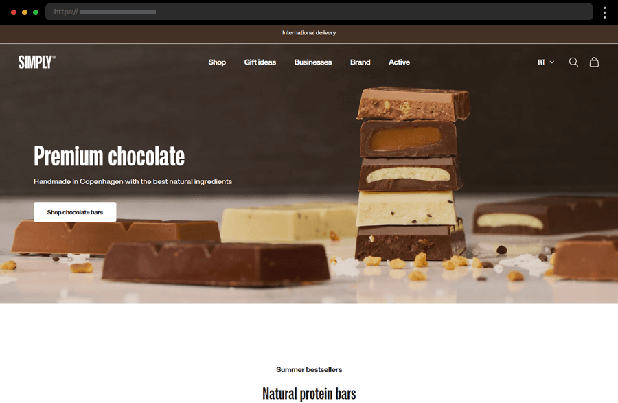
Simply Chocolate blends Scandinavian simplicity with rich visuals. A clean layout, high-quality imagery, and warm tones highlight the brand’s focus on natural, premium chocolate.
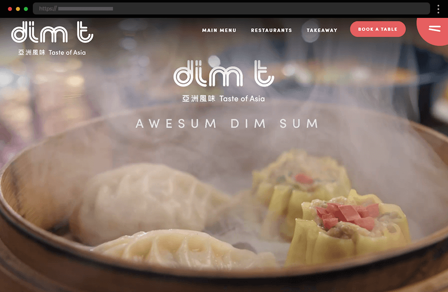
Dim T captures the beauty of Asian culture through stunning food visuals and a calm, balanced design. Subtle animations and thoughtful details, like the chopstick menu icon, make it truly memorable.
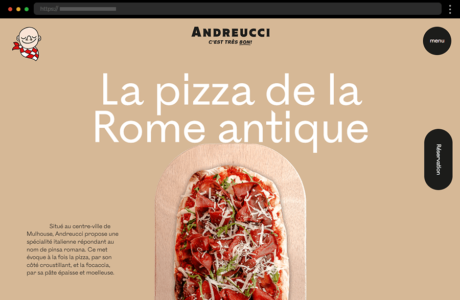
Andreucci’s site instantly tempts visitors with mouth-watering pizza slideshows and smooth scroll animations. Sticky CTAs for reservations and info make browsing effortless and deliciously engaging.
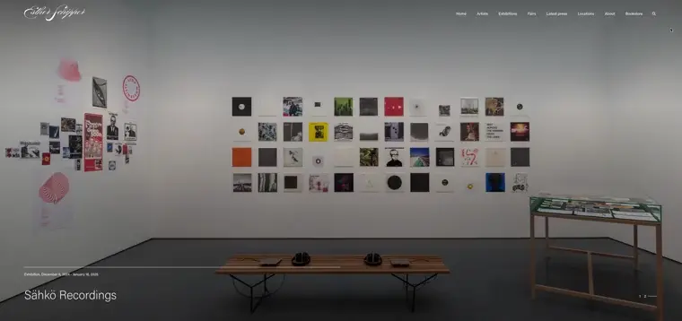
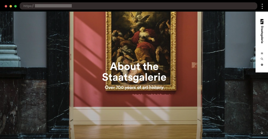
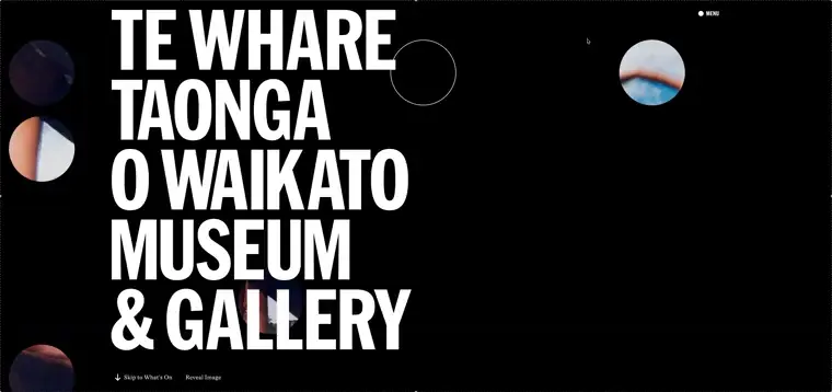
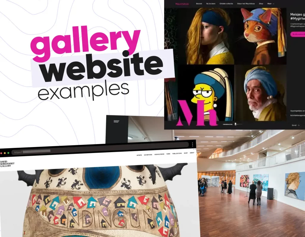
Art gallery websites highlight creativity and curation through elegant layouts and immersive visuals. They keep the focus on the artworks, often using minimalist design and smooth navigation to create a museum-like experience online. In this collection, you’ll see examples that make browsing feel like stepping into a gallery.
Esther Schipper’s site embraces clean minimalism, letting high-quality visuals of each artwork take center stage. Subtle scroll effects and a curated bookstore add depth without distraction.
Staatsgalerie uses bold yellows, playful typography, and dynamic layouts to create an energetic experience. Clear sections guide visitors through collections, exhibits, and events with ease.
The Van Gogh Museum brings art to life with full-screen displays, zoomable details, and interactive tools. The design blends discovery with education, making the artist’s world immersive.
Te Whare Taonga’s earthy tones, authentic typography, and multimedia storytelling highlight New Zealand’s heritage. Interactive elements make exhibits engaging while keeping navigation clear.
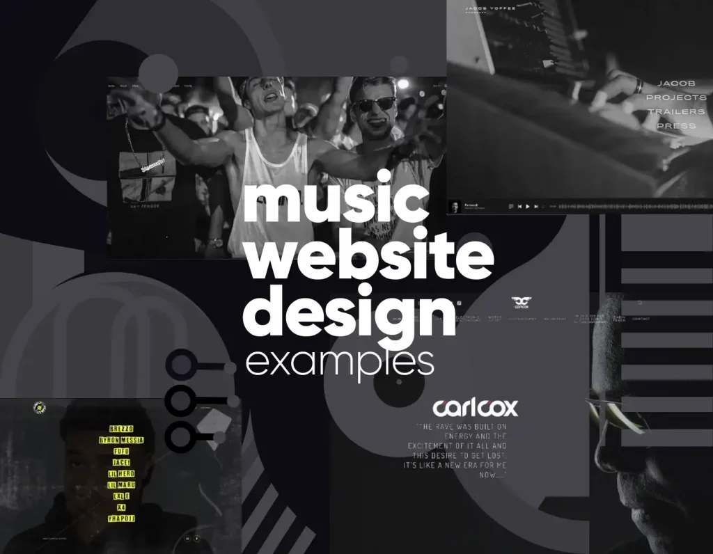
Music websites bring sound and style together with immersive design. Whether for artists, producers, or labels, these sites use bold visuals, streaming integrations, and storytelling to showcase talent. In this collection, you’ll find examples that capture the energy of music while keeping the browsing experience seamless.
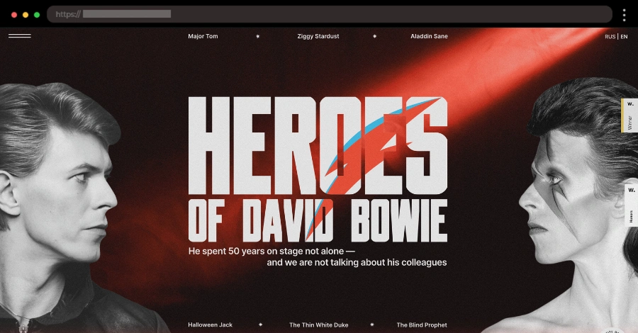
Bowie’s Heroes feels alive with bold colors, smooth scroll effects, and an interactive vertical timeline. Large fonts and dynamic visuals turn this tribute into a full experience.
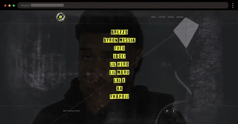
Simple Stupid Records keeps it fun with a dark-and-yellow design and playful hover effects that reveal artists’ images. Interactive touches make the site lively and memorable.
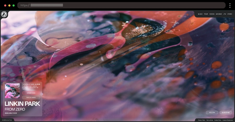
Linkin Park’s site mirrors their gritty sound with bold visuals and dark tones. Fans can easily access music, merch, and news, with their latest album front and center.
The Breedling’s site blends a stark black-and-white palette with skull animations for a powerful vibe. Built-in music controls keep the listening experience seamless as you browse.
B2B business websites focus on professionalism, clarity, and lead generation. They often feature structured layouts, service overviews, and trust-building elements like case studies or testimonials. In this collection, you’ll discover WordPress examples that prove how strong design can support business growth.
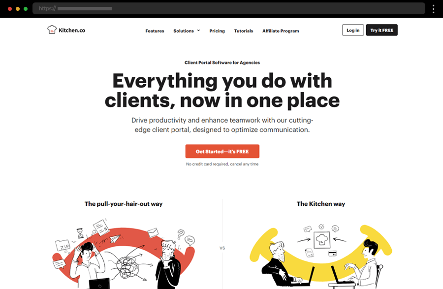
Kitchen.co impresses with an illustrated, modern interface that simplifies project communication. Alternating testimonials and feature highlights build trust while the intuitive layout keeps navigation effortless.
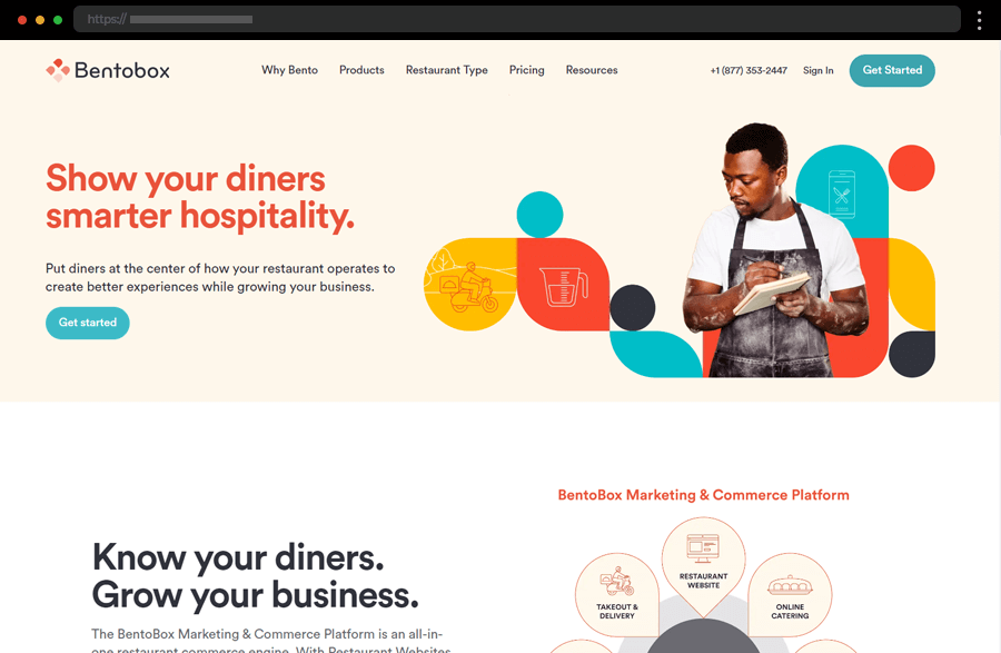
BentoBox uses vibrant imagery, clear CTAs, and a structured layout to showcase its tools for restaurants. The design feels both professional and approachable, guiding users seamlessly through its services.
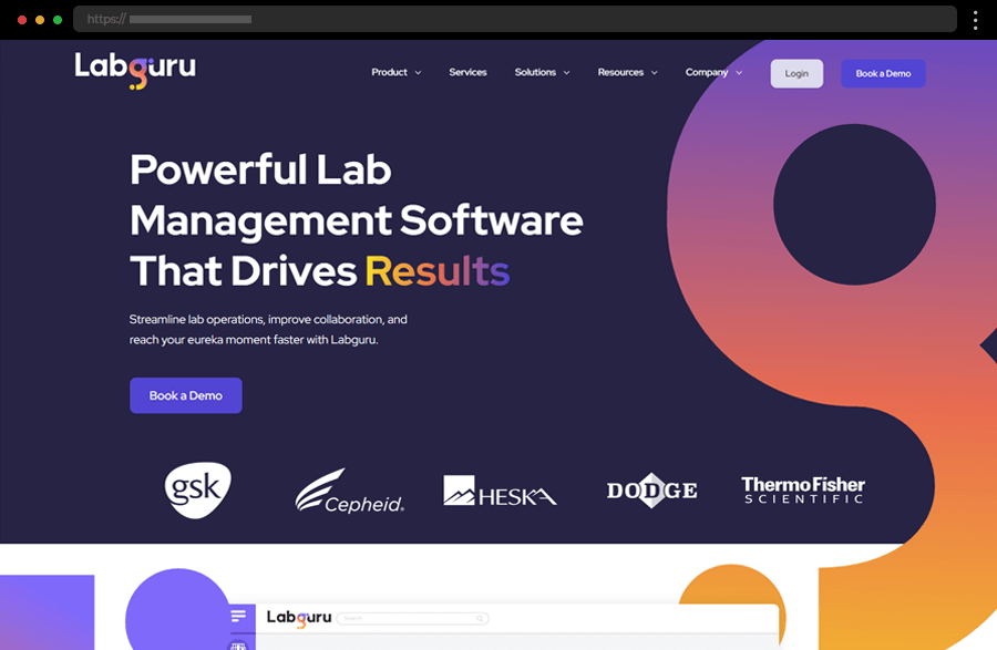
Labguru’s colorful, professional design balances clarity with detail. Anchored navigation and engaging visuals make complex lab management solutions accessible and trustworthy.
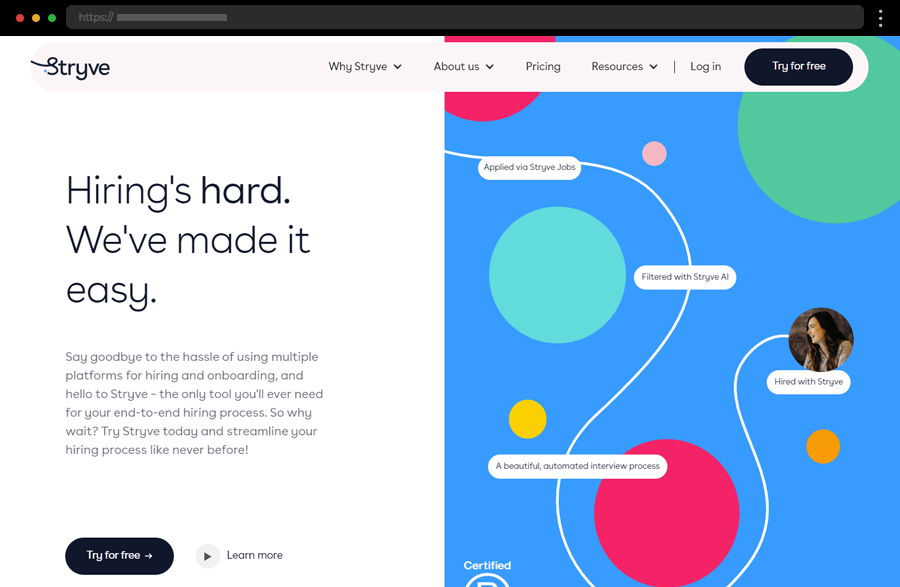
Stryve stands out with a colorful, modern design and smooth navigation. Bold visuals and easy access to detailed info make exploring its hiring tools both engaging and user-friendly.
Insurance websites must inspire trust and clarity right away. The best examples use clean layouts, reassuring visuals, and straightforward messaging to help visitors understand coverage options and take confident next steps. In this collection, you’ll find insurance websites that combine professionalism, usability, and credibility to turn visitors into loyal clients.
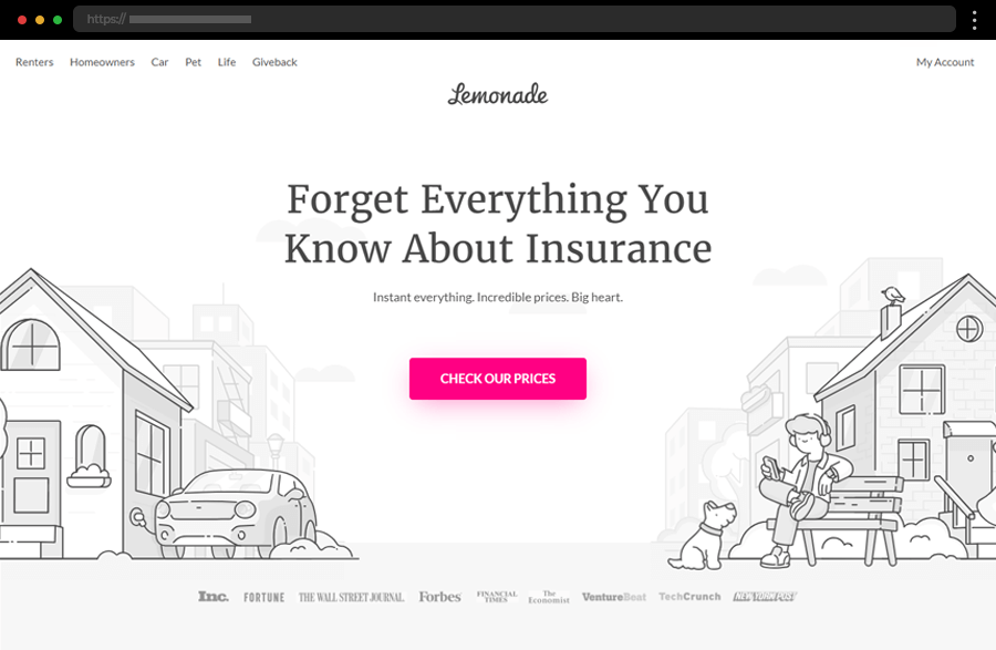
Lemonade’s playful, illustrated insurance website combines vibrant visuals, clear CTAs, and instant chatbot support to make getting coverage feel simple, friendly, and fast.
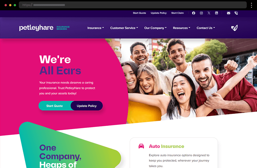
PetleyHare’s colorful, modern design uses smart structure and interactivity to make browsing policies effortless while showcasing trust and expertise.
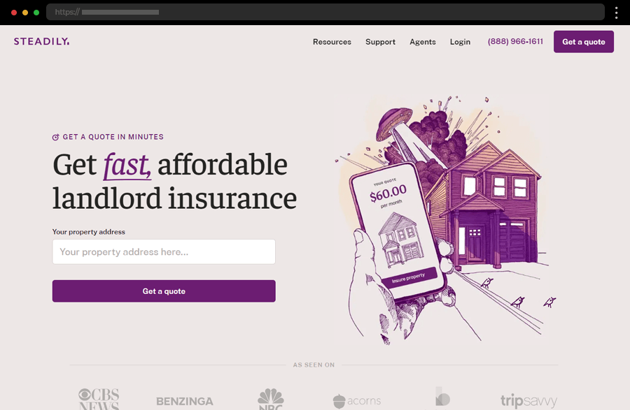
Steadily’s soft pastel design and clear messaging create a calm, trustworthy feel, enhanced by helpful illustrations, testimonials, and an integrated AI chatbot.
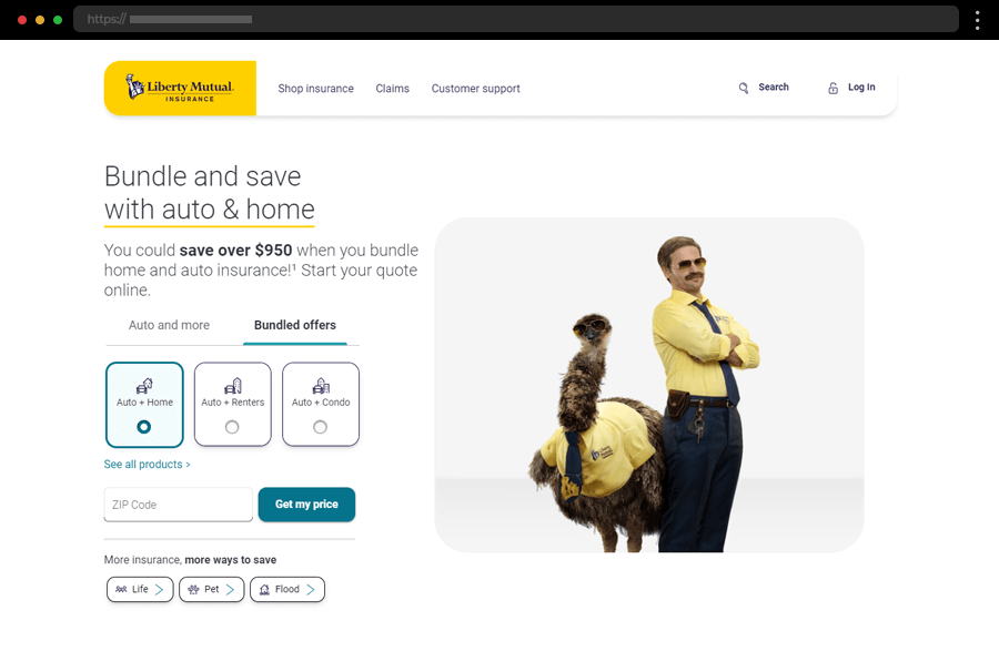
Liberty Mutual’s user-friendly website focuses on easy navigation, bundled offers, and quick quote tools, delivering a smooth, customer-first experience.
Sometimes, it’s the details that elevate a site — headers, footers, forms, CTAs, or error pages. These design elements and page types improve usability, enhance aesthetics, and increase conversions. Discover how WordPress websites use design elements strategically to create an engaging and polished experience.
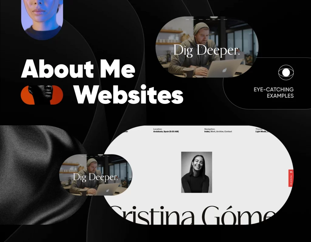
A great About page tells your story and builds trust. These examples show how brands and creators use engaging visuals, authentic messaging, and thoughtful layouts to connect with visitors. Whether you’re a freelancer, startup, or large company, these designs prove that a well-crafted About page can turn curiosity into confidence.
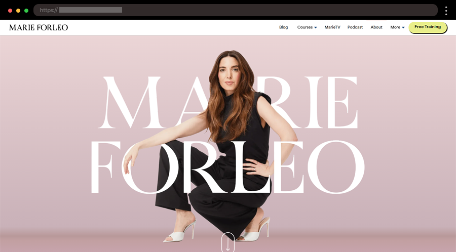
Marie Forleo’s website bursts with positivity and energy, mirroring her motivational brand. Strong visuals, clean fonts, and an uplifting tone make exploring her story, courses, and resources both inspiring and effortless.
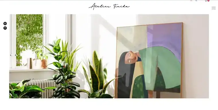
Atelier Tinika’s vibrant and creative site feels like stepping into her colorful world of illustration. Playful visuals, intuitive navigation, and a charming art shop create a beautifully personal and artistic online experience.
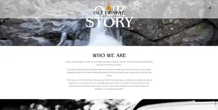
Isle of Skye Distillers’ About page blends Scottish heritage with modern elegance. Stunning landscape visuals and heartfelt storytelling capture the brand’s passion for crafting premium spirits.
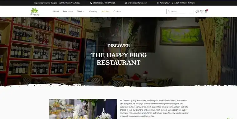
The Happy Frog’s About page feels as fresh and inviting as its menu. Warm visuals, friendly copy, and flavorful storytelling perfectly reflect its gourmet dining charm.
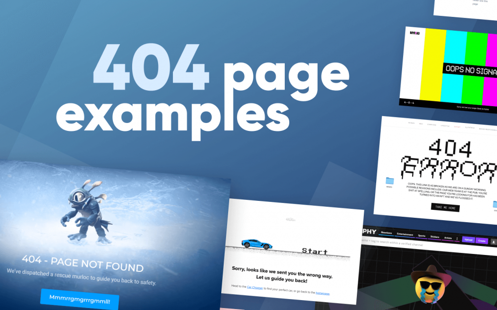
Even errors can make a statement. These creative 404 pages show how smart design and a touch of humor can turn frustration into delight. From playful animations to clever messages and helpful navigation links, these examples demonstrate that every page on your site can reinforce your brand’s personality.
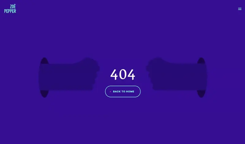
Zoe Pepper’s creative WordPress 404 page example features a playful “rock, paper, scissors” game that entertains while gently prompting users back to Home.
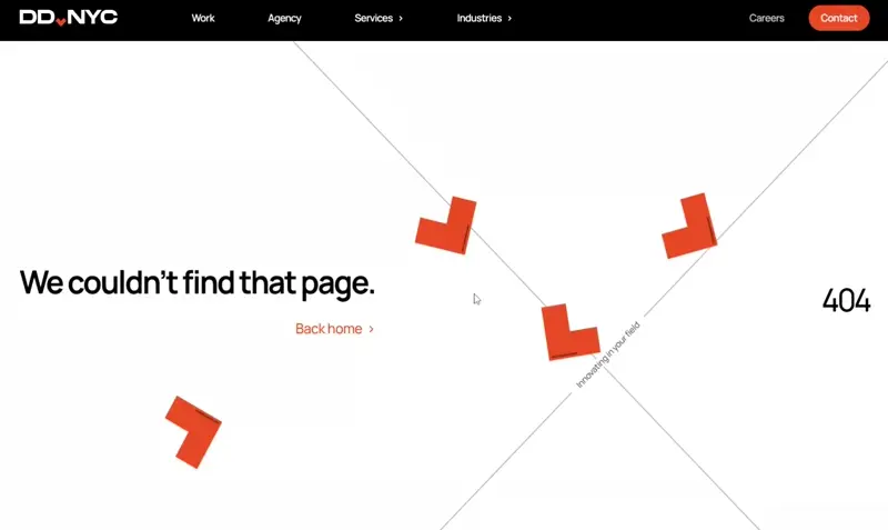
DD.NYC’s sleek animated WordPress 404 page uses tasteful motion design and a quick “Back Home” link, reflecting the agency’s branding expertise.
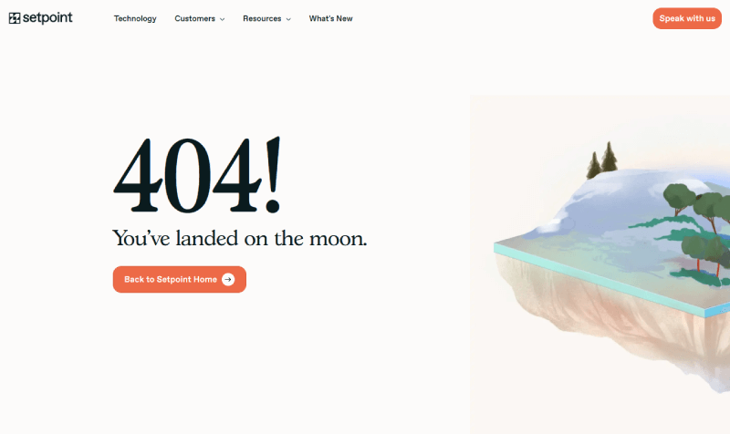
Setpoint’s witty custom WordPress 404 page keeps users engaged with humor (“Back to Earth”) while still guiding them seamlessly home.
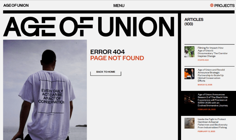
Age of Union’s engaging WordPress 404 design doubles as navigation, offering suggested articles so visitors never feel lost after a misclick.
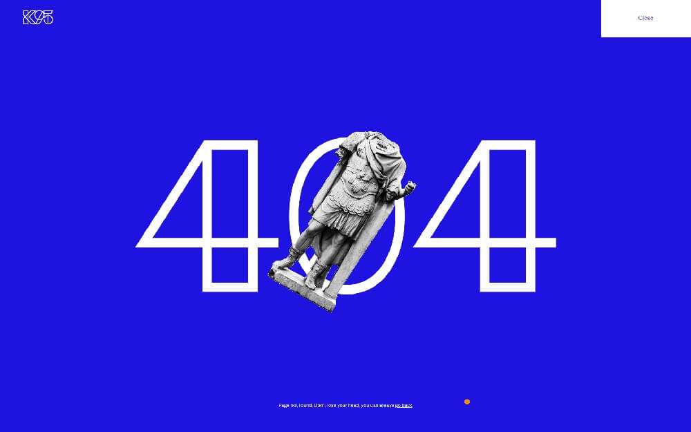
K95 delivers humor with its WordPress error page example, combining an architectural sketch style with a headless statue visual and playful “Don’t lose your head” message.
Testimonials are one of the strongest forms of social proof — and these examples show how to display them beautifully. Each design balances readability, credibility, and brand aesthetics to help build trust with potential customers. Explore how different layouts, visuals, and interactive elements bring real customer voices to life.
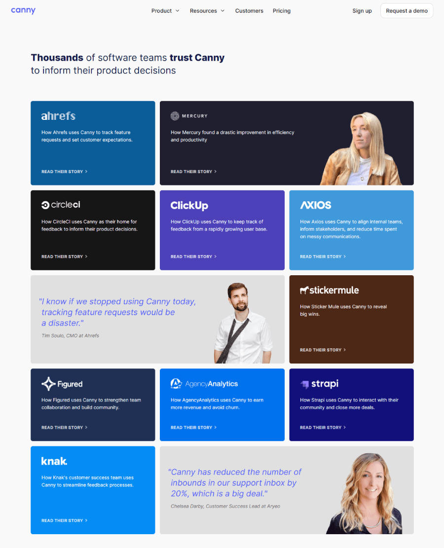
Canny transforms testimonials into colorful mini case studies. Its modular grid highlights real client results, creating an engaging, story-first experience.
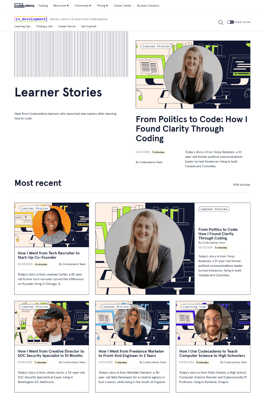
Codecademy’s “Stories” section personalizes testimonials with photos, names, and short bios. The friendly, social format makes user success feel real and relatable.
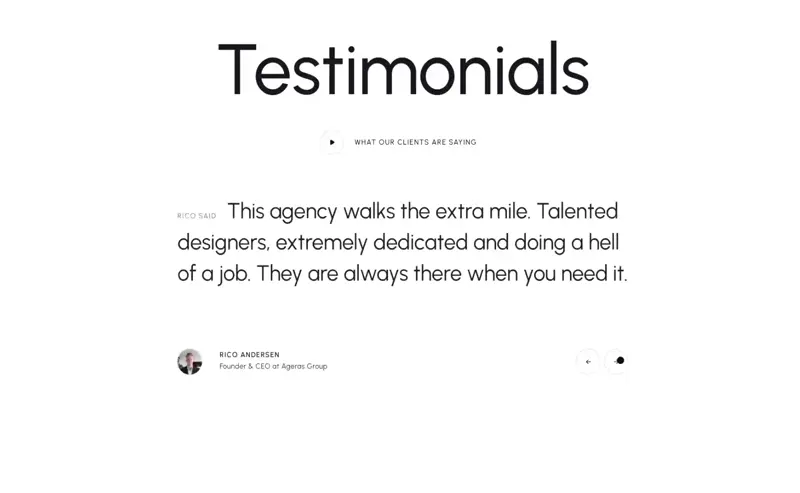
BlackFish’s testimonial slider blends seamlessly with its minimalist design. Smooth transitions, clean quotes, and real video testimonials keep things polished and authentic.
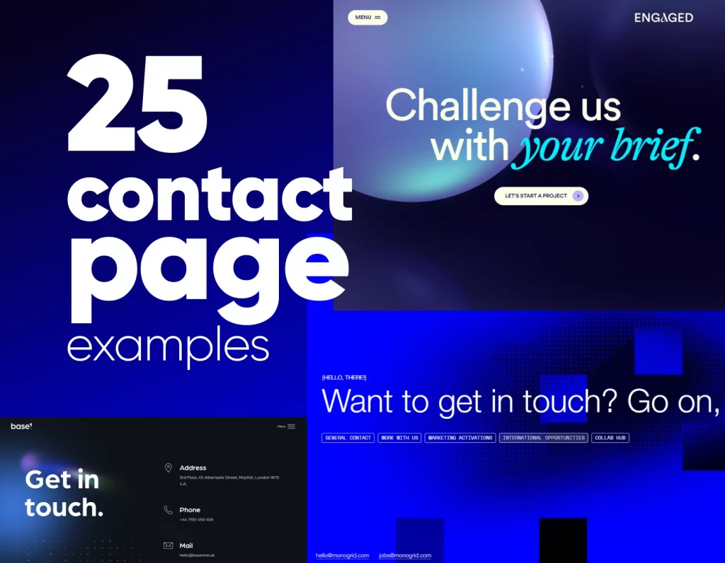
A well-designed contact page makes it effortless for visitors to reach out. The examples in this list stand out for their simplicity, clear CTAs, and welcoming tone. From smart use of forms to embedded maps and engaging microcopy, these pages show how thoughtful design can boost conversions and user satisfaction.
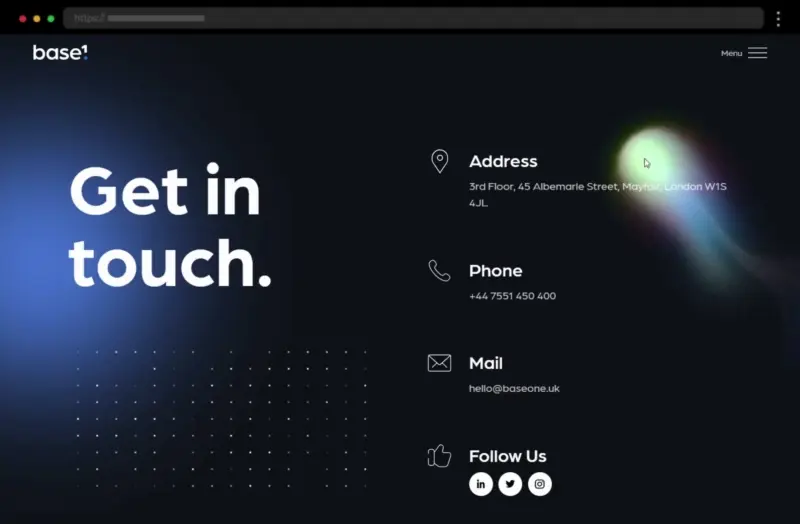
Base One’s “Get in Touch” page combines simplicity with style. A clean, modern form, multiple contact options, and intuitive design make connecting easy and effortless.
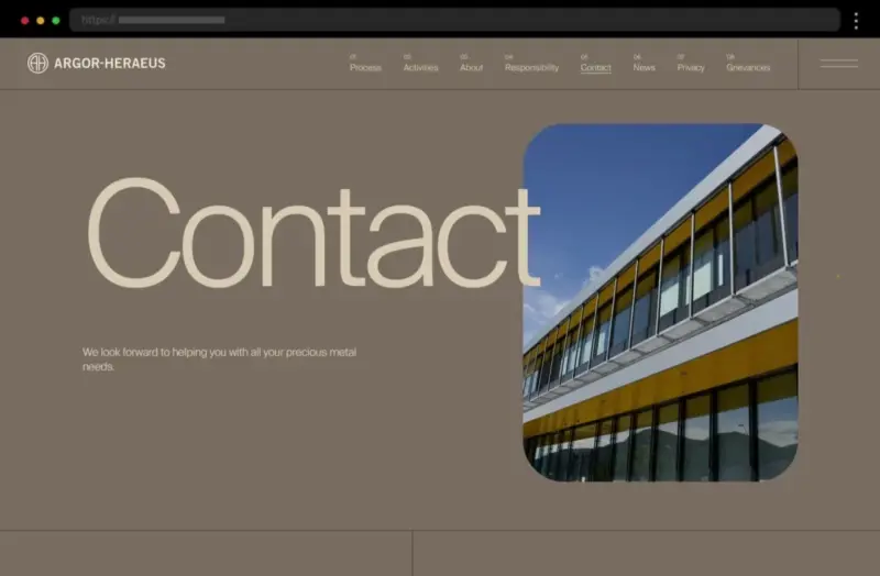
Argor Heraeus’s contact page feels polished and reliable, featuring a smart drop-down form that directs inquiries to the right department and complete contact details for accessibility.
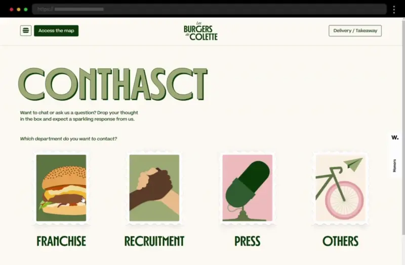
Les Burgers de Colette’s contact page bursts with energy. Playful icons, postcard-style forms, and social media links make reaching out feel casual and friendly.
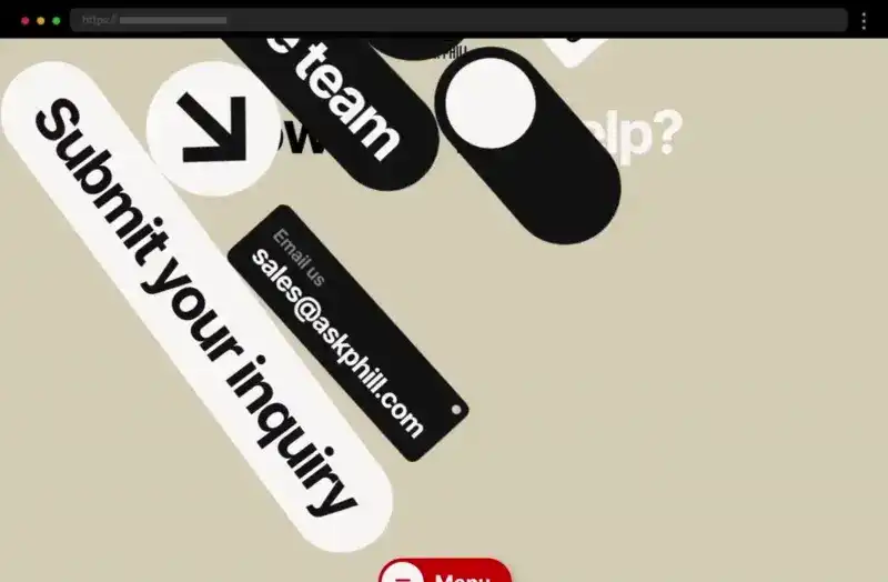
Ask Phill keeps things fresh with a clean, conversational layout. Interactive contact options and a simple form create a smooth, engaging user experience.
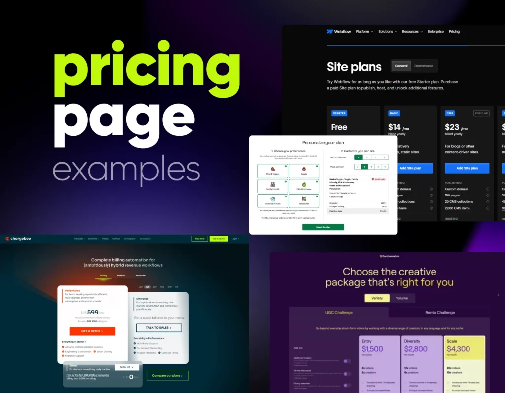
Pricing pages are where curiosity meets decision-making. These examples highlight how great layout, contrast, and clarity can guide users toward the right choice. You’ll see how effective use of visuals, toggles, and feature comparisons can make even complex pricing structures easy to understand — and impossible to resist.
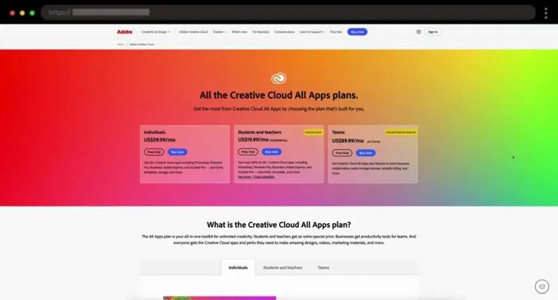
Adobe’s pricing page is clear and intuitive, offering tailored plans for different buyer types. A feature toggle and detailed FAQ make comparison and decision-making effortless.
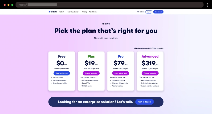
Wistia’s bright, purple-themed design makes pricing fun and easy to navigate. Simple plan descriptions, visual clarity, and FAQs help users pick confidently.
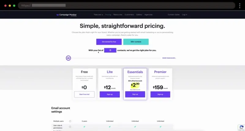
Campaign Monitor keeps it simple yet smart with a slider that adjusts prices based on contact count. Hover tips and concise feature lists enhance usability.
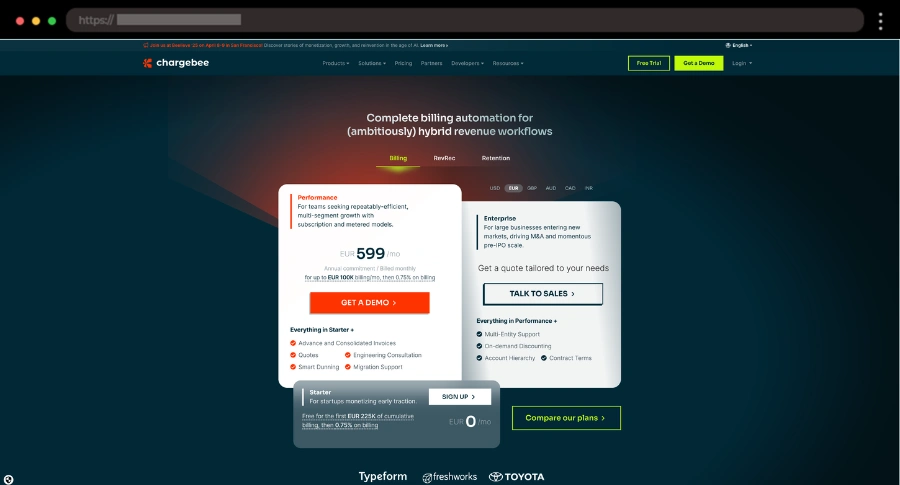
ChargeBee’s layout draws attention with standout plan boxes and multi-currency support. Clear summaries, comparison pop-ups, and social proof inspire trust and clarity.
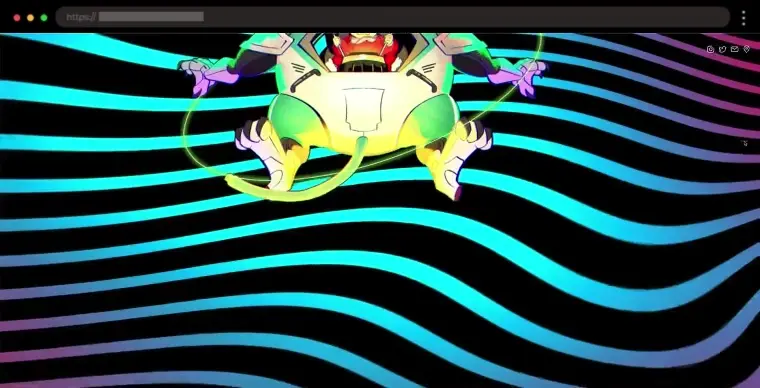
WordPress design evolves constantly. From bold typography to dark mode, animation, and AI-assisted layouts, the latest trends can inspire your next site or refresh your existing one. Explore our collection of WordPress trend examples to see cutting-edge aesthetics, interactive elements, and innovative UX patterns that are shaping the web in 2025 and beyond.
Simple WordPress websites prove that less is more. These examples focus on clarity, usability, and straightforward design that makes navigation effortless and content easy to digest. Perfect inspiration for anyone who values function and elegance without distractions.
Prensalink’s site uses a mint accent for freshness and creativity. The clean WordPress design includes subtle animations and a smooth, logical flow across sections.
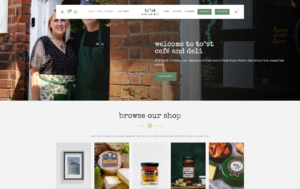
To^st combines a typewriter font and lowercase styling to create a welcoming vibe. Its simple WordPress design also includes a matching e-commerce section
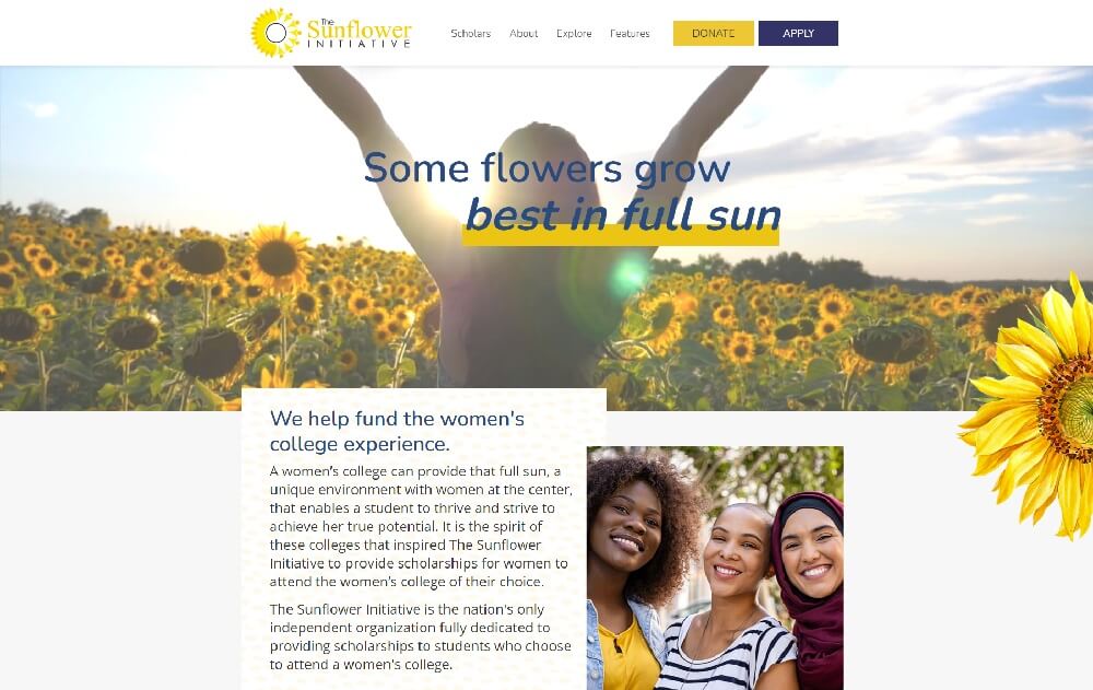
This nonprofit site uses storytelling, hand-drawn sunflowers, and a warm color palette. The editorial-style design feels authentic, simple, and heartfelt.
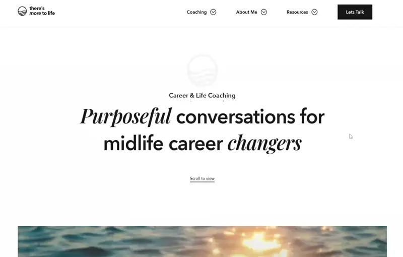
A personal WordPress site with a calming hero video, parallax scrolling, and smooth animations. The clean design guides visitors naturally through the story.
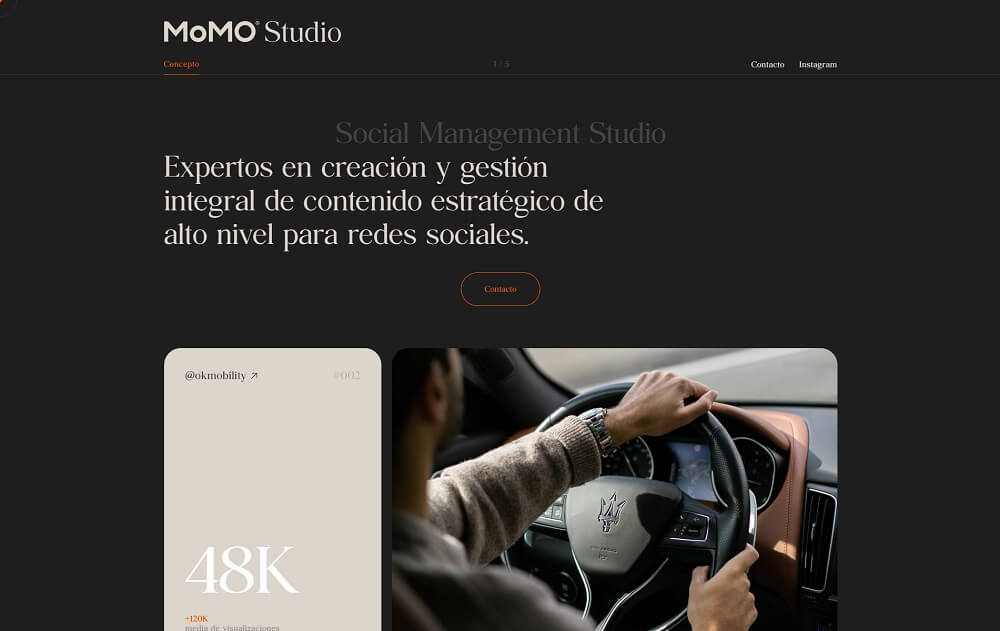
MoMo Studio’s vintage cream palette and intuitive layout make its site feel warm and stylish. The homepage highlights projects right from the hero section.
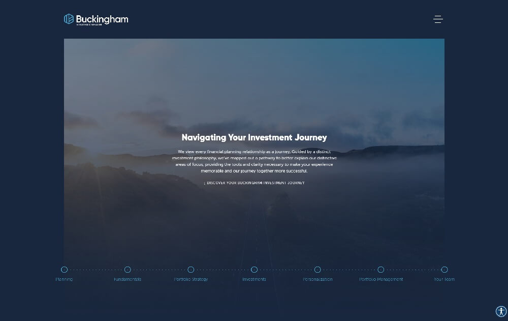
This financial firm’s WordPress site is professional yet simple, with clear content and unique navigation styled like a process diagram for clarity.
Clean WordPress designs use whitespace, balance, and structure to create professional, easy-to-browse experiences. These examples highlight modern layouts where every element serves a purpose—ideal for brands that want to look refined and trustworthy.
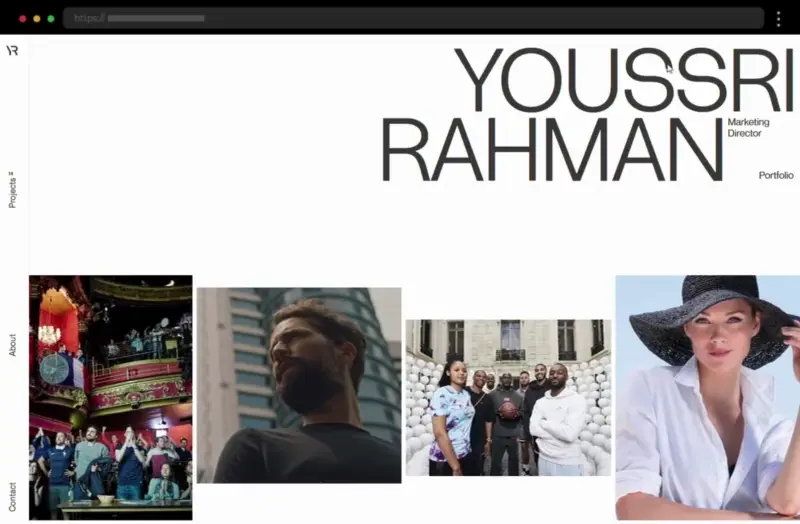
Youssri Rahman’s portfolio uses a clean, minimal design with elegant white space and smooth hover effects that highlight creative projects. The simple layout and image carousel make navigation effortless and engaging.
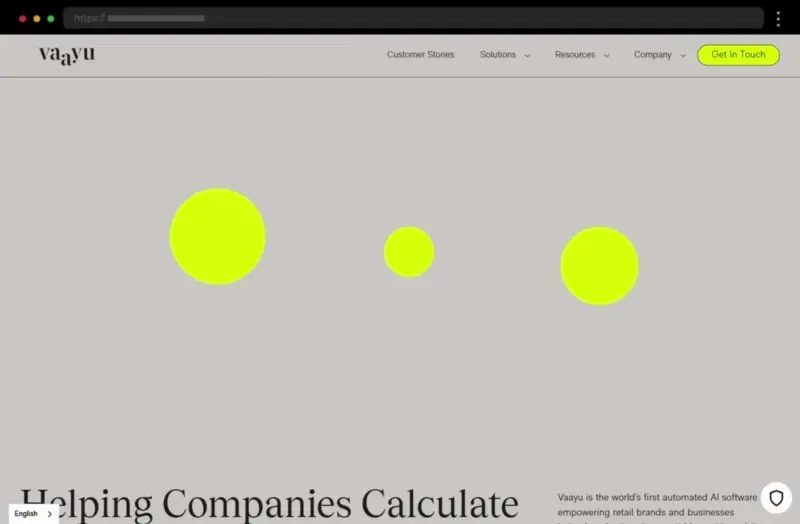
Vaayu’s clean, modern web design combines sustainability and technology through interactive elements and effective white space. The result is a visually balanced, eco-conscious site that feels both fresh and professional.
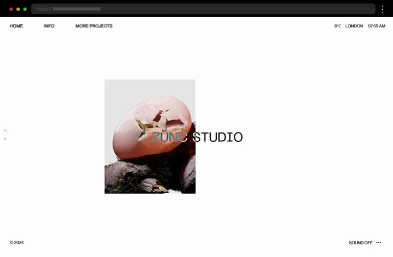
Zunc Studio’s clean, minimalist site uses high-quality visuals and subtle animations to keep users engaged. Its intuitive layout and clear typography create a professional yet creative experience.
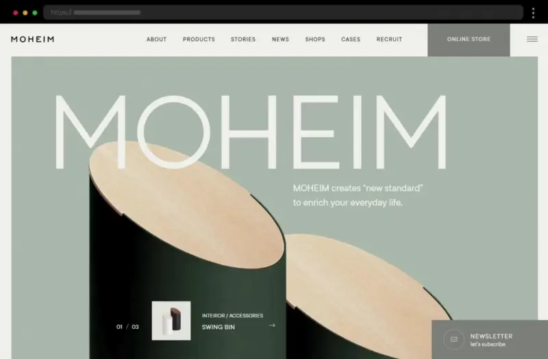
Moheim’s website embodies clean elegance with a cohesive color palette, minimalist visuals, and balanced white space. The refined design conveys sophistication and calm, perfectly suited for a modern furniture brand.
Minimalist WordPress websites embrace simplicity with bold typography, subtle colors, and clear messaging. This collection showcases how strategic restraint and smart design choices can create powerful, elegant online experiences.
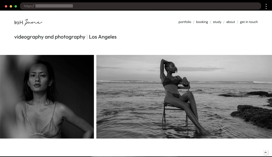
Ira June’s portfolio uses a minimalist layout with bold visuals and plenty of white space, letting her photography take center stage in a sleek, modern design.
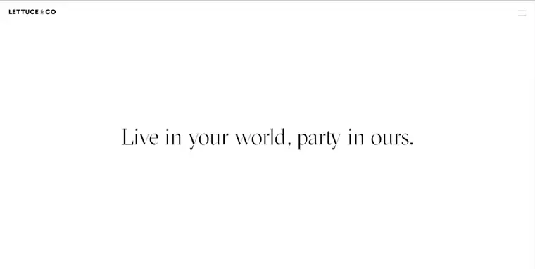
Lettuce & Co blends whimsy with minimalism, using black-and-white tones, playful pops of red, and large event images for a fun, professional look.
Duten’s sleek, minimal site showcases 3D product visuals with bold typography and subtle animations, creating a polished, user-friendly experience.
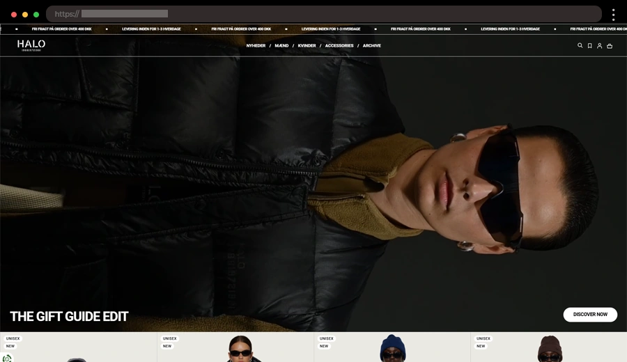
Halo’s site uses bold hero videos, clean images, and minimal text to showcase apparel stylishly, while intuitive navigation and a simple checkout enhance the shopping experience.
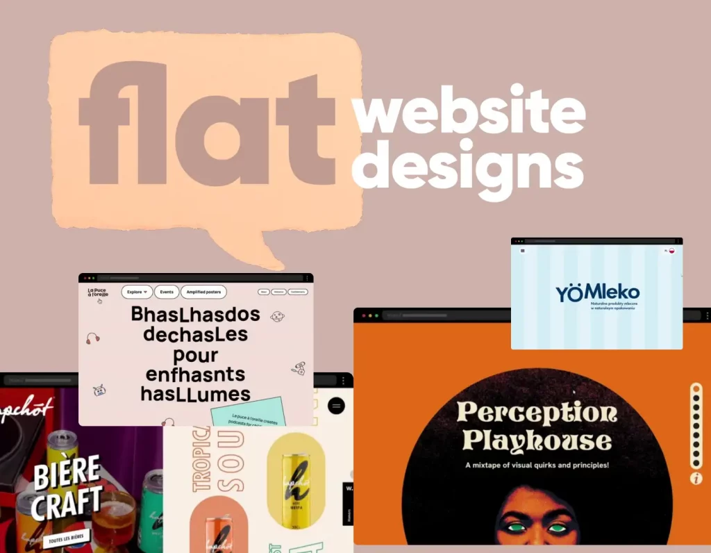
Flat design WordPress sites focus on clarity and simplicity, using solid colors, clean icons, and minimal textures. These examples demonstrate how flat aesthetics can feel modern, fast, and visually appealing without unnecessary clutter.
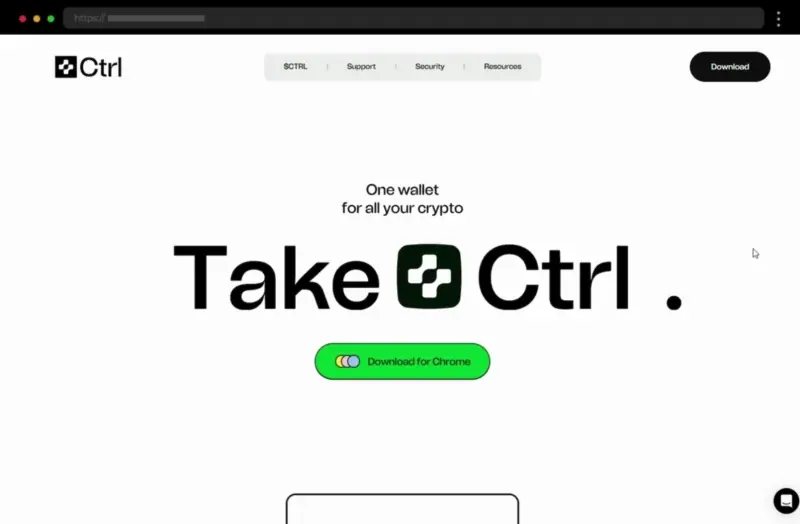
Ctrl Wallet combines simplicity and color in a clean flat design that feels both modern and professional, with subtle animations enhancing usability.
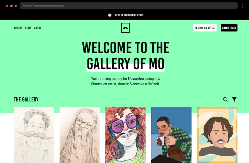
Gallery of Mo’s flat design pairs vibrant colors and clean typography, creating a fun, user-friendly art gallery experience that feels lively yet refined.
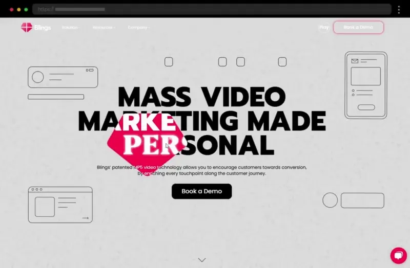
Blings stands out with bold typography, bright colors, and smooth animations that make its flat design dynamic, clear, and engaging for users.
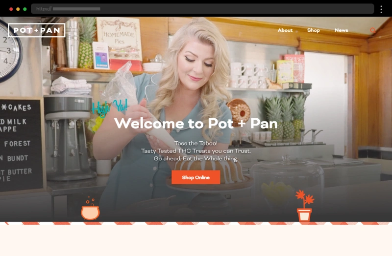
Pot and Pan’s flat design feels warm and fresh, using clean layouts, cohesive colors, and balanced visuals to create a delightful, modern browsing experience.
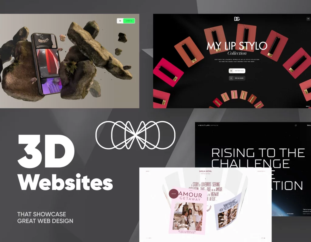
3D WordPress websites bring depth and interactivity to life with motion, layered visuals, and dynamic elements. This selection highlights immersive designs that push creativity while keeping performance and user experience in focus.
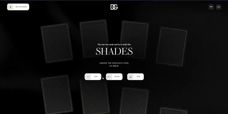
Dolce & Gabbana’s Lip Stylo site blends luxury and play with stunning 3D visuals, smooth animations, and an elegant game-style experience that feels both stylish and interactive.
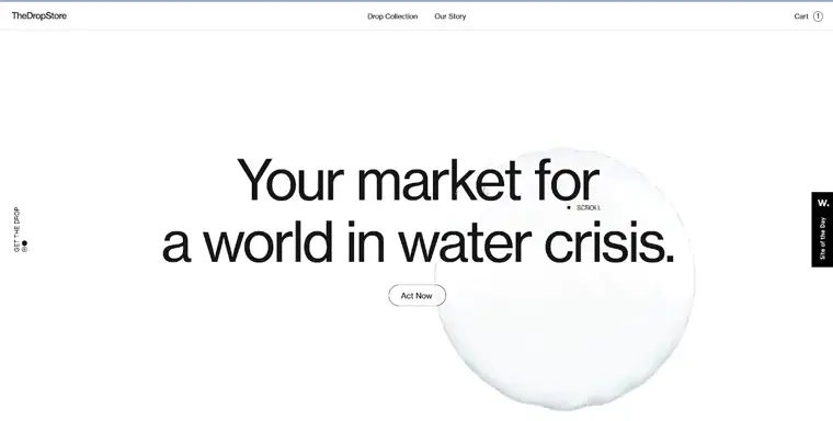
The Drop Store uses realistic 3D models and interactive storytelling to raise awareness about water conservation, turning an e-commerce concept into a meaningful digital experience.
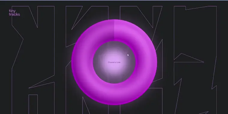
Tiny Tracks brings music creation to life with bold 3D visuals, vibrant colors, and dynamic interactivity that perfectly mirrors the creativity of electronic sound design.
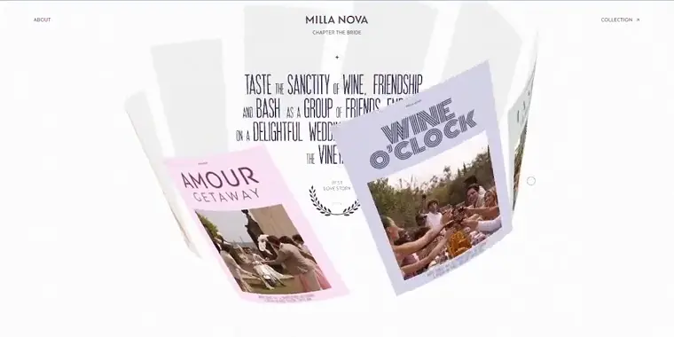
Chapter by Millanova’s elegant 3D website showcases bridal gowns through fluid animations, interactive cards, and cinematic videos, creating a dreamy virtual runway experience.
Typography-centered WordPress designs use creative fonts and layout hierarchy to make text the main design feature. These examples show how powerful typography alone can define a brand’s tone, elevate readability, and craft strong visual identity.
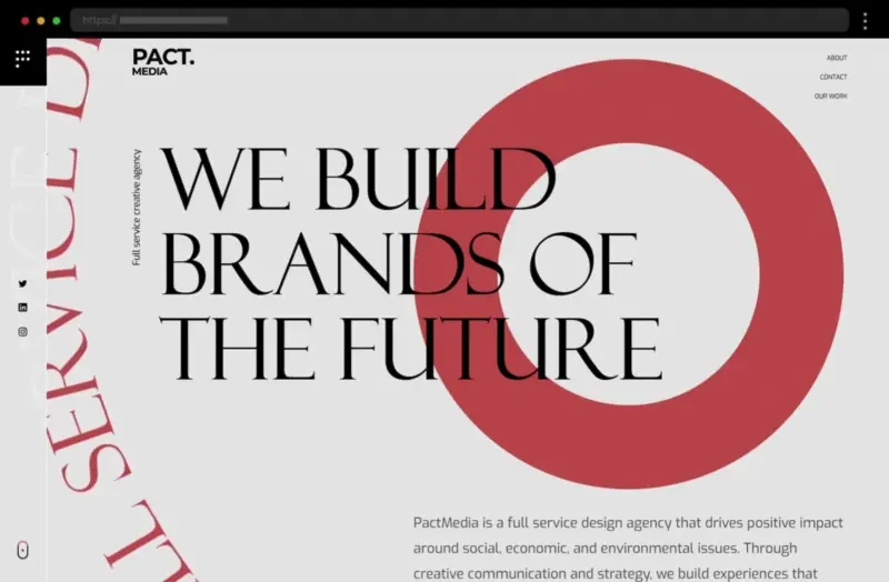
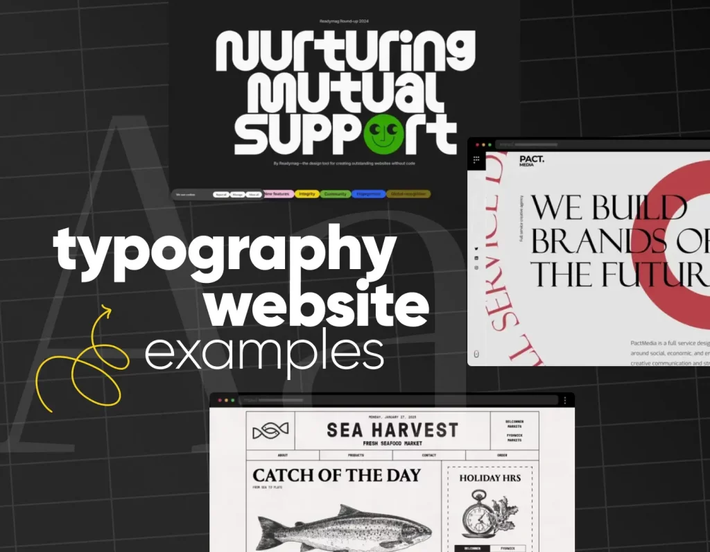
PACT Media’s modern website pairs serif and sans-serif fonts beautifully, using bold headings, clean layouts, and strong contrast for a readable, professional, and stylish design.
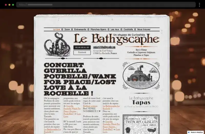
Bathyscaphe’s bar and restaurant site is presented in a newspaper style blending bold fonts and retro imagery to create a vintage yet sophisticated typographic experience.
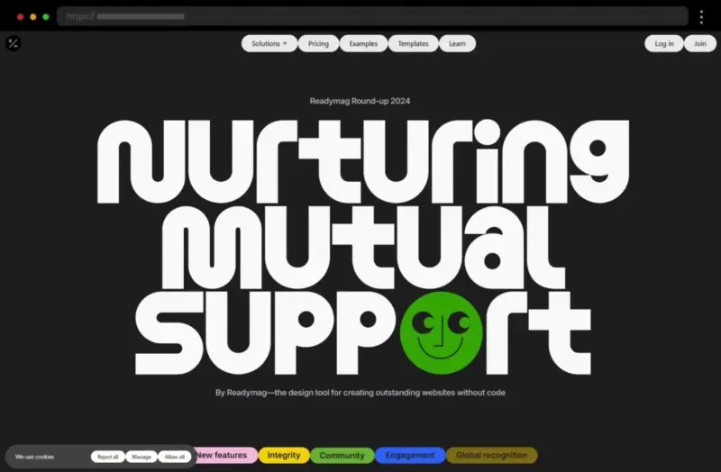
Readymag’s site is a bold celebration of typography, combining oversized vintage fonts and vibrant colors to create a visually striking and highly creative design.
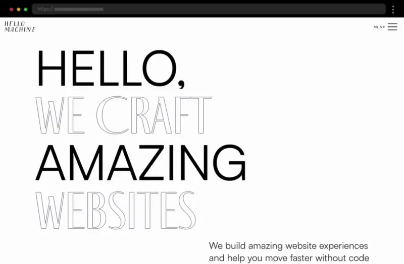
Hello Machine’s sleek design uses expressive sans-serif typography and a soft color palette to create an elegant, modern aesthetic with strong visual impact.
Retro WordPress designs mix nostalgia with modern aesthetics. From vintage typography to old-school textures and color palettes, these examples show how to evoke emotion and personality while staying relevant and engaging.
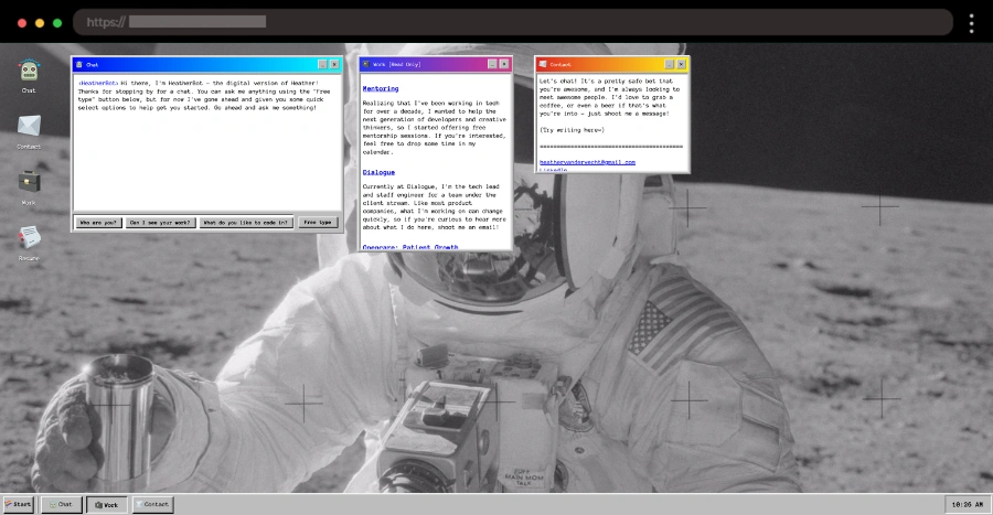
Heather Vandervecht’s site brings 90s nostalgia to life with a Windows-style interface, cosmic background, and playful interactive elements that blend retro fun with a modern twist.
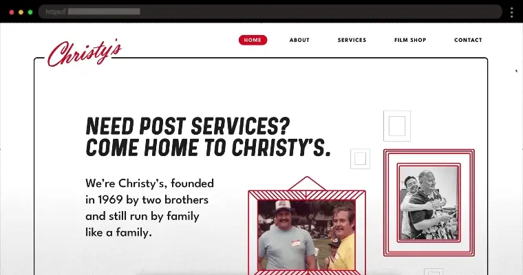
Christy’s vintage-inspired website combines bold colors, classic movie visuals, and smooth animations to reflect decades of expertise in film and post-production.
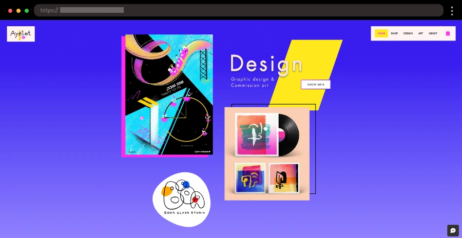
Ayelet Raziel’s dreamy, vintage-style website uses soft pastels, hand-drawn graphics, and elegant typography to create a calm, artistic, and nostalgic atmosphere.
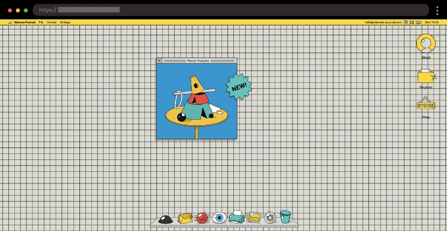
Mariano Pascual’s vibrant site is a mix of a squared notebook background, dynamic shapes, and retro aesthetics for an avant-garde, 80s-inspired digital art experience.
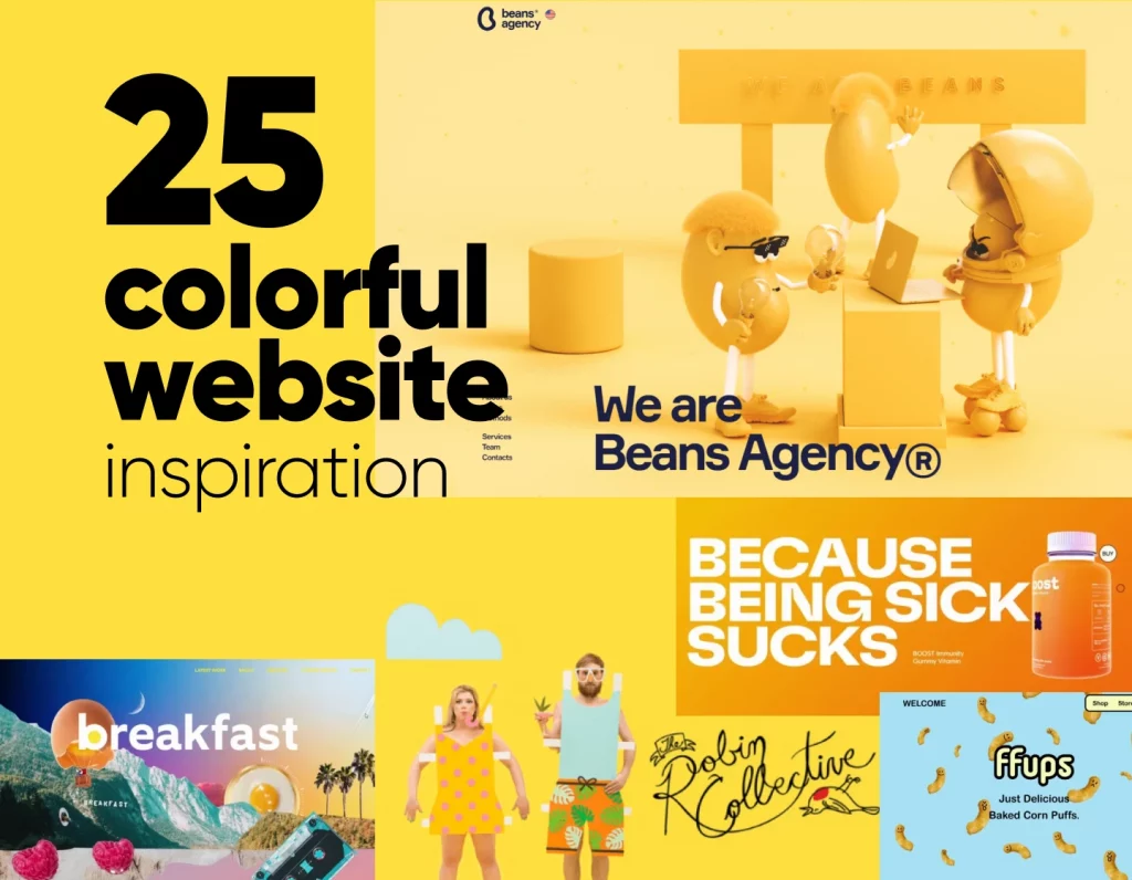
Bold, bright, and full of energy—colorful WordPress websites use vibrant palettes to stand out and connect emotionally with visitors. These examples prove how color psychology and creativity can turn ordinary layouts into unforgettable experiences.
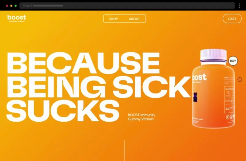
Boost’s vibrant site pops with neon tones, bold visuals and typography, creating an energetic, youthful vibe that draws attention to key brand and product details.
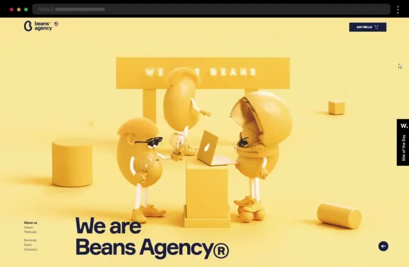
Beans Agency uses bold colors, lively visuals, and fun animations to showcase its creative energy, resulting in a modern, dynamic website that feels both professional and playful.
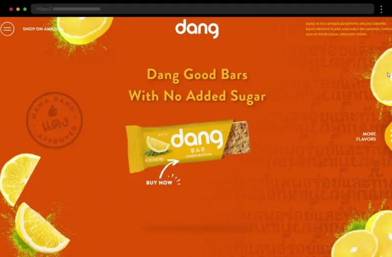
Dang Foods’ website bursts with bright oranges and teals, pairing fun visuals with clean layouts for an energetic, appetizing digital experience.
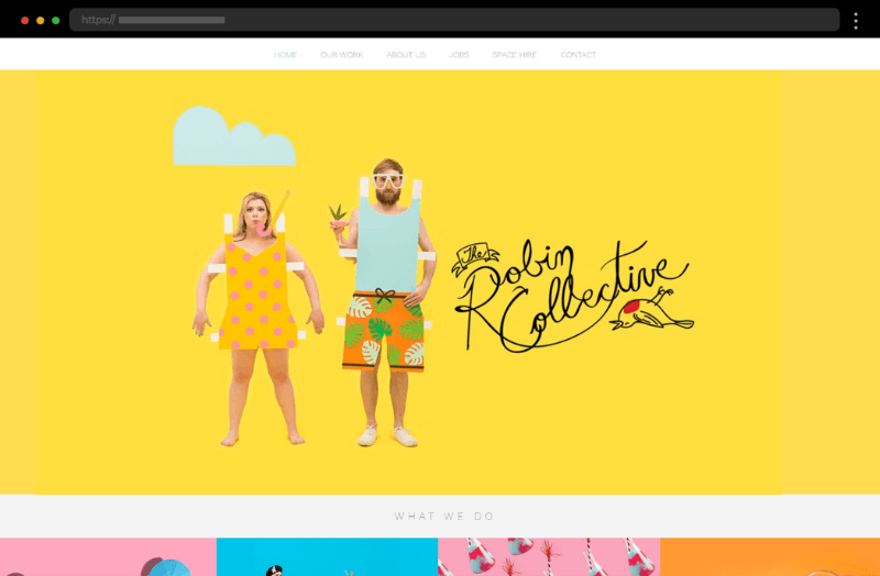
The Robin Collective’s bold, whimsical design uses vibrant colors and playful elements to capture the agency’s fun, creative personality.
Illustrated WordPress websites use custom drawings and artistic visuals to tell unique stories. Whether playful or polished, these examples highlight how illustration adds personality, warmth, and brand authenticity to web design.
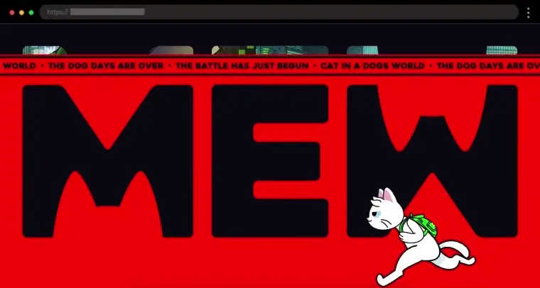
MEW’s vibrant, cat-themed website uses bold illustrations, fun animations, and lively colors to create an interactive, playful digital experience that feels full of personality.
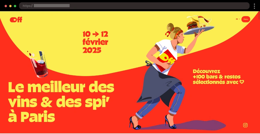
Le OFF Paris blends wine culture with bold vector art, featuring quirky illustrations, vibrant colors, and an interactive restaurant map that make the site visually engaging and fun.
Snap Sound pairs smooth animations with subtle, stylish illustrations to create a modern, minimalist site that captures the brand’s sleek, audio-focused identity.
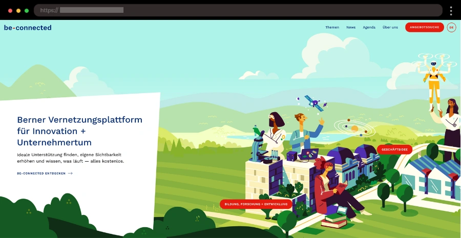
Be Connected’s dynamic site shines with bold colors, animated vector illustrations, and horizontal scrolling, delivering a fun and energetic user experience.
Interactive scrolling websites use animations, parallax effects, and dynamic transitions to create immersive storytelling experiences. These WordPress examples demonstrate how movement and interactivity can engage users from start to finish.
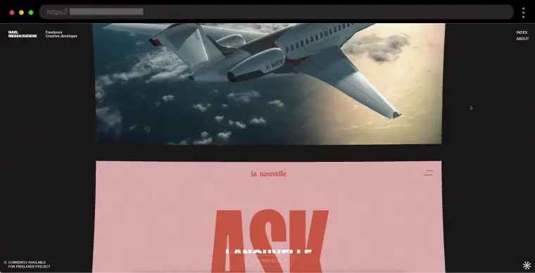
Nael Messaoudene’s portfolio showcases a minimalist scrolling design that flows seamlessly between sections, emphasizing clarity, smooth navigation, and the artist’s creative work.
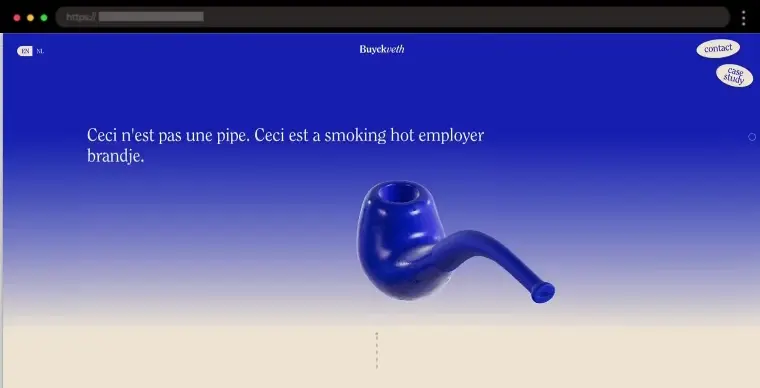
Buyck Veth’s professional scrolling site blends beige and blue tones, clean serif typography, and smooth 3D animations for a refined yet engaging browsing experience.
Snowhouse Studio’s interactive scrolling website turns its 2024 year in review into an immersive experience with dynamic animations, bold typography, and colorful visuals.
Hadaka’s scrolling website bursts with color and motion, featuring vibrant illustrations and playful effects that respond to scrolling, creating an engaging and creative digital experience.
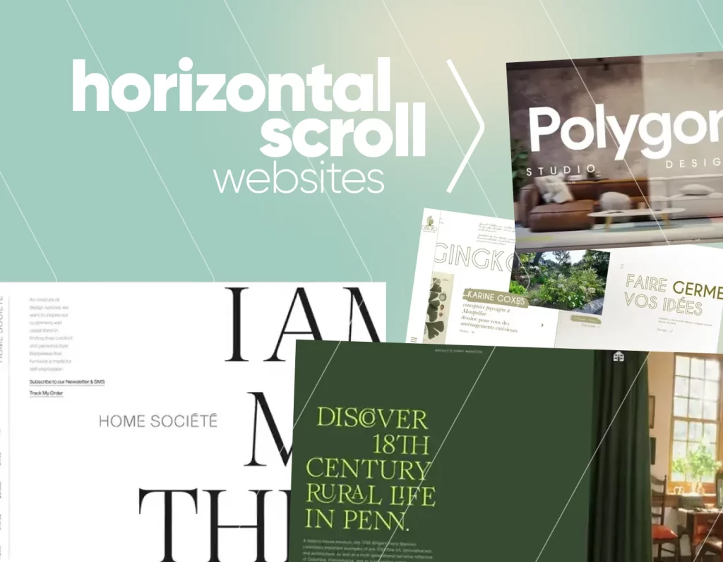
Horizontal scroll websites break the mold of traditional navigation, guiding visitors sideways through visually rich storytelling. These examples showcase how horizontal layouts can feel creative, fluid, and perfect for portfolios or brand showcases.
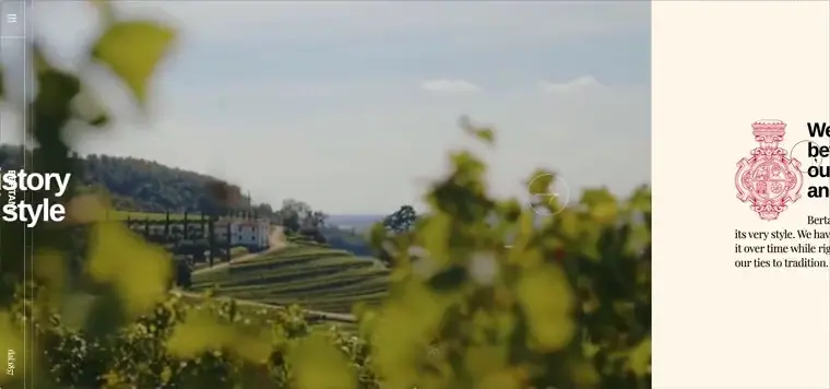
Bertani Rebuild’s horizontal scrolling website beautifully blends vintage charm with modern design, guiding visitors through the winery’s story with elegant typography and stunning full-screen imagery.
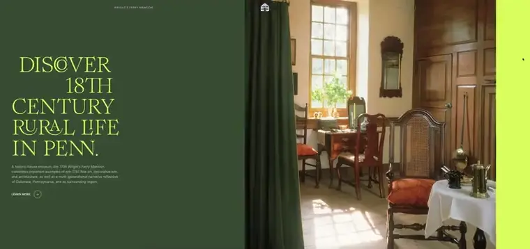
Wright’s Ferry Mansion’s site captures 18th-century warmth through nostalgic tones, rich photography, and horizontal scrolling that turns history into an inviting, immersive experience.
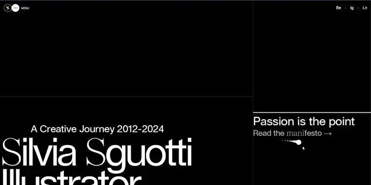
Silvia Sguotti’s horizontal portfolio pairs a minimalist black-and-white palette with bold yellow accents and large typography, creating a clean, modern, and dynamic browsing experience.
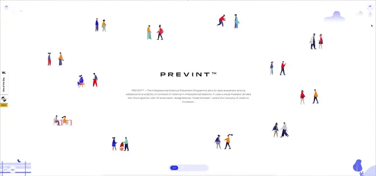
Prevint’s site uses horizontal scrolling and flat illustrations to guide visitors through key social awareness topics, blending minimalist design with meaningful storytelling.
Wrapping up: WordPress Website Inspiration Made Easy
You’ve just explored some of the best WordPress website examples, grouped by homepage layouts, blog designs, portfolios, eCommerce stores, industry niches, and creative trends. Whether you’re planning your first WordPress site or redesigning an existing one, these galleries give you proven patterns to shortcut the design process.
Want to go further? Here are your next steps:
Browse more inspiration in our Website Examples category— featuring not just WordPress, but also eCommerce, portfolios, restaurants, agencies, and more.
Get expert help — our partner agency htmlBurger can turn any of these styles into a pixel-perfect WordPress build.
Bookmark this hub so you can return whenever you need fresh design ideas.
And remember, the best websites aren’t just beautiful — they’re functional. As you explore, note the small details (navigation, CTAs, typography) that make these sites effective, and use them in your own project.
Share this article
By Iveta Pavlova
Iveta loves all things design. In digital space, she shares her take on web and graphic design, creative workflows, tools, and trends that spark inspiration for designers everywhere.